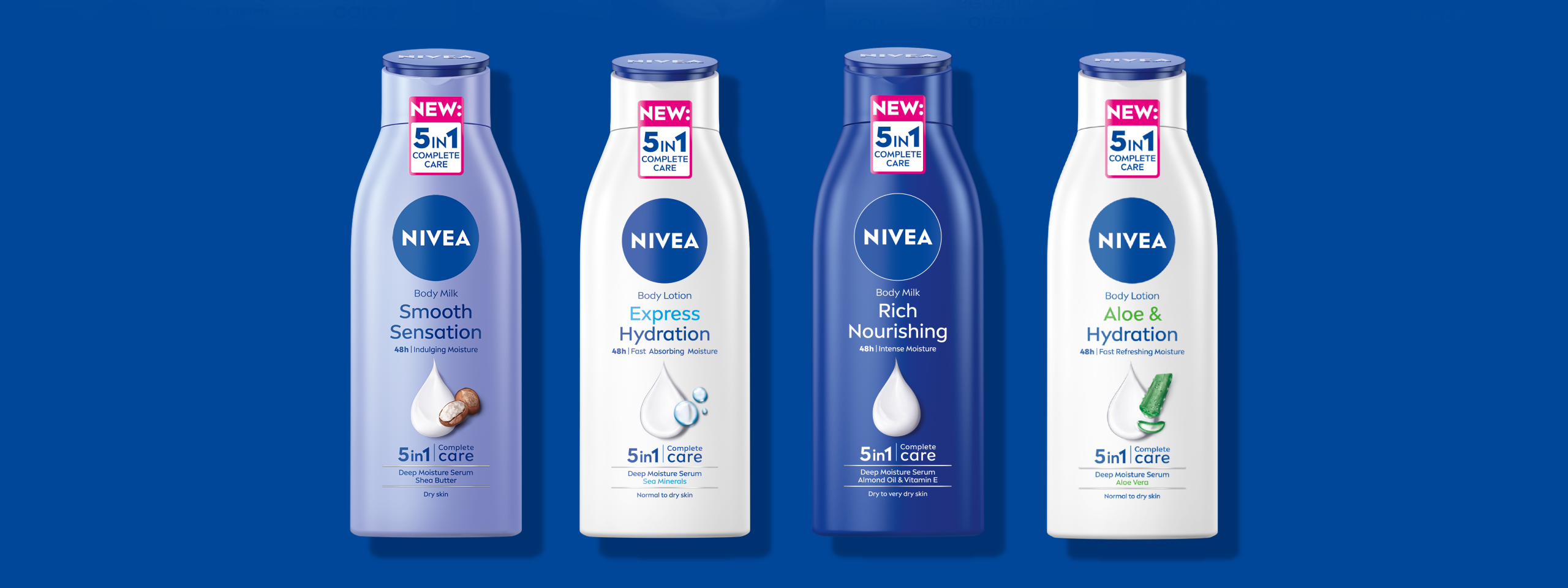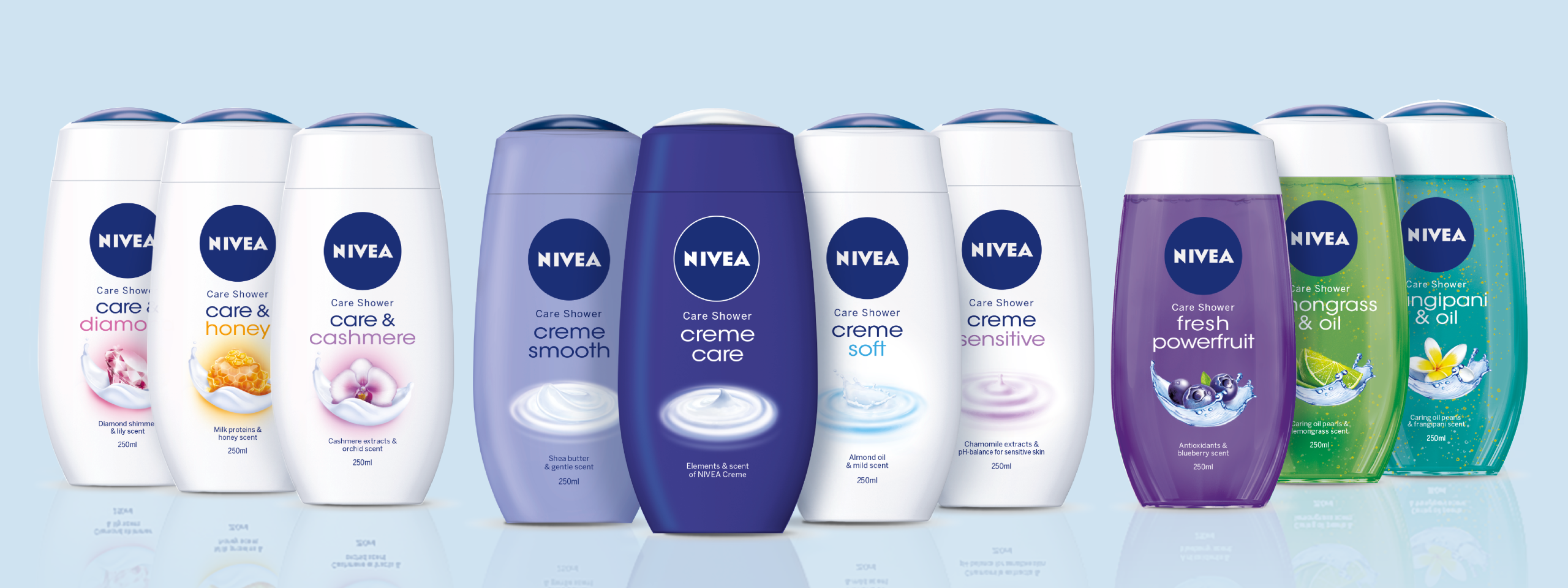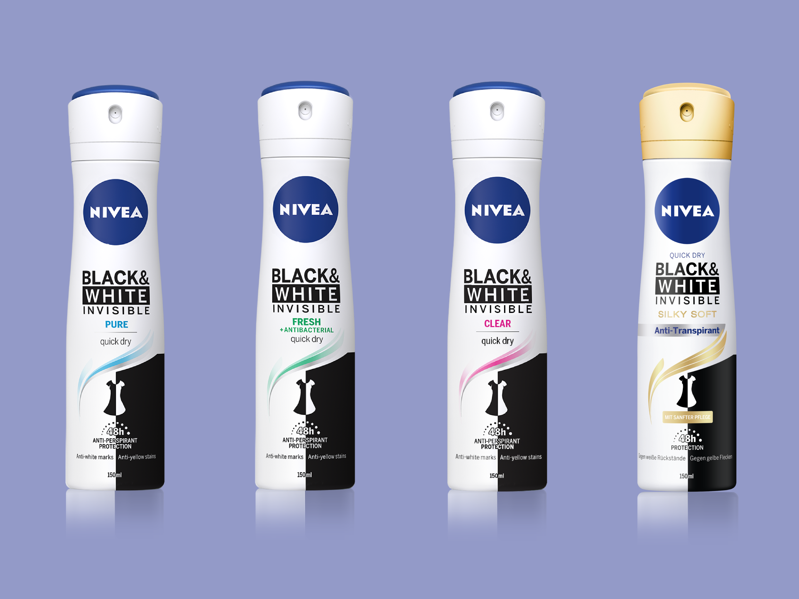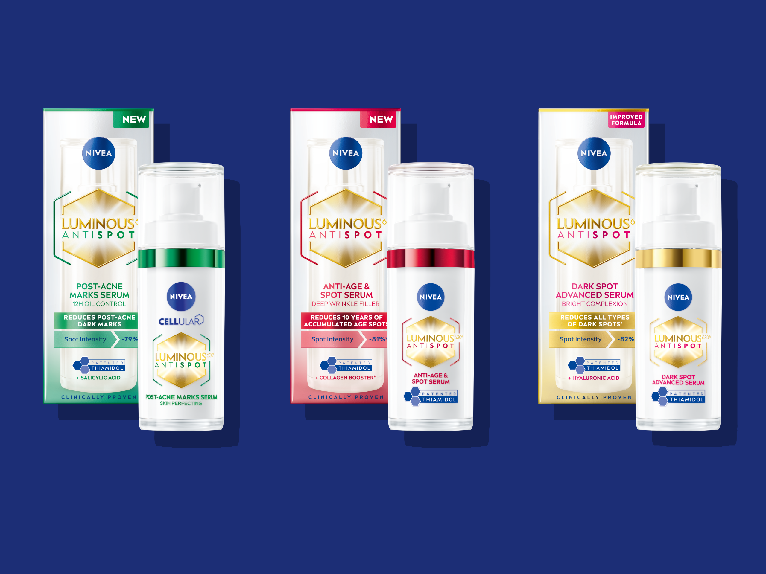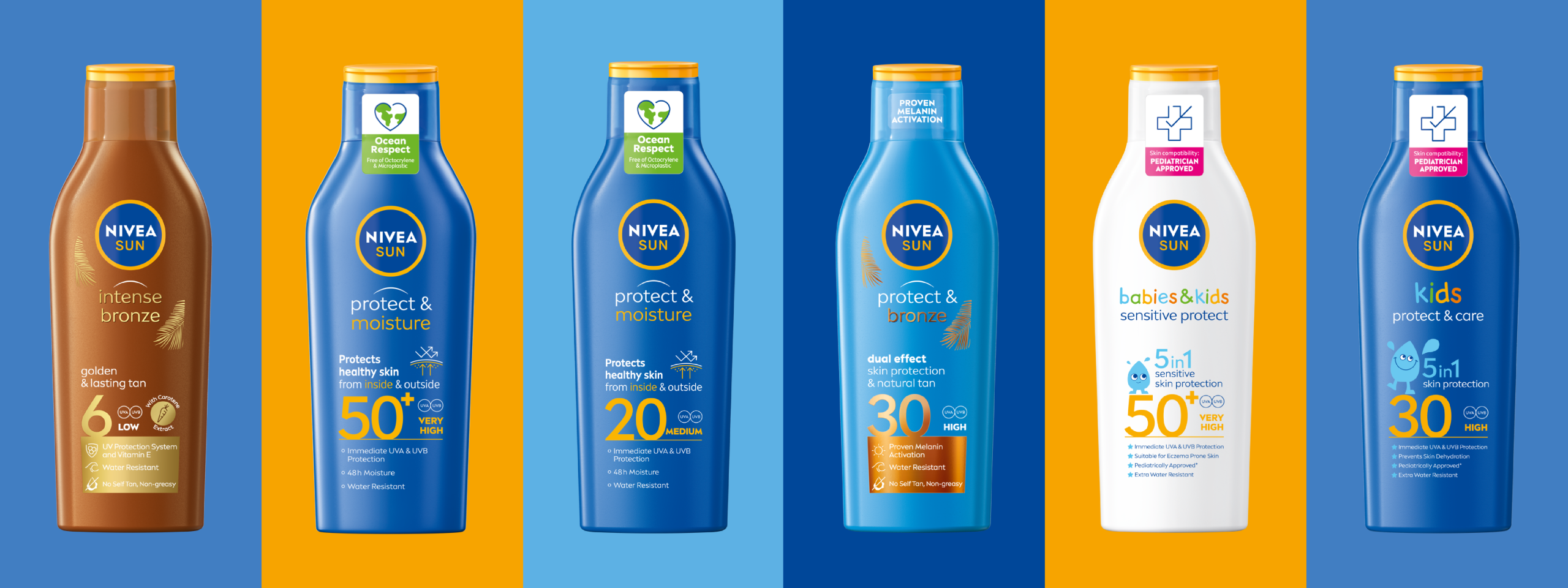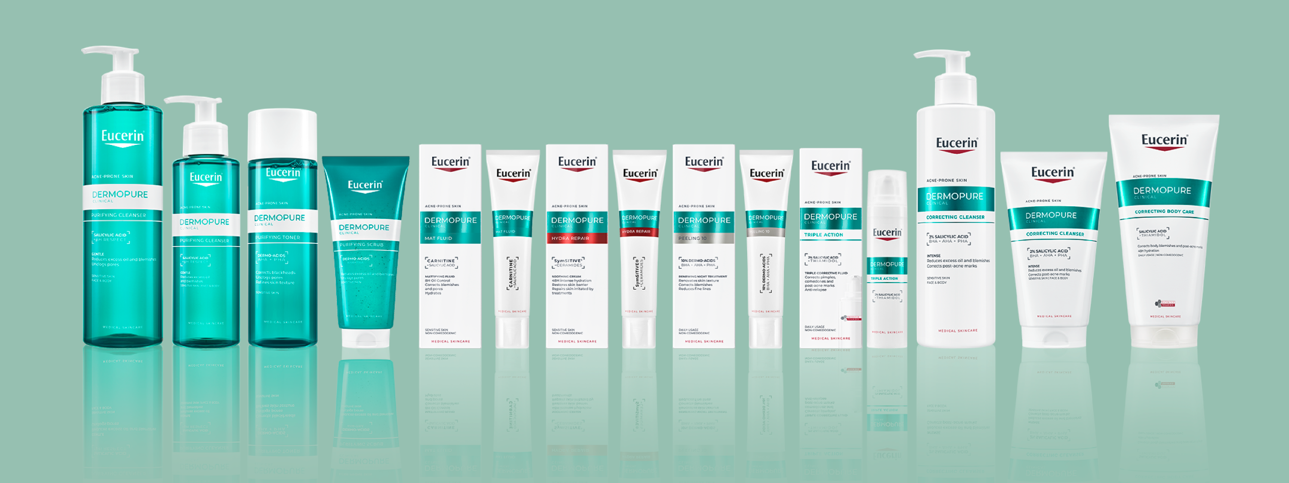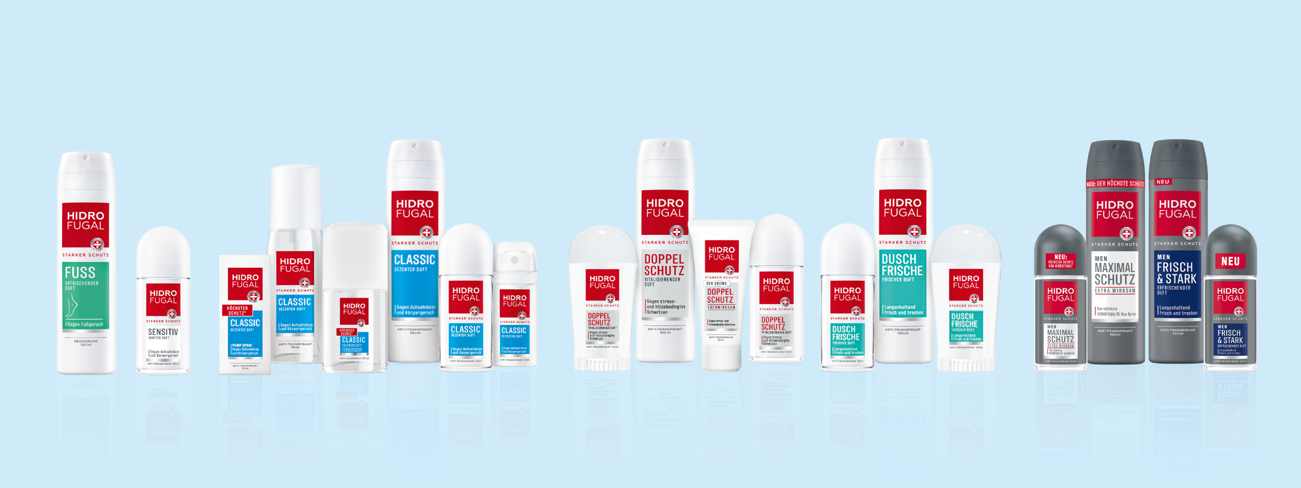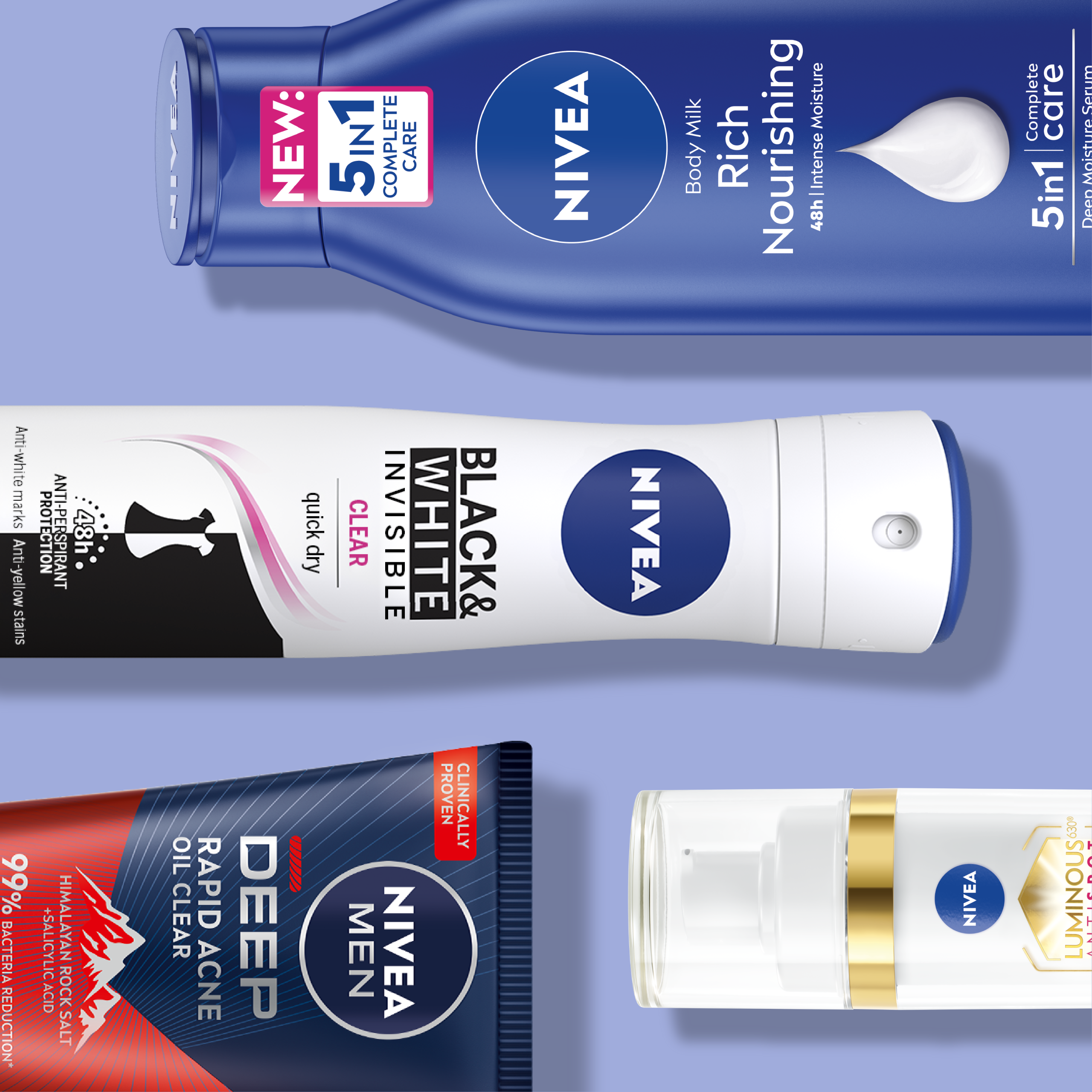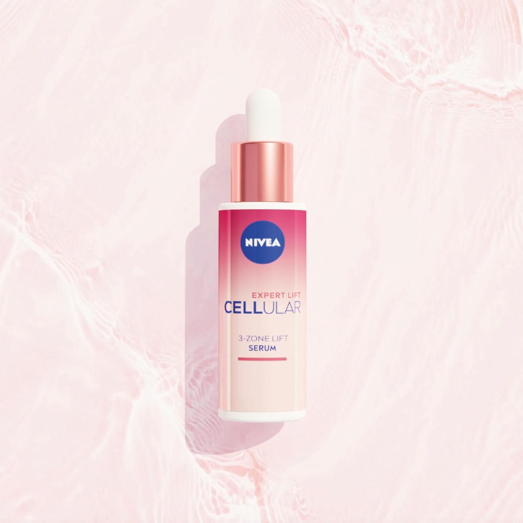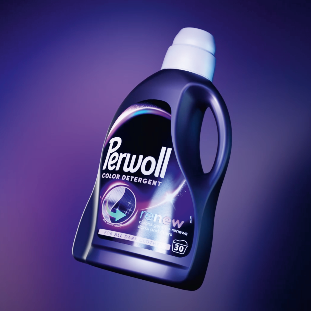


Cosmetics packaging design is a category of its own within product design – with unique challenges and objectives. JUSTBLUE works both in the field of fast-moving consumer goods (FMCG) and for clients in the selective cosmetics sector. Our client portfolio in these areas includes, among others: Nivea, 8×4, HIDRO FUGAL, Eucerin, and Goldwell.
Selective Cosmetics vs. FMCG: Different Requirements for Cosmetics Packaging Design
Selective cosmetics are sold exclusively through department store specialty sections and perfumeries.
This segment includes both skincare products and fragrances. In contrast, cosmetics packaging design for products available in drugstores and grocery retail must meet special requirements. Here, in the absence of personal consultation, products need to practically“sell themselves right off the shelf”. For this reason, cosmetics packaging design is fundamentally a very important factor in purchasing decisions.
However, the importance varies by category. While daily face and body care (face care, body care, and deodorants) are generally characterized by high customer loyalty and brand commitment, the bath and shower segment (bath care) has an extremely high proportion of so-called impulse purchases. In this category, purchase planning often does not include a specific brand or even a specific variant. Around 70 percent of purchasing decisions are made spontaneously and impulsively at the point of sale (POS). Consequently, the share of the purchasing decision influenced by cosmetics packaging design in this category is particularly high.
Trends Influence Cosmetics Packaging Design
In contrast to food packaging design, cosmetics packaging design is strongly shaped by aesthetic values such as “beauty” and “lifestyle.” These visual codes are closely linked to brand identity and awareness – the more established a brand is, the greater its influence on packaging design. At the same time, cosmetics packaging design is subject to dynamic trends that are constantly evolving. As a result, the visual lifespan of many products is shortened – designs must be updated regularly to remain modern and relevant.
How Cosmetics Packaging Design Adapts to Trends and Competition
Cosmetics packaging design must constantly adapt to new market trends and changes in the competitive landscape. At the point of sale (POS), where products are placed directly next to each other, packaging design often determines the purchase decision. An outdated design can quickly appear unappealing – especially when compared directly to trendy competitors. Professional cosmetics packaging design identifies such weaknesses early on and responds strategically. By analyzing category-specific and cross-category design trends, valuable insights are gained for the briefing. These flow directly into key design objectives such as brand identity, recognizability, category visual conventions, and emotional brand values.
Cosmetics Packaging Design Creates Structure
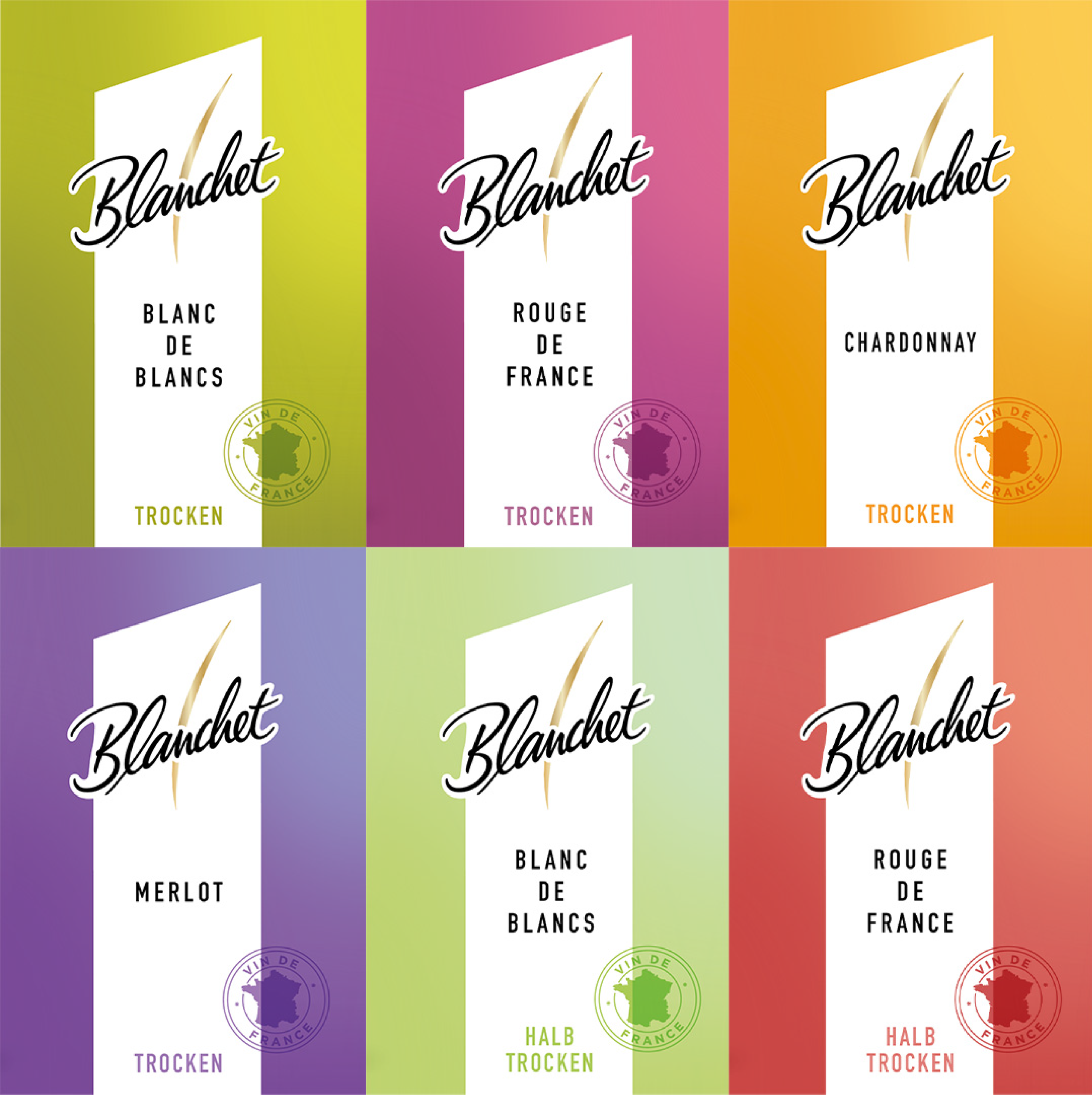
In recent years, many successful brands have significantly expanded their product ranges. Initially, assortments were supplemented with new variants or innovations – so-called line extensions. Once these had established themselves in the market, market research was used to evaluate which areas or categories the brands could credibly expand into. Such an expanded range must be clearly structured (“clustered”) for the consumer. This is another task that good, well-thought-out cosmetics packaging design fulfills. It strikes a balance between block formation on the one hand and segmentation on the other: the packaging design incorporates zones for brand-wide elements as well as for segment- or product-specific codes, such as color-coded labels or visuals.
Our References
Packaging Design for Beverages: Brand Communication Through Bottle Design
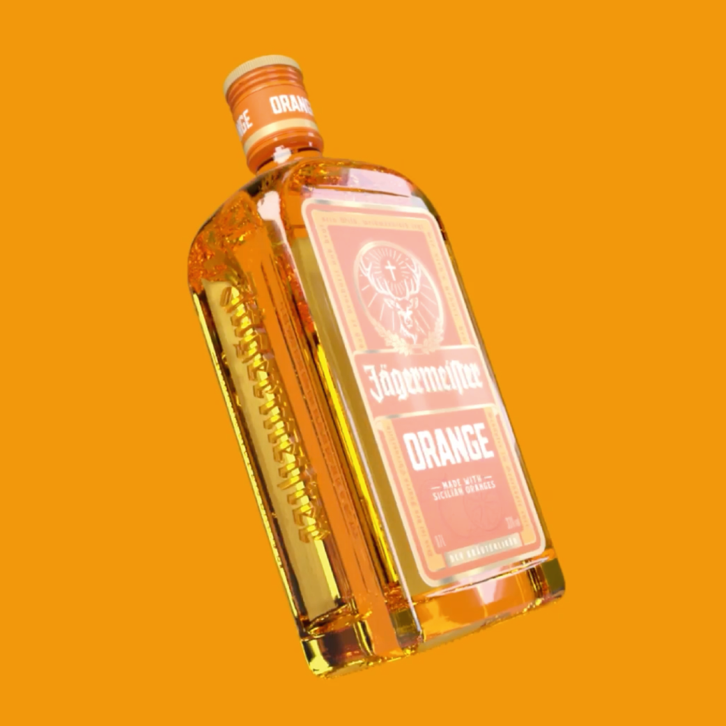
We have already had the opportunity to support numerous brand relaunches, line extensions, and innovation projects for leading beverage manufacturers – from beer and mineral water to spirits. Following the so-called “mix wave” – the boom of mixed drinks such as beer mixes or ready-to-drink cocktails – and a period of market saturation, the entry of many young brands is bringing fresh momentum to the beer market. In the mineral water and soft drinks segment, the ongoing functional trend – the development of functional beverages with added value, such as vitamins, electrolytes, or plant-based ingredients – is shaping the design and positioning of new products. The spirits market, too, is being steadily revitalized: craft influences – artisan-inspired brand strategies focusing on authenticity, quality, and distinctive design – are introducing new visual accents and appealing to a design-savvy target audience. These trends are directly reflected in beverage packaging design – through innovative shapes, eye-catching labels, and a strong brand identity.
This understanding of brand development and design quality is also valued and affirmed by our clients.
Successfully Packaged Beverages: Why Bottle Design Matters
Beverage packaging design must meet a wide range of specific requirements. In addition to functional aspects, the bottle design takes center stage, aiming to clearly and convincingly communicate the brand values and product concept. High recognizability, alignment with category-specific visual habits, and the targeted integration of current design trends are crucial to remaining visible in the highly competitive beverage market. At the same time, careful modernization of existing packaging lines plays an important role – without jeopardizing the brand’s recognizability.
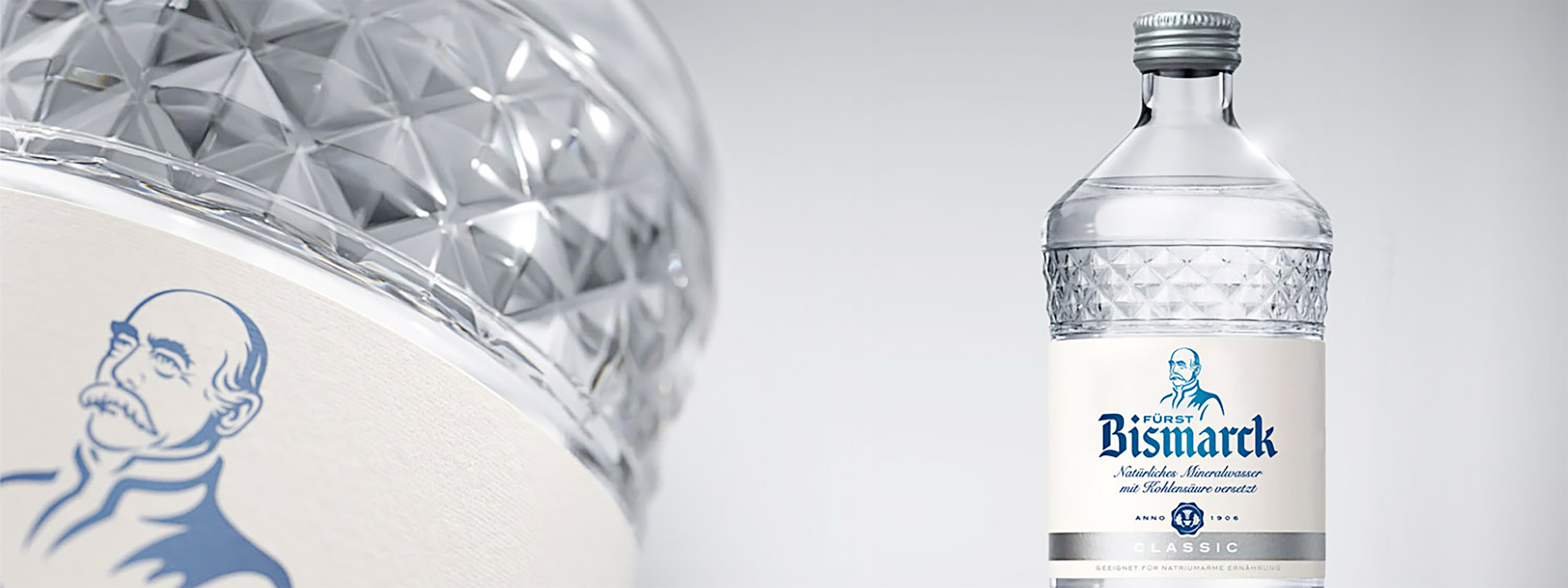
A key success factor in packaging design for beverages and food is maximizing the so-called appetite appeal – the visual allure that stimulates appetite and makes the product desirable. This effect is particularly important for closed products like beverage bottles. Unlike cosmetic products such as shower gels, where scent samples can be tested at the point of sale, consumers cannot directly verify the promise of taste of a beverage. They must rely on the label design and the visual impression of the bottle. The more convincingly, premium, and emotionally the design communicates, the greater the likelihood of positively influencing the purchase decision at the shelf. A strong example of successful and effective 3D bottle design is our bottle for Fürst Bismarck: the custom-designed bottle we created – a unique glass bottle design featuring a faceted cut-glass look.
New Custom Glass Bottle from JUSTBLUE: Premium retail presence, comparable to that of the hospitality industry, laid the foundation for a justified price increase.
Block Formation in Bottle Design: Stronger Together at the POS
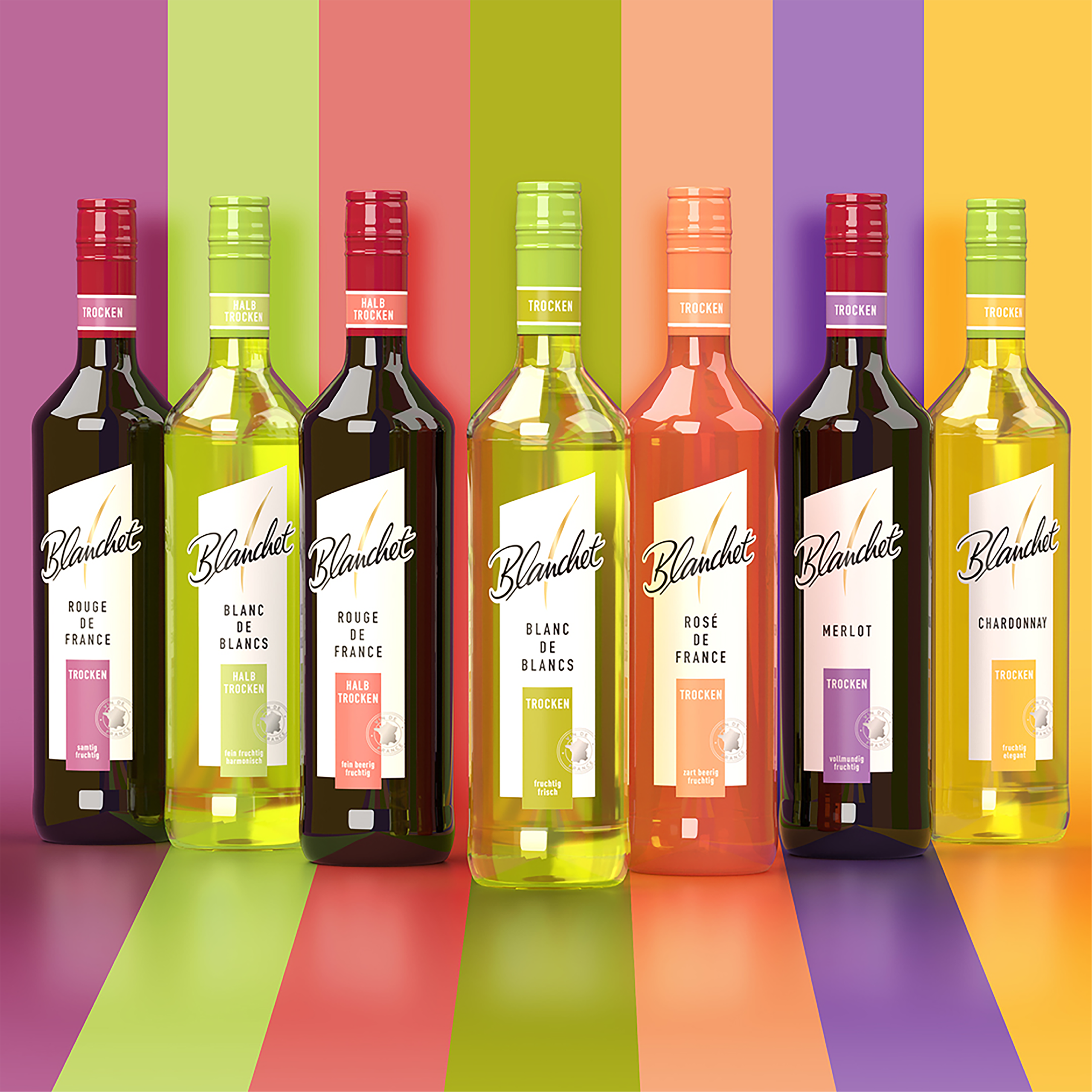
Today, the majority of beverages are sold directly at the point of sale (POS) – in beverage specialty stores and large supermarkets. To stand out from the crowd, the so-called block formation plays a crucial role in beverage packaging design. Block formation refers to the visual unification of all product varieties within a brand through a consistent and cohesive bottle design that functions like a “uniform.” This design consistency strengthens brand perception on the shelf, ensures recognizability, and increases resilience against competitors. In addition, modern beverage packaging design must be flexible enough to accommodate a wide range of packaging formats: from six-pack sleeves and reusable packaging such as bottle bridges, Logipack, or truck loaders, to the increasingly popular smaller package sizes. Classic beverage crates are also adapting to the trend, increasingly appearing as six-, nine-, or eleven-bottle carriers – ideal for single households, on-the-go consumption, or limited editions.
Consistent range design for Blanchet from JUSTBLUE
Label Design and Choice Of Material: First Impressions Count
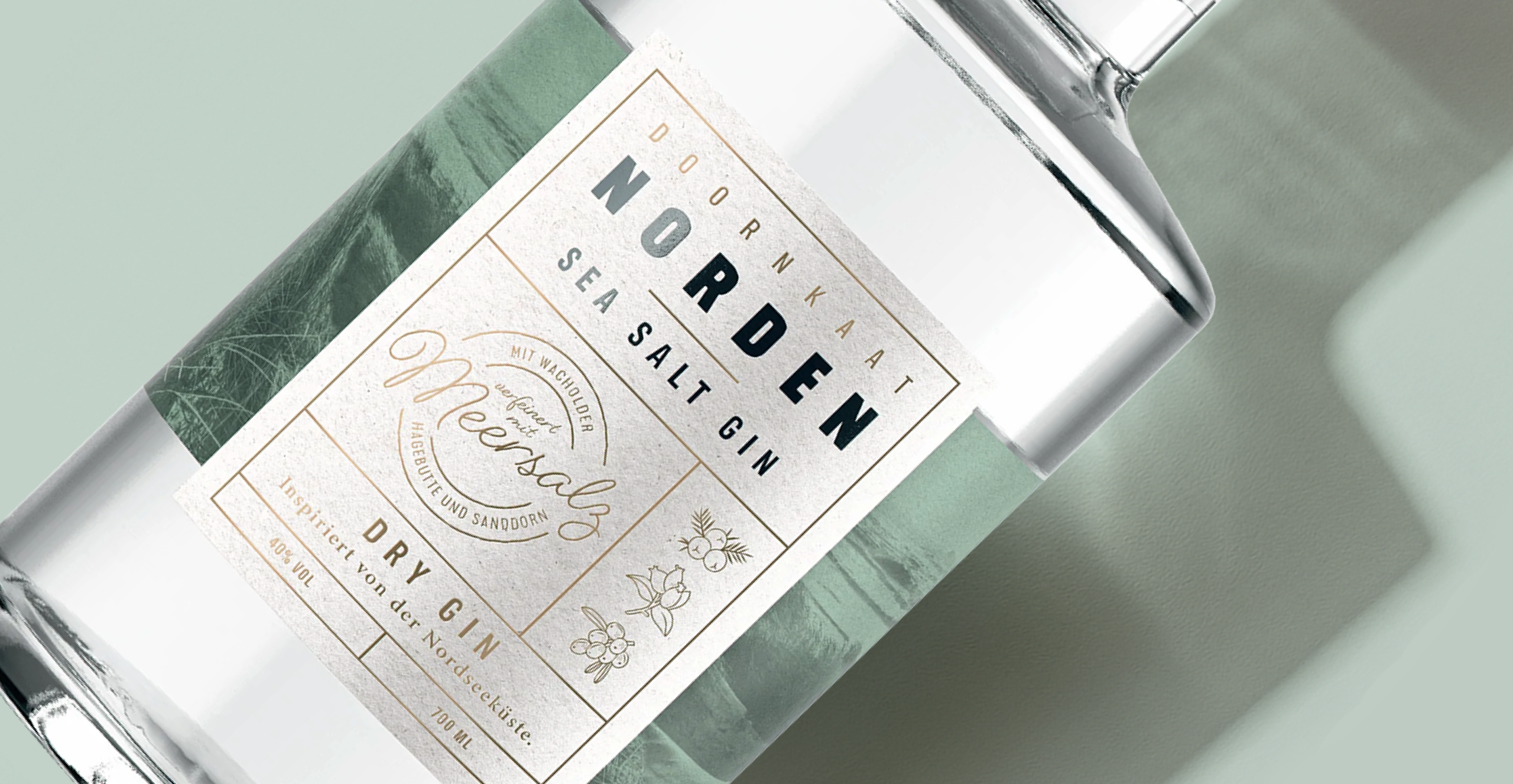
The label is a product’s calling card – it not only “names the child,” so to speak, but also gives it a face and conveys all relevant product information. In label design, the focus is always on the connection to the actual product. An attention-grabbing design – which may well be minimalistic – ensures high recognizability and sparks customer interest. The choice of material is also of importance in label design. Factors such as paper choice and texture play a significant role here. JUSTBLUE stands for the perfect interplay between aesthetic product design – in this case, the bottle design – and purchase-incentivizing label design: two factors that, together, create a product that stands as a steadfast presence in its market segment.
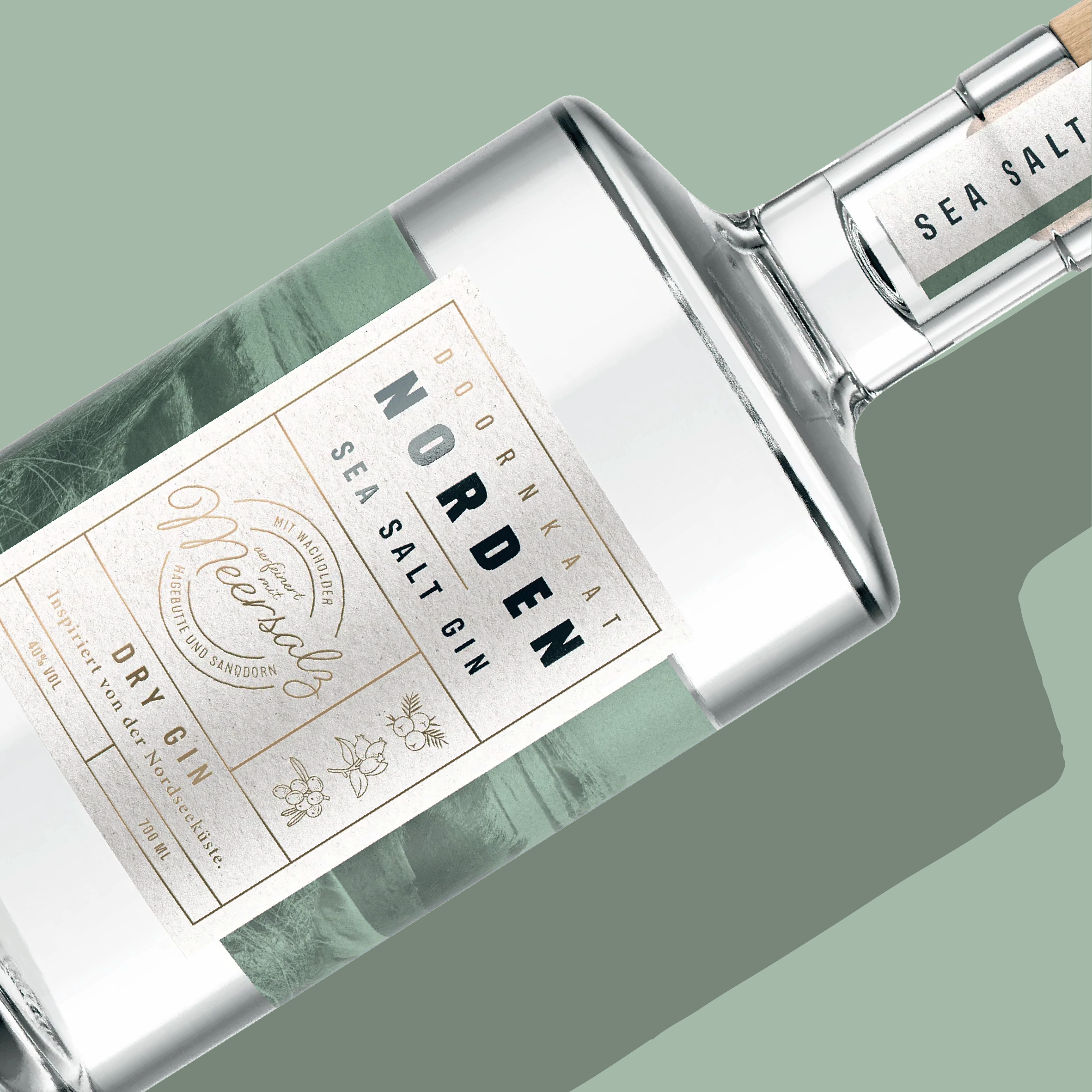
Choice of materials and authentic details support the premium positioning of Norden Dry Gin.
Beer Bottle Design: The Barrel Shape as Inspiration
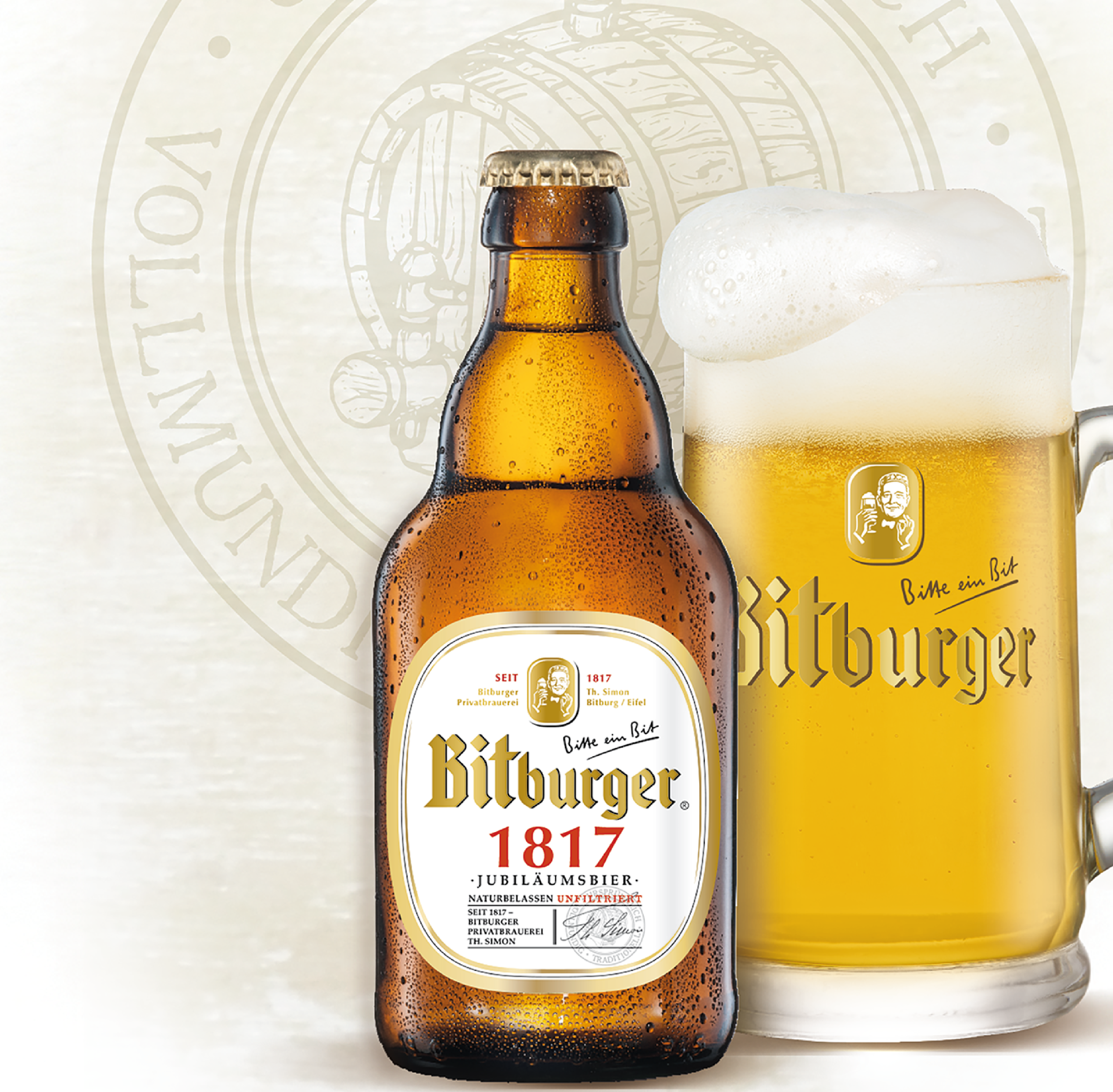
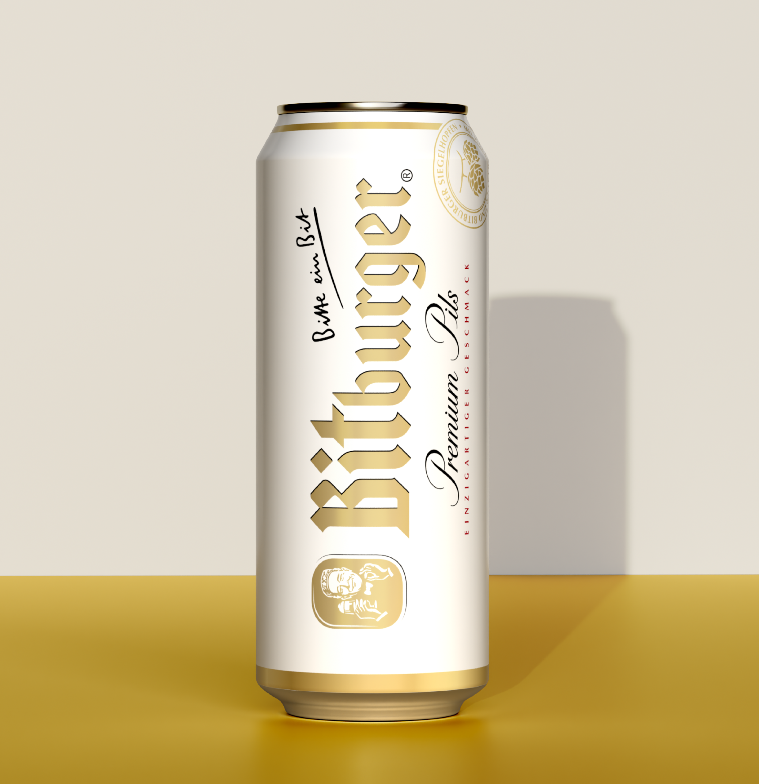
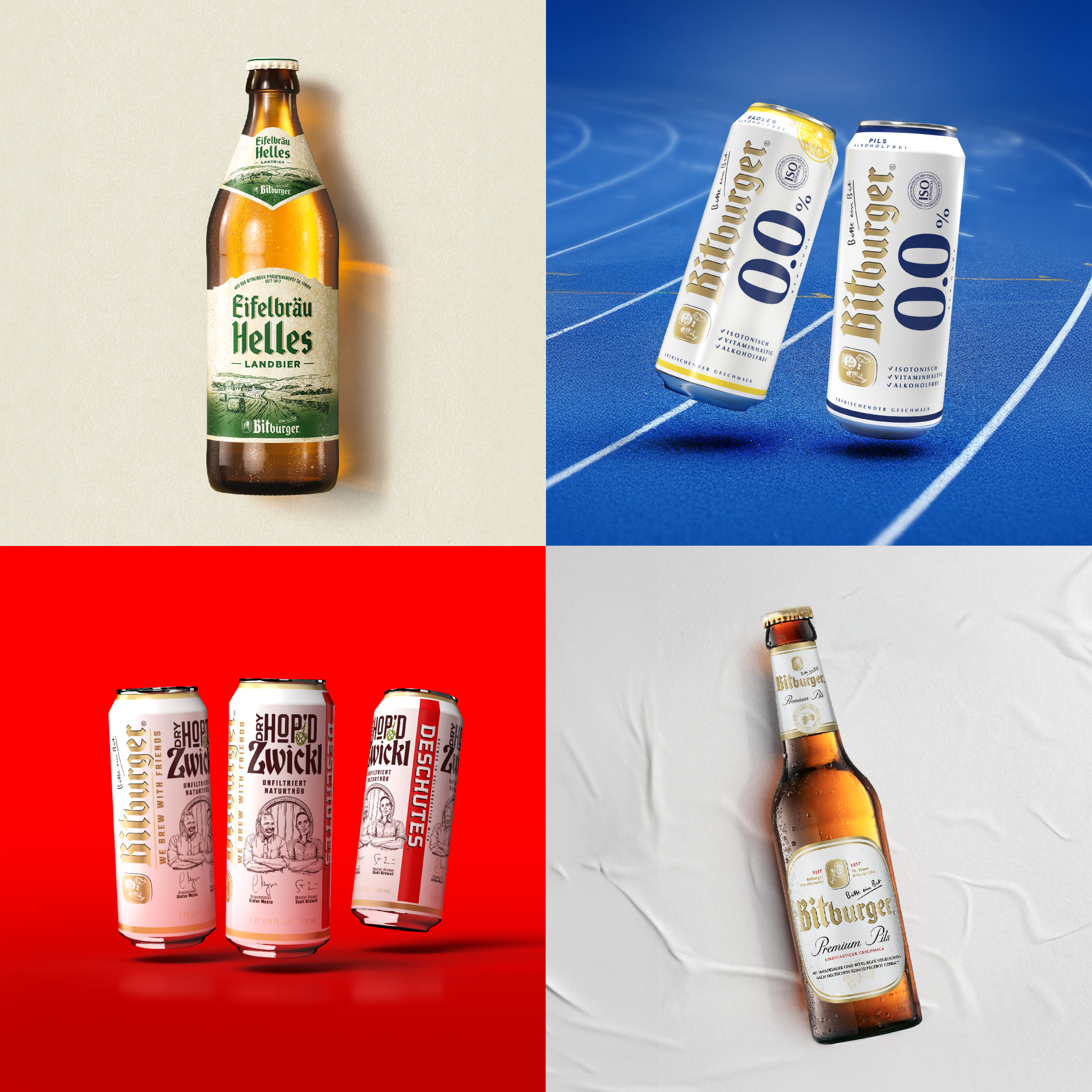
Bitburger is the most consumed draft beer in Germany. This fact inspired us, during the brand relaunch, to use the barrel shape as the fundamental design form. We applied the barrel shape consistently across the entire product portfolio, creating a brand-defining effect without overwhelming loyal customers.
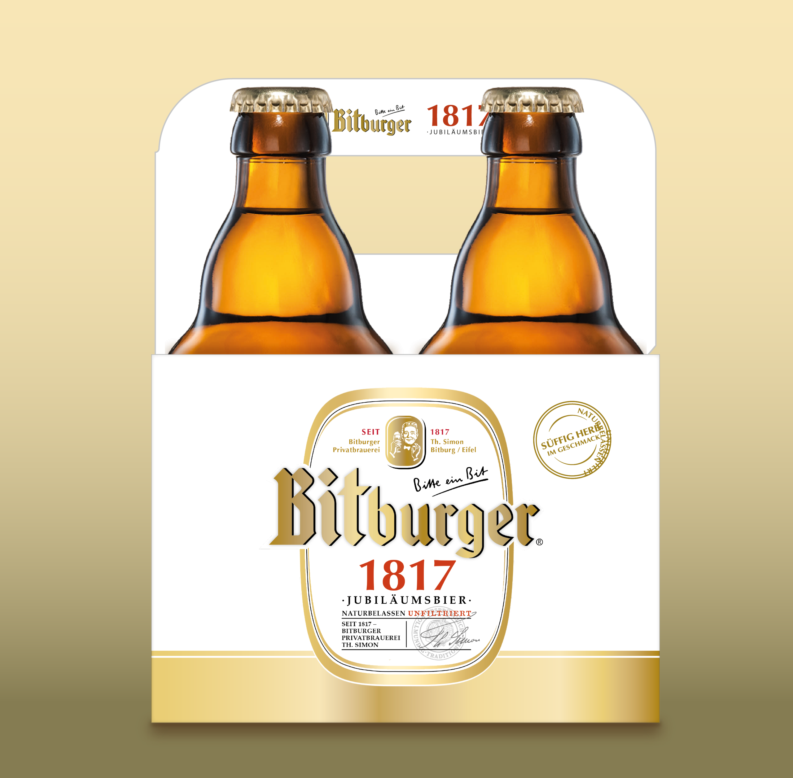
Our “4-Bottle Master” supports the Bitburger 1817 concept with strong authenticity: clearly differentiated from the classic six-pack and exuding a premium feel, the reduced bottle count alone underscores the special positioning of the edition – while at the same time consistently continuing the “barrel shape” design concept.
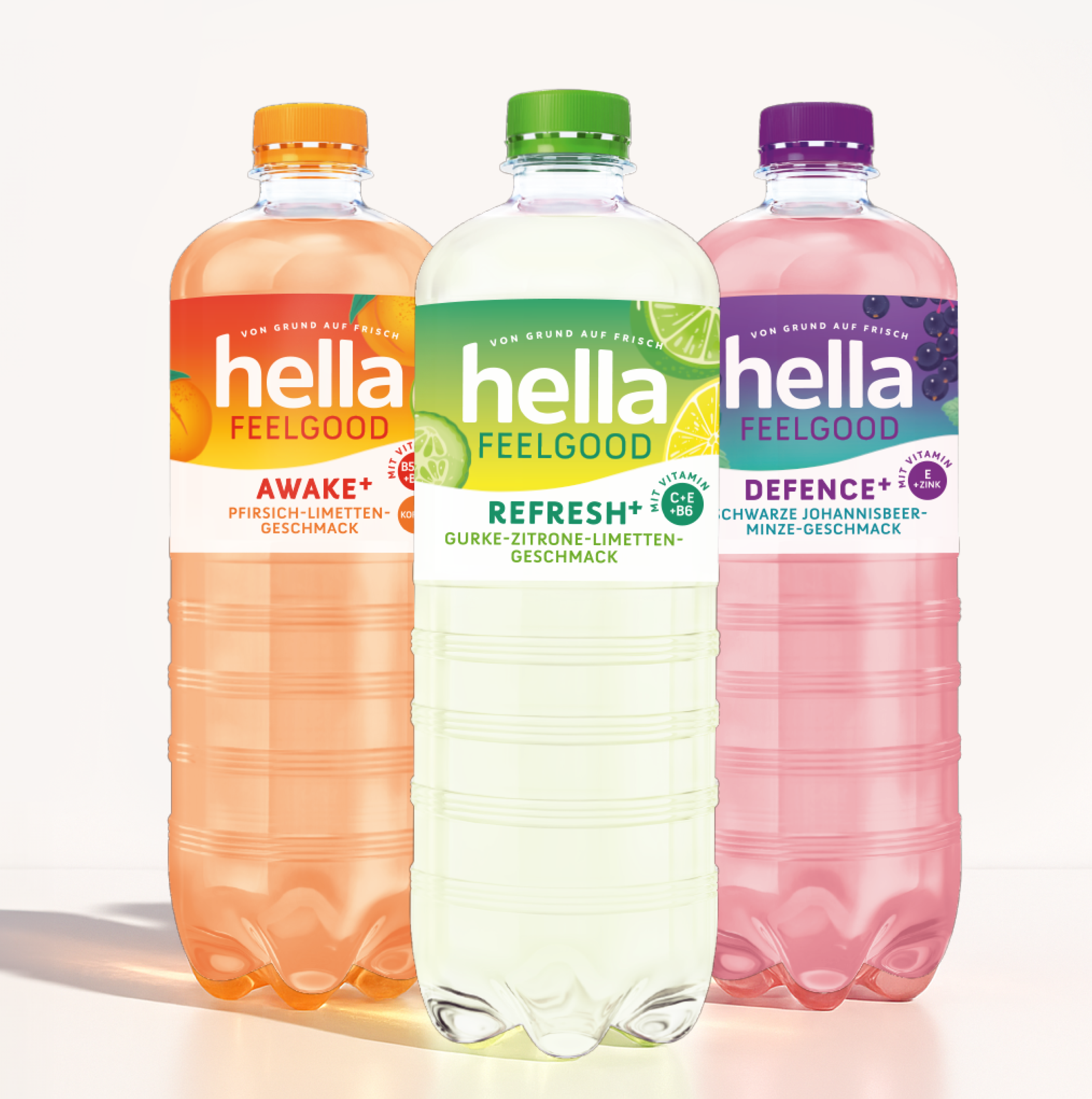
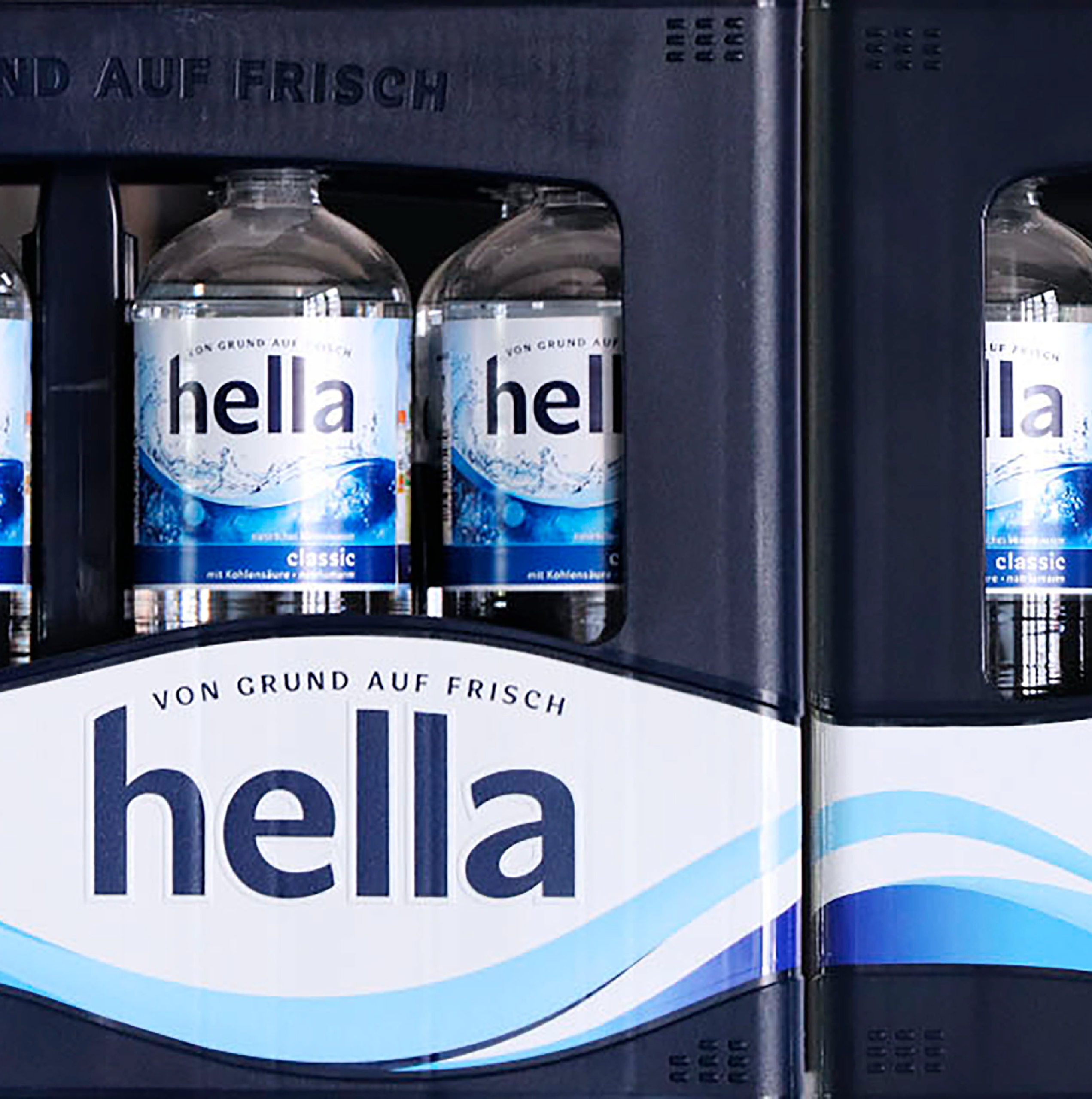
Bottle Design for Hella – Fresh from the Ground Up!
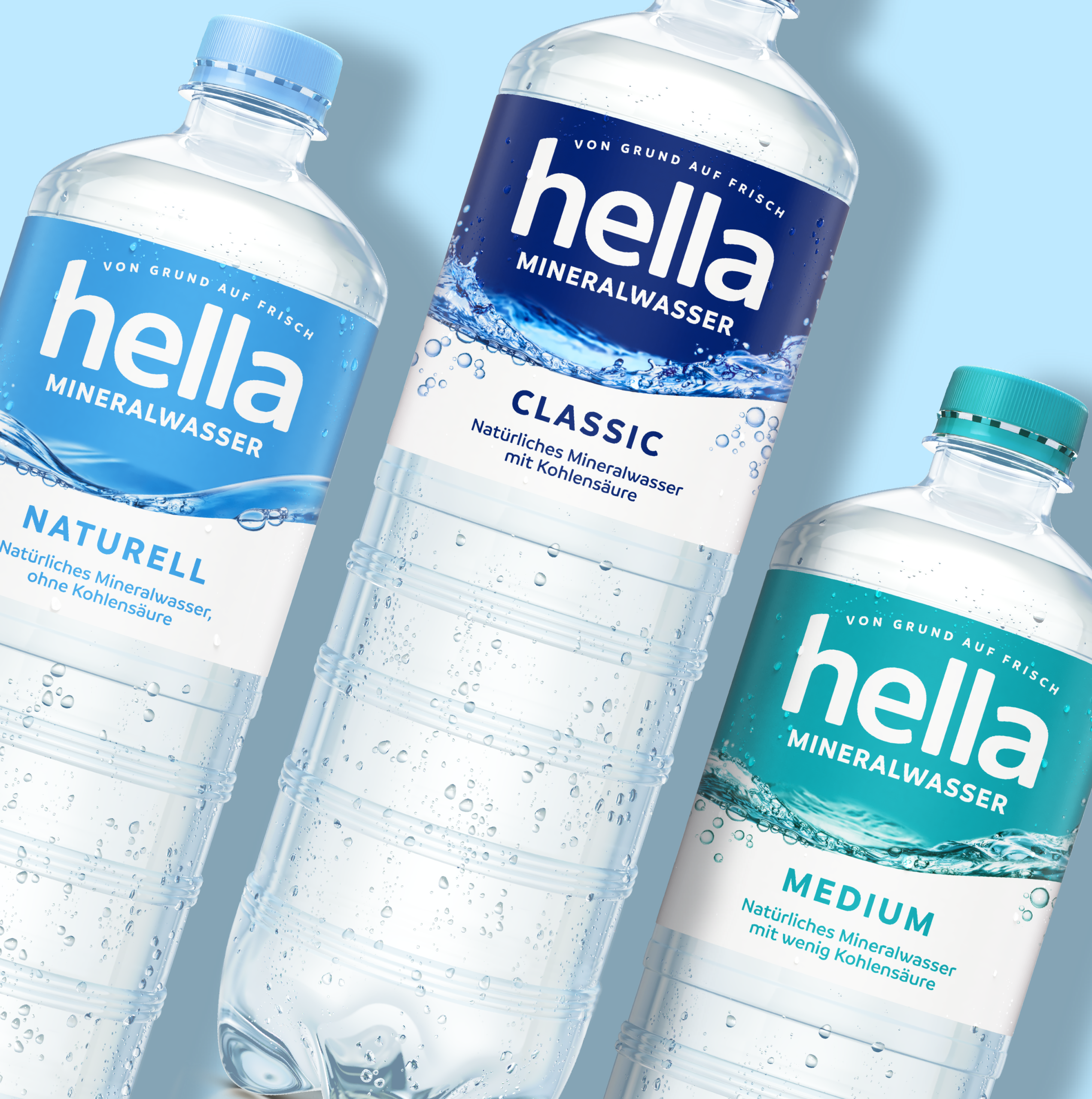
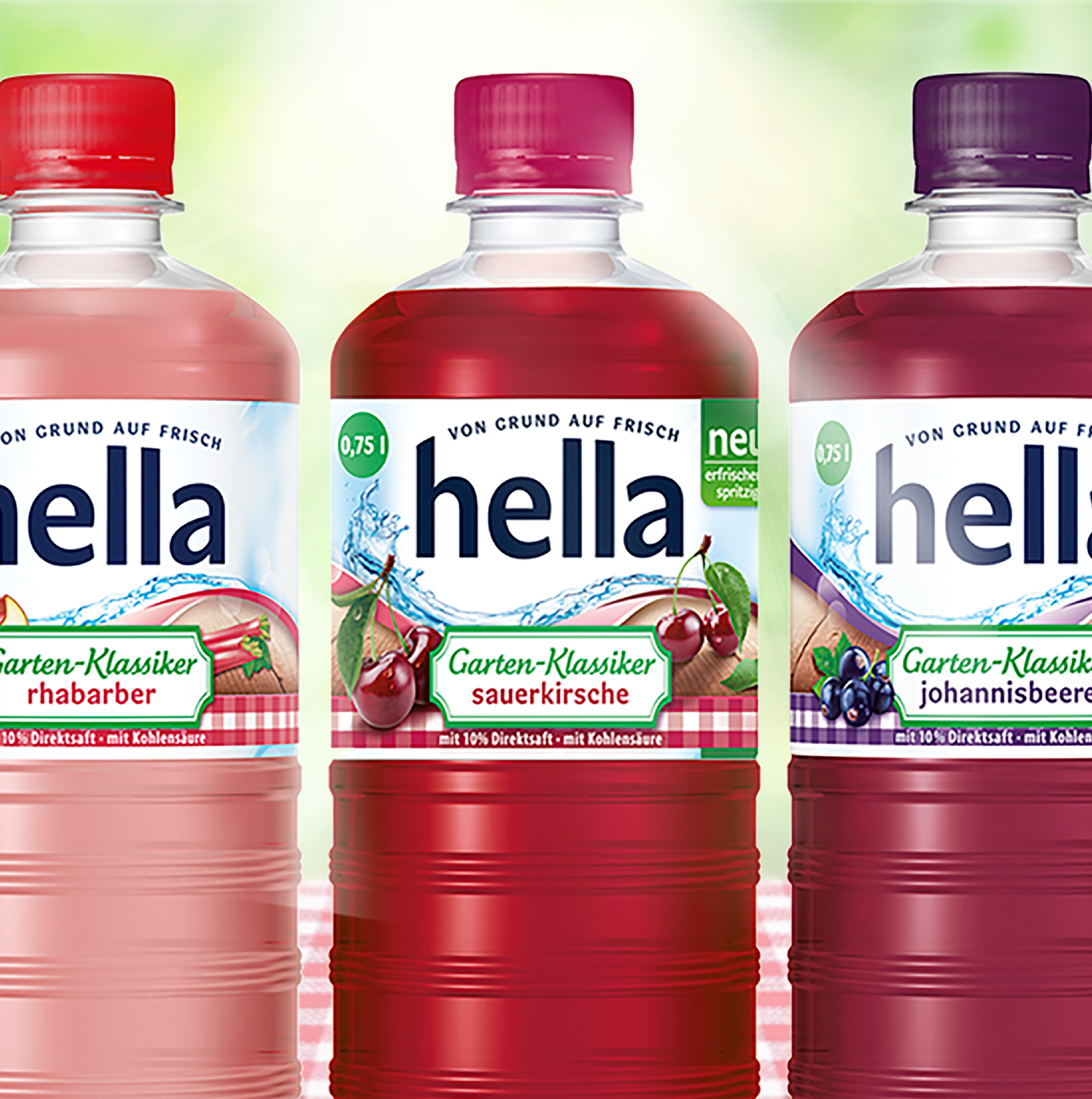
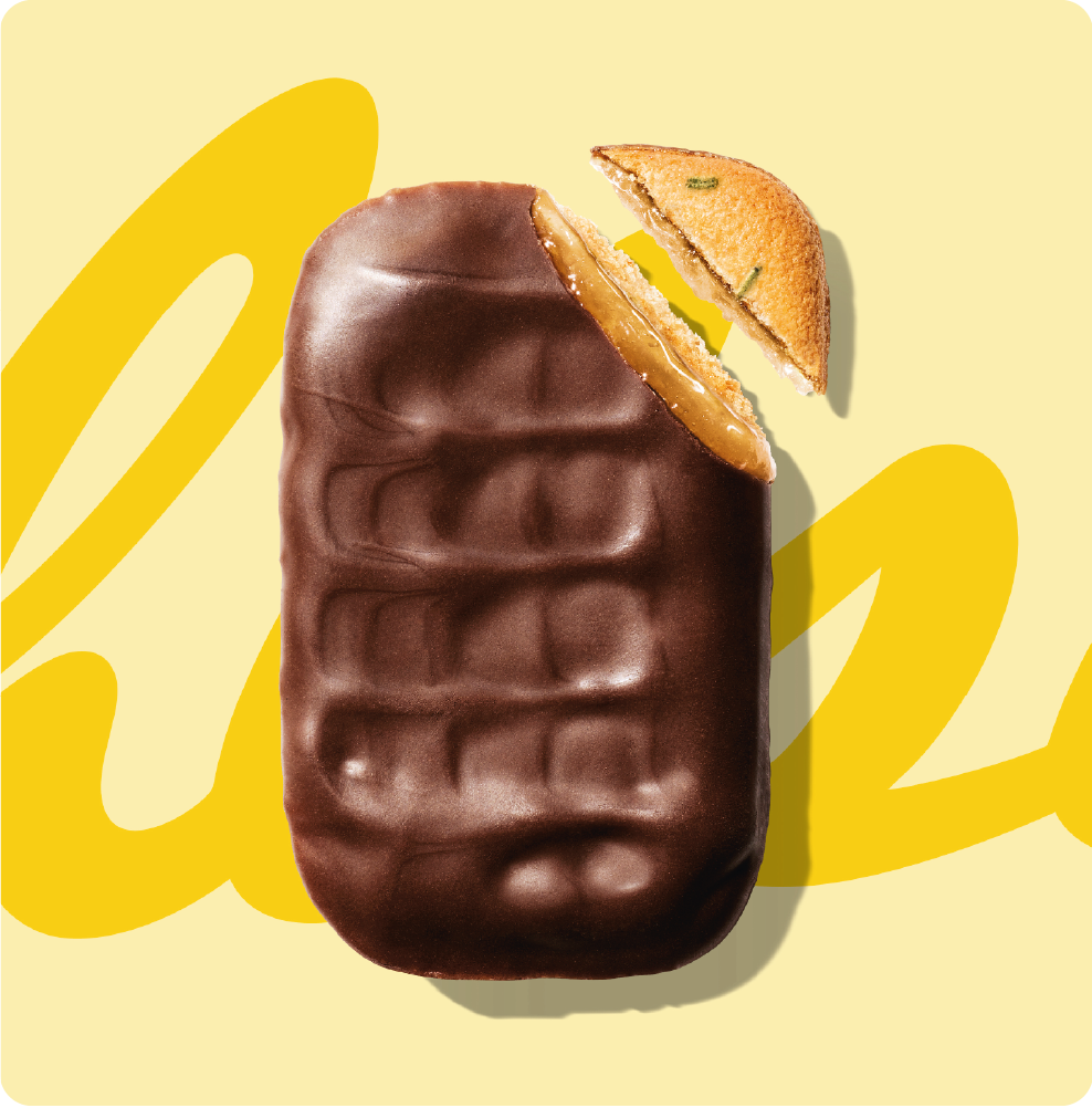
Hella is an established mineral water brand that we have been supporting in the field of beverage packaging design for many years. Under its broad brand umbrella, Hella brings together not only classic mineral water but also product categories such as near water (flavored water), lemonades, fruit juices, spritzers, energy drinks, and limited editions. Despite this diversity, the visual identity remains consistent – with each category given enough space to develop its own individuality in bottle design. We place particular emphasis on design attributes such as freshness and appetite appeal – the visual attractiveness that creates a desire for the product. Especially in the mineral water and fruit juice segments, this emotional approach is essential for attracting attention at the point of sale and positively influencing the purchase decision.
The long-standing partnership with hella is characterized by mutual trust, creativity, and a shared joy in continuous development.
Hella has a strong design concept that can be clearly and appropriately interpreted across a wide range of subcategories – without ever losing its origin.
Innovative Packaging Ideas in a Traditionally Conservative Segment
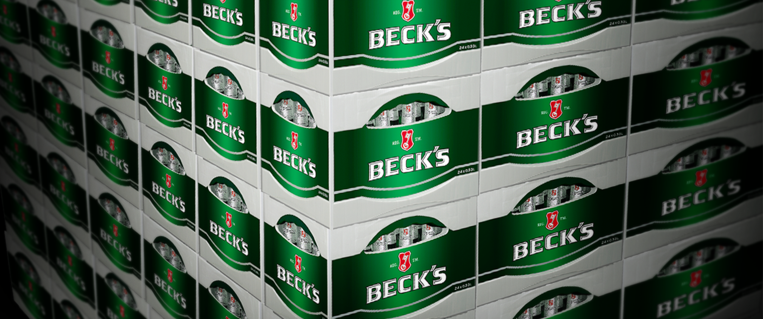
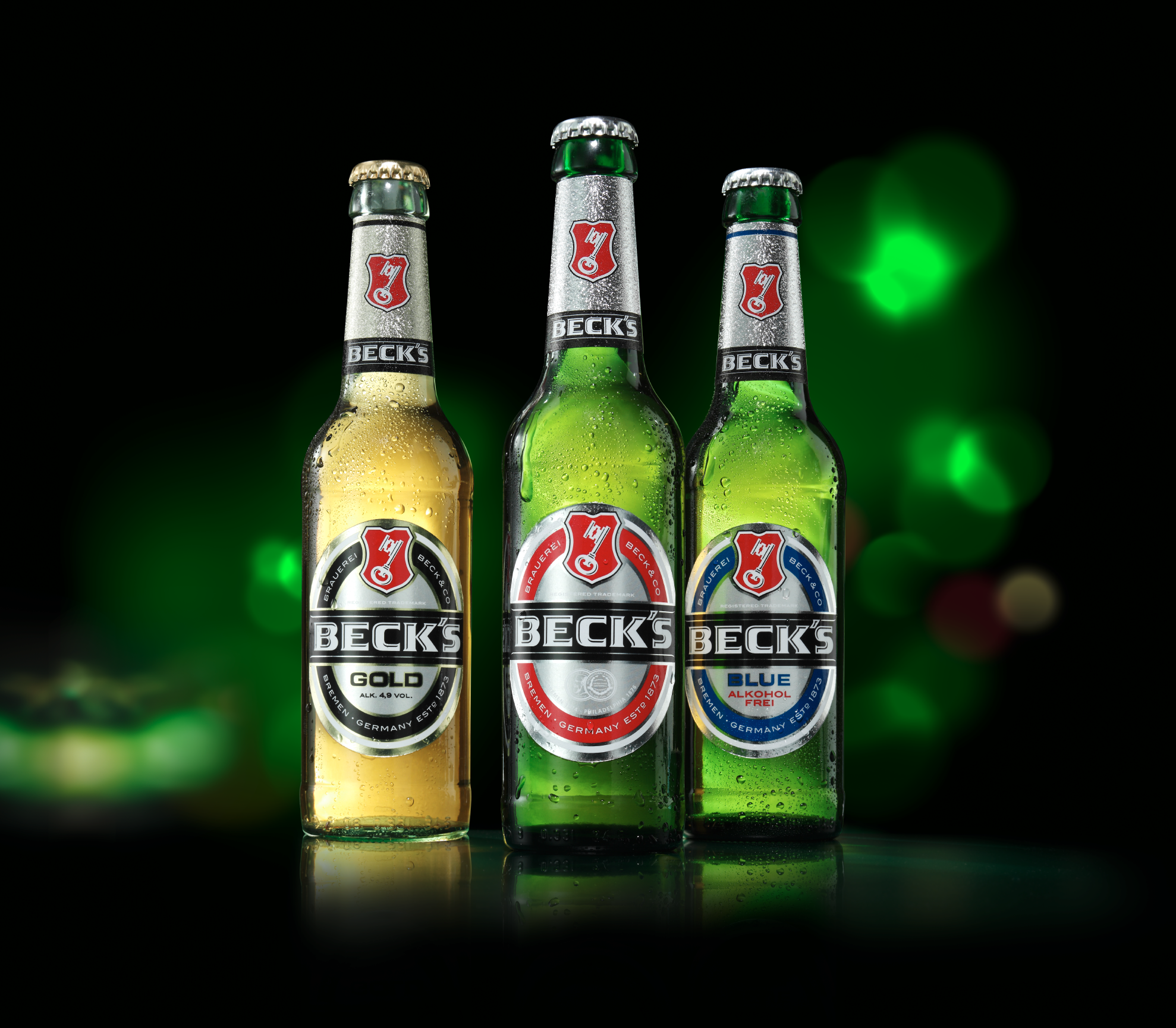
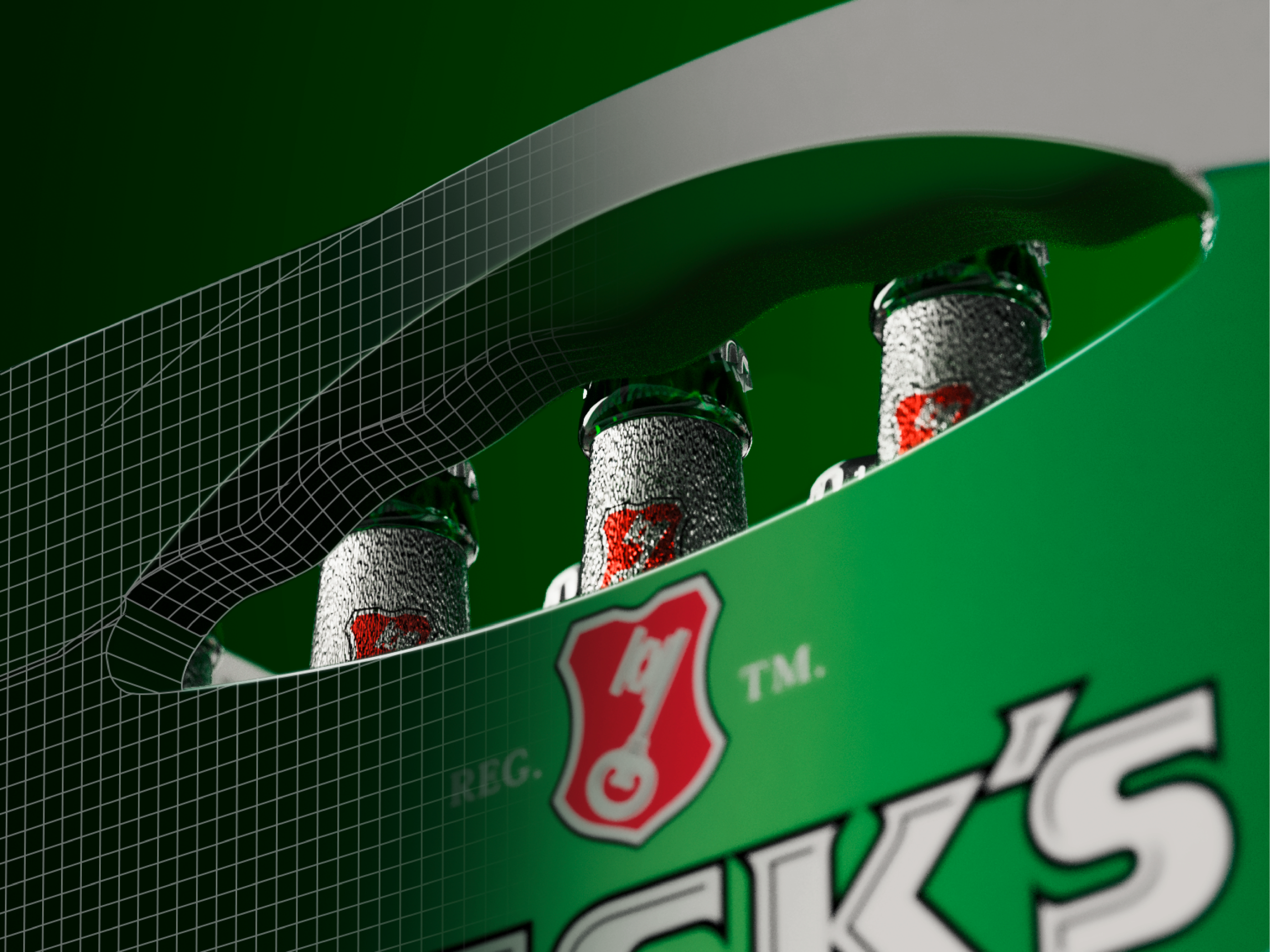
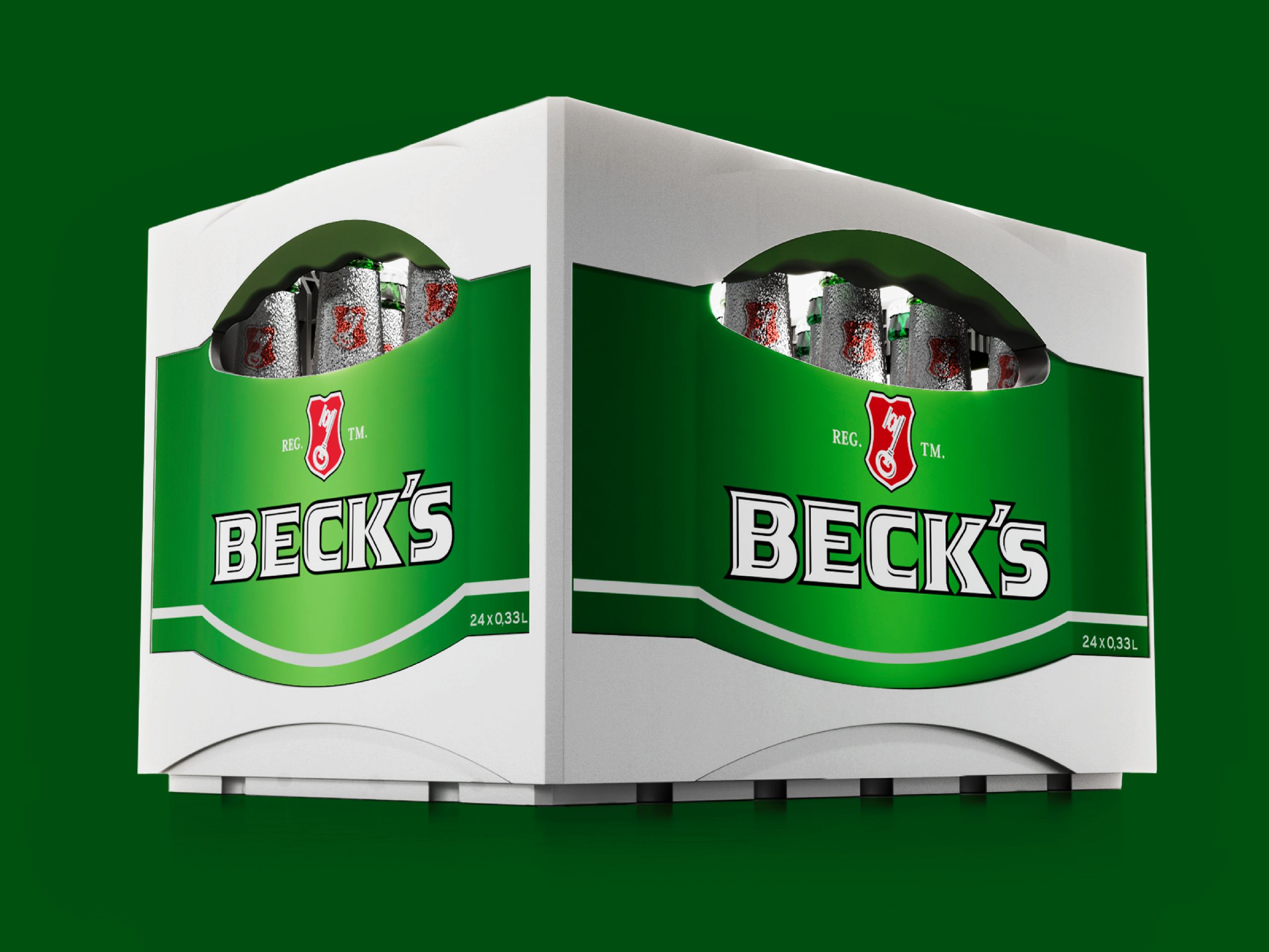
Since 1998, we have been working for the global brand Beck’s. After designing the still-current and iconic beer crate and introducing Germany’s first mild beer (Beck’s Gold), we have carried out numerous other bottle design projects for the brand. In addition to frequently changing seasonal classics and limited editions, we also focus on developing innovative products in the field of beverage packaging design. The Beck’s Cool Pack is one result of these efforts. We have also been commissioned by many other beer brands, such as Hasseröder and Bitburger, to handle numerous relaunches and line extensions. With this wealth of experience, JUSTBLUE is among the leading packaging design agencies in the “beer” and “beverages” segment.
With the innovative beer crate for Beck’s, a client relationship began for JUSTBLUE in 1998 that continues to this day: we created nothing less than a new benchmark in this field – and have since designed more than 30 beverage crates.
Bottle Design for High-Proof Spirits
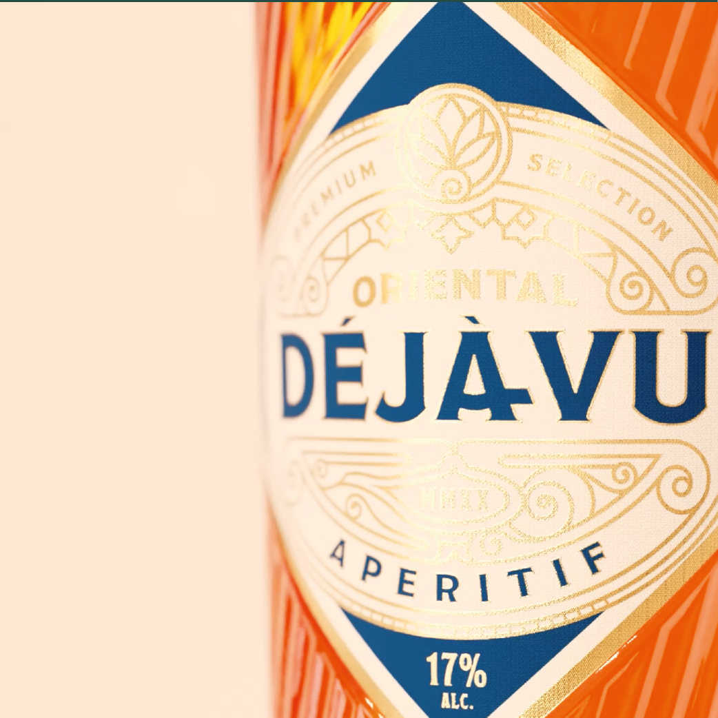
In the field of spirits packaging, we design both the custom 3D bottle shape and the premium bottle finish comprising label design, choice of materials, and refinement techniques. Since spirits typically achieve a higher selling price than, for example, beer or mineral water, the budget allows for the use of especially high-quality materials, elaborate printing processes, and exclusive surface finishes. This opens up extensive creative possibilities in bottle design for spirits – from distinctive, character-rich shapes to luxurious brand staging that makes an impact both on the shelf and at the bar.
Last, but not least: Bar and Restaurant Equipment
Our beverage and bottle design portfolio is rounded off by the design of hospitality equipment. Our work here ranges from smaller items such as beer mats or drip covers to trays, parasols, and exterior lighting and extends all the way to a serving trailer or the branding of a truck.
Food Packaging Design: Successful Brand Staging for Groceries
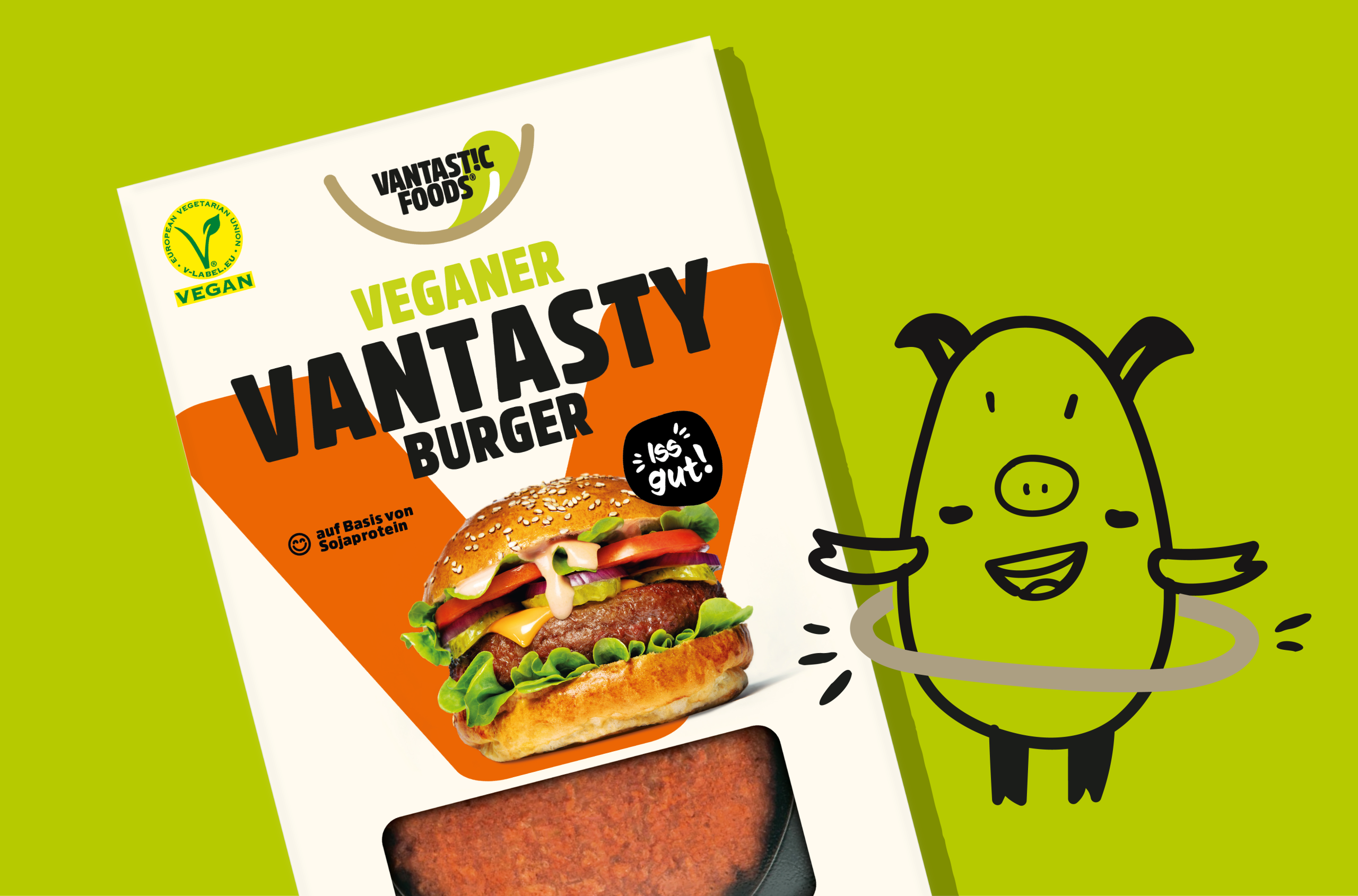
After decades in which visual habits in food packaging design seemed almost set in stone, the sustainability mega-trend has, in recent years, made its mark both conceptually and visually through elements of naturalness and a handmade look. This movement has become so strong and clear that the topic of brand uniqueness is now, in parallel, once again gaining greater consideration.
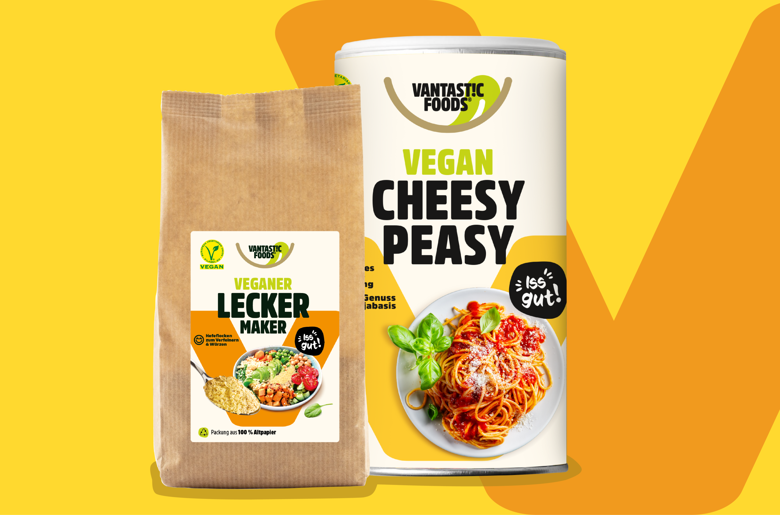
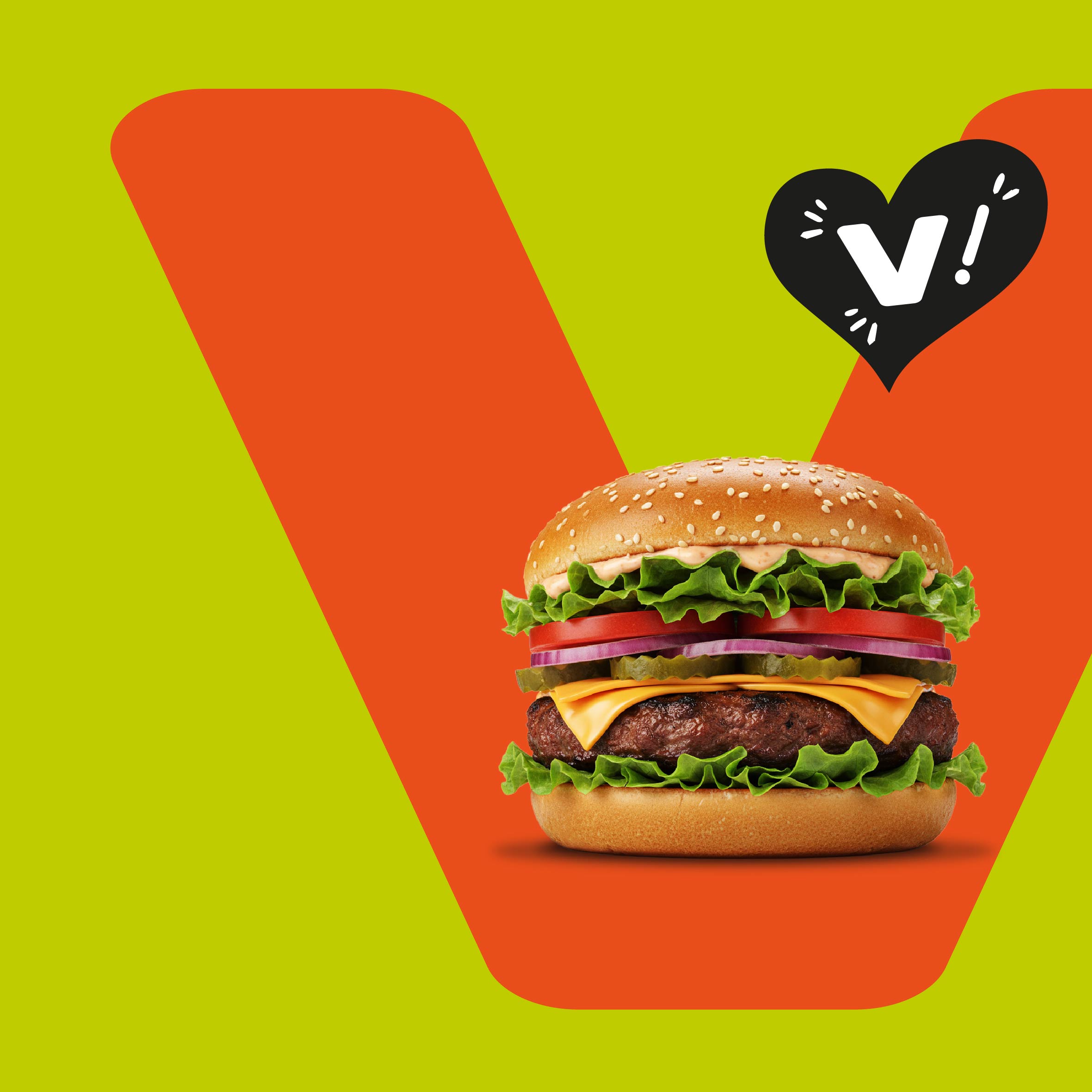
Our design for VANTASTIC FOODS is a good example of this: plenty of ownable uniqueness, modernity, and, at the same time, respect for category-specific visual habits.
Appetite Appeal: The Most Important Factor in Food Packaging Design
In no other field do category-specific visual habits play such a strong role in overall design as in food packaging. The roots of this development lie in the growing realization, over many years, that the so-called appetite appeal has an especially strong influence on purchasing decisions. Products from different competitors rarely offer a product advantage that is relevant and tangible for the consumer.
The competition among various brands – and increasingly also among private labels – therefore often focuses on depicting the most enticing and seductive dishes or foods in packaging design. For designers, stylists, photographers, image editors, and lithographers, this presents the special task of making food packaging design as attractive as possible for the consumer.
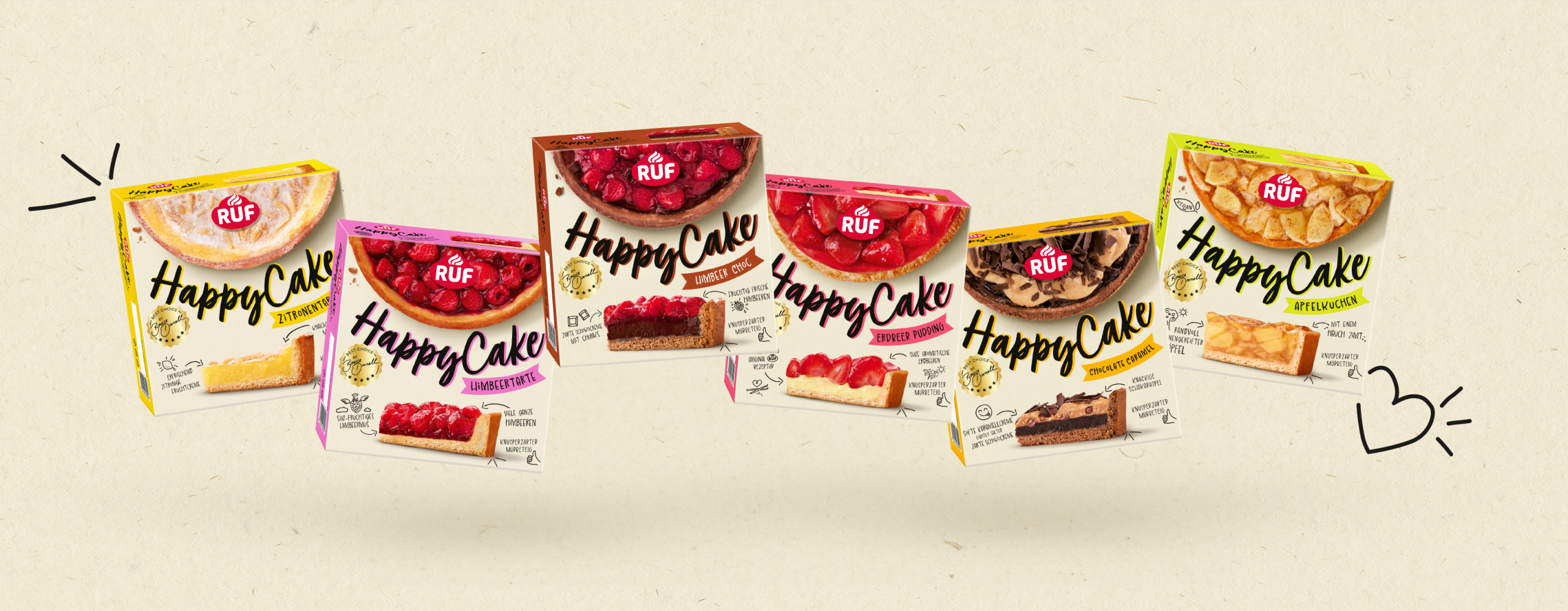
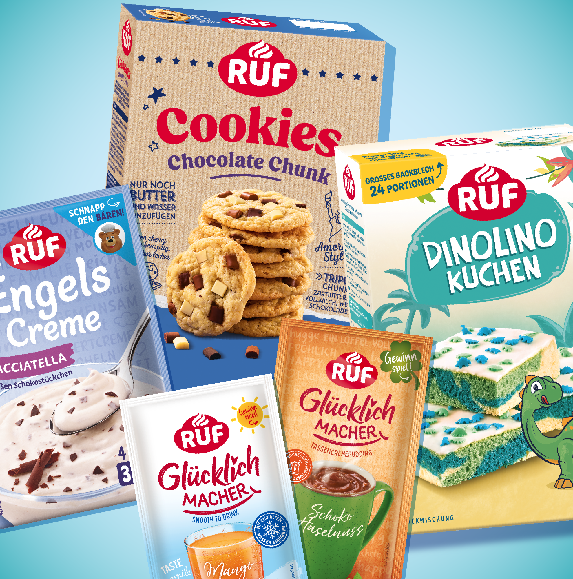
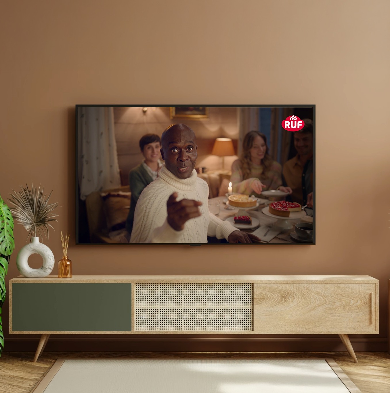
Our packaging for RUF Happy Cakes delivers perfect temptation through maximum appetite appeal.
Brand Staging in Food Packaging Design
In addition to perfect product imagery with high appetite appeal in food packaging design, brand staging is crucial. The more comparable the pure product offering, the more important the part of food packaging design that focuses on the brand becomes. The most effective impact comes from a clear yet unique – in other words, unmistakable – brand logo. Furthermore, a distraction-free and high-impact execution in food packaging design is essential for a logo’s radiance. Otherwise, it will be perceived as too insignificant in context and will fail to communicate the associated brand values. The intended link from traditional advertising to the point of sale (POS) would fail. Traditional advertising is the appropriate marketing tool for charging a brand with associations and values. Food packaging design should then carry these values forward rather than contradict them. Due to reduced budgets for traditional communication, many brands have lost strength in recent years and no longer function as the (sole) decision-making criterion.
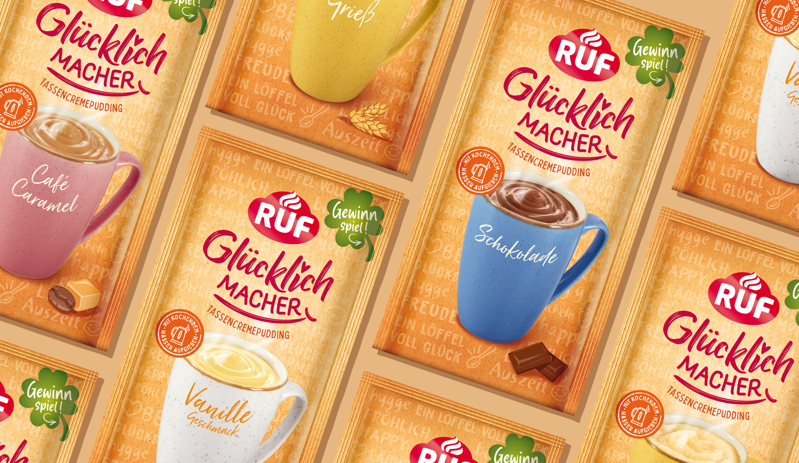
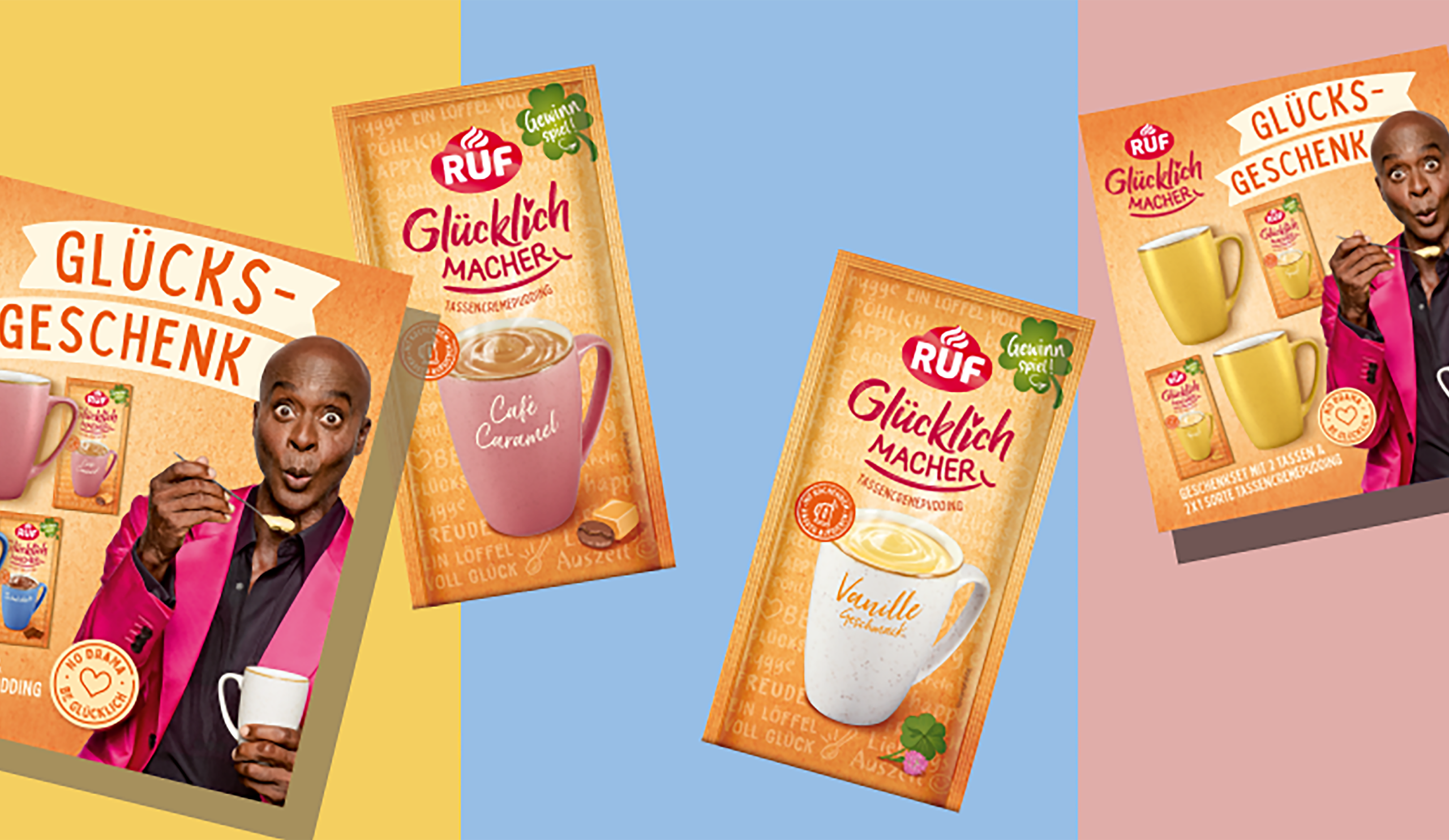
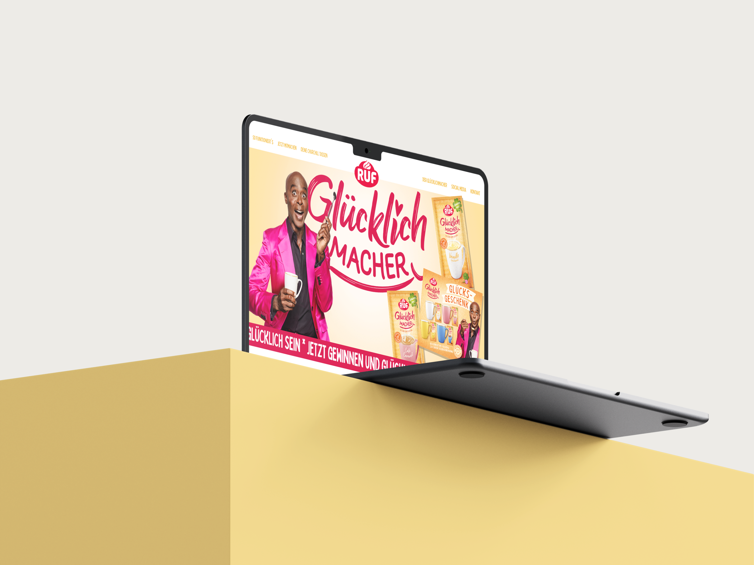
The new RUF brand design by JUSTBLUE provides the perfect foundation for all of RUF’s social media activities.
Strong Design Ideas Create Differentiation on the Shelf
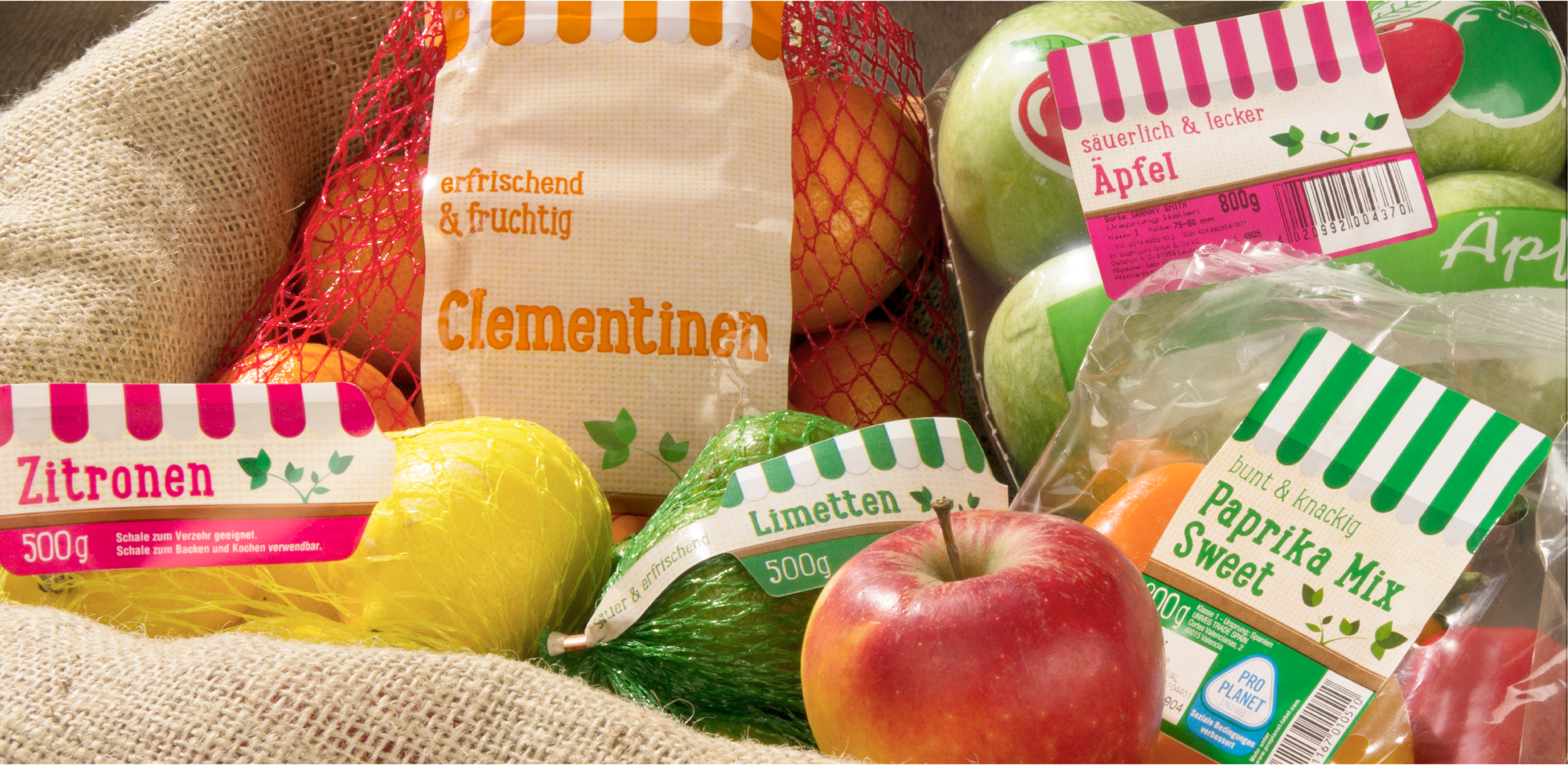
Successful brands have recognized that a strong, distinctive, and modern design concept provides additional differentiation at the POS. Such a concept stands out by setting a brand apart from its competitors – beyond the logo – even when product imagery is similar. It strengthens block formation, and product variety differentiation can be made clearer without jeopardizing the cohesive brand image. The food packaging design of Penny’s fruit and vegetable products can be cited here as a successful example.
Influences from the UK in Food Packaging
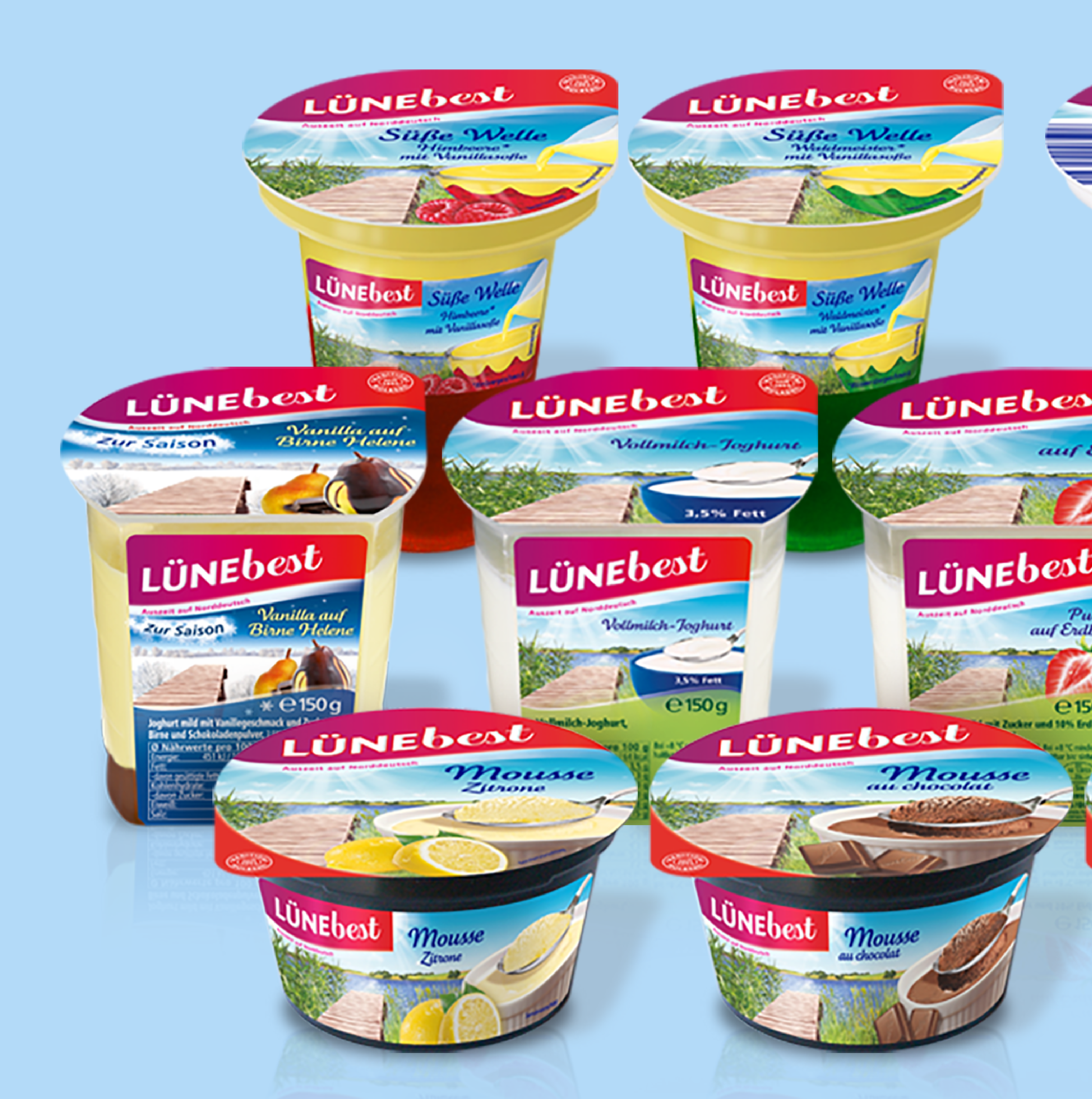
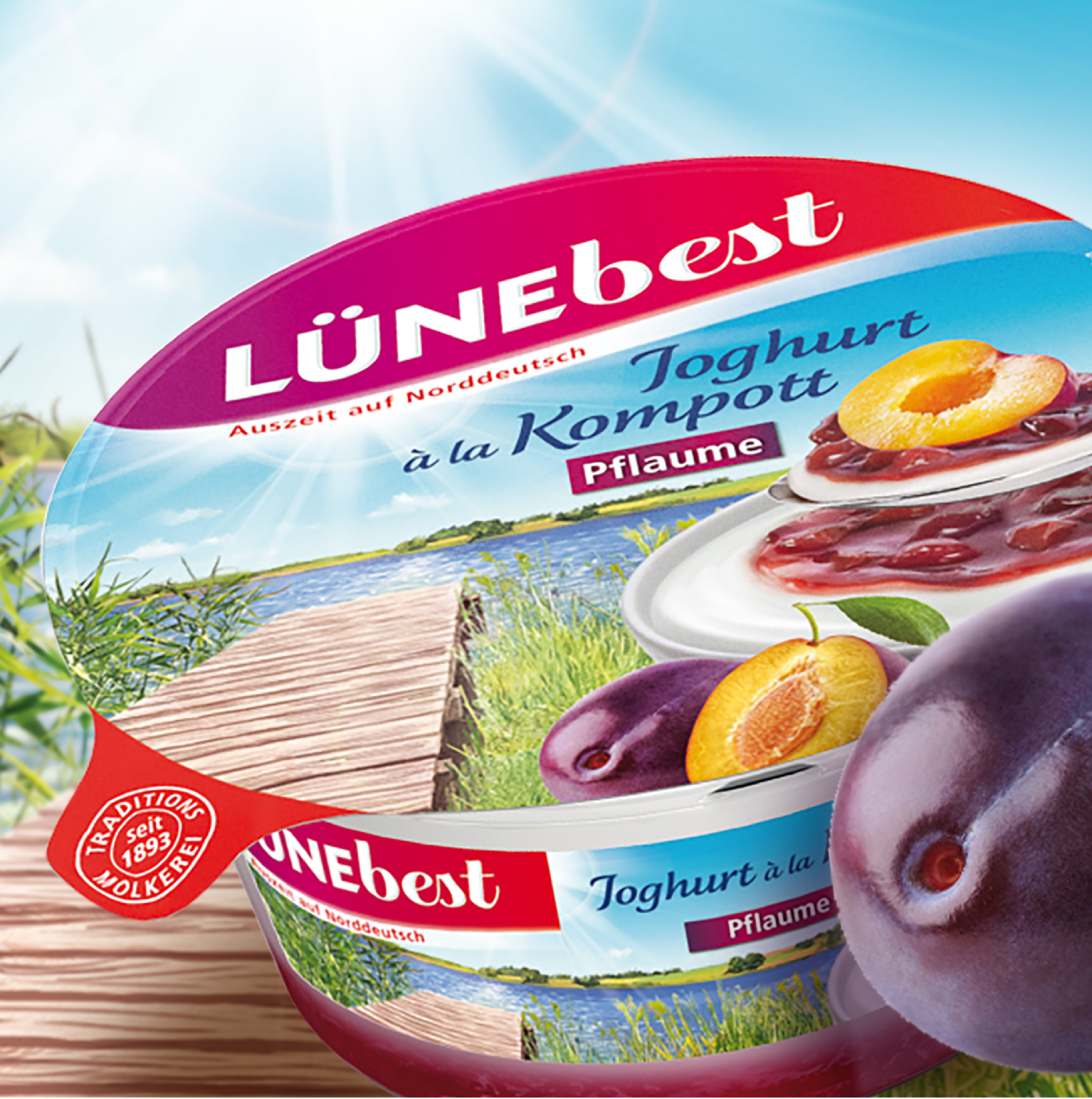
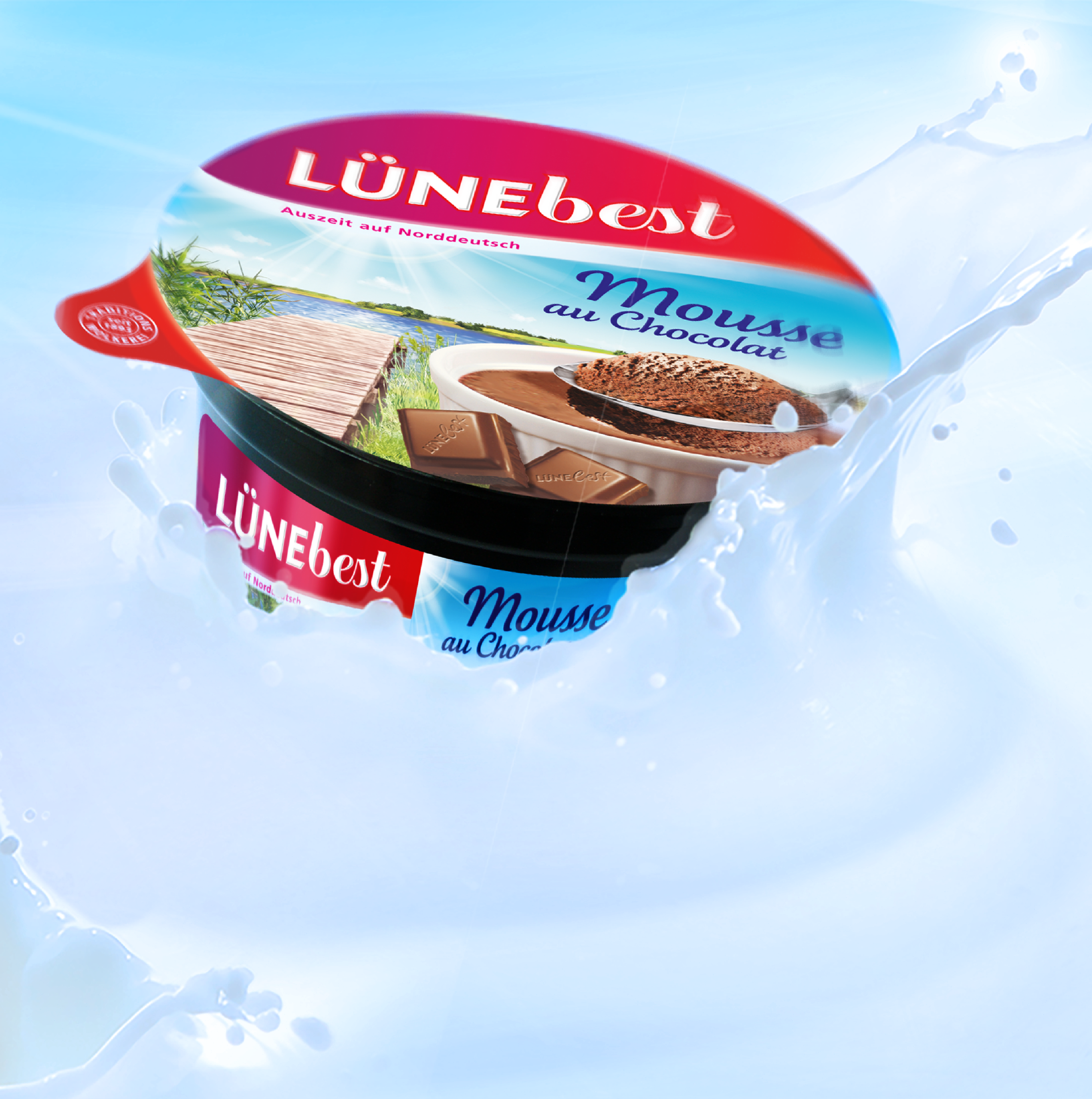
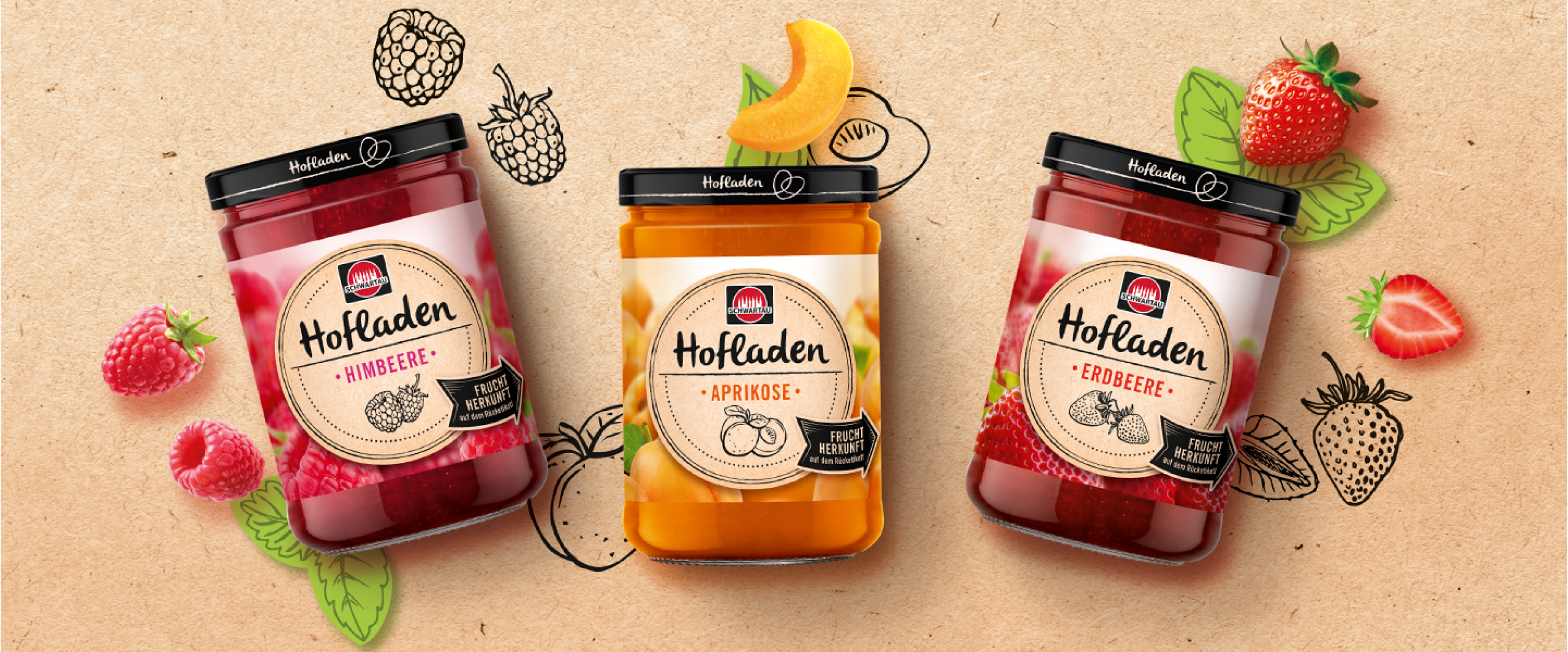
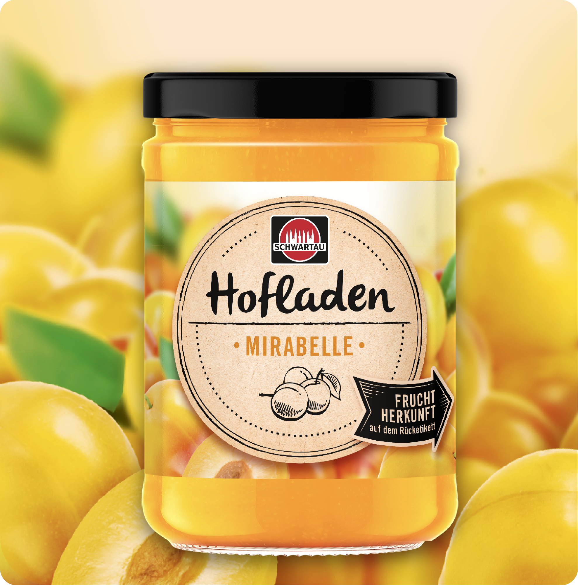
For years, design trends from the UK have been bringing movement to the visual landscape of German store shelves. Interestingly, private labels in the UK have developed a particularly strong design culture, even in the field of food packaging design. The style is characterized by strong contrasts – often in black and white – as well as a high degree of reduction, which, however, does not feel unfinished but rather very premium and modern. In some cases, British brands – and thus their food packaging design – appear in Germany as imported premium specialties. However, their influence is also noticeable in recent relaunches in the German market. It should be noted, though, that private labels have also adopted this style for their premium positioning. Particularly in the field of packaging design for jams and preserves, or in the refrigerated section (for example, with yogurt), a skillful balance of high appetite appeal and effective product variety differentiation is required. Our food packaging designs for Schwartau and Lünebest are examples of successful and effective implementations.
Conclusion: Successful Packaging Design for Food and Beverage Brands
Whether in the refrigerated section, the beverage store, or at the supermarket POS – packaging design for food and beverages today is far more than just a shell. It is a brand ambassador, a purchase incentive, and a differentiating feature all at once. In a highly competitive market, high appetite appeal, compelling product staging, and a clear product range structure determine market success. JUSTBLUE combines strategic expertise with design excellence – from iconic bottle designs for beer and water brands to modern food packaging with strong brand impact. Our many years of experience in food and beverage packaging design make us a reliable partner for anyone looking to give their products an unmistakable face.
Our References
What Makes Good Design? Quality of (Packaging) Design and How to Measure It It
Design is a powerful tool in the modern marketing mix. But what makes good design – and how can it be distinguished from bad design? Although design has long since established itself in an economic context, there is still a lack of clear standards for evaluation. As a result, design outcomes are developed, interpreted, and assessed in widely varying ways.
It is indeed possible to evaluate design systematically and objectively – especially when the goal is to increase demand and ultimately boost a product’s sales. A well-thought-out strategy ensures that all the requirements for good design are taken into account. For successful products in particular, arbitrary design changes can be risky. Conversely, good design can form the foundation for long-term brand success.
What Exactly Is Design – and What Makes Good Design?
Design is far more than decorative packaging. Yet because it is a relatively young discipline, clear standards are often lacking in both education and practice. The term “design” is therefore used in very different ways – ranging from a superficial understanding in the sense of “home design” or “nail design” to strategic process design.
What makes good design can, however, be clearly defined: it serves a function, communicates values, differentiates products from the competition, and influences the purchase decision. Design must not become an end in itself, but should contribute to a concrete objective.
Packaging Design in the Marketing Mix
In the field of fast-moving consumer goods (FMCG), packaging design plays a central role. It is often the first point of contact between the product and the consumer. And since up to 70% of purchase decisions are made at the shelf, visual design is a decisive success factor.
Within the marketing mix, packaging design takes on the role of the silent salesperson, linking product policy with communication strategy directly at the point of sale.
Good Packaging Design …
- conveys brand identity,
- builds trust,
- creates impact at the point of sale (POS),
- and, in the best case, leads to an immediate purchase decision.
What Makes Good Packaging Design: The 4 Key Requirements for a Design Brief
To achieve truly effective packaging design, it is important to take a strategic approach. This is the only way to professionally distance oneself from personal, taste-driven, and thus less constructive design evaluations, and to arrive at well-founded decisions in the design process. Everything starts with the briefing.
Only when the task is clearly defined at this stage are the foundations in place to evaluate results objectively and avoid “gut-feel” decisions. In this sense, a design project is closer to mathematics than to fine art.
A design briefing must contain the following four pieces of information:
1. What does the product stand for? What is it trying to tell me?
Central to this is the product concept: starting from a product benefit that is relevant to the user, a concept is formulated. Traditionally, this task falls within the scope of marketing. If a smaller SME does not have the necessary resources, the design agency can provide support, provided it is set up accordingly. For example, in a workshop, the positioning of the product or brand can be refined. This part of the briefing must give the design agency a clear objective for the associations the packaging design should trigger in the consumer. Later, it should be part of the presentation to explain, for each design alternative, why that particular design has the potential to evoke exactly those associations. This can be done in connection with demonstrating established visual codes for certain values.
2. Consider the company strategy:
Good design looks to the future: if product range extensions are planned, the packaging design should be conceived from the outset to be modular and expandable. Relaunches must also be carried out with care – especially when the current design has contributed to the brand’s success.
3. Win with change or risk losses:
A key question in any packaging design project is whether it involves a product launch (new introduction) or a relaunch (revision of an existing product). Especially in the case of relaunching successful products, it is crucial to analyze whether the brand’s previous success is due to the existing design – or whether the product has performed well despite its design.
4. Convey essential expertise through category codes:
Successful packaging design is guided by established category codes – visual patterns and colors that consumers associate with specific product categories. These visual habits have usually developed over many years. For example, silver was long considered a symbol of strong hold in hairsprays. Today, more colorful packaging dominates, as “hold” is taken for granted and aspects such as creativity and individuality have become more important.
Good Design Is Future-Proof – Through Trend Research
Another criterion for what makes good design is its future viability. Several years often pass between design development and product launch – during which visual habits can change. Those who design today must already be thinking about tomorrow. Current design trends and shifts in target audiences should be taken into account early on to avoid a design that appears “visually outdated.”
Impact Power: Good Design Attracts Attention on the Shelf
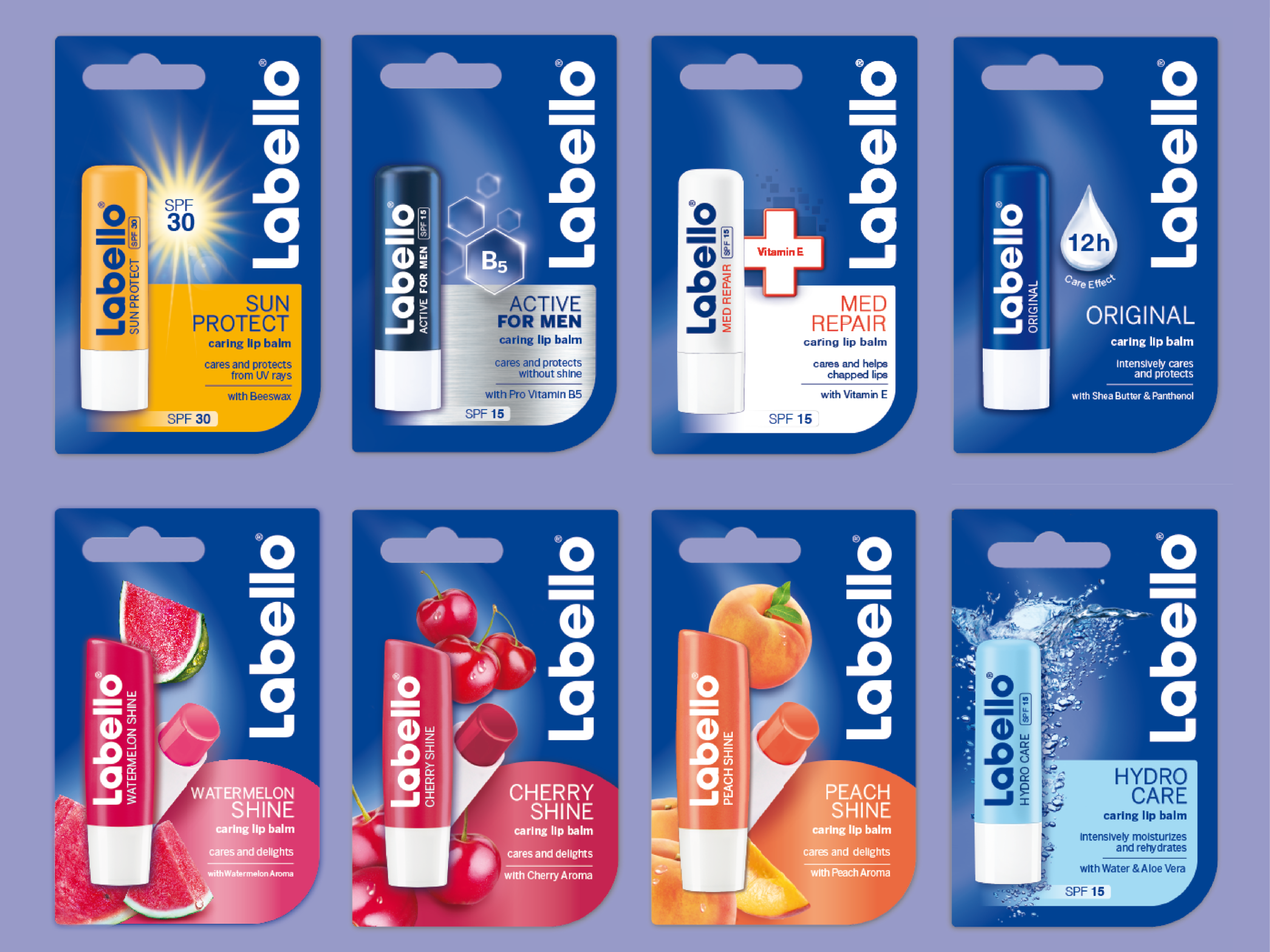
Good design must stand out – especially at the POS. Colors, contrasts, typography, and shape determine whether a product catches the eye. Simulated shelf tests help evaluate the impact of different design variations and select the best option.
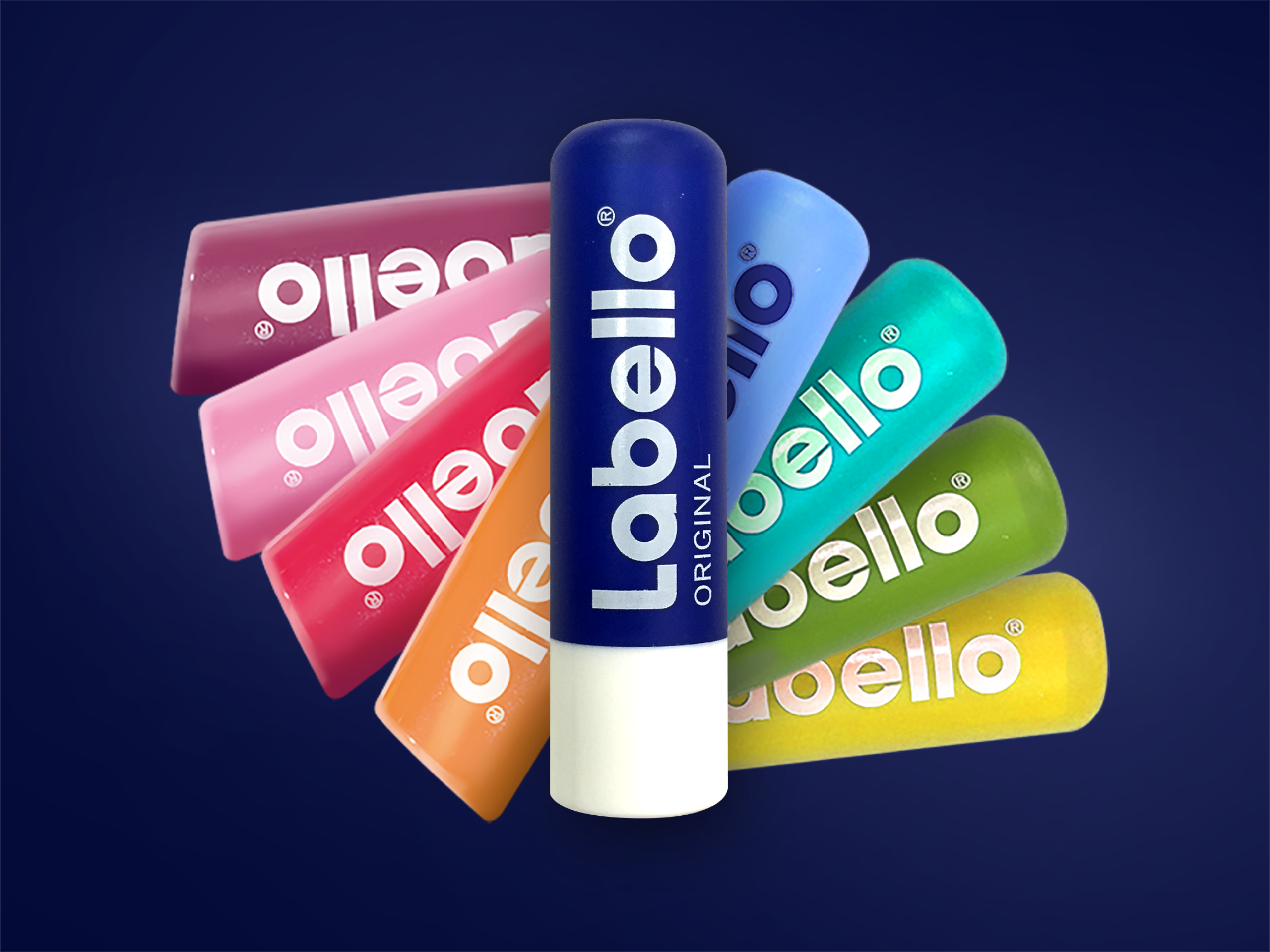
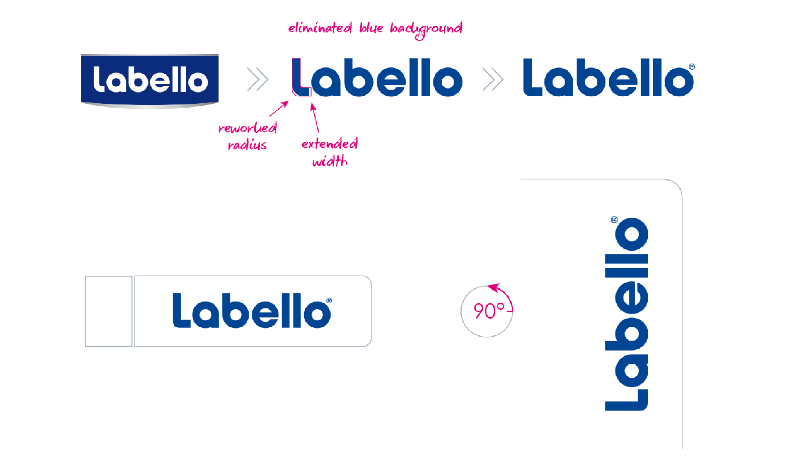
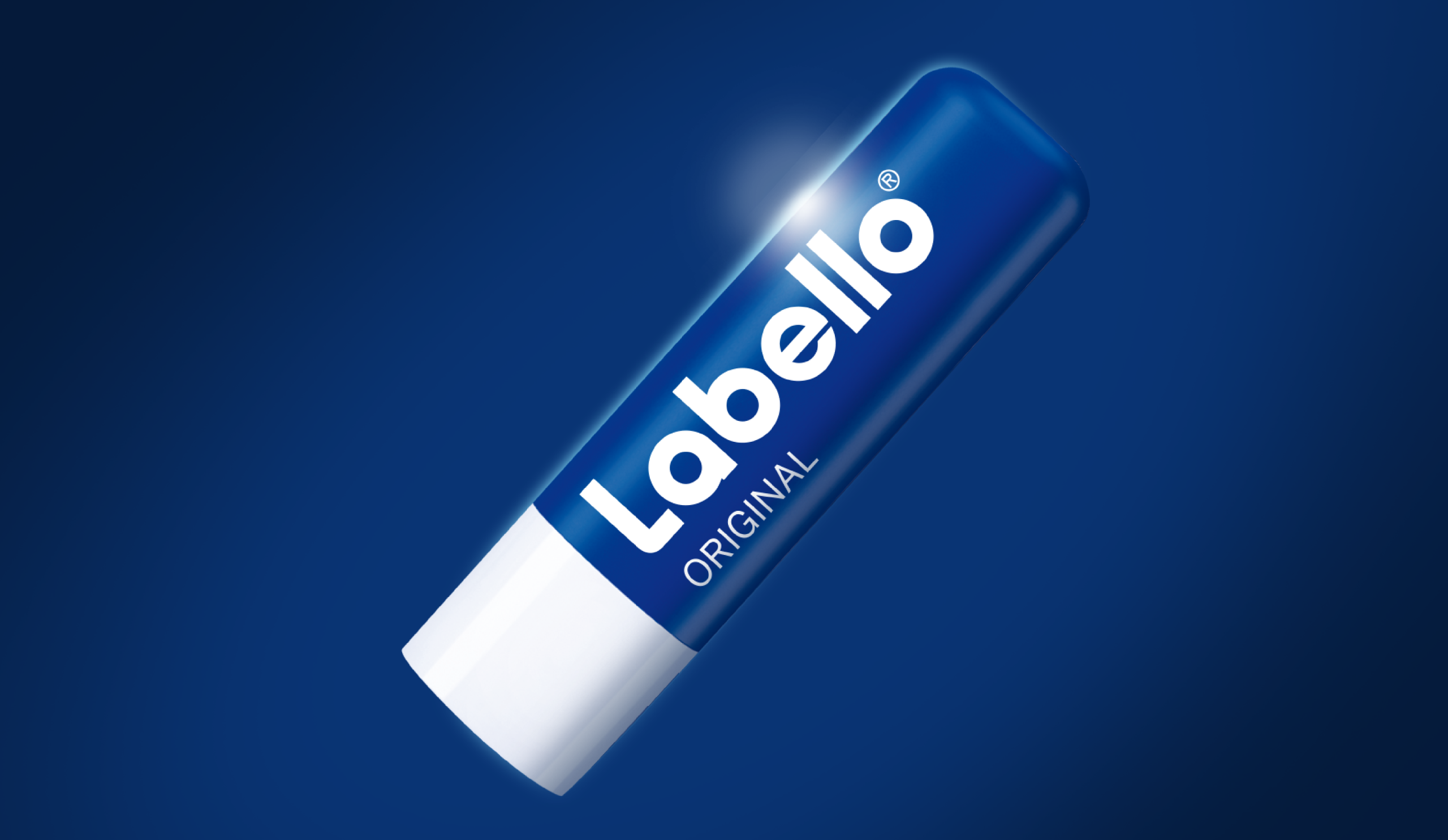
Our Design for Labello: Significant Shelf Impact Boost
Strong Brands as the Foundation of Good Design
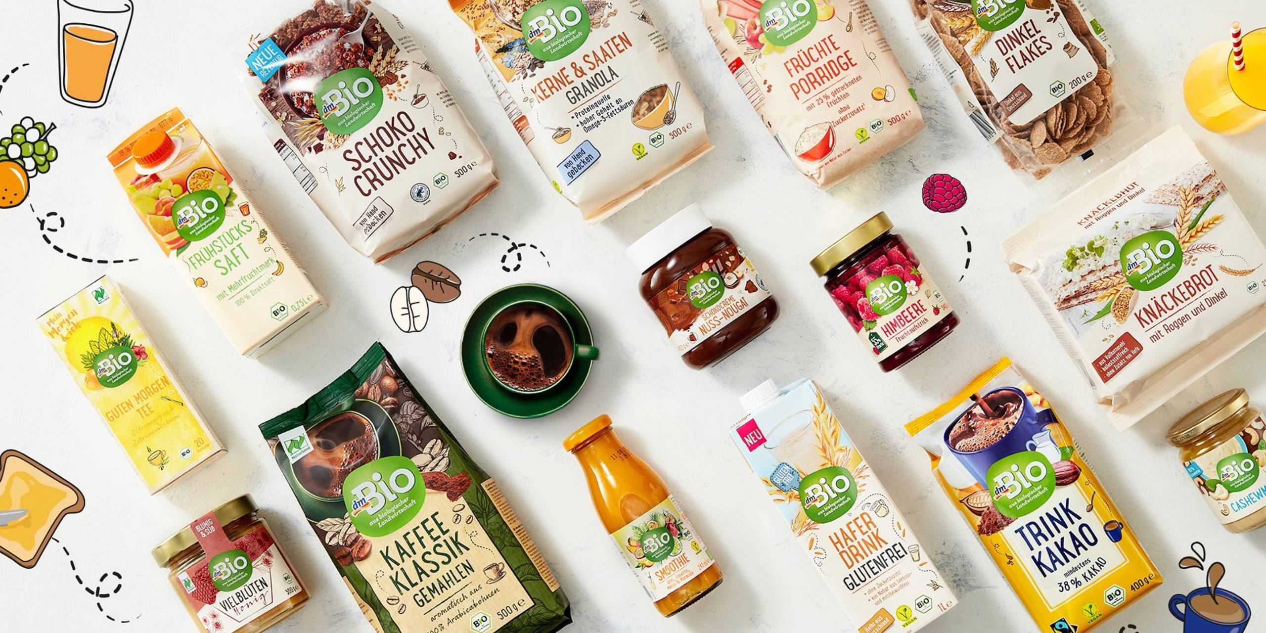
Strong packaging design requires a strong brand. It provides orientation, builds trust, and serves as an anchor for product extensions. Well-known brands such as NIVEA or Milka are good examples of how a visual brand idea can be successfully transferred to new categories.
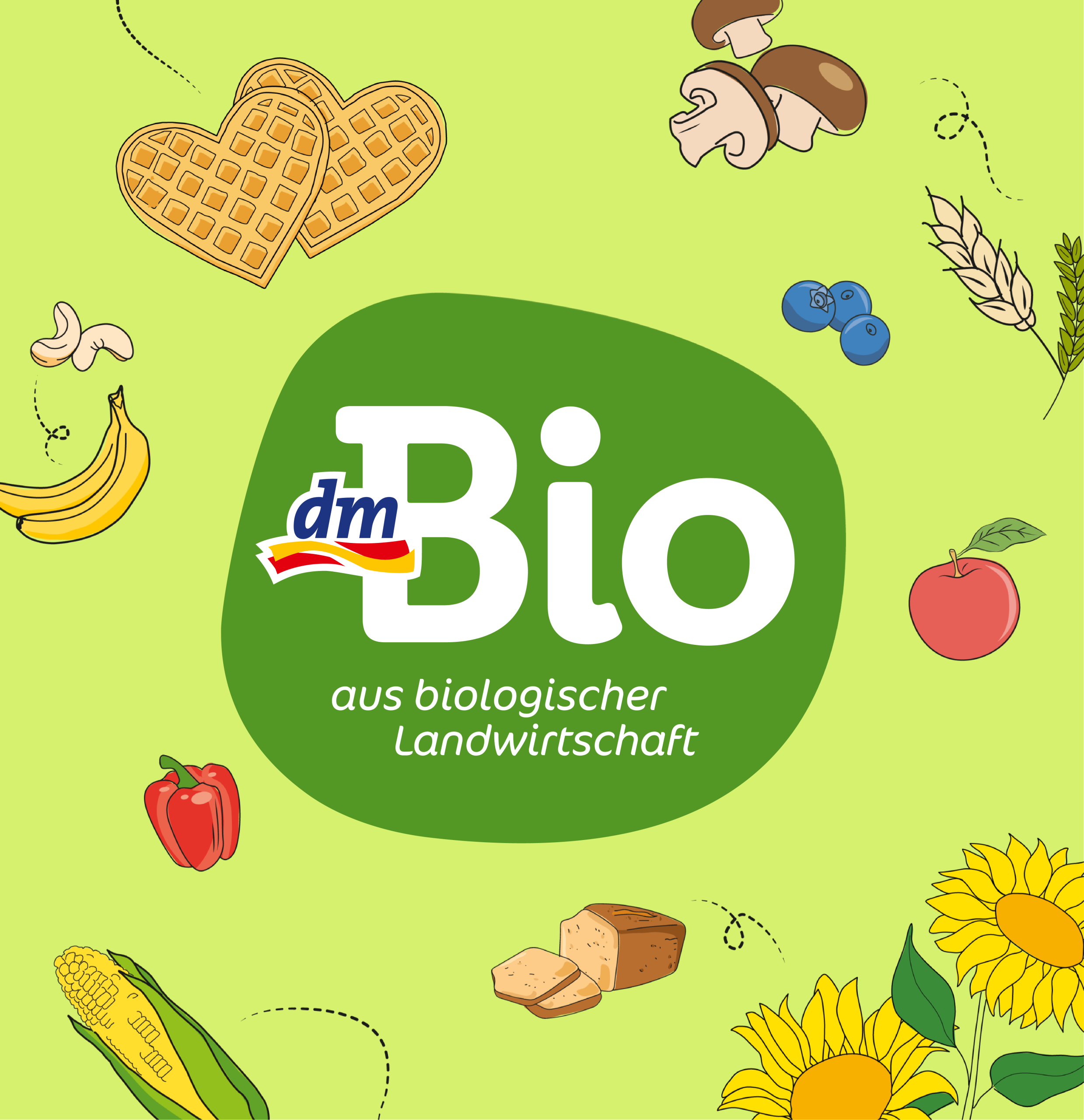
Our dmBio design also delivers strong impact with its powerful logo and clear design architecture, offering endless possibilities for line extensions and brand diversification.
Clearly Structured Brand and Design Architecture
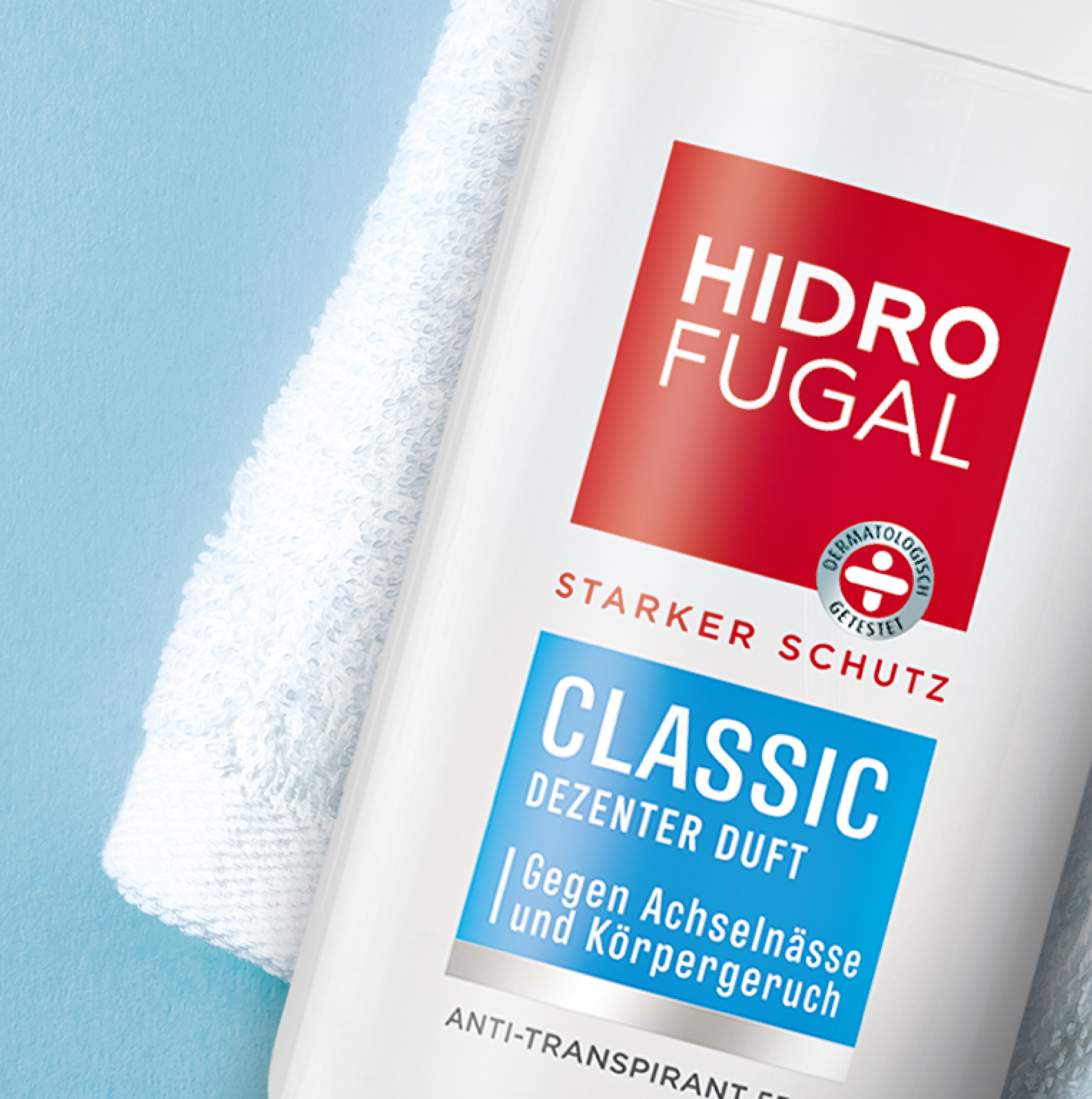
Major brands require clear hierarchies – both within the product range and in the design. The packaging must clearly communicate whether it is a new product, a sub-brand, or a limited edition. A well-thought-out design architecture ensures clarity and recognizability.
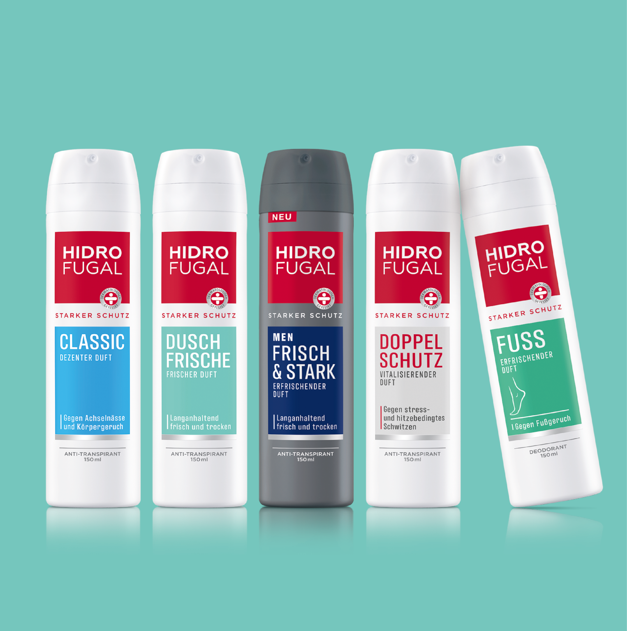
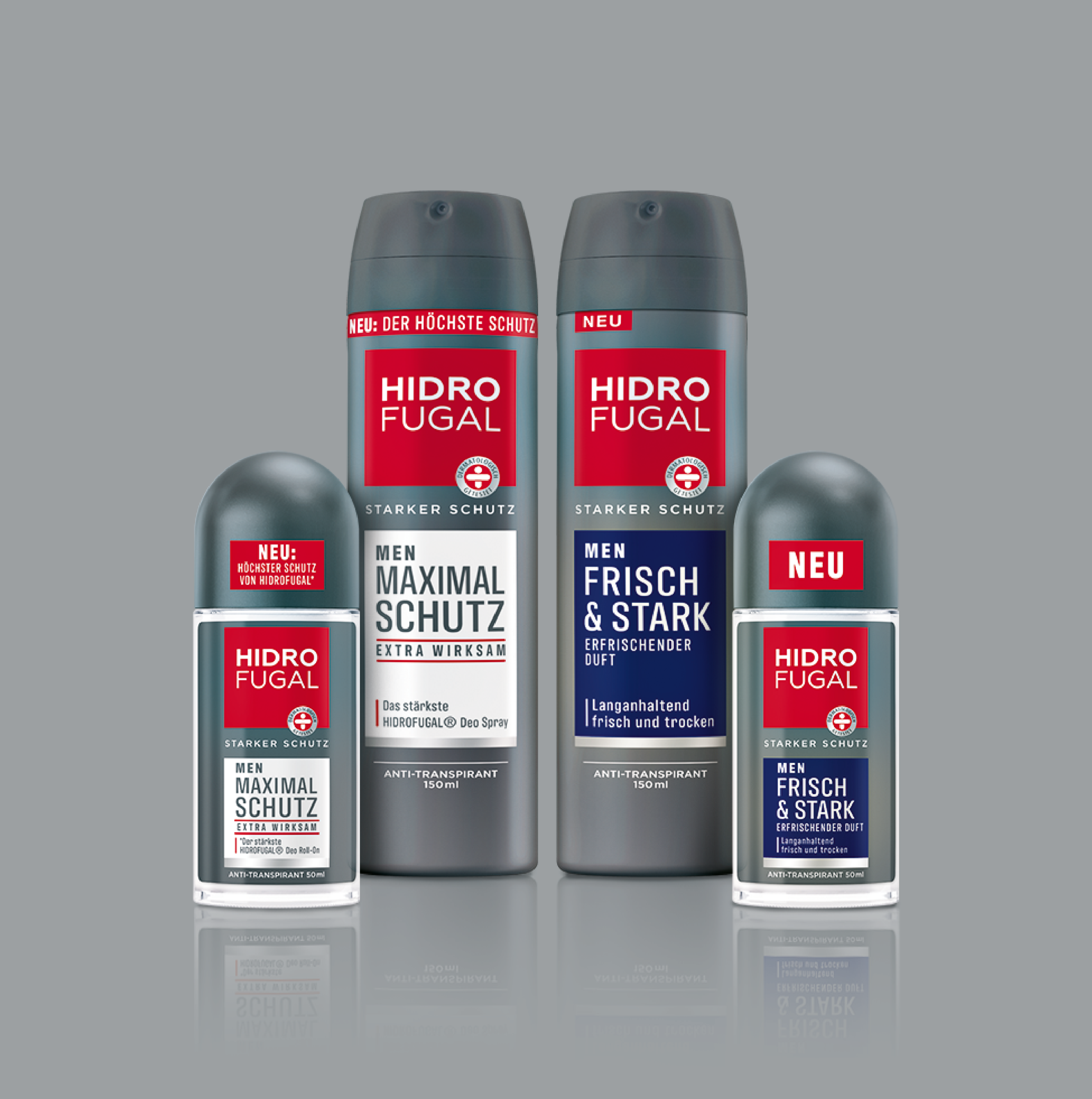
Our relaunch design for Hidrofugal impresses with clear structures and ensures optimal consumer orientation.
Design Quality Is Measurable
Subjective tastes should play no role in design evaluation. Instead, clear evaluation criteria are needed:
- What goals were defined?
- How well does the design meet these goals?
- What impact does it have on the consumer?
Only when design is developed strategically and evaluated systematically can its quality be measured and assessed objectively.
What Makes Good Design: Success Stories
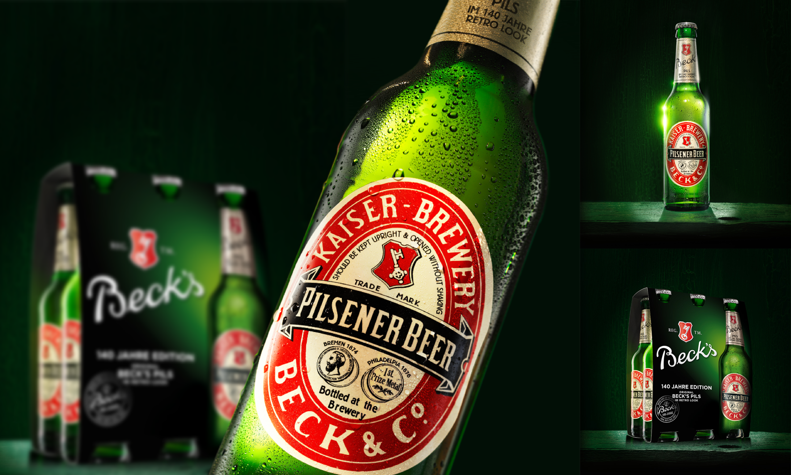
Numerous case studies show that design can bring about measurable market changes. For example, following a targeted shower gel relaunch without any additional advertising measures, NIVEA significantly increased sales. Likewise, the retro edition of Beck’s achieved outstanding sales with a historic label.
Conclusion: What Makes Good Design?
Good design is strategic, functional, and future-proof. It is guided by clear objectives, communicates precisely, and appeals to the consumer both emotionally and rationally. Above all, however, it is not a product of chance – but the result of a well-thought-out, structured process. Anyone who wants to understand what makes good design must see design not as art, but as a strategic tool – with a measurable impact on brand perception, purchasing decisions, and market success.
Our References
Why We Love Design Pitches – and Yet Don’t Take Part in Every One
We love pitches – partly because they keep surprising us. Sometimes pitch invitations land in our inbox before we even know exactly what they’re about. And yet, we can sense that there’s potential: an exciting brand, a topic that sparks curiosity, or simply a feeling of “This could turn into something.”
But one thing is certain: not all design pitches are the same.
Of course, whenever possible, we familiarize ourselves with the brand in advance. We also assess whether the effort involved is reasonable for a pitch and fair in relation to the pitch fee. We remain open – to new industries, new perspectives, and sometimes to the little surprise that only reveals itself at second glance.
Design Pitches as a Creative Challenge
We’ll be honest: we like pitches.
Not because they’re easy. Not because they always pay off. But because they challenge us. A pitch means new ways of thinking, fresh energy, and a clear goal in sight. For us as an interdisciplinary branding agency, it’s like a creative catalyst – whether it’s about packaging design, brand identity, or the strategic development of a new social media campaign.
At the same time, it’s clear: pitches are an investment. Time, experience, ideas, and our full passion – all of this goes into participating. That’s why, over the years, we’ve developed clear criteria to decide whether or not to take part in a tender.
When a Design Pitch Makes Sense for Us
As a creative design agency with a focus on holistic brand development, we assess in advance, among other factors:
- Is the pitch fairly compensated?
- How many agencies have been invited?
- How precise is the briefing?
- Is the timing realistic?
- What is the expected scope of work?
- Do we have direct access to the decision-makers?
- And most importantly: what is there to gain?
Because in the end, it’s not just the creative idea that counts – but also the prospect of genuine collaboration. If, after the pitch, six visuals are to be adapted and then put out to tender again, that’s not a sustainable deal for us. Sustainability in pitches, for us, means a long-term partnership.
What Matters to Us: Fairness, Transparency & Working as Equals
We value transparency in the process and appreciation for creative work. For us, this also includes fair compensation – not only in the event of winning but ideally already for participating. Whether we act as a social media agency, packaging design studio, or brand consultant, our ideas are the result of intensive work – not just creative intuition, but also strategy, experience, and teamwork.
And that’s exactly why we sometimes say no.
For example, to unpaid design pitches. Or when the briefing is unclear, the conditions are vague, or the added value for both sides is not apparent. We want to use our time – and that of our clients – wisely. For brand work that makes an impact. For designs that make our clients more successful.
Design Pitches Done Right – and Built for Sustainability
The good news is: it can be done differently. Many companies and brands run pitches in a fair, transparent, and sustainable way – making participation genuinely worthwhile. In such cases, pitches are not just a competition but an invitation to collaborate. That’s exactly how we see it.
Because we believe in clarity – and in strong relationships.
And when a pitch leads to a shared path, it’s more than worth the effort.
The Growing Importance of Medical Packaging Design
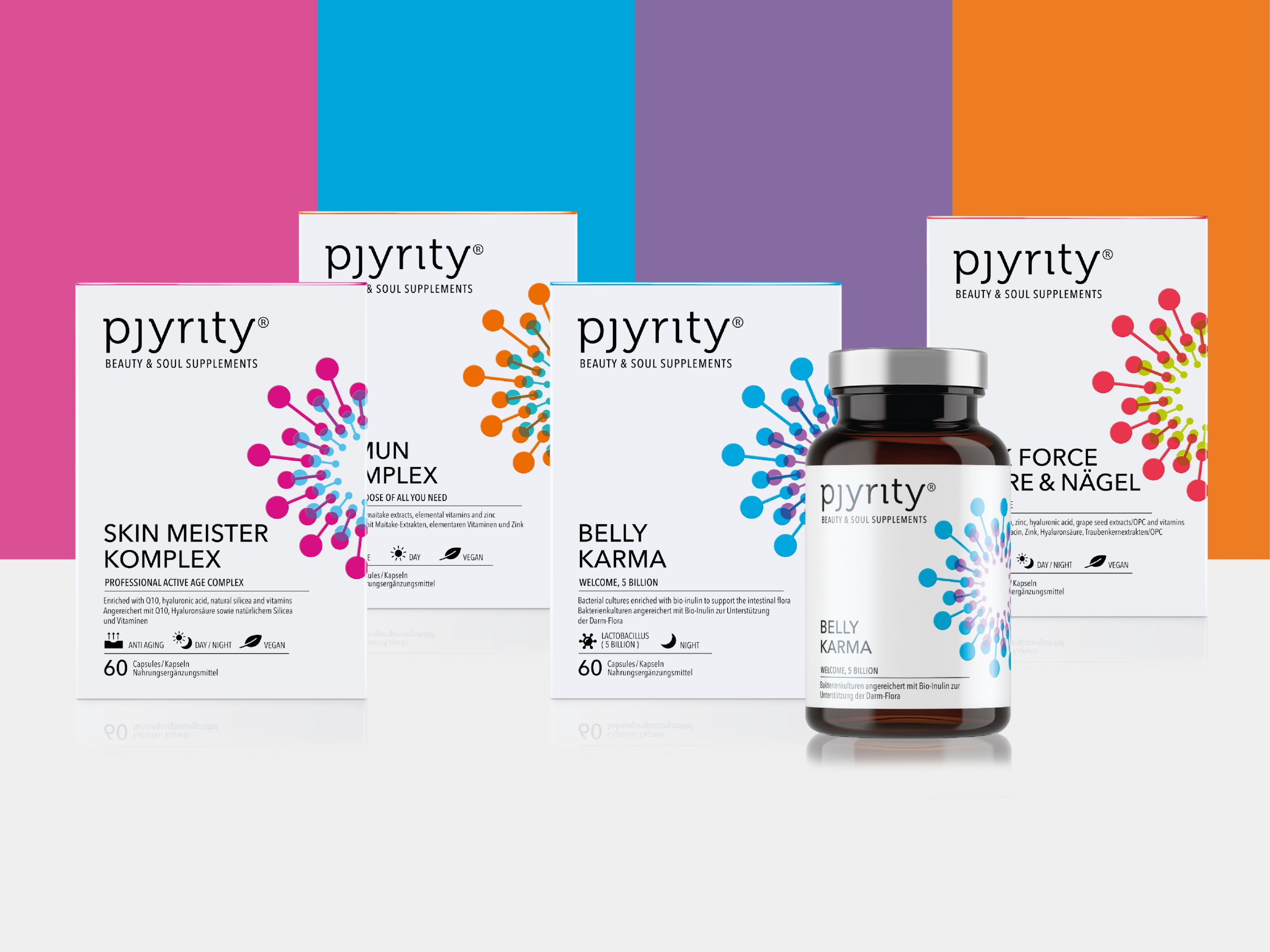
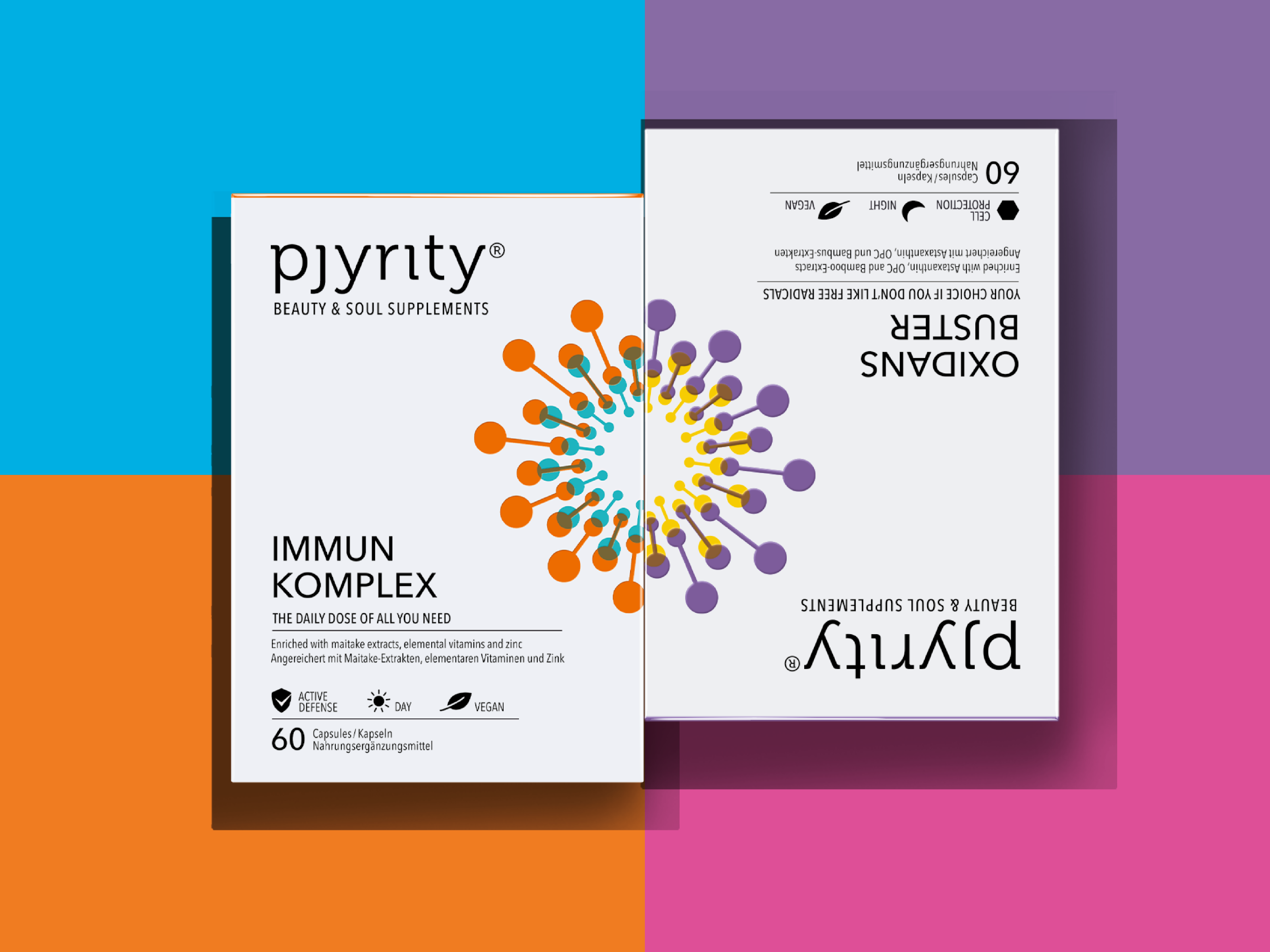
Health is a central topic for many people, and the market for nutritional supplements is booming. Our packaging design helps communicate positioning and make the benefits and effects of the products visible. In doing so, we create a well-balanced blend of competence and attention.
Packaging Design for Prescription and OTC Products: Competence Meets Attention
In medical and pharmaceutical packaging design, there are two main product groups: ethical products, which are only available by prescription, and over-the-counter (OTC) products, which are sold freely in pharmacies. Both groups have different requirements for packaging design, yet both are experiencing a shift in design and presentation that is becoming increasingly visible in pharmacies.
Changes in the Design of Prescription Products: The Challenge Posed by Generics
Until a few years ago, little attention was paid to the design of prescription products. The focus was on functionality and hygiene. However, this has changed with the rise of generic drugs — copies of the original medicines that contain the same active ingredient but are usually sold at a lower price — and with patients becoming more empowered. The First Moment of Truth (FMOT) – the first decisive moment when the customer comes into contact with the product and makes a purchasing decision – now often takes place at the pharmacy counter, making packaging increasingly important.
Packaging Design for Ethical Products
For ethical products, design has so far been minimalist: a high proportion of white, clear typography, and a prominently displayed brand logo and product name. However, competition from generics has led to these packages now needing to place greater emphasis on attention and brand presence. This presents a challenge for design agencies: they must combine medical expertise and trust with an appealing, eye-catching design.
Over-the-Counter Products: Competition on the Pharmacy Shelf
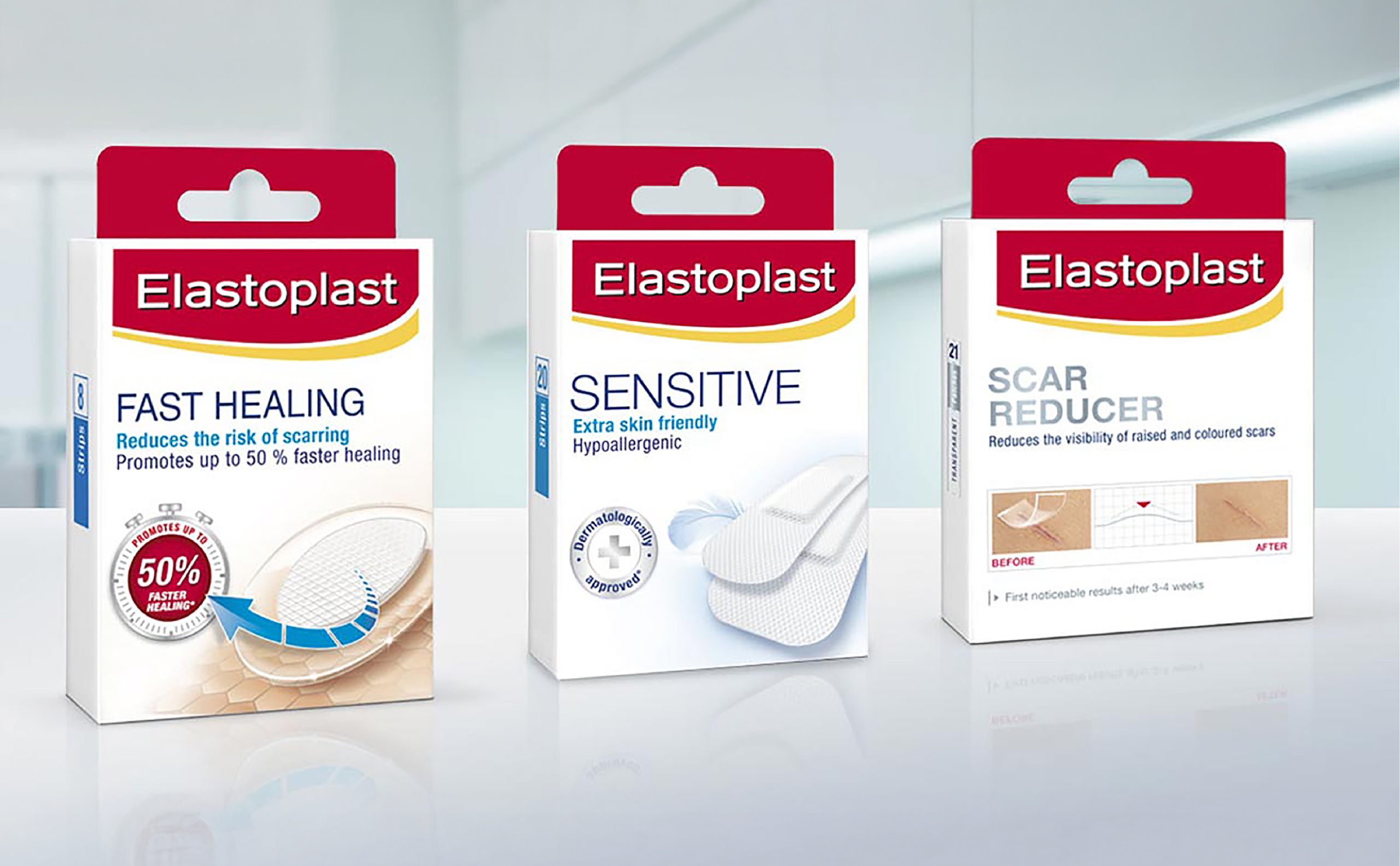
OTC products must stand out against numerous other products on the pharmacy shelf. Here, packaging design plays a decisive role. It must attract attention while also conveying credibility. A design that appears too clinical can unsettle customers, while one that is too emotional can have the same effect.
Medical Packaging Design: Combining Emotionality with Credibility
Colors, imagery, and icons can add more emotionality to medical packaging design. However, this requires a delicate touch. The design must clearly and simply communicate what the consumer can expect, while at the same time conveying credibility and effectiveness.
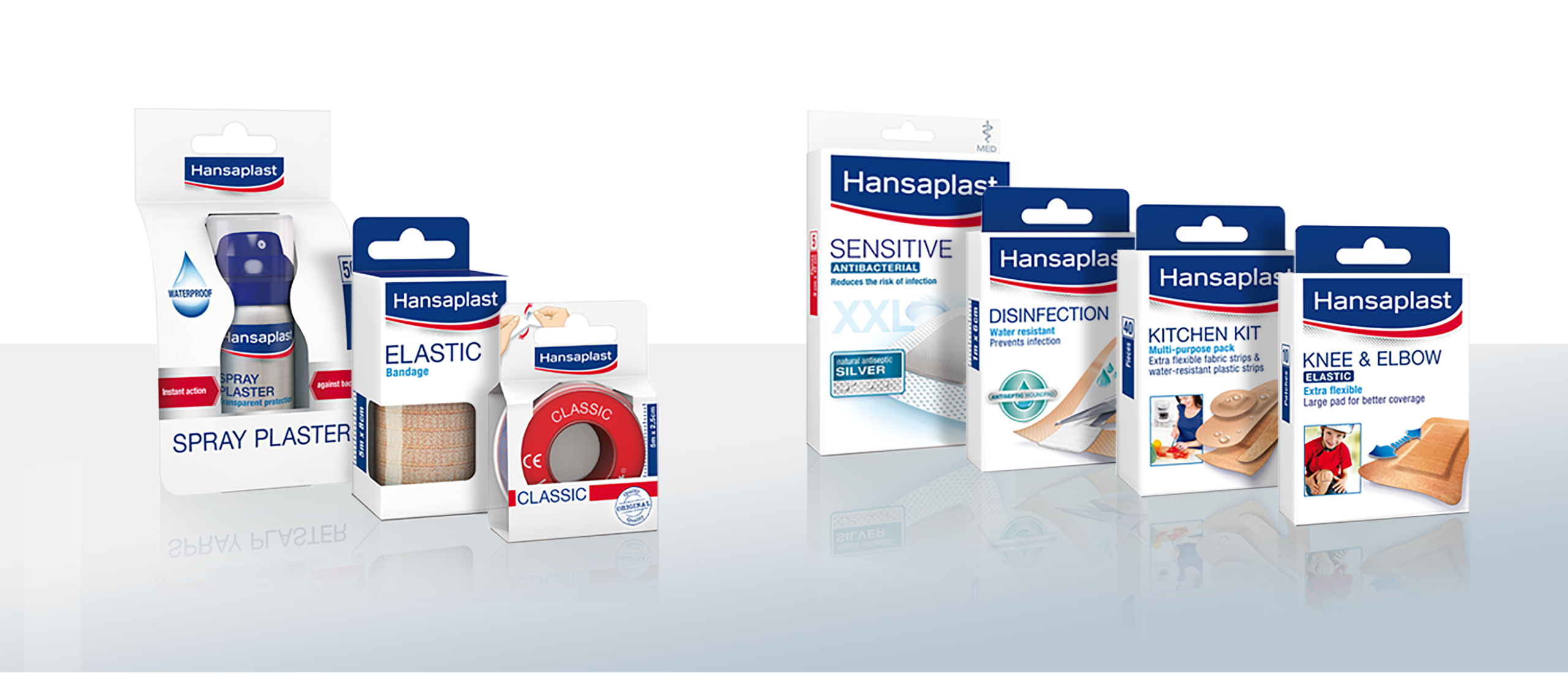
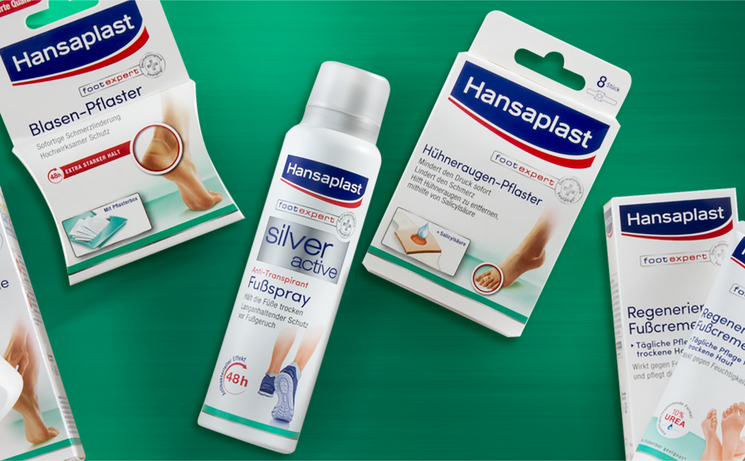
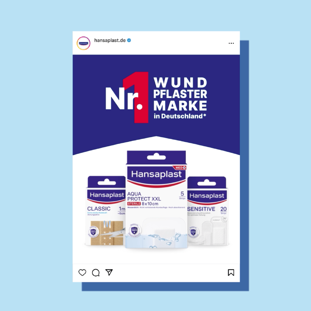
Our relaunch design for our long-standing client Hansaplast is a very successful example of this.
Block Formation for Greater Attention
A consistent design across a product line or an entire range can generate significant attention. This helps clearly differentiate the brand from its competitors and builds customer trust.
Careful Relaunches: Using Medical Packaging Design to Increase Attention and Retain Customers
A packaging design relaunch aims to increase attention and attract new customers without losing existing ones. A successful relaunch maintains recognizability while simultaneously conveying modernity and quality. Examples such as Aspirin and Wick show how this can be successfully achieved.
Successful Medical Packaging Design Projects: Hansaplast and More
We were able to demonstrate our expertise with the relaunch of the Hansaplast brand. The goal was to modernize the brand and convey greater quality and competence without losing recognizability. The redesign of the “Foot Expert” range and the ABC heat patches are also among our successful projects.
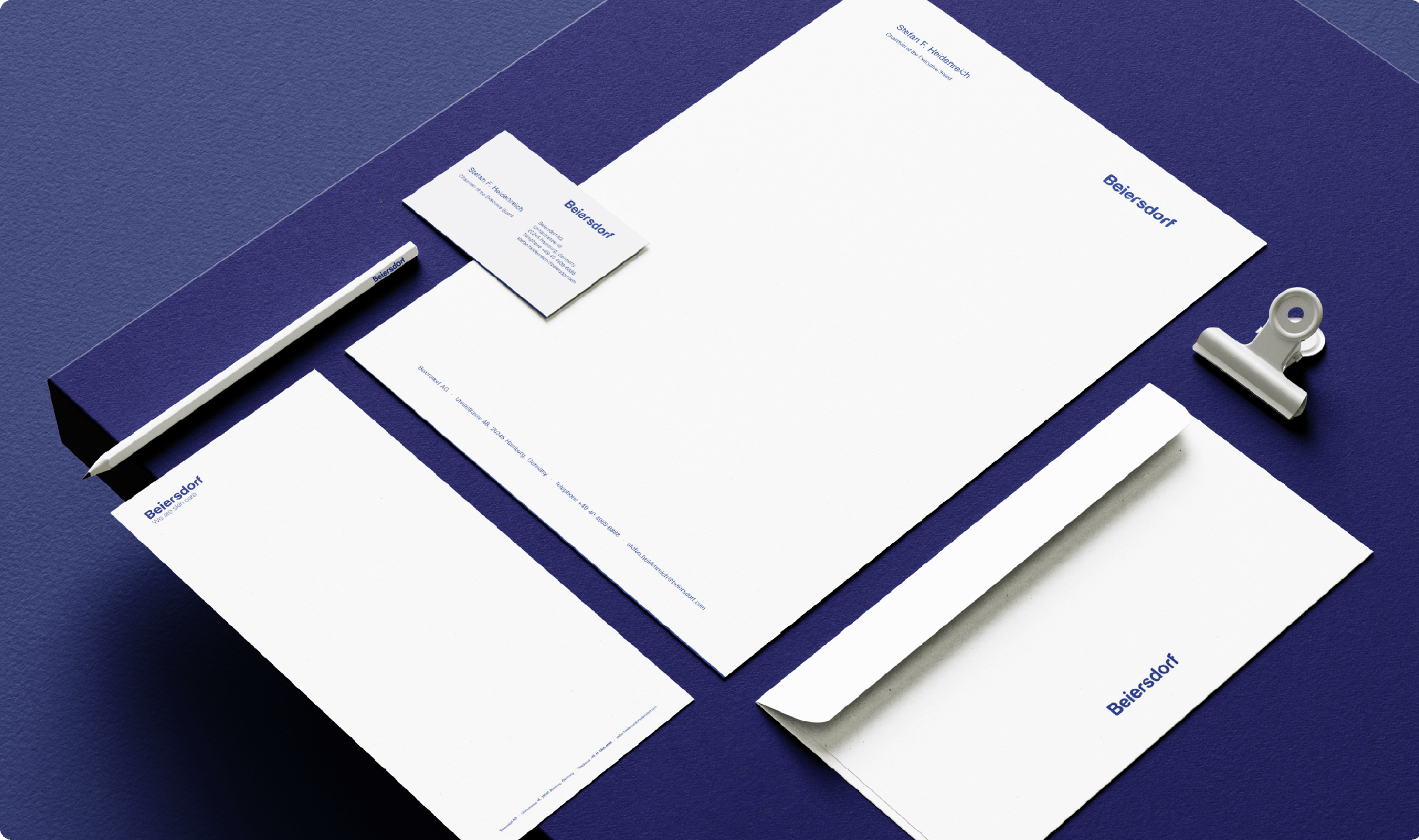
The positive response from our clients, as reflected in the feedback from Beiersdorf, shows how well this approach resonates.
Nutritional Supplements: A Growing Market
The nutritional supplements market is growing rapidly, and with it the importance of packaging design. Here, a balance between medical credibility and vibrant, eye-catching design is essential. Our work for LR Health & Beauty Systems demonstrates how creative designs with clear benefit communication can be successfully implemented.
Corporate Design: Strong Trademarks and Timeless Design
Whether on websites, business stationery, or in presentations – first impressions count, and these are usually shaped visually. This is precisely where corporate design comes in: it provides the creative framework for a company’s public appearance and ensures a recognizable, consistent, and professional overall image.
Definition: What is Corporate Design?
Corporate design (CD) is the visual component of the overarching corporate identity (CI). It defines how a company presents itself both externally and internally – across all communication channels. This includes digital media as well as traditional print products and product packaging. Corporate design is far more than just visual styling – it conveys brand values, attitude, and personality in a visual form, providing clarity and orientation.
Creating Timeless Trademarks with Corporate Design
Memorable trademarks are essential for the long-term success of a brand. Unlike fast-moving consumer goods, they must be designed to stand the test of time. A strong trademark gains value and remains recognizable for years. If, after a long period, a redesign becomes necessary, it must be carried out with the utmost care to gently evolve the brand while preserving its successful foundation.
The Core Elements of Corporate Design
An effective corporate design is built on several coordinated elements:
1. Logo
The brand’s core visual element. It should be distinctive, flexible, and versatile in its application.
2. Colour system:
A defined color scheme – usually consisting of primary and secondary colors – ensures visual coherence and conveys emotional messages.
3. Typography:
Fonts and font sizes are a crucial component of brand impact. Consistent typography enhances legibility and promotes a professional overall impression.
4. Visual Language:
Whether realistic photography, illustrations, or icons – the visual style should be consistent and align with the company’s character.
5. Design Grid and Layout Rules:
Structures for page layout, spacing, logo placement, and content arrangement create order and ensure recognizability.
6. Application Across Media:
The visual style is applied across all communication materials – from business cards to websites and social media, as well as packaging and trade show booths.
Corporate Design with Brand and Trend Awareness
When designing packaging, it is often the case that a logo for a new brand or company also needs to be developed. Our clients value the support of an experienced corporate design agency in Hamburg. Through our work in packaging design, we engage deeply with our clients’ values and culture, continually expanding our expertise in the field of corporate design.
Extensive Expertise Through Trend Research
Our extensive research into markets, industries, and trends gives us in-depth knowledge that we incorporate into the development of corporate designs. We use this expertise to create logos and corporate identities that are both contemporary and future-proof.
Logo Design: The Foundation of Corporate Design
The Logo as the Central Emblem
A company or brand logo is the flagship of any brand. It represents the character of a business and ensures recognition and identification. A logo is an important communication element that supports a brand’s visual positioning in the market. Whether traditional, modern, or innovative, the logo must reflect the essence of the brand.
A Delicate Touch in Logo Relaunches
Redesigning an established logo requires great sensitivity. The change should be perceived positively and must not jeopardize the brand’s recognizability. A well-prepared logo relaunch, communicated positively both internally and externally, can generate significant attention and strengthen the brand.
Corporate Design: The Visual Expression of a Company’s Character
Influence on the Company’s Character
Corporate design is a central part of corporate identity and shapes a company’s visual appearance. It encompasses all communication materials, from business stationery and promotional items to the online presence. Even within the company – for example, through uniform workwear and interior design – corporate design plays an important role.
Holistic Planning and Functionality
A well-thought-out corporate design requires careful planning. All design elements must be functional and applicable across all communication materials. This also includes proprietary fonts and defined color palettes that ensure consistency and recognizability.
Reasons for a Logo Relaunch
A logo relaunch should be carefully considered and implemented with sensitivity. Reasons for doing so may include new business areas, mergers, changes in ownership, or a rebranding of the company. A more modern and refreshed appearance can help present the brand in a contemporary way and appeal to new target groups.
What Must a Logo Do? – Criteria for a Successful Logo
A logo must be individual and unique. It should be clearly readable, durable, and functional – both in color and in black and white. In addition, it must work well across different media, such as company stamps, letterheads, and also in digital media, ensuring the brand’s attention and recognizability.
The Design Manual: Guideline for Corporate Design – The Corporate Design Manual
For the implementation of a consistent corporate design, a comprehensive design manual is essential. It describes in detail how to handle all design elements and serves as a guide for collaboration with suppliers and agencies. A well-developed design manual anchors the corporate culture and ensures a unified appearance that strengthens the corporate identity.
Our References
The World of Beer Crate Design
It all began with our beer crate for Beck’s. What was once a plain transport container became a true lifestyle item through innovative features such as the soft-touch handle and in-mould label. Shortly thereafter, Warsteiner followed this example. Today, the beverage crate is an indispensable marketing tool. Despite the limited design possibilities due to pallet dimensions, developing beverage crates remains an exciting challenge for us as designers.
The Art of Beer Crate Design
The design of beverage crates is a special discipline within industrial design. The dimensions are set by standards, leaving only a few millimeters of leeway. This space is used to create striking, brand-compliant, and intelligently stacked visuals. We focus on structured shapes and creative graphic ideas that stand out at the POS.
More Than Twenty Years of Beer and Beverage Crate Design
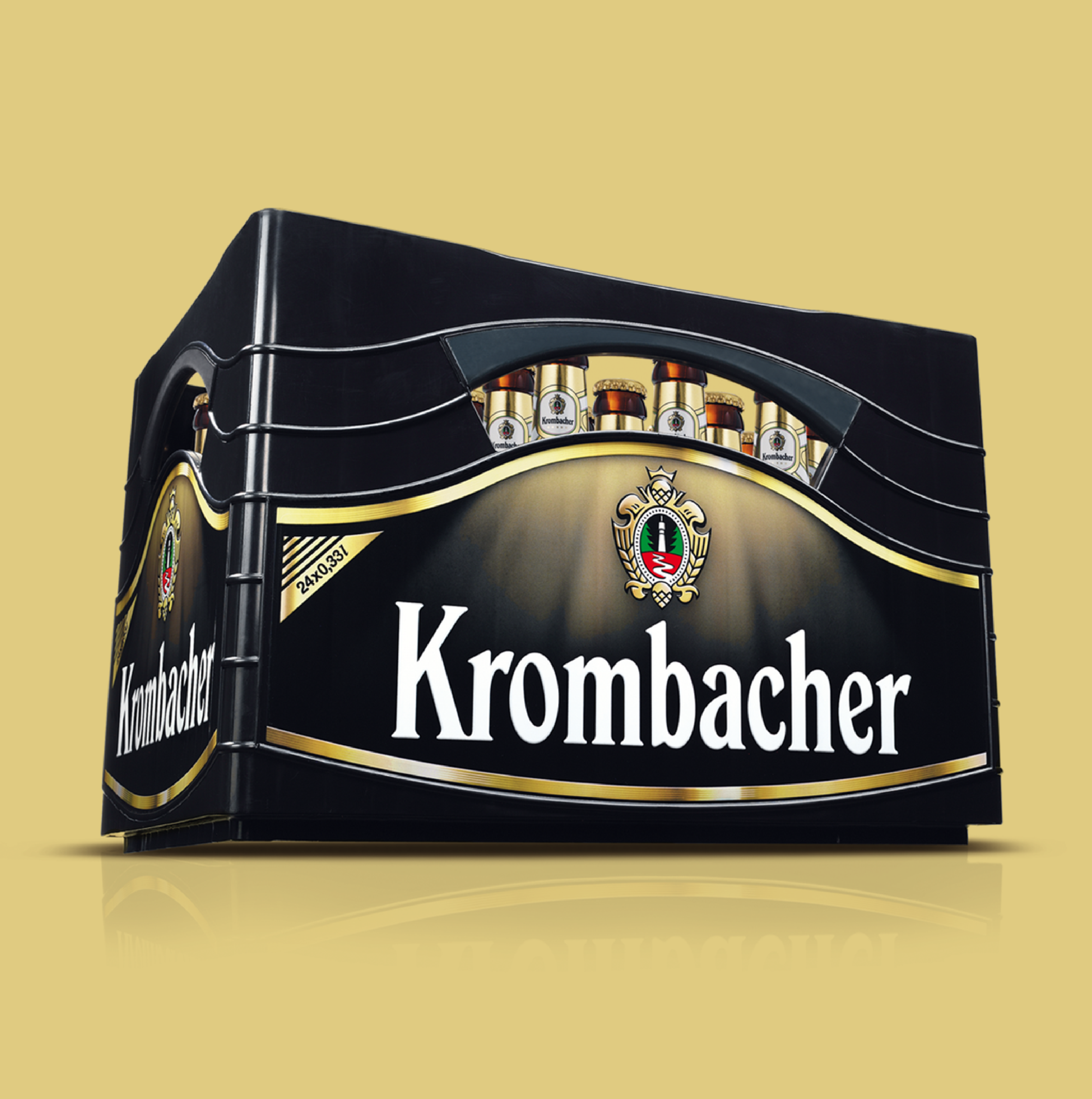
Good beer crate design requires experience and expertise. JUSTBLUE has both and has developed numerous successful designs. Functionality and aesthetics are equally important for improving carrying comfort and creating purchase incentives. Our designs for Beck’s, Warsteiner, Krombacher, and many others have sustainably enhanced brand perception and increased sales.
Innovations in Three-Dimensional Design
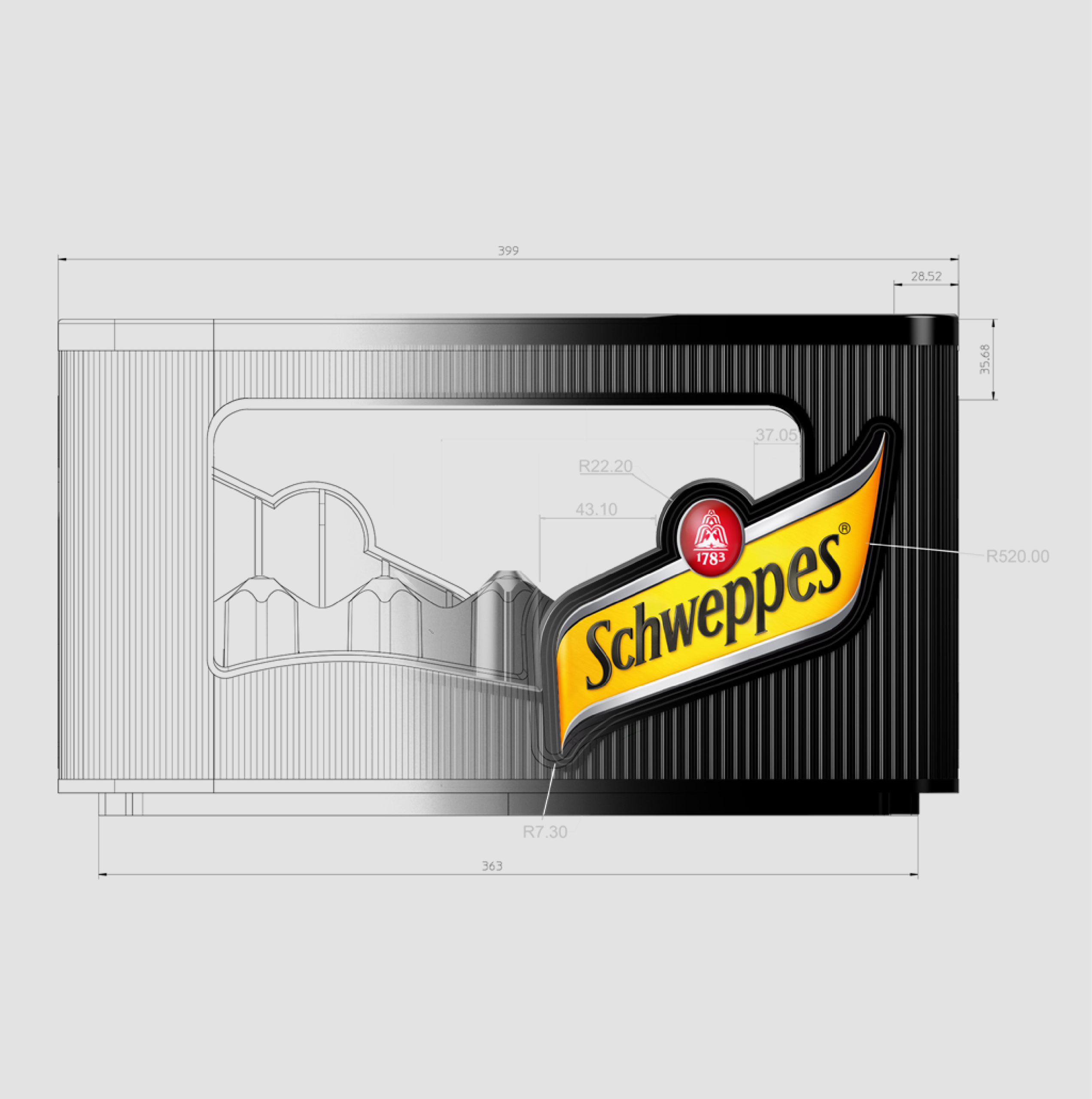
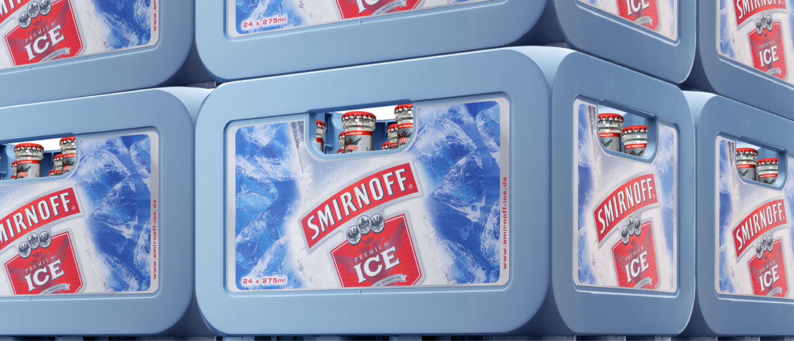
A highlight of our work is the Smirnoff Ice crate, which makes full use of three-dimensional possibilities down to the very last millimeter. With rounded corners and a striking stacking pattern, we create an emotional brand association that impresses especially at events. Like a wall of ice blocks, the light blue, transparent beverage crates seem to tower up, supporting the brand’s key associations in the most emotional and tangible way.
Our References
3D packaging design is far more than aesthetics – it is brand management cast into form. Whether cosmetics, FMCG, or beverages, we create packaging solutions that make an impact – on the shelf, in the hand, and in the minds of the target audience.
Our Expertise in 3D Packaging Design
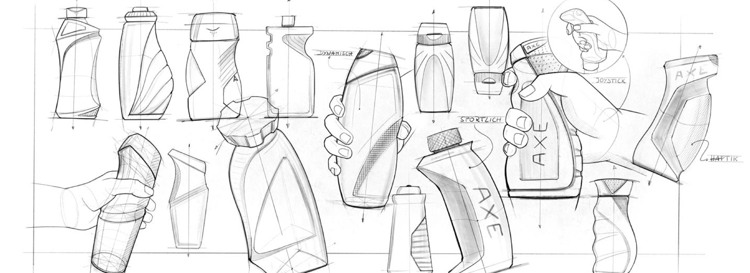
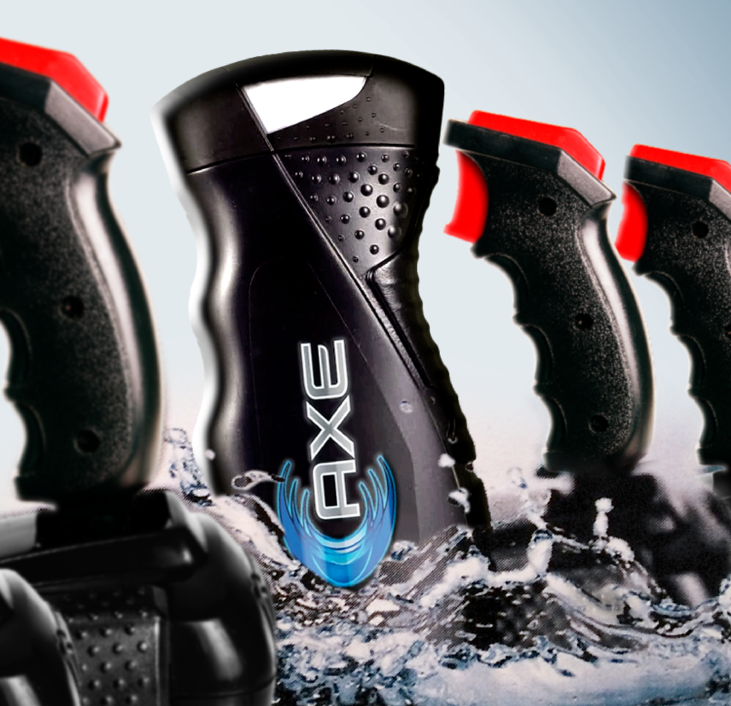
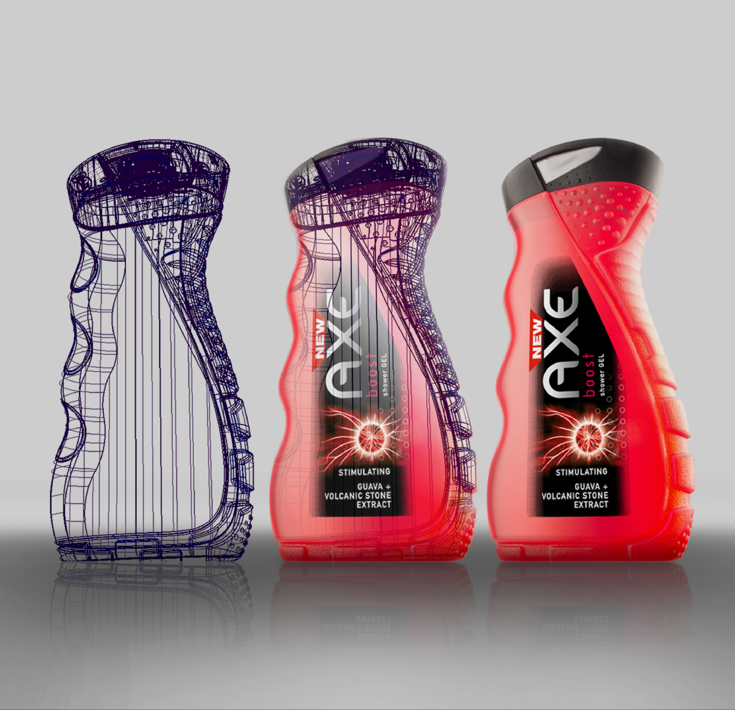
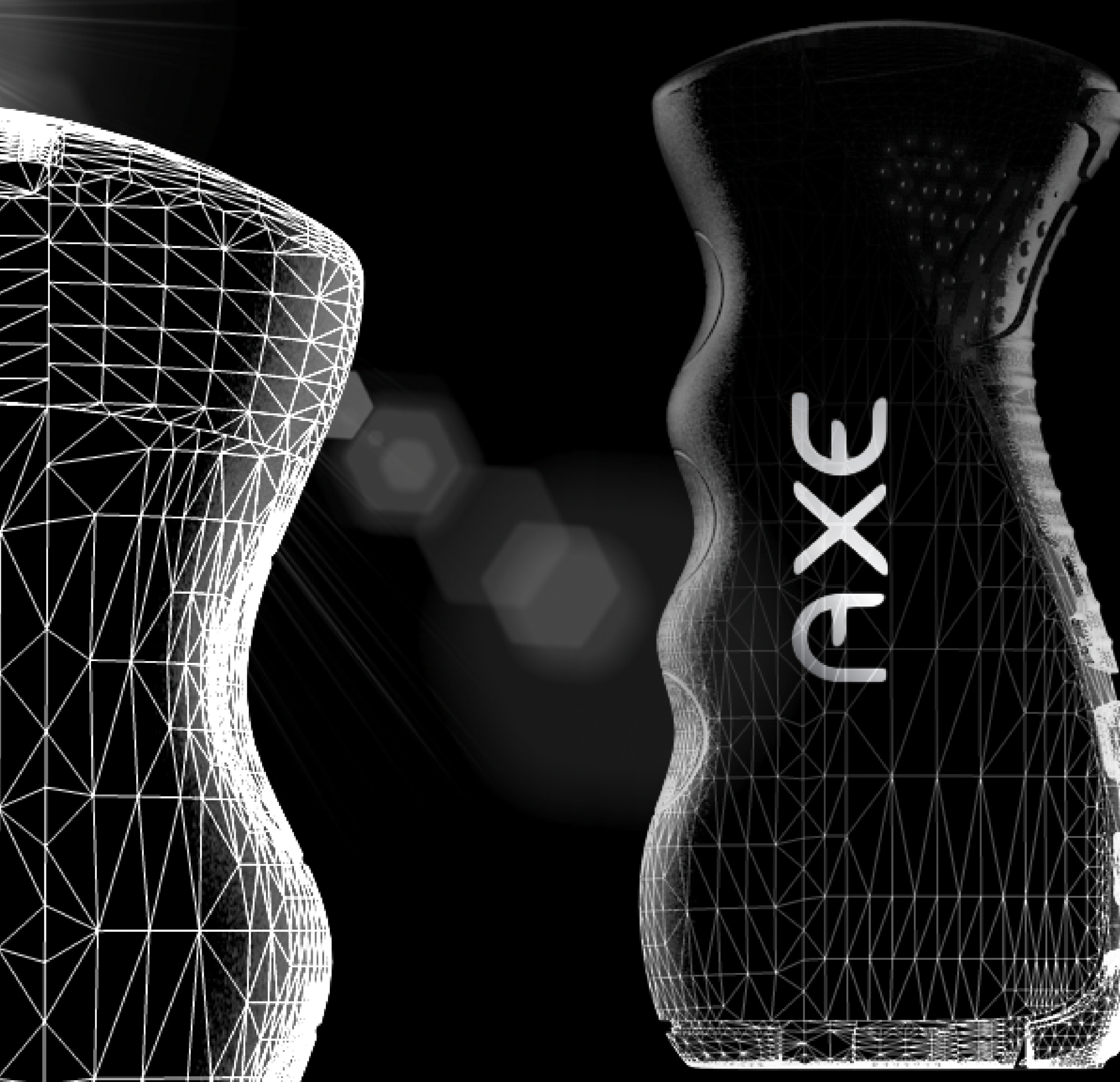
Whether PE, PP, PET, or glass – we have extensive experience in three-dimensional packaging design. It’s essential to understand the wide range of requirements: handling, stability, size impression, suitability for labeling, label size, filling capability, and residual emptying. Category codes must also be taken into account, as shapes give consumers subconscious cues – particularly for secondary placements or when orienting themselves at home. When everything is done right, milestones can be achieved – as we did with the AXE shower gel bottle: the world’s first truly masculine shower gel bottle. This design revolutionized the market, dominated the visual habits of the male target group for years through its form, and has been widely copied – something we see as a confirmation of its success.
Relaunch with Impact: 3D Packaging Design as a Key to Brand Success
The three-dimensional discipline of design can be an important part of a relaunch. A holistic approach to product design includes not only graphics but also packaging – for example, a new bottle shape. As early as 1996, JUSTBLUE, as a product design agency in Hamburg, designed the first PET mineral water bottle for the German market – for Gerolsteiner. During the cooperation with the Peter Schmidt Studio (now Peter Schmidt Group) that lasted until 1999, the still modern and premium-looking gastronomy bottle for Apollinaris was created. Closely connected to the material glass, the team at justblue.design has also been responsible for numerous globally recognized flacon designs for major brands such as Hugo Boss, Davidoff, and Jil Sander. By combining technical requirements with current trends, we deliver results that are highly relevant to the target audience.
Already in the initial design phase, we present photorealistic renderings (CGI). After completing the detailing phase, we provide Class-A CAD data in all common formats as the basis for subsequent engineering. Other successful examples in this area include the make-up jar for NIVEA Mousse and the design of a cosmetics bottle for Dove (Unilever), which was modeled after a gentle body silhouette.
Material, Form, Function – What Makes Good 3D Packaging Design
Our roots lie in flacon design – where every detail matters: glass as a material, form as an expression of brand values. We now apply this conceptual design expertise to a wide range of packaging solutions – from premium glass flacons to plastic bottles for the mass market.
While flacon design must deliberately communicate specific values, PP, HDPE, or PET bottles come with additional requirements. In 3D packaging design for FMCG products, consistency, recognizability, and adherence to category codes play a central role – because a shower gel bottle should not look like a shampoo or a household cleaner.
But in addition to the visual code, ergonomic function is also crucial: packaging must feel good in the hand, remain stable when opened, and perform reliably across different filling lines. Whether deodorant roller, aerosol, or PET bottle – form follows function, but always with the brand in mind.
At the same time, we take current trends in 3D packaging design into account, such as sustainability, material usage, and brand aesthetics.
Other Key Evaluation Criteria:
- Size Impression: How large does the product appear on the shelf?
- Label Size & -position: How much space is allocated to the branding?
- Stability & Fillability: Even in production on international lines
- Cap Size & Material: Balancing Sustainability and Cost
Only when these aspects are in the right balance and sensibly prioritized can a design be both economically and aesthetically convincing.
Our References
While the economic, social, and political development of the post-war period up to the 1990s was characterized by sustained growth, prosperity, and a certain degree of predictability, the environment in which companies and organizations operate today has fundamentally changed since the turn of the millennium. With the end of the Cold War, the rise of globalization, and, above all, the ongoing digital revolution – including the establishment of social networks – the pace of global dynamics has accelerated dramatically since the early 200
What Does VUCA Stand For?

The acronym VUCA, derived from English, stands for volatility, uncertainty, complexity, and ambiguity. The VUCA world describes a state in which rapid and unexpected changes (volatility), uncertainty about future developments (uncertainty), complex multiple effects (complexity), and a lack of clarity about cause-and-effect relationships (ambiguity) are no longer the exception but the norm. In the context of VUCA, people often speak of the “new normal” – a state of constant change that has permanently replaced the previous status quo.
The VUCA Model in the Context of Consumer Brands
In this VUCA world, brands are more challenged than ever to position themselves clearly and unmistakably. As part of the daily lives of countless consumers, the VUCA environment affects brands – and brands, in turn, influence this environment.
Even long-established brands that have been successful for decades are under pressure and, in some cases, face existential threats to their economic success. At the same time, there are more new brand launches and brand concepts than ever before. In this “age of new brands,” newcomers can establish themselves with consumers in a very short time through disruptive approaches and, in particular, by leveraging new digital communication opportunities – challenging existing market structures in the process.
The fact that consumer behavior itself is being fundamentally shaped by the VUCA environment defines the context in which brands operate. In a VUCA world, consumers’ openness to new things and their willingness to question the established becomes a self-catalyzing system that continuously drives change forward.
Brands must therefore approach this dynamic environment with the awareness that they need to challenge the established and explore new paths – while adopting a clearer positioning than ever before. A clear positioning, along with a brand strategy built upon it, serves as the foundation and prerequisite for successfully addressing the four elements of the VUCA world.
Volatility
A volatile market environment has a significant impact on brands. When trends rapidly evolve or fade, economic conditions change abruptly, or social, economic, or political crises are part of the daily agenda, this affects consumer behavior. Does the brand address relevant needs? Does it reflect the spirit of the times? Does it offer a compelling value proposition at a price appropriate to the circumstances? Does its positioning still reflect relevant aspects? Only brands that can answer these questions have a chance of success in a volatile environment.
Uncertainty
Due to a higher flood of information and an increasingly rapid pace of change, perceived uncertainty is on the rise. Brands have always had to deal with uncertainty, but the simultaneous erosion of numerous influencing factors amplifies this challenge. Market scenarios and early engagement with relevant trends help manage uncertainties, anticipate developments, and develop courses of action in this environment. For brands, agility combined with strategic foresight is essential.
Complexity
What is undisputed is the increasing interconnection of diverse factors relevant to a brand’s success. Whether supply chains, real-time communication media, social trends, economic crises, or global events – everything is interconnected and influences each other. Brands can suffer from this development but can also benefit from it. For example, are all brand activities sufficiently integrated to create synergies? Does the brand respond to current developments while acting in line with its brand values, thereby taking on a position that is meaningful to its target audience?
Ambiguity
What may seem right in one context can appear fundamentally wrong in another. Taking a stance becomes a balancing act – and, in some cases, even a political issue. Brands, in particular, rely on communication as both a medium and a projection surface. What matters most is credibility and a foundation of values that guides the brand’s orientation. Only when a brand’s standpoint is clearly defined can it take a position. Here again, a clear and well-defined brand positioning plays a decisive role, providing all brand stakeholders with clear guidelines for action.
Do You Need Help with the Topic of VUCA?

Challenges and Opportunities of VUCA for Brands
In the VUCA world, consumers look for stability and trust. Brands that are clearly positioned – in content, visuals, and communication – and consistently project this positioning outward provide consumers with an anchor amid constant change. A brand that knows what it stands for and communicates this consistently earns the trust of consumers. In an overcrowded market where consumers face an overload of information, a clear brand message helps to differentiate, position, and remain relevant over time.
VUCA at JUSTBLUE
As an expert in brand development and brand management, JUSTBLUE supports its clients in meeting the challenges of the VUCA world. We firmly believe that a clear brand positioning, strategy, and consistent execution are the decisive success factors for brands. Only with these in place can brands face the challenges of the VUCA world with relevance, stability, trust, and simplicity. At the same time, high agility is essential to respond quickly and successfully to the ever-evolving challenges of the market environment.
JUSTBLUE sees itself as a reliable full-thinking partner, understanding brands in a fully comprehensive and 360° integrated way. Our creative work is always based on a clear vision rooted in brand strategy and aimed at developing the brand’s content further. We refine brand positioning, and our visual execution based on it resonates on a rational level while also appealing emotionally. In our view, only in this way can brand assets unfold their full impact and sustainably influence brand perception.
Our work does not take place in isolation, like in a “black box”; rather, we derive our approach from established brand tools, seek dialogue with our clients, and present our thinking and methods transparently. By integrating our clients into this creative transformation process toward greater brand relevance, we can quickly create tailored, meaningful results that make a real difference in today’s agile VUCA world.
Here, “tailored” is the decisive differentiating factor. There is, of course, no universal recipe for brand success in the VUCA world. However, with deep branding expertise, a high level of strategic understanding, and agility in concept development, JUSTBLUE creates the right approach for building successful brands.
We work within the following framework parameters, which, based on our experience, can serve as a starting point for the strategic development of brand relevance in the VUCA world. A brand’s ability to master the balancing act between stability in times of crisis and ongoing renewal depends on several key prerequisites:
Strong Brand Identity
A clear brand promise, firmly anchored values, and a distinctive brand personality provide a stable framework. This serves as a point of orientation for both internal decision-makers and the target audience.
Target Audience Understanding
A deep understanding of the target audience and their needs is essential. This enables brands to develop relevant and timely innovations that resonate even in times of crisis.
Authentic Communication
Honest, transparent, and consistent communication builds trust. When consumers feel that a brand communicates authentically, they are more willing to embrace change and innovation.
Innovation
To remain innovative, brands must invest continuously and always look for opportunities to improve or expand their offerings.
Successfully combining stability and innovation is undoubtedly a major challenge. However, brands with a clear identity, strong connections to their target audiences, and the ability to adapt to changing circumstances while communicating visibly and relevantly are well-positioned to master this balancing act. JUSTBLUE supports brands in achieving greater relevance through the strategic and creative development of these areas, enabling them to operate successfully and sustainably in the market.
Our VUCA Cases
Lead Agency JUSTBLUE: Your Partner for Holistic Marketing Concepts
As a leading lead agency, we offer you a comprehensive solution for all aspects of marketing. Working closely together, we develop a tailored strategy that fits your company perfectly.
- Naming
- Vision
- Branding
- Digital Branding
- Landing Page
- Packaging Design
- POS
- Styleguide
- Content Creation
- Content Strategy
Why Do You Need a Lead Agency?
In building brand relevance, alongside insight-based targeting of the audience, coherence is a crucial factor for efficiently developing brand equity. As a lead agency, we not only ensure that the brand is positioned clearly and relevantly, but also that, based on this positioning, all marketing activities contribute to the brand strategy. This enables brands to achieve their goals faster and with fewer resources. It is secondary whether the primary objective is building reach, penetration, or loyalty – all measures must support the positioning and be relevant to the target audience; only then can they have their full effect. The lead agency serves as the central point of contact, either independently developing multiple initiatives in-house or coordinating various specialist agencies or service providers for advertising, public relations, digital marketing, and other areas. The result is an orchestrated implementation of the brand strategy with maximum impact – as we achieved in the relaunch of the dmBio brand.
Tasks a Lead Agency Takes On
Development of the Marketing Strategy
A lead agency works closely with the client to define marketing goals, target audiences, and key messages. It develops a comprehensive marketing strategy that serves as a guide for all marketing activities.
Coordination of Specialist Agencies
The lead agency is responsible for coordinating various specialist agencies or service providers involved in marketing and advertising activities. This may include agencies for advertising, public relations, digital marketing, event management, and more. The lead agency acts as the interface between these service providers and the client.
Management of the Marketing Budget
The lead agency often also manages the budget allocated for marketing and advertising.
Monitoring and Evaluation
Monitoring the results of marketing activities and analyzing them is also one of the lead agency’s tasks. It collects data, prepares reports, and presents them to the client. Based on these analyses, optimization measures are derived to continuously improve the marketing strategy.
Looking for a lead agency?

