8×4 Logo Design Relaunch

The 8×4 Logo as the Heart of the Brand
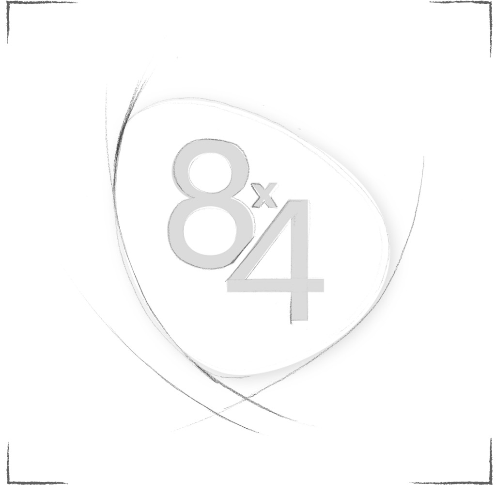
The 8×4 logo has been completely redesigned. A new typeface and a consistent use of color coding across all variants bring a modern touch. The numeric elements have been moved closer together, forming a stronger visual unit.
Before – After
The organic shape surrounding the wordmark enhances uniqueness and reinforces the brand character of the logo. The modern, more compact typography of the 8×4 lettering is a contemporary interpretation of the traditional 8×4 logo. The logo now appears more youthful but not too trendy, appealing to a broad target group aged 15 to 50.
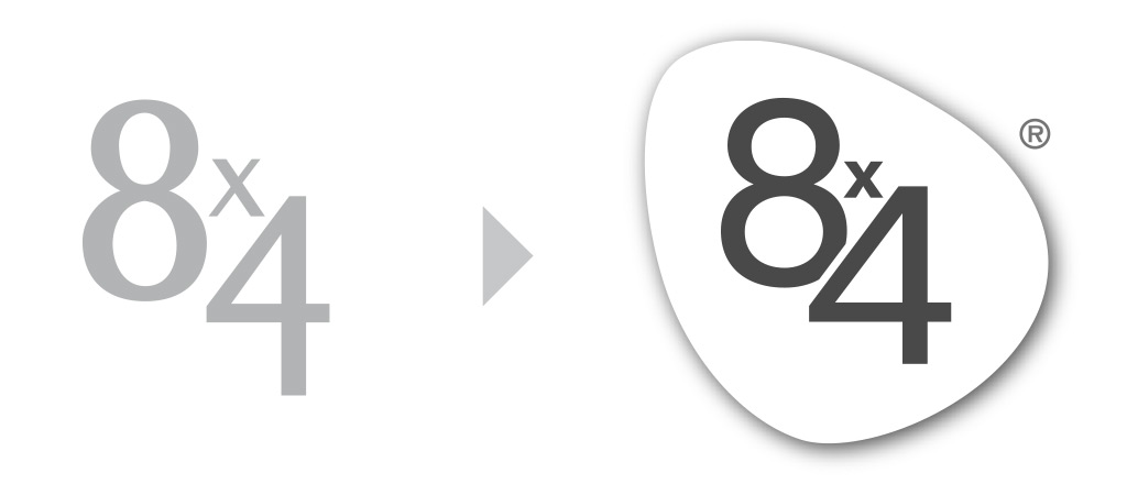
The Logo Shape
The logo shape is composed of three scent waves and becomes the heart of the brand.
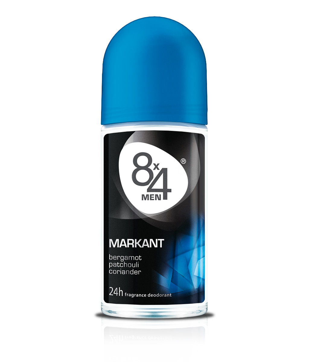
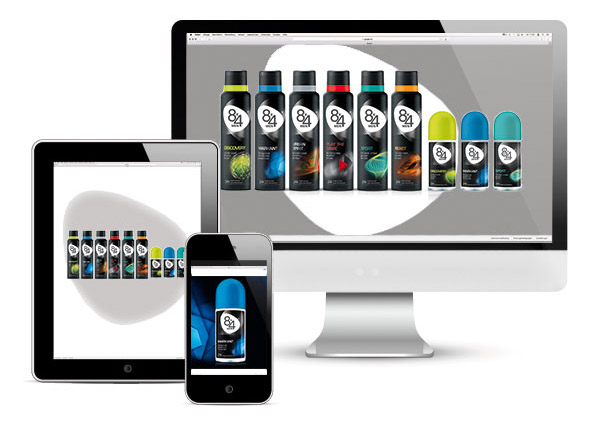
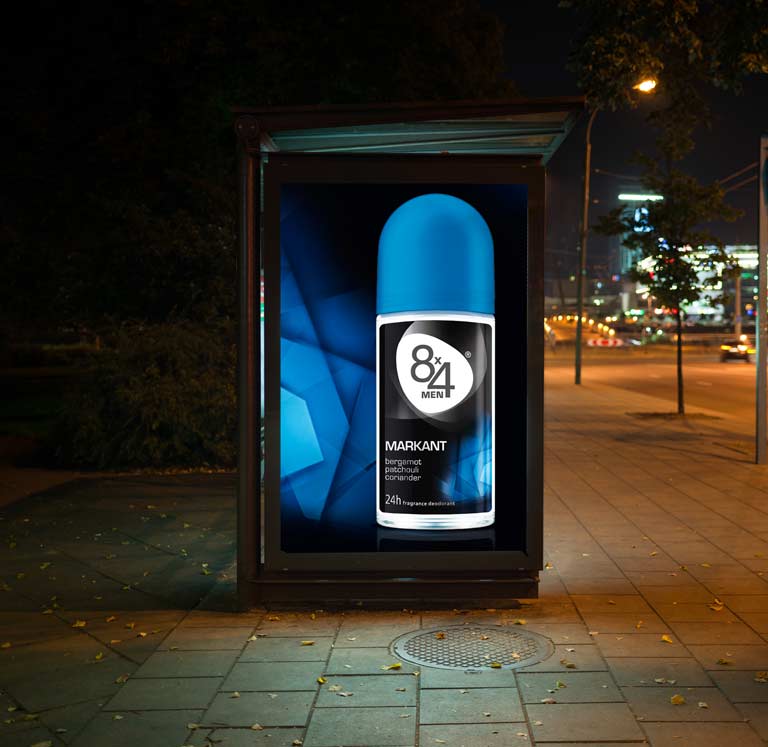
A Strong Communication Logo
Even beyond packaging applications, the new 8×4 logo demonstrates strong visual impact. Its distinctive shape commands attention and conveys the brand’s values. A powerful logo as the foundation for a powerful brand.