Packaging Design for Food & Beverages: Innovative Solutions

Packaging Design for Beverages: Brand Communication Through Bottle Design
We have already had the opportunity to support numerous brand relaunches, line extensions, and innovation projects for leading beverage manufacturers – from beer and mineral water to spirits. Following the so-called “mix wave” – the boom of mixed drinks such as beer mixes or ready-to-drink cocktails – and a period of market saturation, the entry of many young brands is bringing fresh momentum to the beer market. In the mineral water and soft drinks segment, the ongoing functional trend – the development of functional beverages with added value, such as vitamins, electrolytes, or plant-based ingredients – is shaping the design and positioning of new products. The spirits market, too, is being steadily revitalized: craft influences – artisan-inspired brand strategies focusing on authenticity, quality, and distinctive design – are introducing new visual accents and appealing to a design-savvy target audience. These trends are directly reflected in beverage packaging design – through innovative shapes, eye-catching labels, and a strong brand identity.
This understanding of brand development and design quality is also valued and affirmed by our clients.
Successfully Packaged Beverages: Why Bottle Design Matters
Beverage packaging design must meet a wide range of specific requirements. In addition to functional aspects, the bottle design takes center stage, aiming to clearly and convincingly communicate the brand values and product concept. High recognizability, alignment with category-specific visual habits, and the targeted integration of current design trends are crucial to remaining visible in the highly competitive beverage market. At the same time, careful modernization of existing packaging lines plays an important role – without jeopardizing the brand’s recognizability.
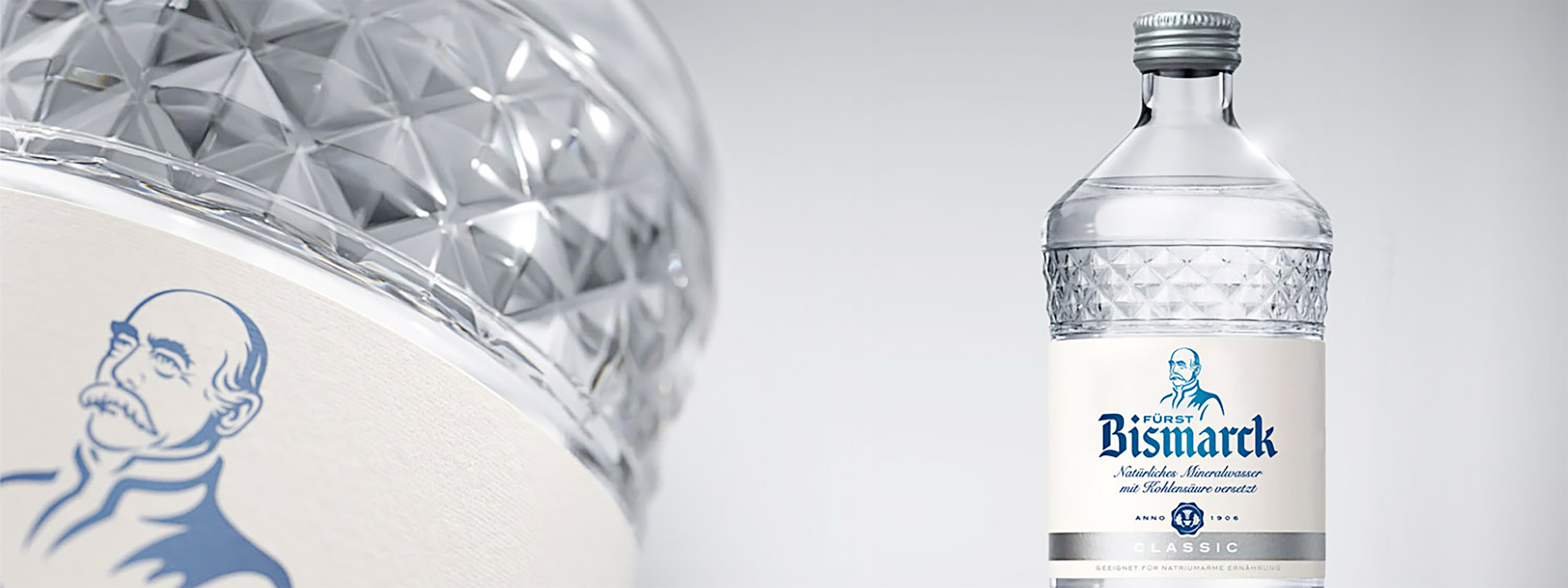
A key success factor in packaging design for beverages and food is maximizing the so-called appetite appeal – the visual allure that stimulates appetite and makes the product desirable. This effect is particularly important for closed products like beverage bottles. Unlike cosmetic products such as shower gels, where scent samples can be tested at the point of sale, consumers cannot directly verify the promise of taste of a beverage. They must rely on the label design and the visual impression of the bottle. The more convincingly, premium, and emotionally the design communicates, the greater the likelihood of positively influencing the purchase decision at the shelf. A strong example of successful and effective 3D bottle design is our bottle for Fürst Bismarck: the custom-designed bottle we created – a unique glass bottle design featuring a faceted cut-glass look.
New Custom Glass Bottle from JUSTBLUE: Premium retail presence, comparable to that of the hospitality industry, laid the foundation for a justified price increase.
Block Formation in Bottle Design: Stronger Together at the POS
Today, the majority of beverages are sold directly at the point of sale (POS) – in beverage specialty stores and large supermarkets. To stand out from the crowd, the so-called block formation plays a crucial role in beverage packaging design. Block formation refers to the visual unification of all product varieties within a brand through a consistent and cohesive bottle design that functions like a “uniform.” This design consistency strengthens brand perception on the shelf, ensures recognizability, and increases resilience against competitors. In addition, modern beverage packaging design must be flexible enough to accommodate a wide range of packaging formats: from six-pack sleeves and reusable packaging such as bottle bridges, Logipack, or truck loaders, to the increasingly popular smaller package sizes. Classic beverage crates are also adapting to the trend, increasingly appearing as six-, nine-, or eleven-bottle carriers – ideal for single households, on-the-go consumption, or limited editions.
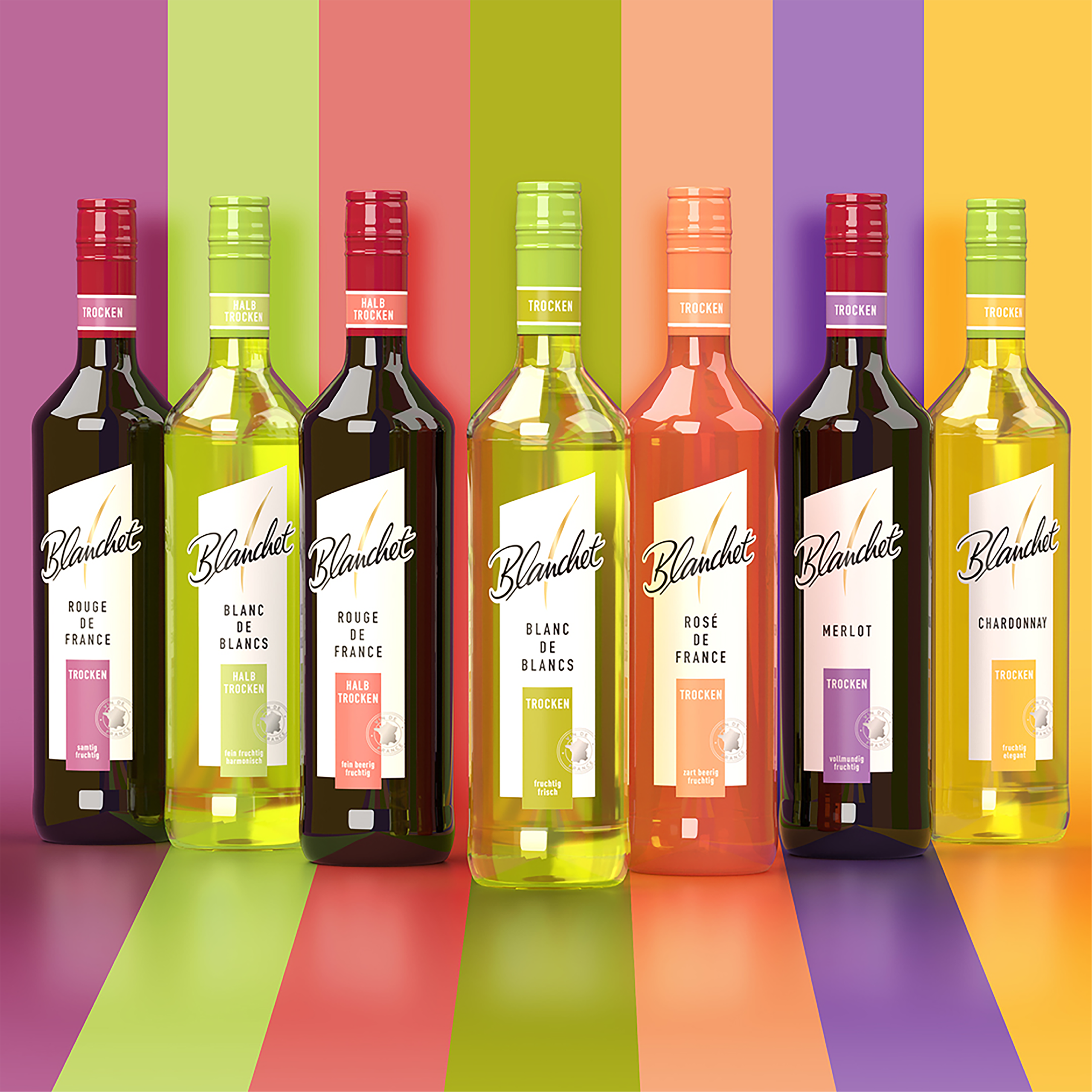
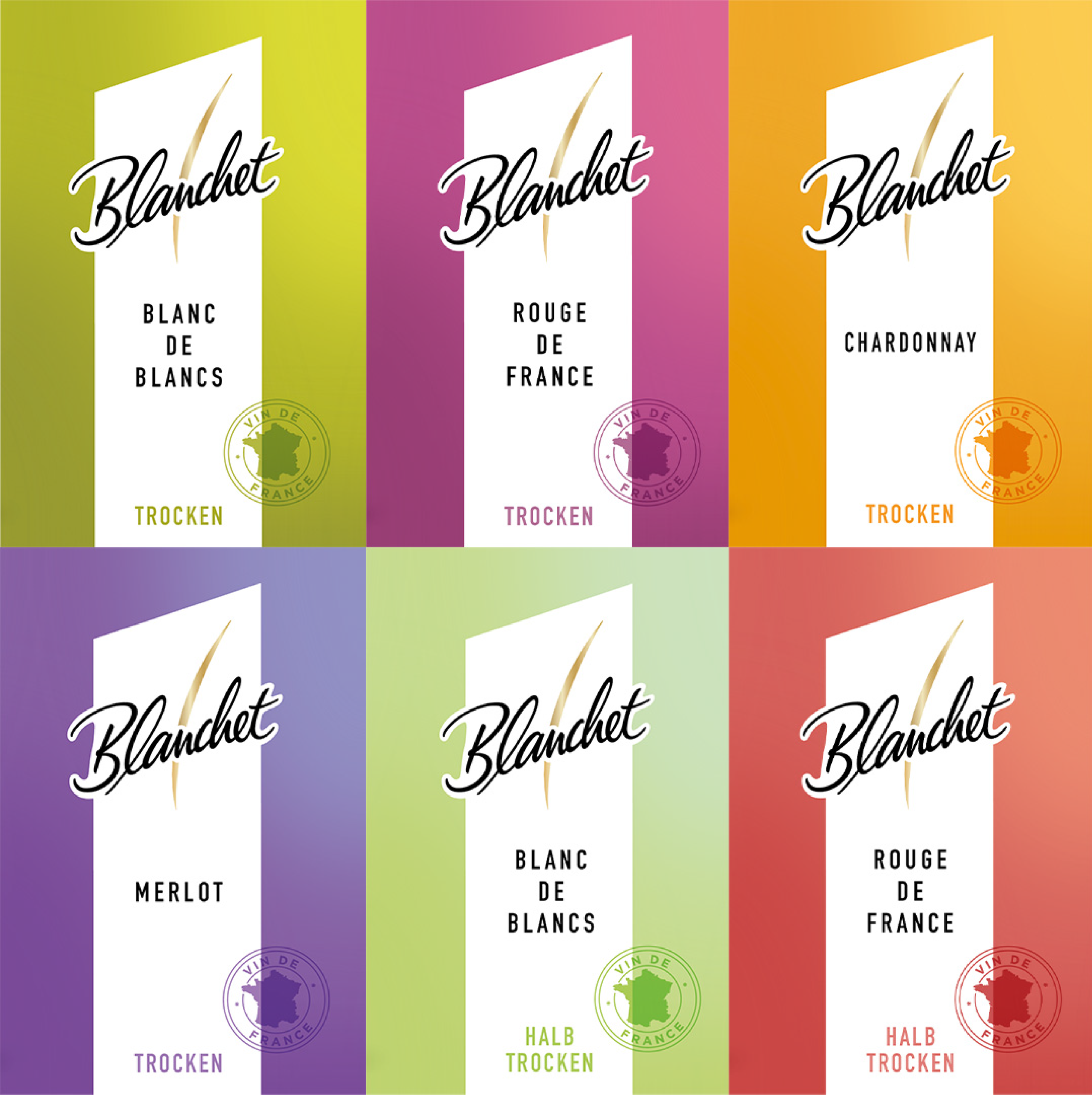
Consistent range design for Blanchet from JUSTBLUE
Label Design and Choice Of Material: First Impressions Count
The label is a product’s calling card – it not only “names the child,” so to speak, but also gives it a face and conveys all relevant product information. In label design, the focus is always on the connection to the actual product. An attention-grabbing design – which may well be minimalistic – ensures high recognizability and sparks customer interest. The choice of material is also of importance in label design. Factors such as paper choice and texture play a significant role here. JUSTBLUE stands for the perfect interplay between aesthetic product design – in this case, the bottle design – and purchase-incentivizing label design: two factors that, together, create a product that stands as a steadfast presence in its market segment.
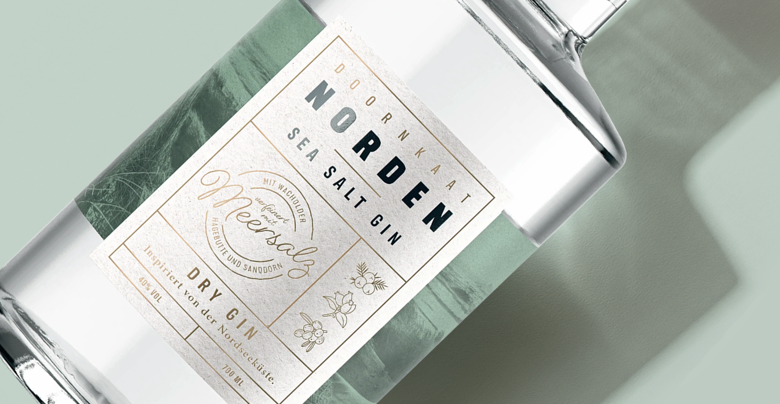
Choice of materials and authentic details support the premium positioning of Norden Dry Gin.
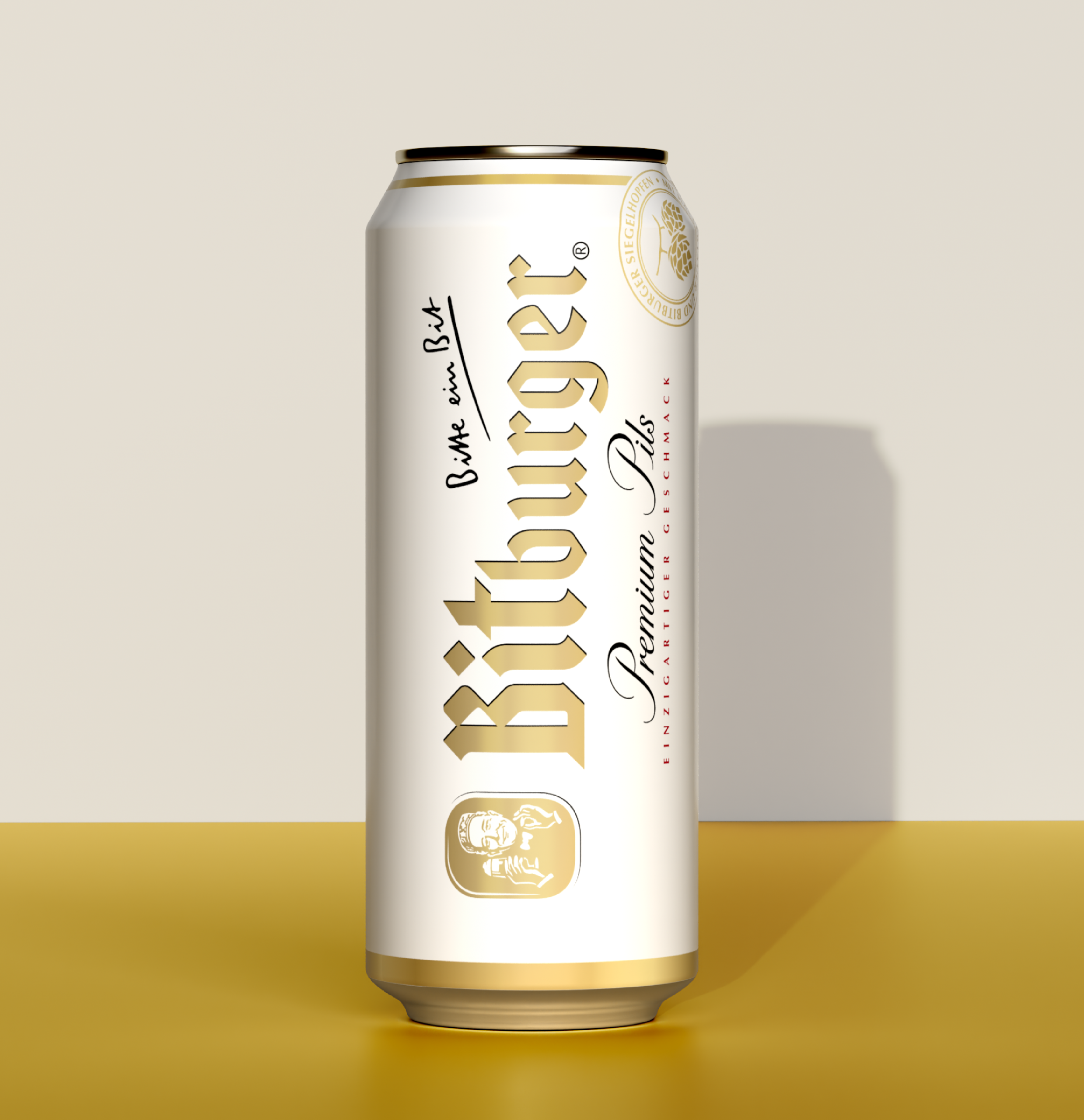
Beer Bottle Design: The Barrel Shape as Inspiration
Bitburger is the most consumed draft beer in Germany. This fact inspired us, during the brand relaunch, to use the barrel shape as the fundamental design form. We applied the barrel shape consistently across the entire product portfolio, creating a brand-defining effect without overwhelming loyal customers.
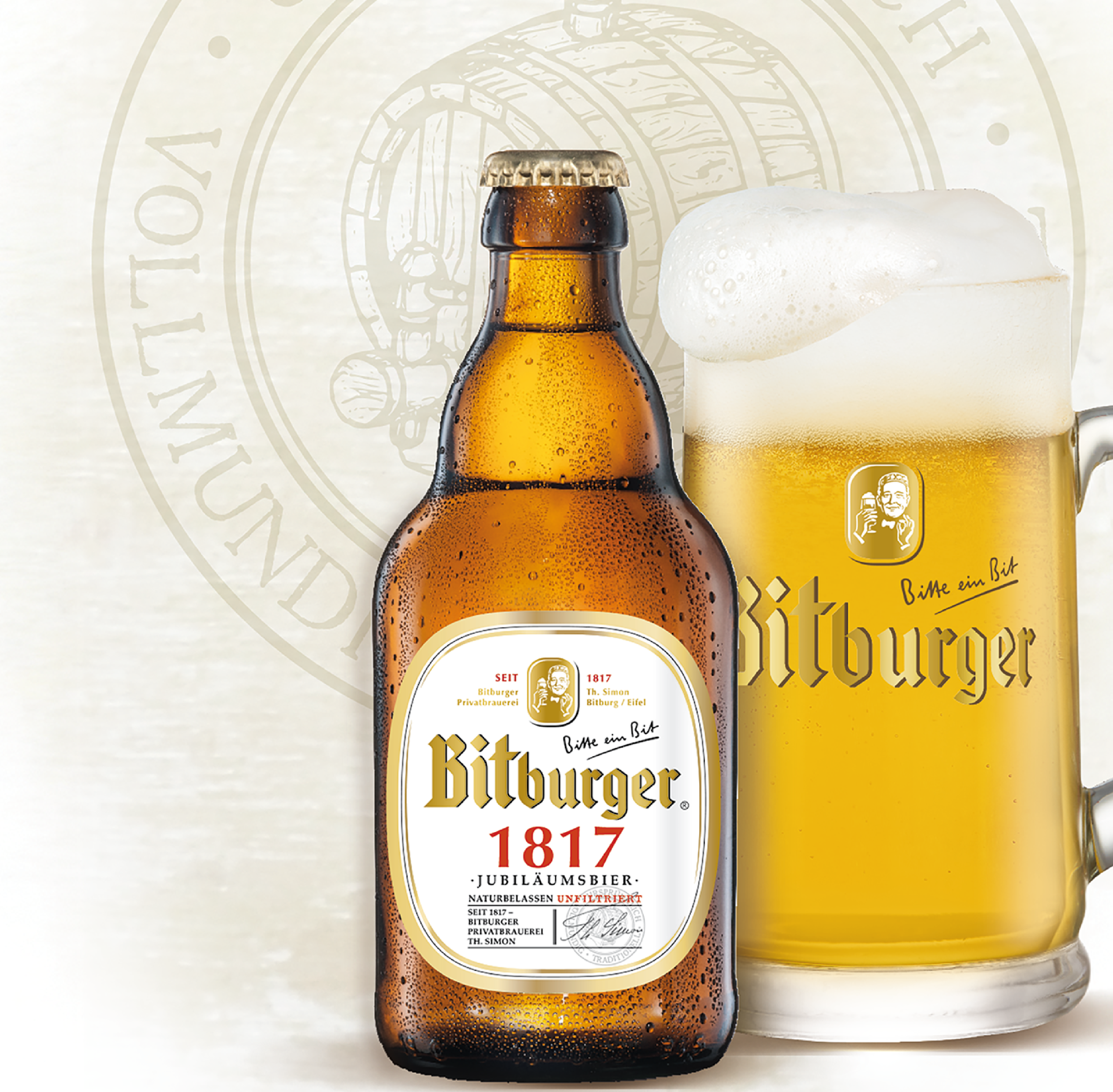
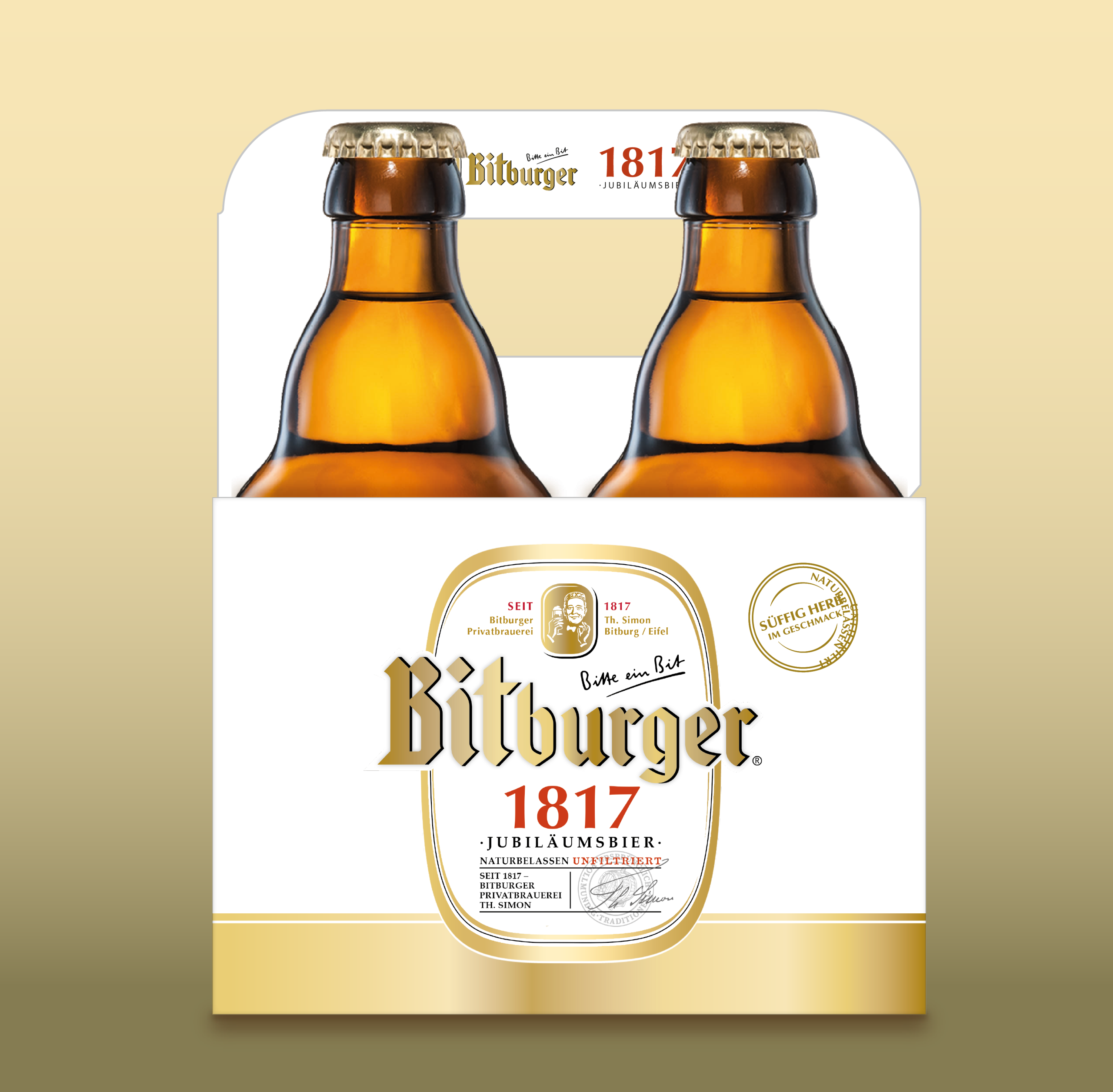
Our “4-Bottle Master” supports the Bitburger 1817 concept with strong authenticity: clearly differentiated from the classic six-pack and exuding a premium feel, the reduced bottle count alone underscores the special positioning of the edition – while at the same time consistently continuing the “barrel shape” design concept.
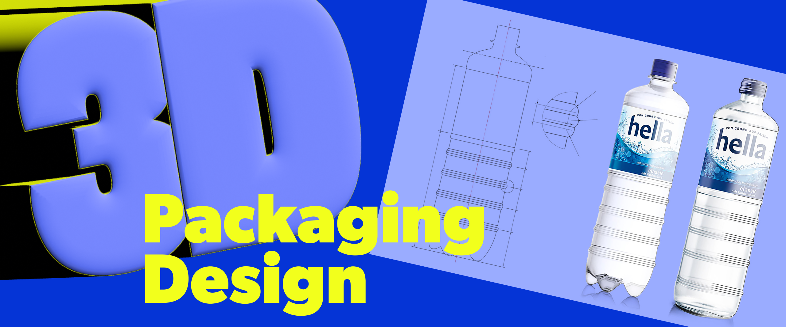
Bottle Design for Hella – Fresh from the Ground Up!
Hella is an established mineral water brand that we have been supporting in the field of beverage packaging design for many years. Under its broad brand umbrella, Hella brings together not only classic mineral water but also product categories such as near water (flavored water), lemonades, fruit juices, spritzers, energy drinks, and limited editions. Despite this diversity, the visual identity remains consistent – with each category given enough space to develop its own individuality in bottle design. We place particular emphasis on design attributes such as freshness and appetite appeal – the visual attractiveness that creates a desire for the product. Especially in the mineral water and fruit juice segments, this emotional approach is essential for attracting attention at the point of sale and positively influencing the purchase decision.
The long-standing partnership with hella is characterized by mutual trust, creativity, and a shared joy in continuous development.
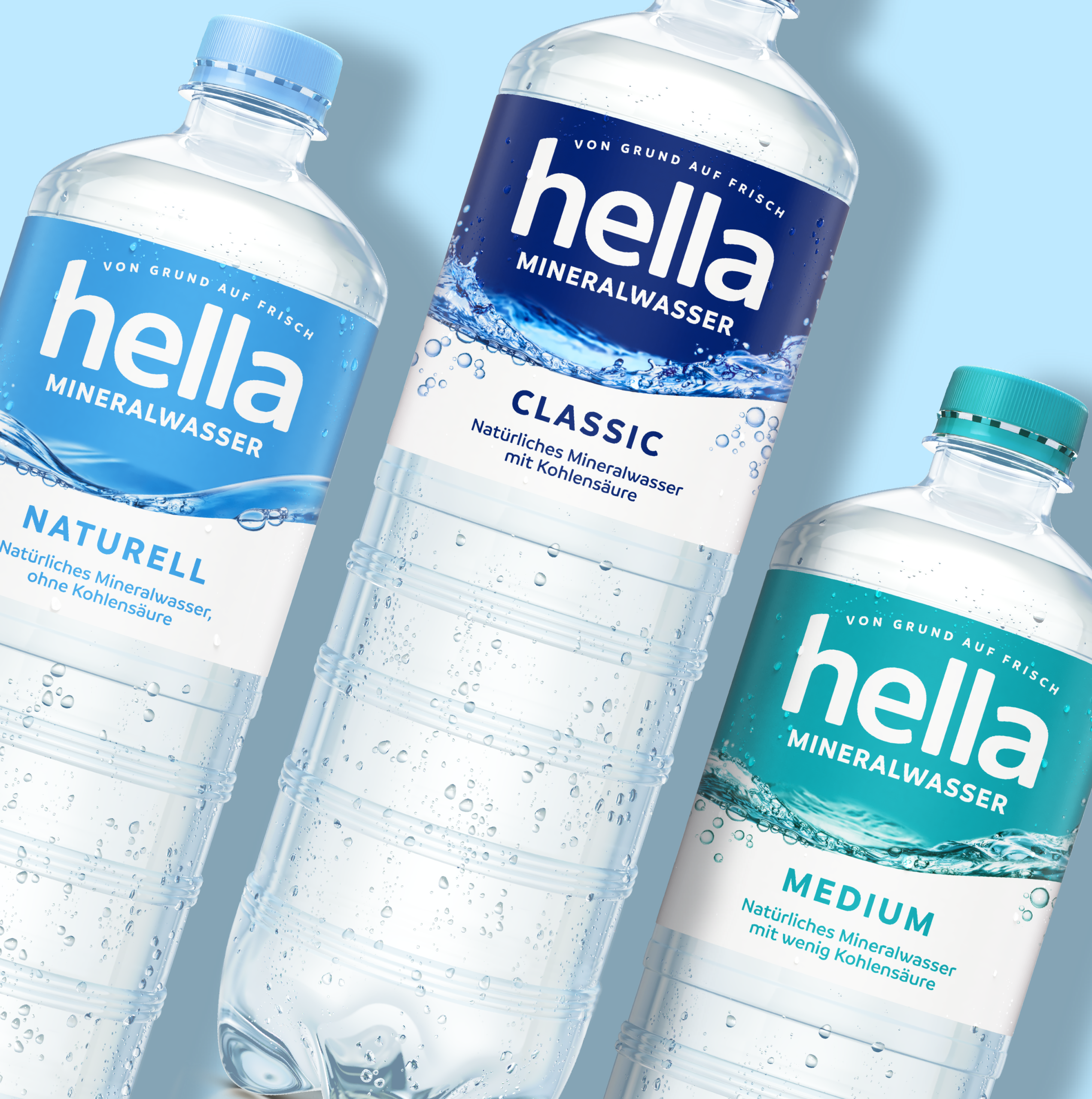
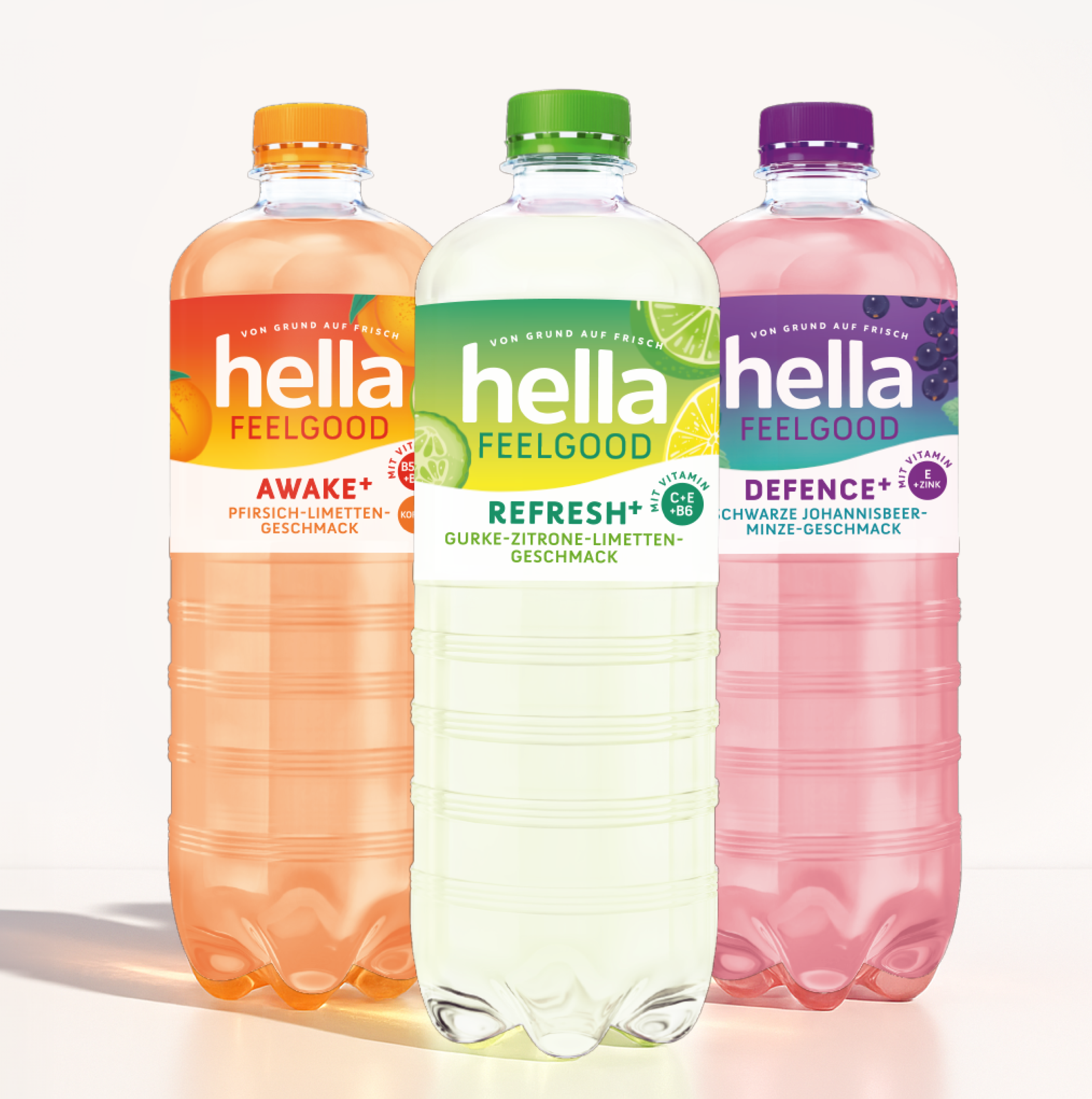
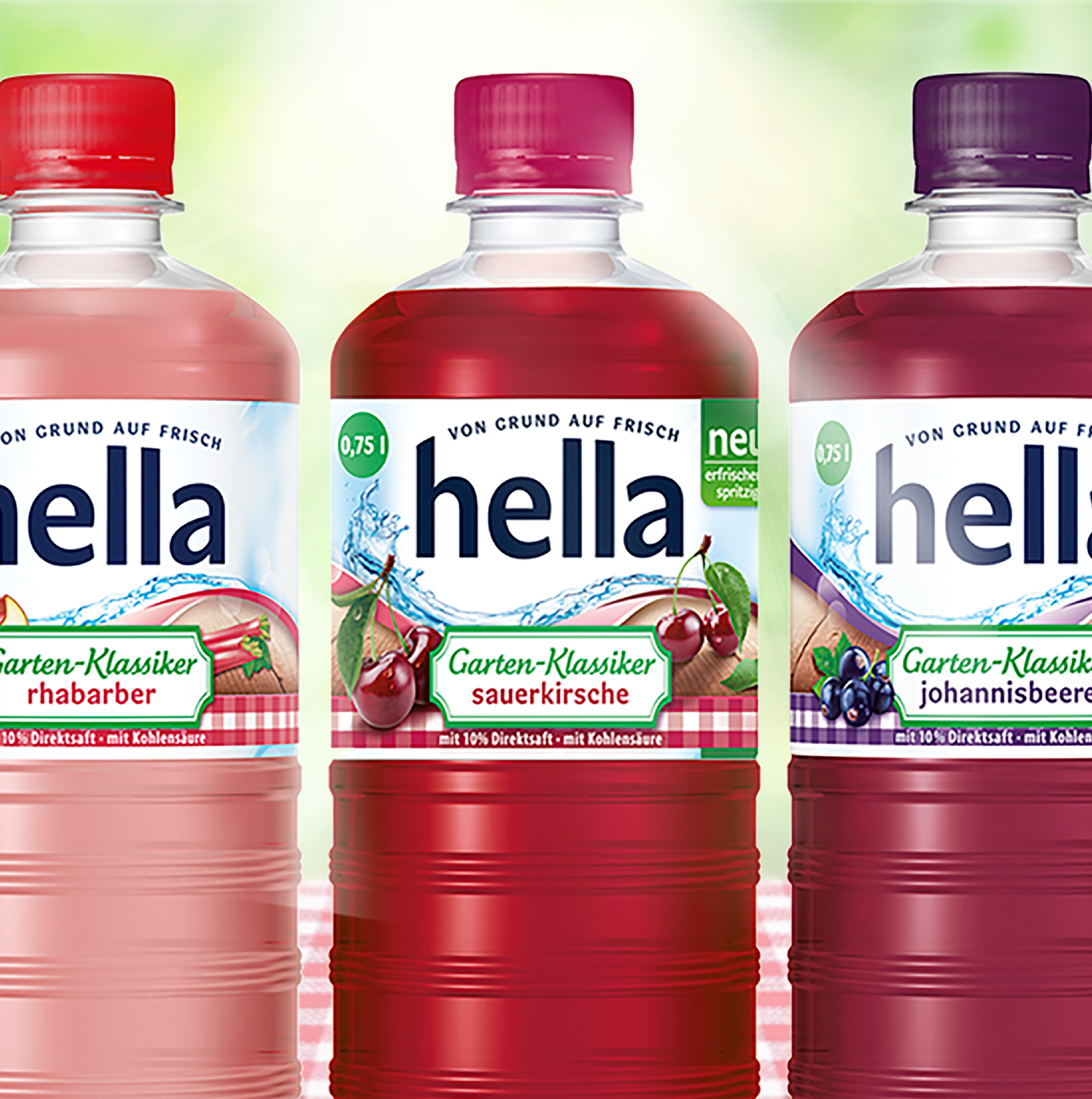
Hella has a strong design concept that can be clearly and appropriately interpreted across a wide range of subcategories – without ever losing its origin.
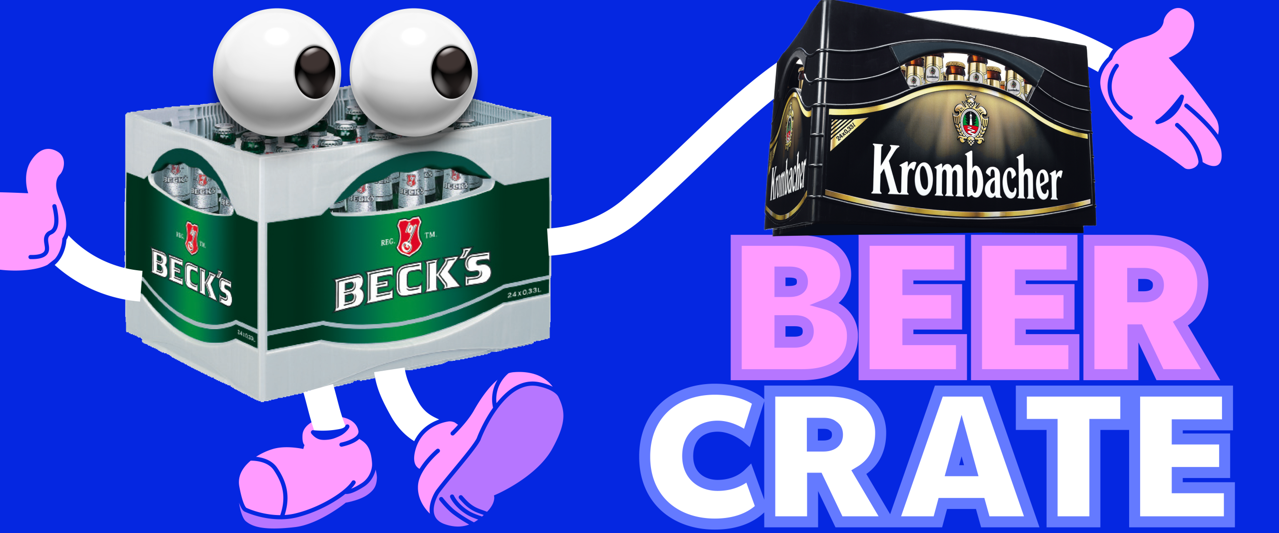
Innovative Packaging Ideas in a Traditionally Conservative Segment
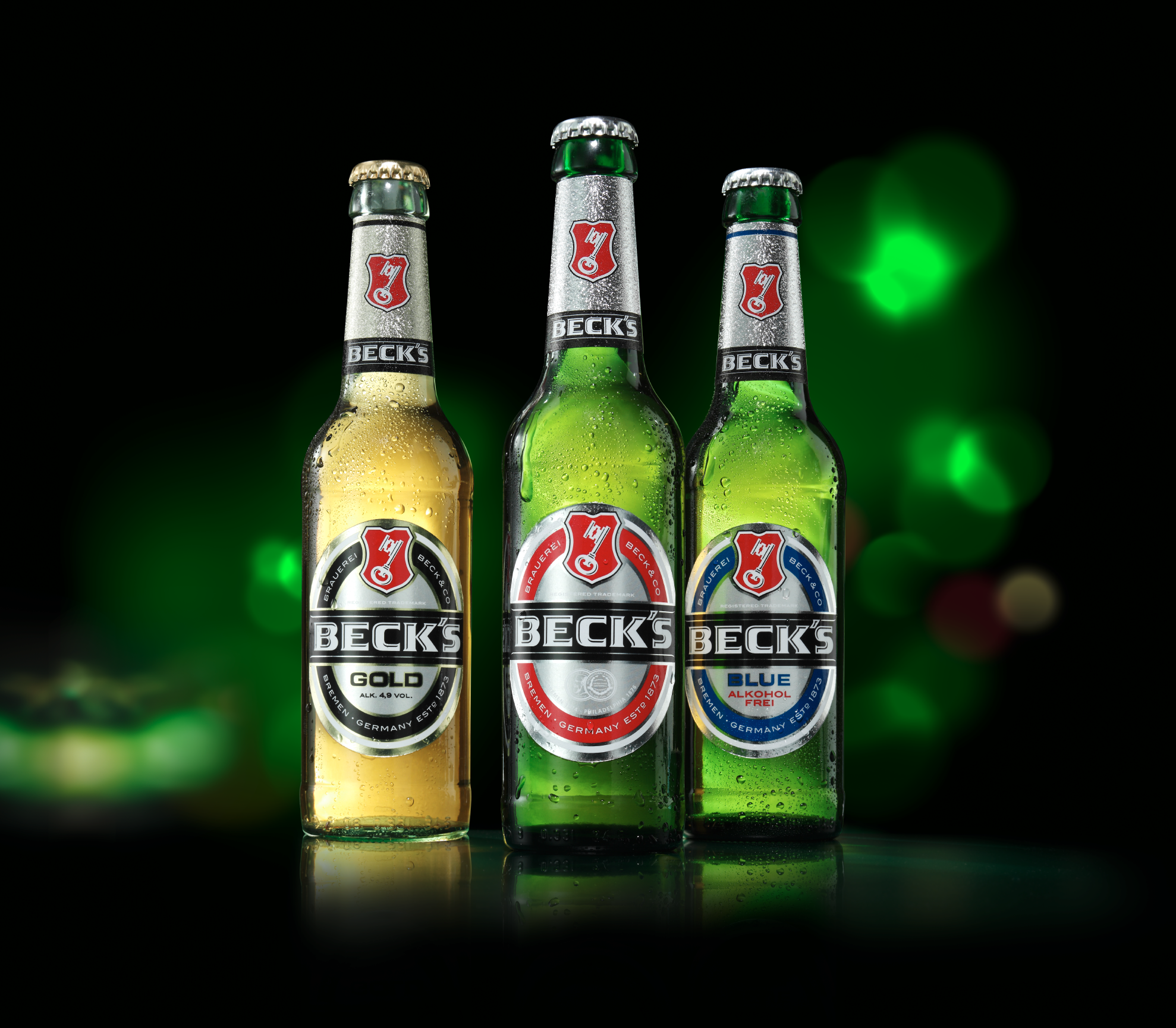
Since 1998, we have been working for the global brand Beck’s. After designing the still-current and iconic beer crate and introducing Germany’s first mild beer (Beck’s Gold), we have carried out numerous other bottle design projects for the brand. In addition to frequently changing seasonal classics and limited editions, we also focus on developing innovative products in the field of beverage packaging design. The Beck’s Cool Pack is one result of these efforts. We have also been commissioned by many other beer brands, such as Hasseröder and Bitburger, to handle numerous relaunches and line extensions. With this wealth of experience, JUSTBLUE is among the leading packaging design agencies in the “beer” and “beverages” segment.
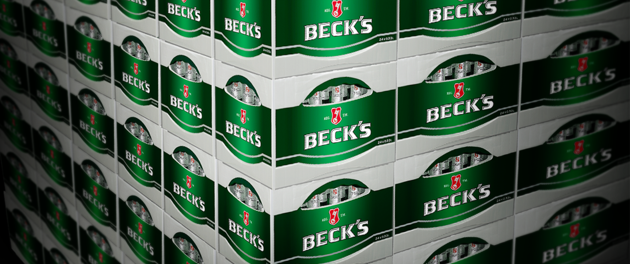
With the innovative beer crate for Beck’s, a client relationship began for JUSTBLUE in 1998 that continues to this day: we created nothing less than a new benchmark in this field – and have since designed more than 30 beverage crates.
Bottle Design for High-Proof Spirits
In the field of spirits packaging, we design both the custom 3D bottle shape and the premium bottle finish comprising label design, choice of materials, and refinement techniques. Since spirits typically achieve a higher selling price than, for example, beer or mineral water, the budget allows for the use of especially high-quality materials, elaborate printing processes, and exclusive surface finishes. This opens up extensive creative possibilities in bottle design for spirits – from distinctive, character-rich shapes to luxurious brand staging that makes an impact both on the shelf and at the bar.
Last, but not least: Bar and Restaurant Equipment
Our beverage and bottle design portfolio is rounded off by the design of hospitality equipment. Our work here ranges from smaller items such as beer mats or drip covers to trays, parasols, and exterior lighting and extends all the way to a serving trailer or the branding of a truck.
Food Packaging Design: Successful Brand Staging for Groceries
After decades in which visual habits in food packaging design seemed almost set in stone, the sustainability mega-trend has, in recent years, made its mark both conceptually and visually through elements of naturalness and a handmade look. This movement has become so strong and clear that the topic of brand uniqueness is now, in parallel, once again gaining greater consideration.
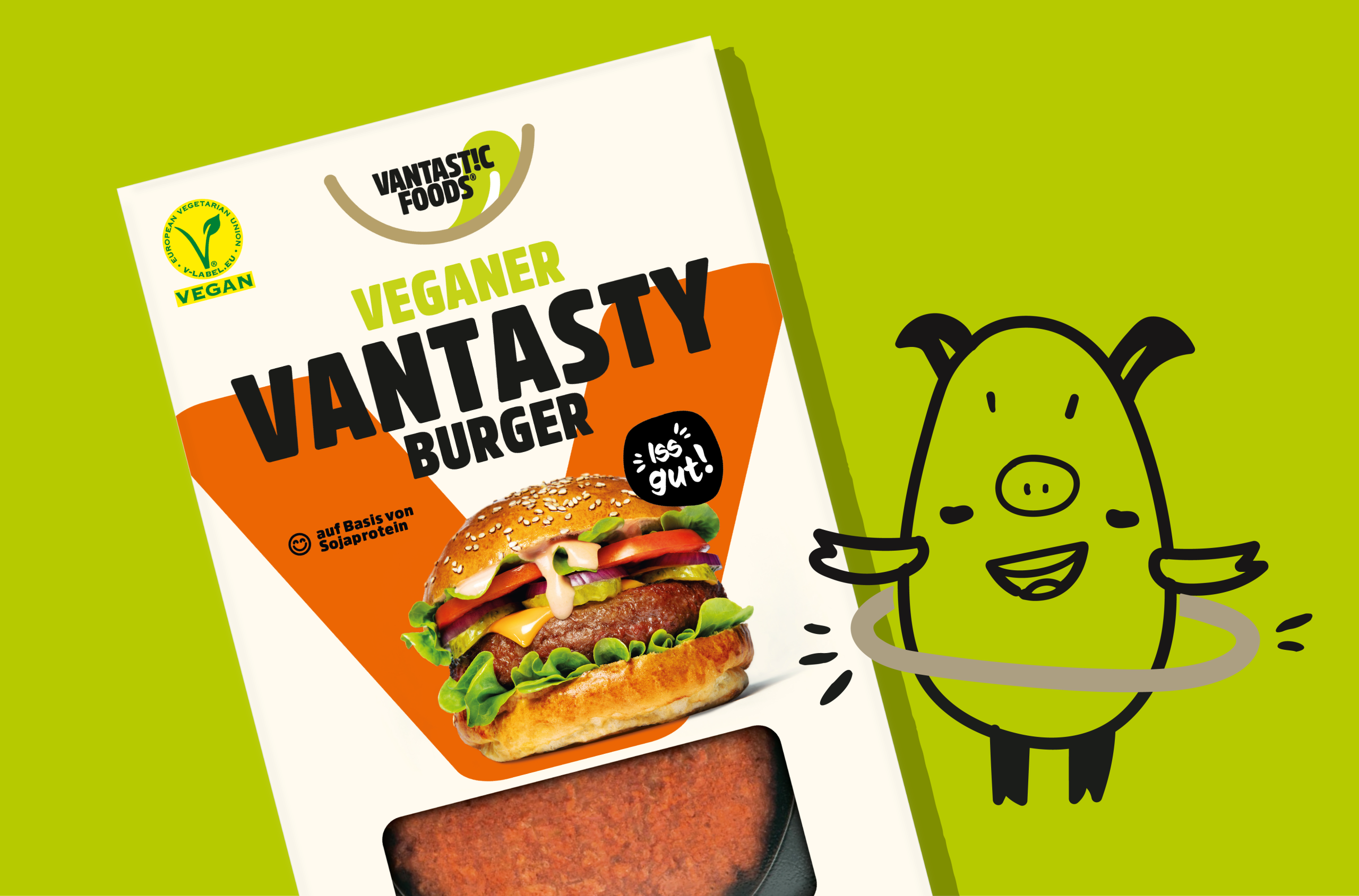
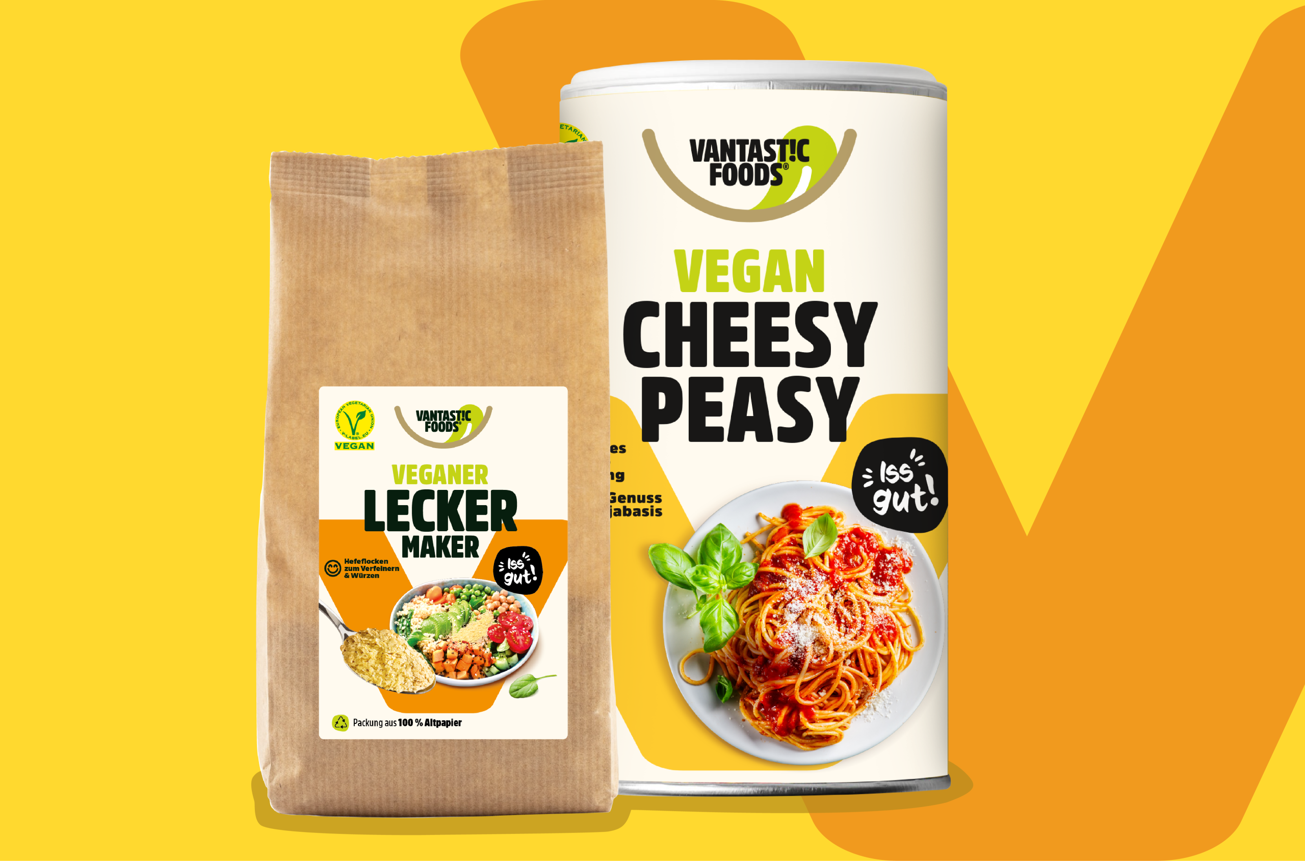
Our design for VANTASTIC FOODS is a good example of this: plenty of ownable uniqueness, modernity, and, at the same time, respect for category-specific visual habits.
Appetite Appeal: The Most Important Factor in Food Packaging Design
In no other field do category-specific visual habits play such a strong role in overall design as in food packaging. The roots of this development lie in the growing realization, over many years, that the so-called appetite appeal has an especially strong influence on purchasing decisions. Products from different competitors rarely offer a product advantage that is relevant and tangible for the consumer.
The competition among various brands – and increasingly also among private labels – therefore often focuses on depicting the most enticing and seductive dishes or foods in packaging design. For designers, stylists, photographers, image editors, and lithographers, this presents the special task of making food packaging design as attractive as possible for the consumer.
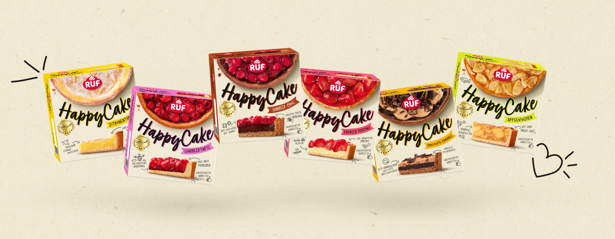
Our packaging for RUF Happy Cakes delivers perfect temptation through maximum appetite appeal.
Brand Staging in Food Packaging Design
In addition to perfect product imagery with high appetite appeal in food packaging design, brand staging is crucial. The more comparable the pure product offering, the more important the part of food packaging design that focuses on the brand becomes. The most effective impact comes from a clear yet unique – in other words, unmistakable – brand logo. Furthermore, a distraction-free and high-impact execution in food packaging design is essential for a logo’s radiance. Otherwise, it will be perceived as too insignificant in context and will fail to communicate the associated brand values. The intended link from traditional advertising to the point of sale (POS) would fail. Traditional advertising is the appropriate marketing tool for charging a brand with associations and values. Food packaging design should then carry these values forward rather than contradict them. Due to reduced budgets for traditional communication, many brands have lost strength in recent years and no longer function as the (sole) decision-making criterion.
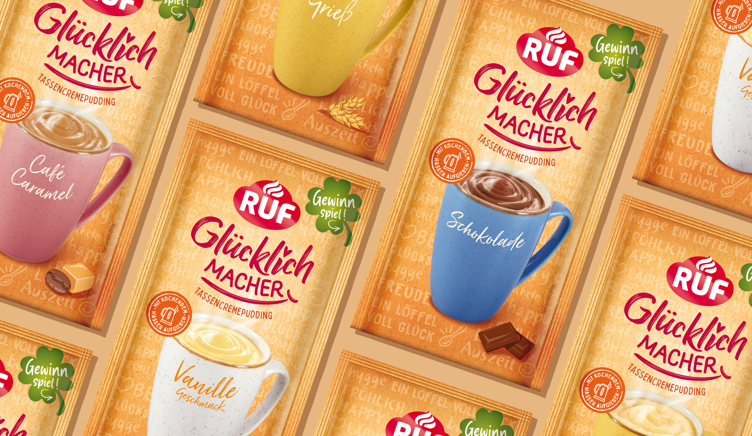
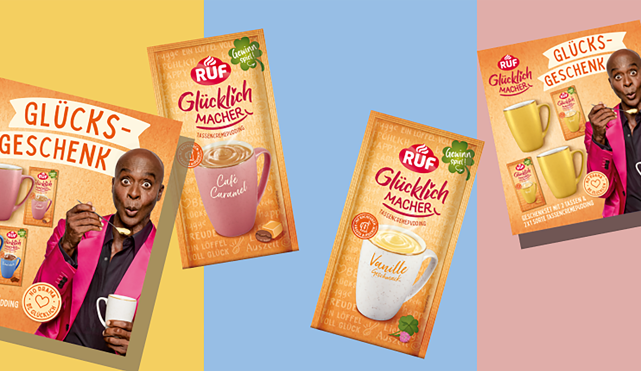
The new RUF brand design by JUSTBLUE provides the perfect foundation for all of RUF’s social media activities.
Strong Design Ideas Create Differentiation on the Shelf
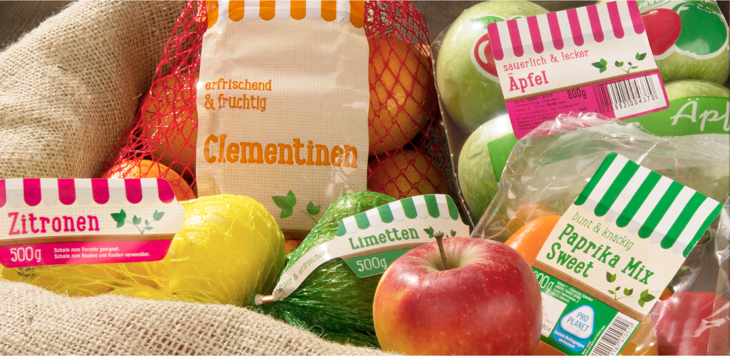
Successful brands have recognized that a strong, distinctive, and modern design concept provides additional differentiation at the POS. Such a concept stands out by setting a brand apart from its competitors – beyond the logo – even when product imagery is similar. It strengthens block formation, and product variety differentiation can be made clearer without jeopardizing the cohesive brand image. The food packaging design of Penny’s fruit and vegetable products can be cited here as a successful example.
Influences from the UK in Food Packaging
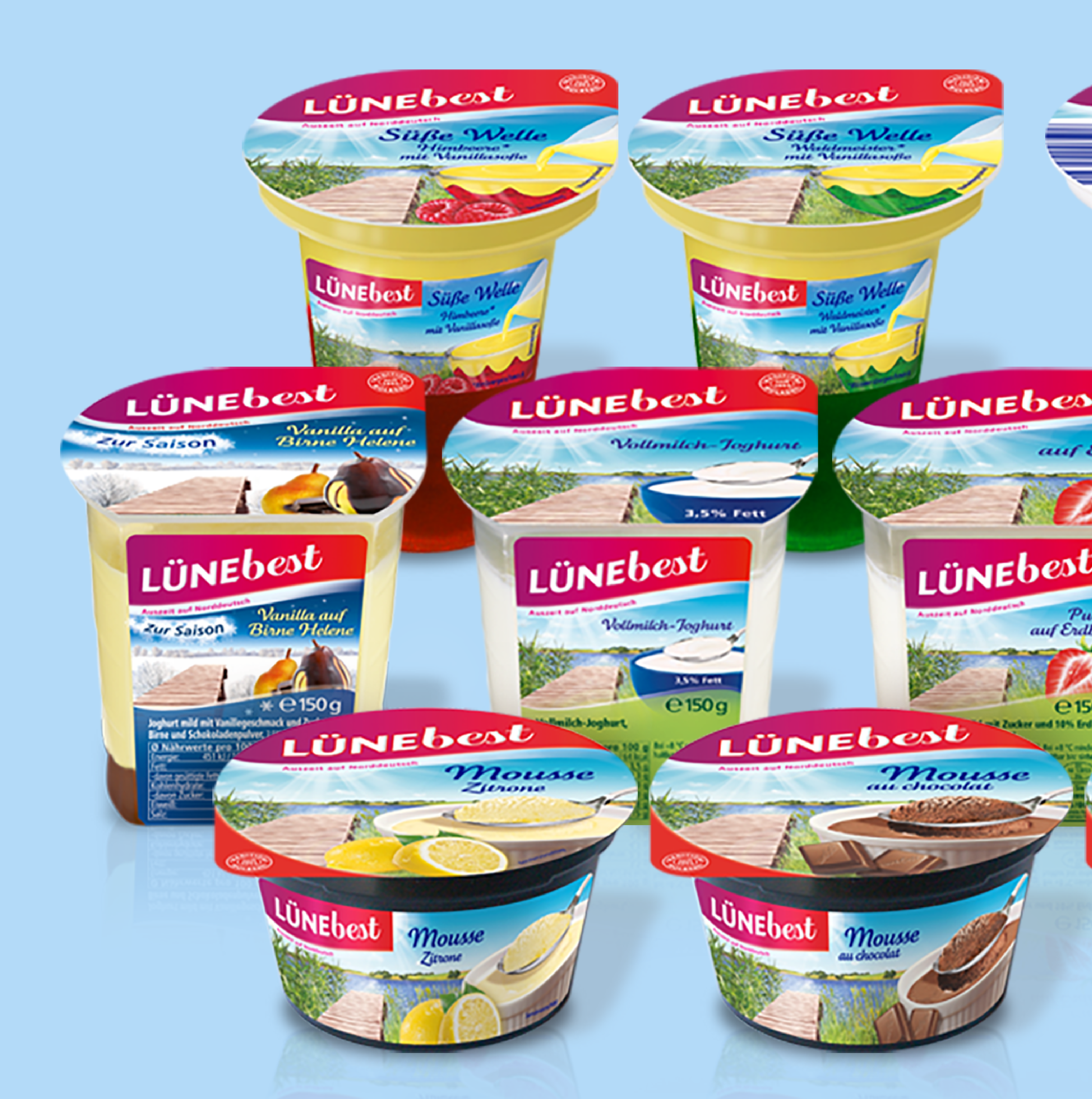
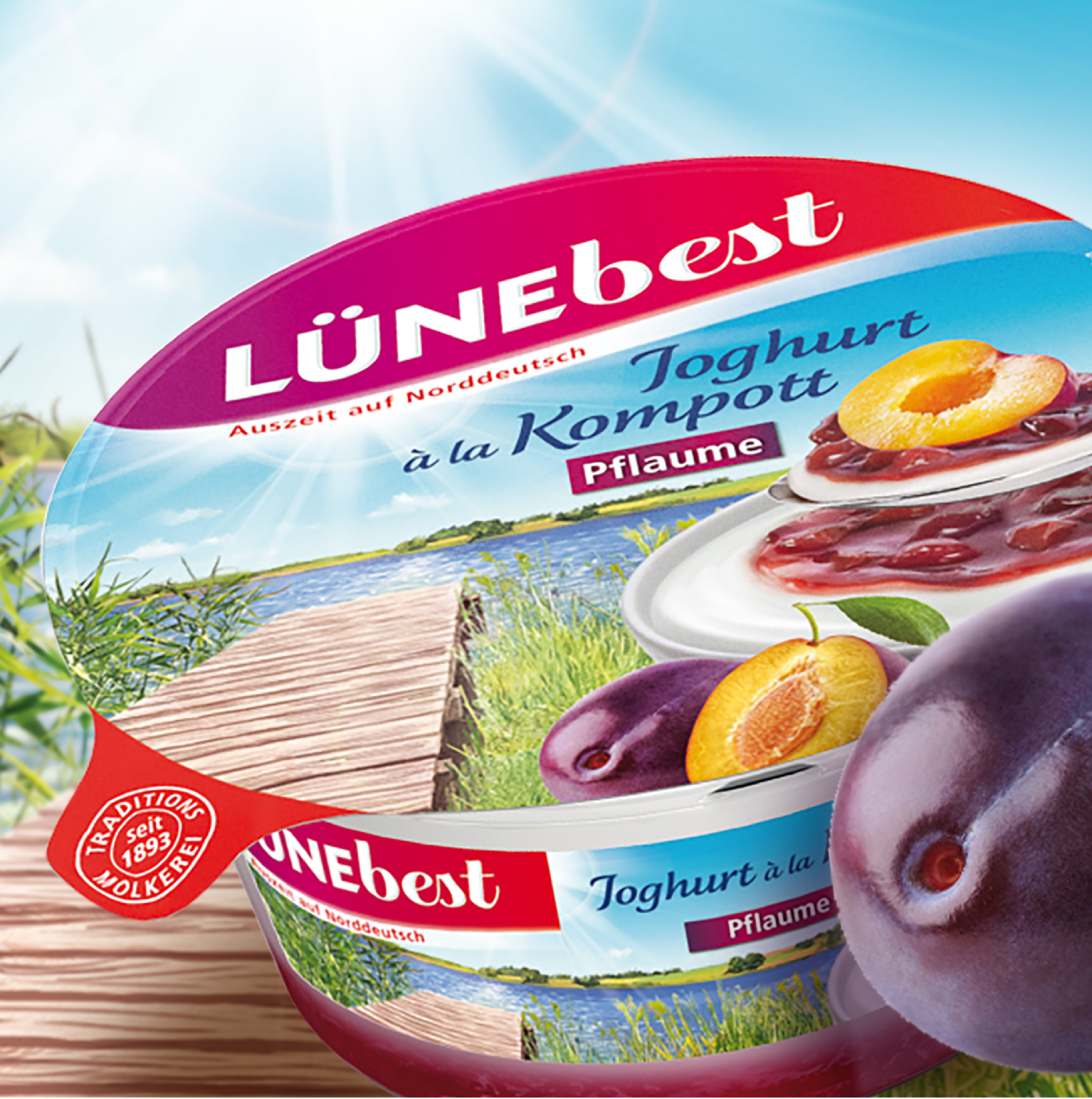
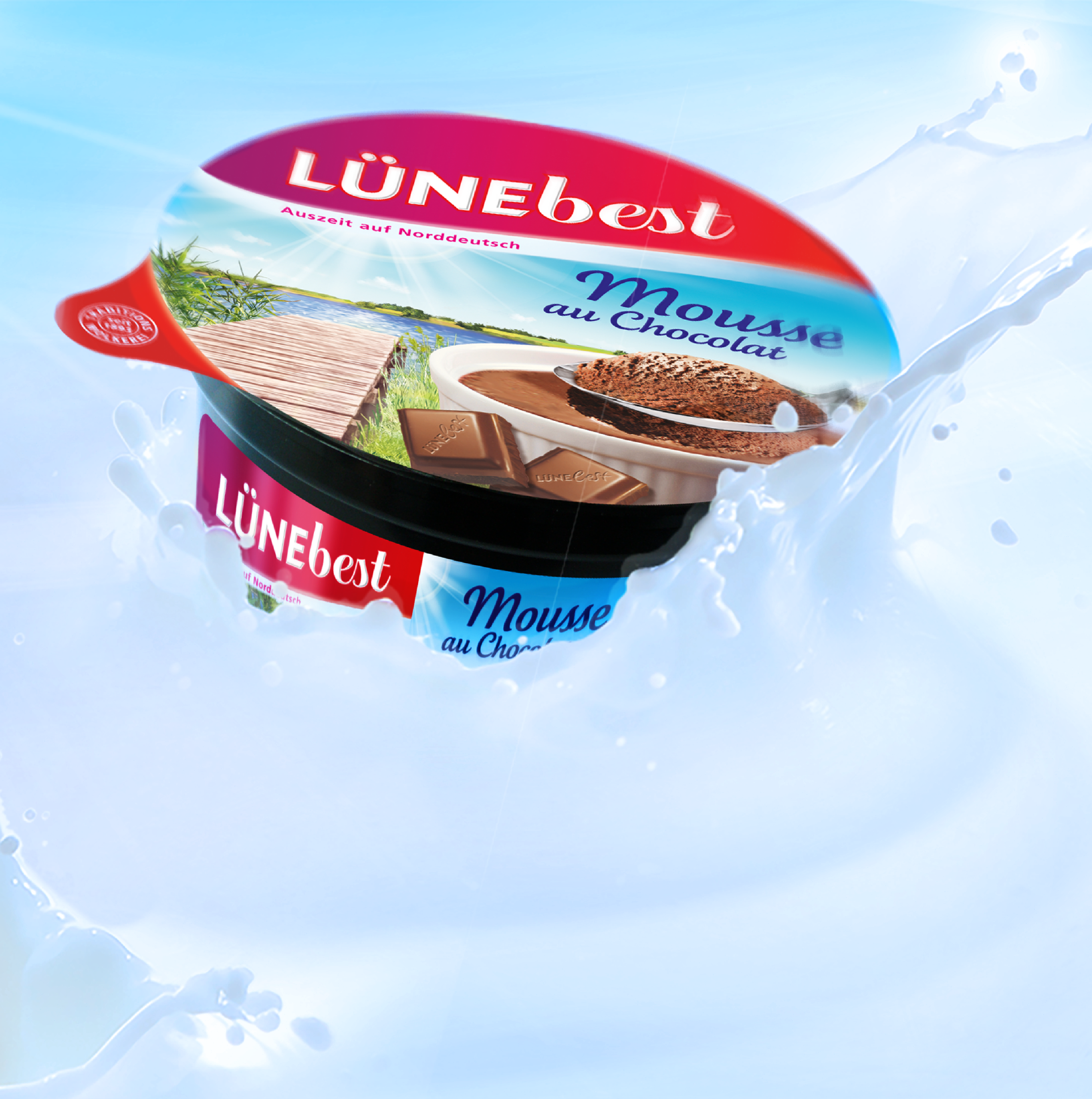
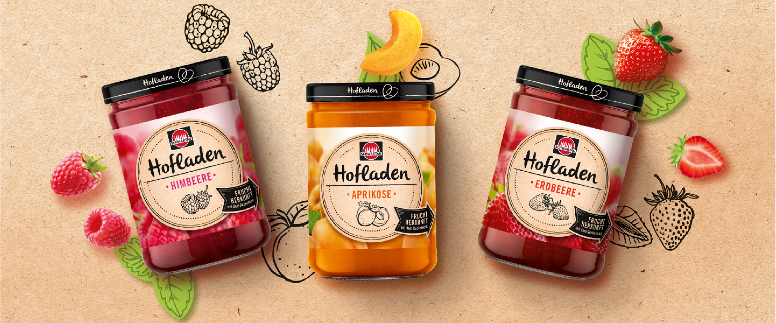
For years, design trends from the UK have been bringing movement to the visual landscape of German store shelves. Interestingly, private labels in the UK have developed a particularly strong design culture, even in the field of food packaging design. The style is characterized by strong contrasts – often in black and white – as well as a high degree of reduction, which, however, does not feel unfinished but rather very premium and modern. In some cases, British brands – and thus their food packaging design – appear in Germany as imported premium specialties. However, their influence is also noticeable in recent relaunches in the German market. It should be noted, though, that private labels have also adopted this style for their premium positioning. Particularly in the field of packaging design for jams and preserves, or in the refrigerated section (for example, with yogurt), a skillful balance of high appetite appeal and effective product variety differentiation is required. Our food packaging designs for Schwartau and Lünebest are examples of successful and effective implementations.
Conclusion: Successful Packaging Design for Food and Beverage Brands
Whether in the refrigerated section, the beverage store, or at the supermarket POS – packaging design for food and beverages today is far more than just a shell. It is a brand ambassador, a purchase incentive, and a differentiating feature all at once. In a highly competitive market, high appetite appeal, compelling product staging, and a clear product range structure determine market success. JUSTBLUE combines strategic expertise with design excellence – from iconic bottle designs for beer and water brands to modern food packaging with strong brand impact. Our many years of experience in food and beverage packaging design make us a reliable partner for anyone looking to give their products an unmistakable face.