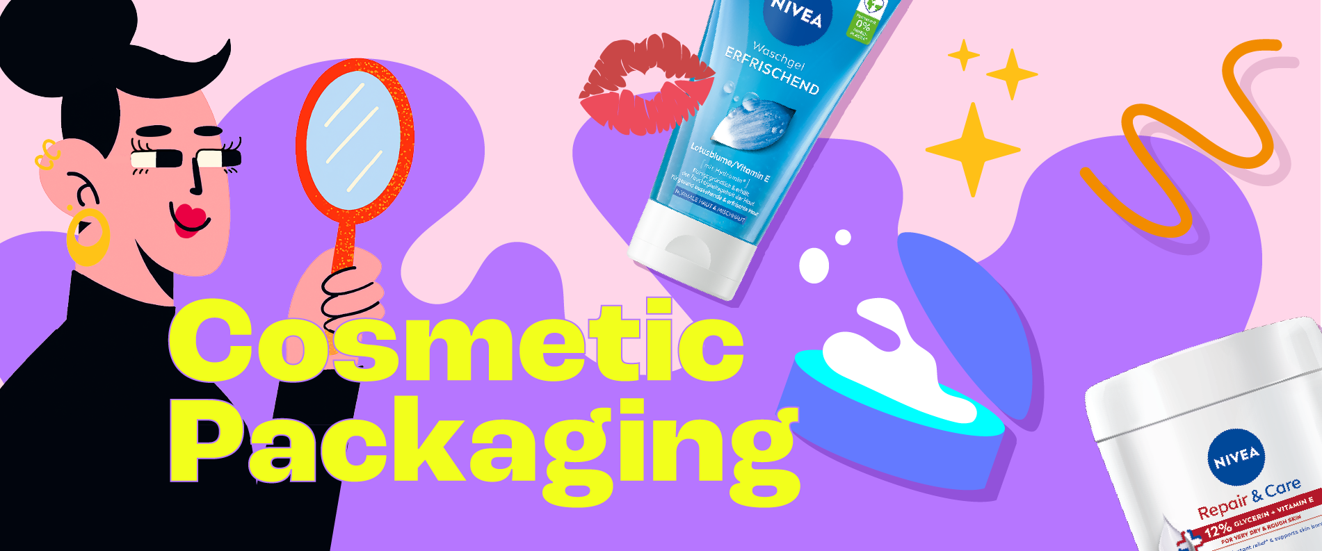
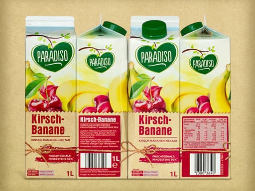
Penny Paradiso Relaunch

Makes Your Mouth Water!
We developed a new packaging design for the entire juice range of the discount retailer Penny. The new “Paradiso” logo, the emotional brand umbrella created through light and shadow, as well as large fruit and vegetable imagery in rich, natural arrangements, enhance appetite appeal and establish a clear design architecture.
Range Differentiation
The differentiation between varieties is achieved not only through appetizing visuals of the fruit and vegetable types, but also via individualized background design for each category. This background creates a stage for the product information while reinforcing the natural positioning.
Additionally, a unique, food-style typography for each flavor signals its belonging within the juice range.
The New Paradiso Logo
As part of the design development, the Paradiso logo was completely redesigned. By focusing on naturalness and authenticity in its current handmade character, the logo conveys a strong emotional appeal combined with a high-quality appearance.
The natural effect of the Paradiso logo is further emphasized by an emotional brand umbrella composed of light and landscape elements.