Schwartau Fruttissima Relaunch

New Packaging Design for the Jam
We gave the brand Fruttissima – the fresh jam from Schwartau – a facelift. This jam brand presents unique demands for packaging design because it is not found alongside other marmalades or jams, but exclusively in the chilled aisle. For this reason, it was important to strengthen both the positioning and recognizability of Schwartau Fruttissima as a jam. The product concept also needed to be communicated even more clearly – all while maintaining brand recognition.
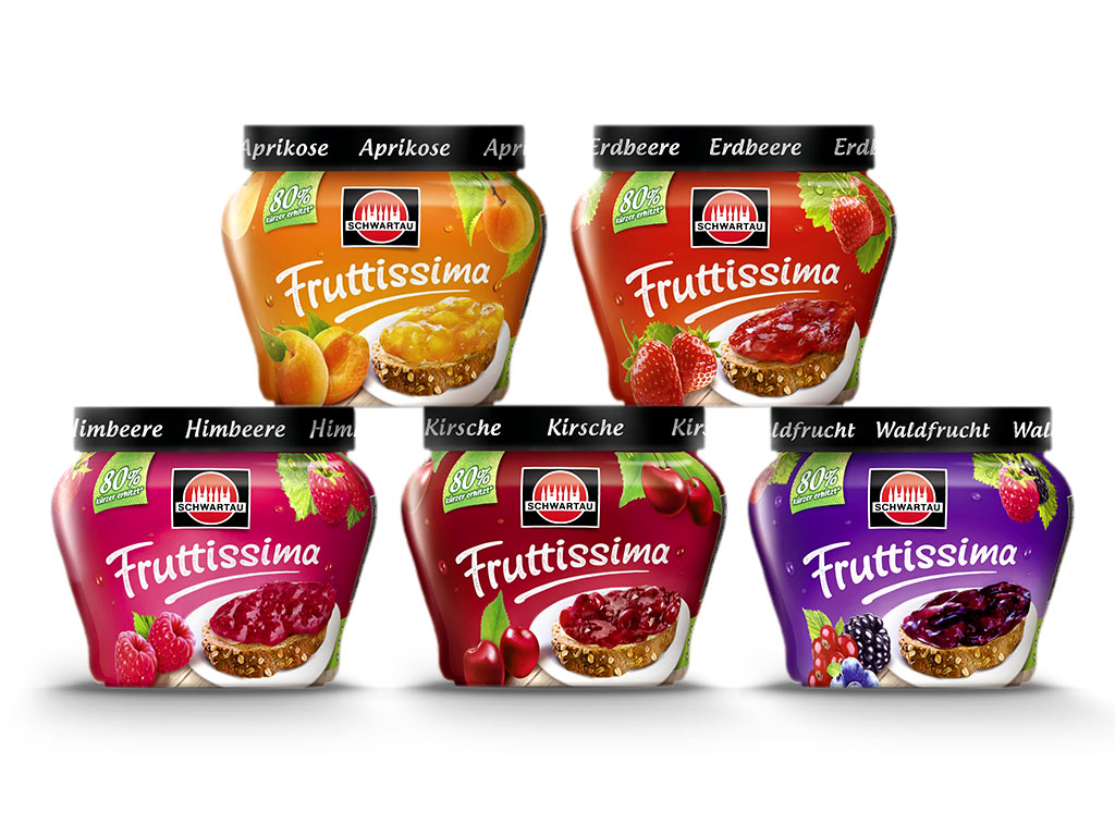
Schwartau first developed a new jar shape, whose classic marmalade design language aligns much better with familiar 3D codes. To further strengthen recognition of Fruttissima as jam through the sleeve design, we arranged the previously “floating fruit” lying on a plate. Additional key ingredients appear below the lid, as though still hanging naturally from their branches.
A green disruptor supports the concept and contributes to a more natural impression. Our newly integrated bread element and wooden background also add to a more modern and wholesome tonality in the new packaging design. To highlight freshness, we incorporated a light dew effect into the composition. The revised Fruttissima wordmark now feels more natural and harmoniously blends into the overall layout with a fresh dynamic.
How well the new design was received is shown by our client’s feedback:

Schwartau Launch – Fruit with Nuts: Fruity & Crunchy
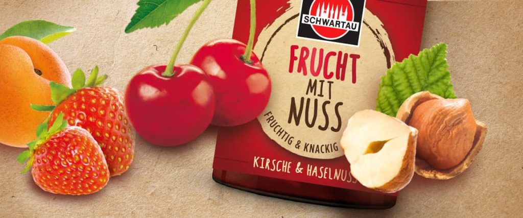
A new product innovation from Schwartau: Fruit with Nuts. The first fruit spread with bite, combining jam with crunchy hazelnut pieces.
The label design carries a deliberately masculine note to visually express the hearty concept of the jam. It uses deliberate edges and angles along with a nutty beige color scheme. However, the product is clearly targeted at both men and women, reflected in the handmade-style typography.
Even an emotional packaging design must follow clear rules to succeed in the market.
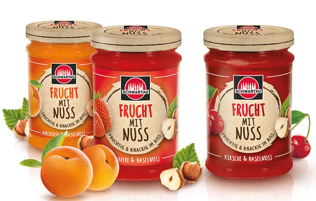
The design architecture for Schwartau Fruit with Nuts is therefore cleanly structured. The label is centrally aligned, with the Schwartau logo prominently placed at the top. Below it sits the product name “Fruit with Nuts,” underlined by the claim “Fruity & Crunchy.” Highly detailed, natural-looking ingredient visuals flank the label on both sides, supporting the concept. In combination with the background color coding and product name, they also help clearly differentiate between the Strawberry, Cherry, and Apricot varieties.
Relaunch “Leichter Genuss”: Indulgence without regret
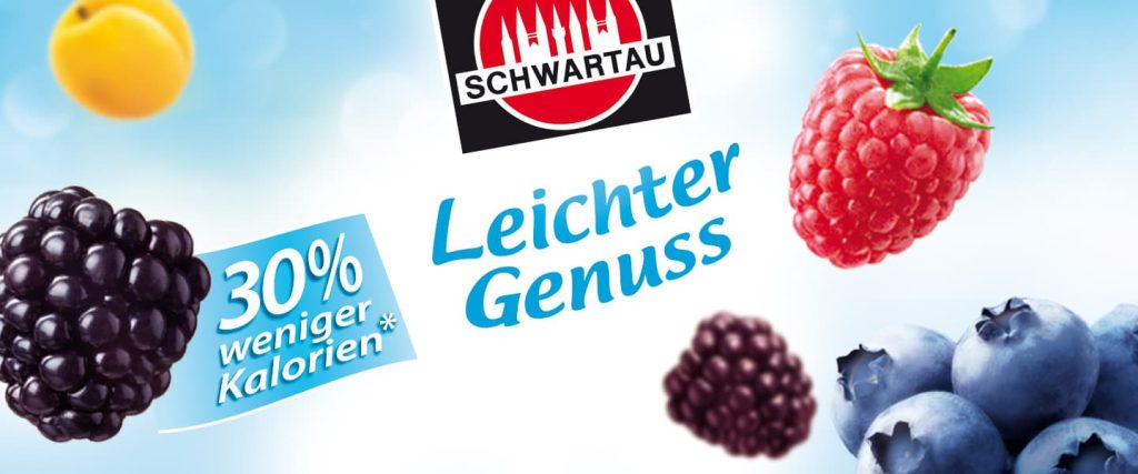
We refreshed the reduced-calorie jam range “Leichter Genuss” (EN: “Light Indulgence). Since reduced-calorie foods are no longer placed in special diet sections and now have to compete directly with regular products, new demands have emerged for packaging design. With a light design optimization, we were able to place clear focus on the concept of lightness for these low-calorie jams.
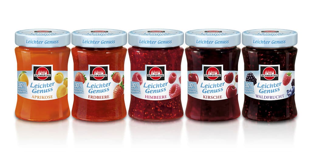
Small changes produced a big impact. The fresh and airy appearance of the range now communicates its product benefit even more clearly. Shelf visibility has also been improved through the consistent design of the label and lid, helping it hold its own against the competition while maintaining brand recognition. Crucial for a successful brand with loyal customers entering a new competitive environment.
Line Extension – Ginger with Lemon: Fruity & Spicy
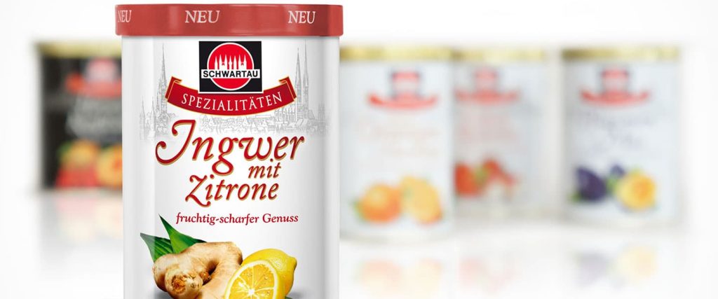
The Schwartau Specialties range stands for jams made from traditional recipes in eight varieties with unique fruit combinations. Its classic tin design with striking fruit arrangements targets so-called Best Agers – older consumers with traditional values and discerning tastes.
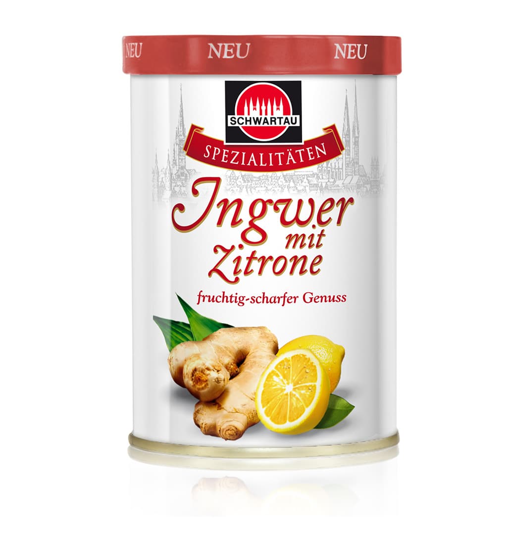
The newest addition, Ginger-Lemon, refreshes the range with a fruity-spicy note. The design of the tin and lid needed to fit seamlessly into the range while also standing out as a newcomer at the POS. The result is a harmonious composition of fruits combined with the classic design elements of the Specialties range. .
Attention is drawn through a red lid, which contrasts clearly with the range’s usual gold closures
Schwartau Packaging Relaunch – From Wellness to Frutivia
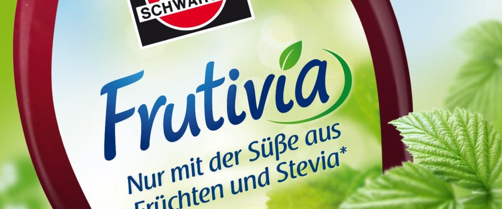
Schwartau’s Wellness line now completely forgoes refined sugar, sweetening its jams exclusively with fruit and – as an industry first – the sweetness of stevia. This move anticipates a growing trend in food production, particularly in the jam sector, shifting away from low-calorie fitness or “light” lines toward naturally sweetened products. Alongside the packaging design relaunch, the product name was changed from Wellness to Frutivia, for which we also designed the logo.
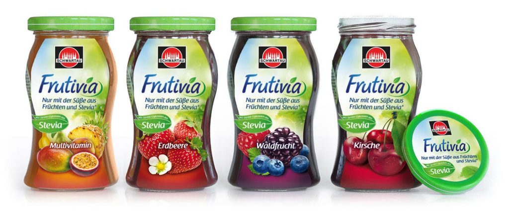
On the market, this product benefit is primarily communicated through its packaging. We designed the lid and jar label in a natural green with a more minimal background. An information panel placed between the front and back labels gives consumers a brief and clear explanation of the sweetening agent stevia.