What is Prompt Engineering?
“Prompt engineering” refers to the crafting of specific requests or instructions to interact with AI models, such as ChatGPT. The term “prompt” describes the text or command given to an AI model to perform a particular task. This prompt should be designed in such a way that the user receives the results and answers they are aiming for.
Goal of Prompt Engineering: Improving the Performance of AI Models
The main goal of prompt engineering is to improve the interaction between humans and AI. This is achieved by optimizing the way instructions or requests are formulated.

What Are the Goals of Prompt Engineering?
- Precise Results: By skillfully phrasing prompts, it should be ensured that AI models clearly understand what is being asked and provide precise and relevant responses.
- Bias Reduction: The term “bias” refers to unwanted prejudices or distortions in the responses an AI model may give to a particular prompt. These can arise, for example, from linguistic, cultural, or gender-related nuances in the prompts. By consciously phrasing requests, it is possible to try to minimize these unwanted biases in the responses.
- Efficiency and Effectiveness: Prompt engineering makes it possible to increase the efficiency and effectiveness of AI models by aligning them more closely with the needs and expectations of users.
Prompt engineering enhances the performance, adaptability, and ethical responsibility of AI models, enabling AI technologies to be integrated more effectively and responsibly across various fields.
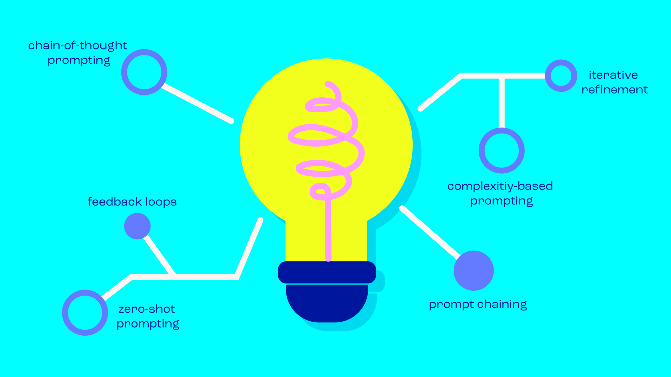
Prompt Engineering Tips: The Key Basics for Writing Effective Prompts
Prompt engineering can be a highly complex topic. Successful prompt engineering requires a deep understanding of how the model works, as well as its strengths and weaknesses. Nevertheless, there are some basic rules that should be followed when creating prompts:
- Precise Wording: Make sure your prompts are clear and precise. This helps avoid misunderstandings and ensures you get exactly the results you want.
- Contextualization: Add sufficient context to your requests so that the AI model can better understand the task. Clear contextual information helps to achieve more accurate answers.
- Iteration and Experimentation: Test different phrasings and experiment with various prompts.
- Avoiding Biases: Be mindful to minimize linguistic and cultural biases in your prompts. Phrase instructions as neutrally as possible to reduce prejudice in the responses.
- Task-Specific Prompts: Adapt your prompts to the specific use case. A prompt that works well for text generation may be less suitable for a translation.
- Documentation: Keep a record of the performance of different prompts. This not only improves traceability but also enables better analysis and optimization.
- Community Exchange: Share and discuss with others. Platforms like GitHub and forums can often help improve your prompt strategies.

Prompt Engineering Terms: Prompt Injection, Prompt Takeover & More
You may have already come across terms like prompt injection, prompt takeover, or prompt leak. Here’s what they mean:
- Prompt Injection: In prompt injection, new instructions or responses are inserted into a chatbot’s prompt set. Developers can use prompt injection to extend functionality and tailor the model to specific requirements. The goal is to improve the chatbot’s overall performance or integrate new features.
- Prompt Takeover: When an AI model takes over the conversation and processes requests without human intervention, this is referred to as a prompt takeover. It is often used in situations where predefined processes or frequently asked questions can be handled automatically. A prompt takeover can help reduce wait times and create a seamless user experience.
- Prompt Leak: A prompt leak describes a situation in which an AI bot reveals information that should not be shared with the user. Possible causes include flaws in the system’s design or implementation. Such leaks can compromise the security of user data.
- Reverse Prompt Engineering: Reverse prompt engineering aims to understand how AI models work. It involves analyzing how certain prompts lead the model to produce specific outputs. By experimenting and analyzing, one tries to determine which types of prompts generate the desired or undesired results. The goal is to decipher the model’s logic to better predict how it will respond to different phrasings.
Automated Prompts: The Future of Prompt Engineering?
What does the future of AI models and prompt engineering look like? How relevant will prompt engineering be? Artificial intelligence already plays a significant role in our world today and is expected to become even more important in the near future. Prompt engineering will also continue to evolve. One possible scenario is the automation of prompts: future developments could aim to automate the process of prompt engineering, for example, through advanced algorithms that automatically generate optimized prompts. Machine learning can be used to train models that continuously learn from the performance of various prompts. Based on feedback and results, these models could automatically improve their prompt-generation capabilities – increasing efficiency and making the use of AI models in various applications easier.
And How Does JUSTBLUE Prompt?
At JUSTBLUE, artificial intelligence has long been part of our daily work – not as a replacement for creativity, but as a tool that opens up new possibilities. We see particular potential in prompting: it’s our direct line to the AI and plays a decisive role in shaping the final outcome. Whether for idea generation, text development, or visual concepts, we use prompts deliberately to get to the point faster, structure complex thoughts, or spark new creative directions. It’s not about chance, but about finesse: how you ask determines the result.
Our internal AI core team regularly tests new tools and platforms, shares knowledge within the team, and works with all colleagues to develop a feel for how to use AI in a way that enhances, rather than replaces, our work. Prompting in this context isn’t just a buzzword – it’s real, hands-on practice.
FAQ
Prompt engineering refers to the process of designing or developing effective prompts for AI models such as GPT (Generative Pre-trained Transformer). It involves formulating clear and precise instructions to obtain the desired results from an AI model.
Prompt engineering is crucial for improving the performance of AI models. With precisely formulated instructions, users can control exactly what the model generates. A well-crafted prompt helps minimize unwanted or misleading results.
The consistency of model outputs can be maintained by carefully designing prompts and regularly reviewing the results. It’s also important to gather feedback and adjust the model if necessary.
Who Is Gen Z?
Generation Z, often abbreviated as “Gen Z,” is a demographic group that comes after Generation Y (also known as Millennials). Gen Z generally includes people born in the late 1990s or early 2000s. Members of Generation Z have grown up in a world shaped by technology and social media. They have had access to smartphones, tablets, and the internet from a young age, making them highly skilled in digital communication and technological proficiency.
Key Facts About Gen Z at a Glance
Years of Birth:
Members of Generation Z were generally born between 1995 and 2010.
Grown Up in a Digital World:
Gen Z has grown up in a world shaped by digital technology and the internet. They are therefore often referred to as “Digital Natives.”
Social Awareness:
Generation Z is known for its strong social and environmental awareness. They advocate for social justice, environmental protection, and diversity.
Independence and Personal Fulfillment:
Generation Z often shows a strong drive for freedom and self-fulfillment. Meaningfulness and enjoyment at work hold great importance for this demographic group.
Characteristics and Interests of Generation Z
The most important values and characteristics of Gen Z – this is what defines Generation Z:
Tech-Savvy:
Raised in the digital world, skilled in using digital media.
Environment & Sustainability:
Strong environmental awareness, prefers sustainable consumption and ethical brands.
Multiculturalism and Diversity:
Places great importance on diversity and inclusion.
Activism and Social Engagement:
Advocates for social and political issues such as environmental protection, social justice, and equality.
Self Fulfillment:
Seeks to develop personal interests and talents, pursuing open career paths that align with their own values.
Technology and Social Media
Generation Z is the first to grow up in a digital world. Smartphones, social media, and the internet are an integral part of their lives. They are generally very skilled in using digital media and use them for communication, entertainment, and education.
Environmental Awareness
The generation is known for its strong environmental awareness. It shows an increased interest in sustainable consumption and ethical brands. Members of this demographic group pay attention to the social and ecological impact of their purchases. In recent years, members of Gen Z have actively engaged in climate protection. The “Fridays for Future” movement, initiated by Swedish activist Greta Thunberg, has inspired thousands of young people worldwide to demonstrate for action against climate change and demand political change.
Multiculturalism and Diversity
Gen Z is often more diverse and multicultural than previous generations. They place great importance on diversity and inclusion. Growing up in a globalized world, they have easier access to different cultures and perspectives. As a result, Gen Z highly values diversity and inclusion. They appreciate diversity in terms of ethnicity, gender, sexual orientation, and cultural background, and they advocate for equality and tolerance.
Social Engagement and Activism
Many members of Gen Z are activism-oriented and advocate for social and political issues that matter to them. In addition to environmental protection, they are committed to social justice, equality, and other societal challenges.
Self Fulfillment and Identity Development
Gen Z strives for self-realization and the development of personal interests and talents. They are open to various career paths and life journeys that allow them to pursue their passions and interests, rather than limiting themselves solely to traditional career paths.
Gen Z vs. Gen Y: The Diffrences
The generation before Gen Z is known as Gen Y – or “Millennials.” The birth years of Millennials range from the early 1980s to the mid-1990s.
There are several differences between Gen Z and Millennials in terms of culture, social life, work, and values:
- Gen Z has grown up with technology and has a natural affinity for it. Gen Y, on the other hand, has witnessed technological advancements but did not grow up in an environment as dominated by technology as Gen Z.
- Members of Gen Z also tend to prefer short, visual, and direct communication. Platforms such as Instagram, Snapchat, and TikTok are popular. Gen Y, however, is more oriented toward email, instant messaging, and social networks like Facebook.
- There are also differences between generations when it comes to careers and professional development: Gen Z often shows a stronger interest in entrepreneurial activities, independent work, and the use of technology in career development. In contrast, Gen Y often pursued more stable and traditional career paths.
Gen Z in the Job Market
With their gradual entry into the labor market, Gen Z has already had a major impact on the world of work. A defining characteristic of this generation is its close connection to technology. Having grown up in the age of the internet and digital communication, they master digital tools and platforms with ease, making them valuable assets for companies. Diversity, inclusion, and equality in the workplace are particularly important to Gen Z. They look for employers that share and actively promote these values. Gen Z is also known for its willingness to change jobs. To retain employees, companies therefore need to find new approaches to employee engagement. Many members of Gen Z think entrepreneurially and consider starting their own businesses. They place great importance on a balanced work-life relationship and expect flexibility from employers in terms of working hours and work location. Companies that understand and respond to Gen Z’s expectations and needs in the labor market will find it easier to attract and retain this generation as talented employees in the long term. This often requires adjustments in recruitment strategies and workplace culture.
Marketing to Gen Z – How to Reach This Target Audience
Marketing activities targeting Generation Z require careful planning and adaptation of marketing strategies in order to take into account the specific preferences and behaviors of this audience.
Reaching Generation Z as a target audience presents some specific challenges that companies need to take into account:
Challenges: The Difficulties of Targeting Gen Z as an Audience
- Short attention spans: Gen Z often has shorter attention spans. Marketing content must therefore be quickly digestible and engaging in order to capture their attention.
- Advertising skepticism: Gen Z is skeptical of traditional advertising. They can easily spot marketing tricks and react negatively to intrusive or misleading ads. Authenticity is essential.
- Information overload: Gen Z is bombarded with a flood of information and content. To stand out, marketing messages need to be clear and concise.
- Multi-platform usage: Gen Z is active on multiple digital platforms and social media channels. Marketing campaigns need to be consistent across the different platforms.
- Brand loyalty: Gen Z tends to be less brand-loyal and switches more quickly between brands and products. Companies must continuously provide value to earn and maintain their loyalty.
- Diversity and inclusion: Gen Z places great importance on diversity and inclusion. Marketing campaigns should reflect these values and avoid stereotypical portrayals.
- Sustainability and environmental awareness: Gen Z is environmentally conscious and prefers sustainable products and brands. This should also be reflected in marketing activities.
How to Appeal to Gen Z?
Here are some tips on how to develop a marketing strategy tailored to Generation Z:
- Digital presence and mobile optimization: Gen Z is digitally savvy and spends a lot of time online, especially on mobile devices. Therefore, having a strong online presence is essential.
- Authenticity: Gen Z is highly sensitive to advertising and marketing that feels insincere or intrusive. Authenticity is key. Show real people, real stories, and genuine values in your marketing communication.
- Use video content: Short, informative, and entertaining videos are highly effective in engaging Gen Z. Platforms like TikTok and YouTube are popular, and storytelling videos can create a strong connection.
- Leverage social media: Gen Z is active on platforms such as Instagram, Snapchat, and TikTok. Use these platforms to reach your target audience and create interactive content.
- Sustainability and social responsibility: Gen Z places great importance on sustainability and social engagement. Highlight in your marketing activities how your company supports socially and environmentally conscious initiatives.
Gen Z in Focus: Successful Engagement by JUSTBLUE
In the fast-paced world of advertising, it is crucial to understand the target audience precisely and to develop innovative strategies to capture their attention. Gen Z presents a unique challenge. At JUSTBLUE, we create creative approaches to reach this versatile generation.
Precise Target Group Definition with Best for Planning
A precise definition of the target audience forms the foundation of every successful campaign. At JUSTBLUE, we rely on well-founded data, particularly from Best4Planning and other renowned sources. By analyzing demographics, behavior, and preferences, we create an exact audience profile to ensure that each campaign is perfectly tailored.
Targeted Audience Communication (Tone of Voice)
Gen Z has a strong sense of authenticity. Our experts at JUSTBLUE understand the importance of the right “tone of voice.” We develop messages that are not only informative but also speak the language and style of Gen Z. Through targeted communication, we create connections and bring brands to life.
Trend Analysis for Forward-Thinking Campaigns
Gen Z is constantly looking for what’s new. At JUSTBLUE, our trend analyses go beyond the obvious to identify emerging movements. These insights are integrated into our strategies to ensure that your brand is perceived not only as current but also as forward-thinking.
Concept Development Based on Relevant Concept Territories
Gen Z values innovative concepts and unconventional approaches. At JUSTBLUE, we develop concepts based on relevant concept territories. We think beyond traditional boundaries to create unique ideas that leave a lasting impression.
Development of a Communication Strategy
A well-thought-out communication strategy is essential to clearly convey your brand’s message. We develop a comprehensive communication strategy that takes all touchpoints into account. From social media and influencer partnerships to experience-driven events, we maximize the reach and relevance of your message.
FAQ
Generation Z includes people born in the late 1990s to the early 2010s.
Generation Z is characterized by their digital affinity, environmental awareness, multiculturalism, social engagement, and desire for self-fulfillment.
Technology, smartphones, and social media are an integral part of Gen Z’s life. They use these platforms for communication, entertainment, and education.
Gen Z places great importance on sustainability and prefers environmentally conscious brands and products. They pay attention to the social and environmental impact of their purchases.
Gen Z seeks diverse, inclusive work environments, prefers flexible working hours and locations, and values companies with clear principles and social engagement.
Companies should focus on short, engaging content, communicate authentically, make greater use of video content, maintain a presence across multiple platforms, and highlight their sustainability efforts.
Challenges include shorter attention spans, advertising skepticism, information overload, multi-platform usage, lower brand loyalty, and the need to emphasize diversity and inclusion in marketing campaigns.
Our References

Our Roots Lie In Flacon Design
During our long-standing collaboration with the Peter Schmidt Studio (now Peter Schmidt Group), which lasted until 1999, we created flacon designs for prominent fragrances by Hugo Boss, Davidoff, Laura Biagiotti, René Lezard, Toni Gard, Anna Sui, Kiton, Tabac, Gabriele Strehle, Lancaster, Bogner, Chopard, Otto Kern, Gucci, Mexx, Carrera, Joop!, and Jil Sander.
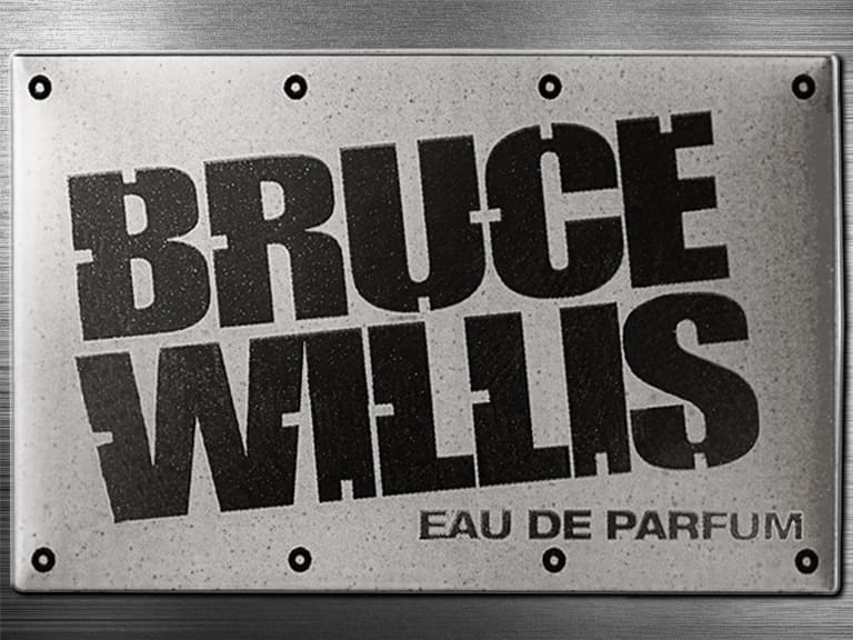
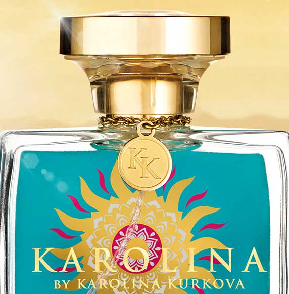
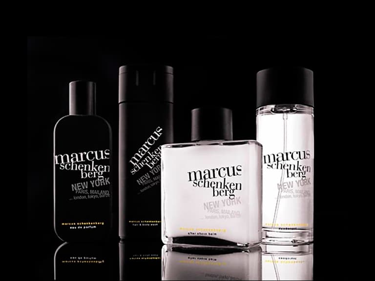
More recently, we have developed flacon designs for celebrities such as Bruce Willis, Emma Willis, Karolina Kurkova, Leona Lewis, Marcus Schenkenberg, Guido Maria Kretschmer, and for the fragrance inspired by the TV hit Desperate Housewives.
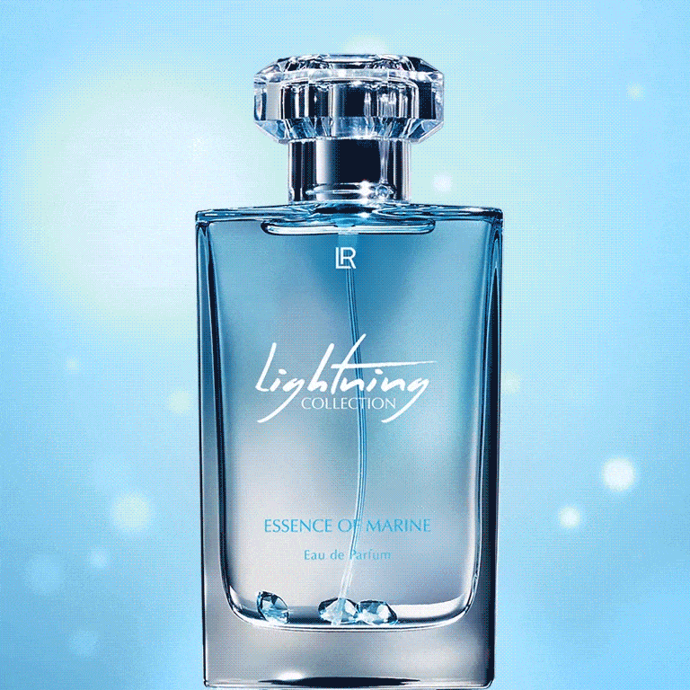
A particular highlight was our collaboration with LR Health & Beauty Systems, during which numerous celebrity fragrances were created.


Flacon Design Inspires The Imagination
Our clients provide professional briefings, tested concepts, and well-thought-out brand positioning. Our task is to ensure that the flacon triggers exactly the right associations at first glance. A flacon design should spark the viewer’s imagination and invite them to dream.


Flacon Design – A Dream Job
It’s not just the viewer or potential buyer who gets to dream – for us designers, these projects are genuine highlights. Compared to “classic” product design, the restrictions in flacon design are limited. Even when briefings include specific cost requirements, glass weight guidelines, or a set number of cap components, there is still plenty of room for creative and imaginative perfume bottle design.
The freedom to move boldly within this space is what makes it such a dream job. Initial sketches are discussed within the team, ideas are refined, others discarded, and new concepts emerge. Even when the thought “everything has already been done” crosses your mind, new inspiration always arises, and new forms or interpretations can be developed that perfectly visualize the unique character or concept.

Flacon Design Offers Creative Freedom
What makes flacon design so special is the ability to focus entirely on the concept. Fragrances are rarely bound to existing, rigid brand worlds or ranges with strict design guidelines. They are almost always launches rather than relaunches – meaning recognizability is not a key concern.
As a result, almost every perfume flacon design is a fresh start – finding the perfect blend of character, concept, positioning, inspiration, and current trends. This is why our clients greatly value the creative range they receive when we present the first designs for their new flacons.

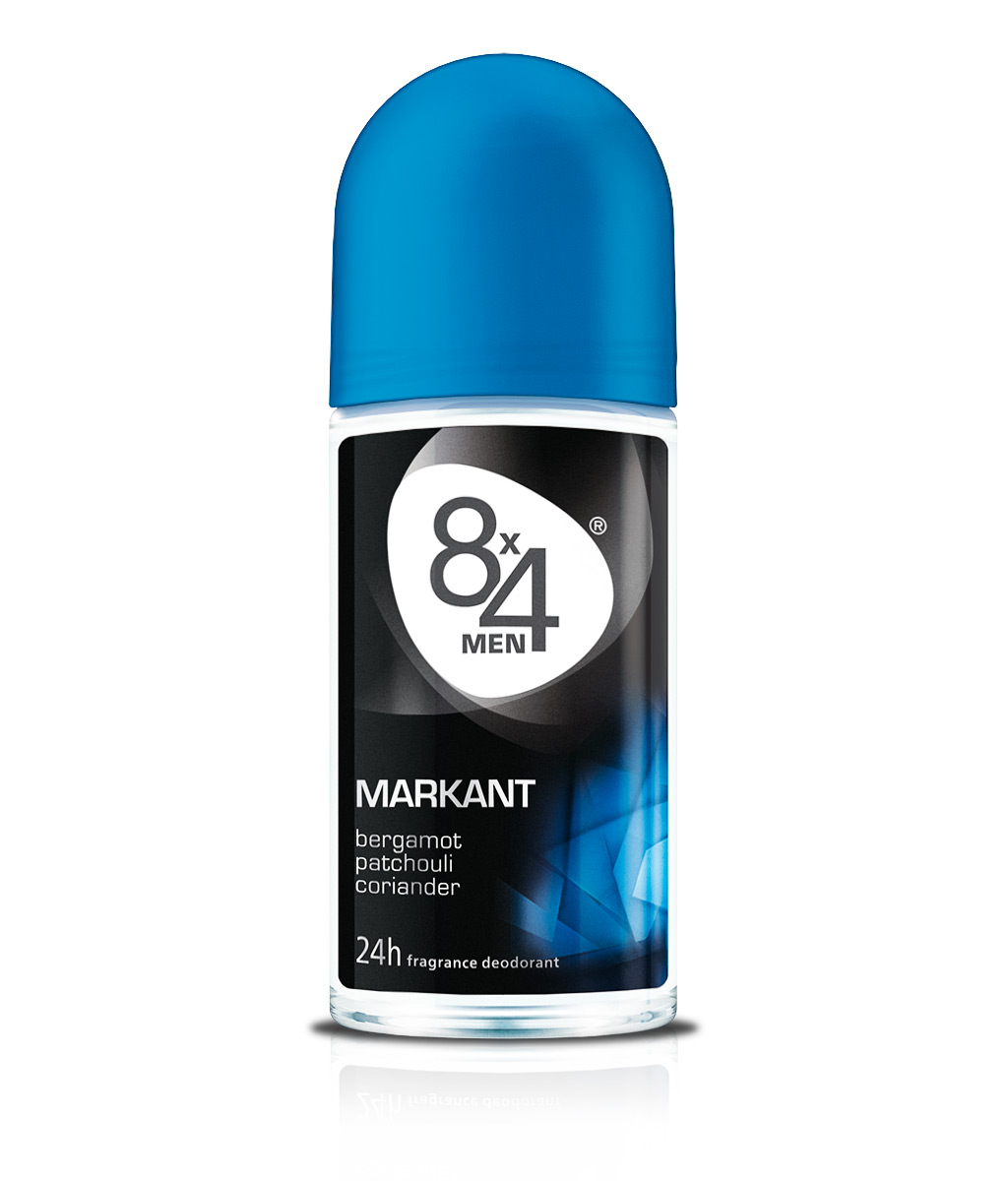
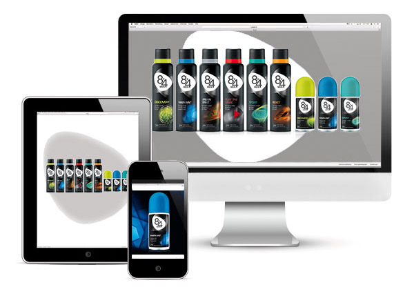
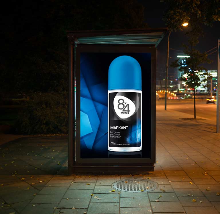
The 8×4 Logo as the Heart of the Brand
The 8×4 logo has been completely redesigned. A new typeface and a consistent use of color coding across all variants bring a modern touch. The numeric elements have been moved closer together, forming a stronger visual unit.
Before – After
The organic shape surrounding the wordmark enhances uniqueness and reinforces the brand character of the logo. The modern, more compact typography of the 8×4 lettering is a contemporary interpretation of the traditional 8×4 logo. The logo now appears more youthful but not too trendy, appealing to a broad target group aged 15 to 50.

The Logo Shape
The logo shape is composed of three scent waves and becomes the heart of the brand.

A Strong Communication Logo
Even beyond packaging applications, the new 8×4 logo demonstrates strong visual impact. Its distinctive shape commands attention and conveys the brand’s values. A powerful logo as the foundation for a powerful brand.
Makes Your Mouth Water!
We developed a new packaging design for the entire juice range of the discount retailer Penny. The new “Paradiso” logo, the emotional brand umbrella created through light and shadow, as well as large fruit and vegetable imagery in rich, natural arrangements, enhance appetite appeal and establish a clear design architecture.
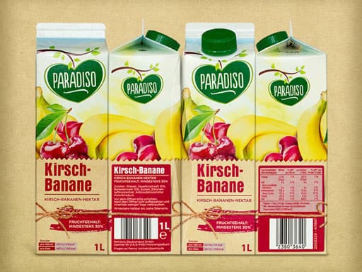
Range Differentiation
The differentiation between varieties is achieved not only through appetizing visuals of the fruit and vegetable types, but also via individualized background design for each category. This background creates a stage for the product information while reinforcing the natural positioning.
Additionally, a unique, food-style typography for each flavor signals its belonging within the juice range.
The New Paradiso Logo
As part of the design development, the Paradiso logo was completely redesigned. By focusing on naturalness and authenticity in its current handmade character, the logo conveys a strong emotional appeal combined with a high-quality appearance.
The natural effect of the Paradiso logo is further emphasized by an emotional brand umbrella composed of light and landscape elements.
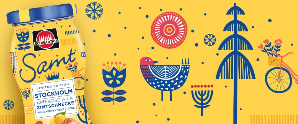
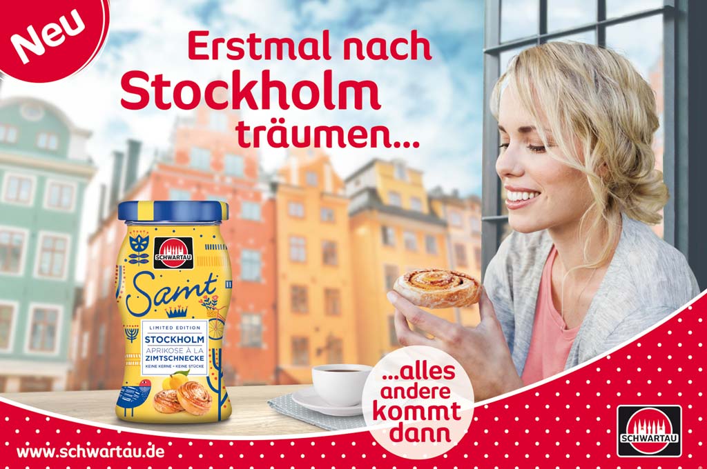
Schwartau Samt
The limited edition Schwartau Samt “Stockholm – Apricot à la Cinnamon Bun” was available for a one-year period since December 2018.
As in previous years, the design of this 2019 annual edition stands out clearly from the standard design of the core range.
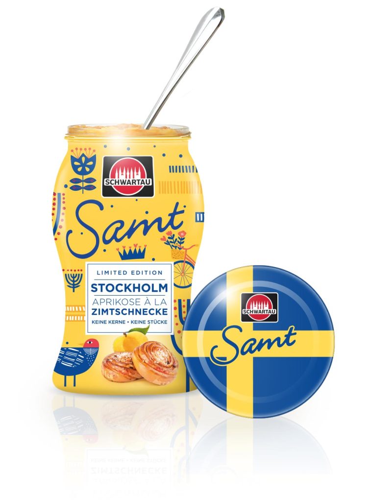
A golden-yellow background meets blue décor – by incorporating elements of traditional Swedish folk art, such as blue floral patterns and pictograms depicting Scandinavian lifestyle, the Swedish theme is captured in an emotional way, highlighting the personal character of this edition.
Directly below the corporate brand logo, the Samt brand name appears in a handwritten typeface, ensuring quick recognition. It was also important to clearly visualize the variety of “Apricot à la Cinnamon Bun,” with both the fruit and the cinnamon bun prominently and appealingly positioned.
To further distinguish the variety, the Swedish flag was featured on the lid as an additional design element. The result is an impulse-driven packaging design that stands out as a striking limited edition.
In addition to the product packaging, we also developed the display poster for secondary placements of the 2019 Samt Limited Edition, visually communicating both the Scandinavian flair and the taste and indulgence of the fruit spread.
New Packaging Design for the Jam
We gave the brand Fruttissima – the fresh jam from Schwartau – a facelift. This jam brand presents unique demands for packaging design because it is not found alongside other marmalades or jams, but exclusively in the chilled aisle. For this reason, it was important to strengthen both the positioning and recognizability of Schwartau Fruttissima as a jam. The product concept also needed to be communicated even more clearly – all while maintaining brand recognition.
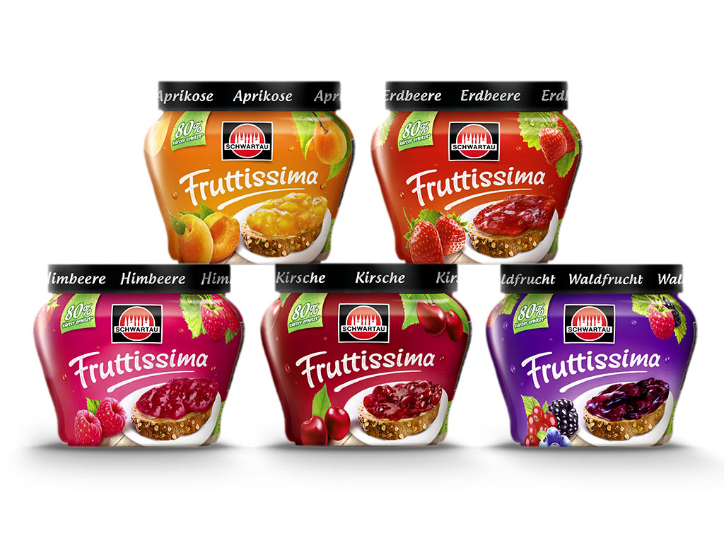
Schwartau first developed a new jar shape, whose classic marmalade design language aligns much better with familiar 3D codes. To further strengthen recognition of Fruttissima as jam through the sleeve design, we arranged the previously “floating fruit” lying on a plate. Additional key ingredients appear below the lid, as though still hanging naturally from their branches.
A green disruptor supports the concept and contributes to a more natural impression. Our newly integrated bread element and wooden background also add to a more modern and wholesome tonality in the new packaging design. To highlight freshness, we incorporated a light dew effect into the composition. The revised Fruttissima wordmark now feels more natural and harmoniously blends into the overall layout with a fresh dynamic.
How well the new design was received is shown by our client’s feedback:

Schwartau Launch – Fruit with Nuts: Fruity & Crunchy
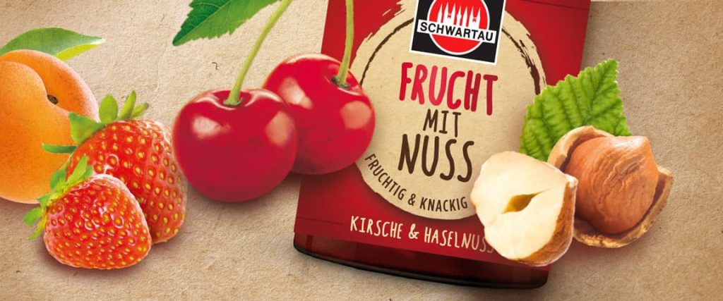
A new product innovation from Schwartau: Fruit with Nuts. The first fruit spread with bite, combining jam with crunchy hazelnut pieces.
The label design carries a deliberately masculine note to visually express the hearty concept of the jam. It uses deliberate edges and angles along with a nutty beige color scheme. However, the product is clearly targeted at both men and women, reflected in the handmade-style typography.
Even an emotional packaging design must follow clear rules to succeed in the market.
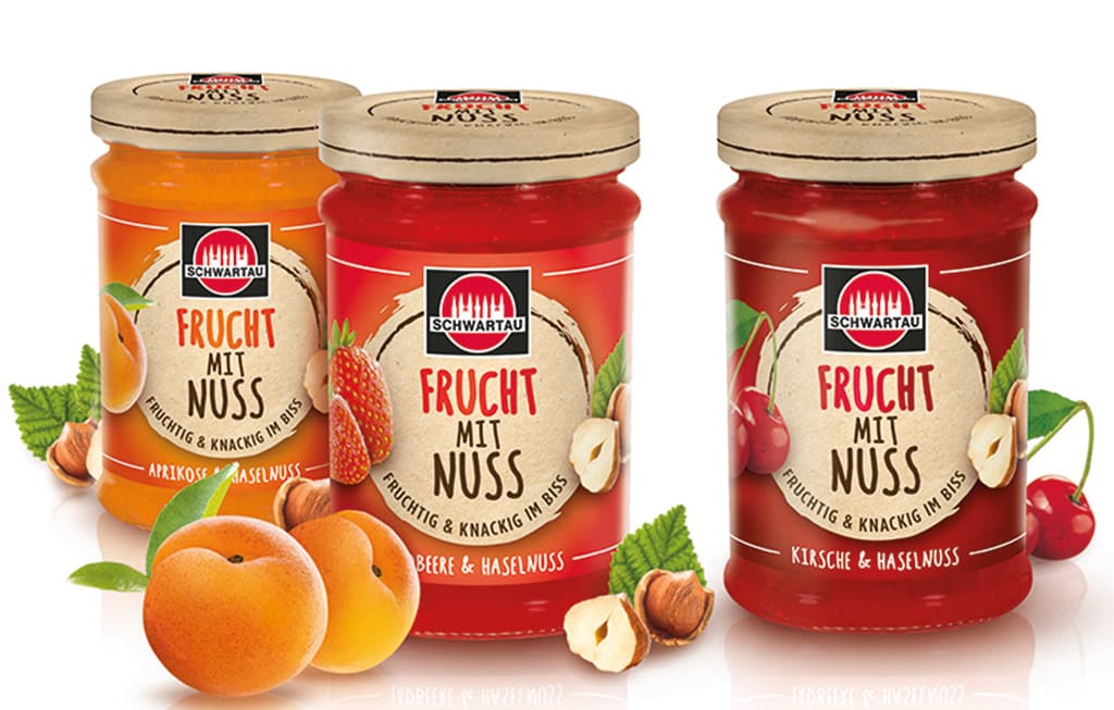
The design architecture for Schwartau Fruit with Nuts is therefore cleanly structured. The label is centrally aligned, with the Schwartau logo prominently placed at the top. Below it sits the product name “Fruit with Nuts,” underlined by the claim “Fruity & Crunchy.” Highly detailed, natural-looking ingredient visuals flank the label on both sides, supporting the concept. In combination with the background color coding and product name, they also help clearly differentiate between the Strawberry, Cherry, and Apricot varieties.
Relaunch “Leichter Genuss”: Indulgence without regret
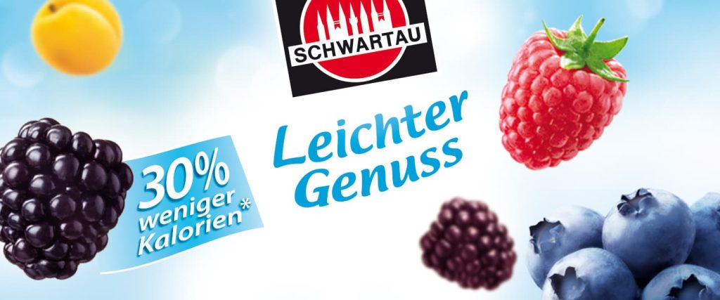
We refreshed the reduced-calorie jam range “Leichter Genuss” (EN: “Light Indulgence). Since reduced-calorie foods are no longer placed in special diet sections and now have to compete directly with regular products, new demands have emerged for packaging design. With a light design optimization, we were able to place clear focus on the concept of lightness for these low-calorie jams.
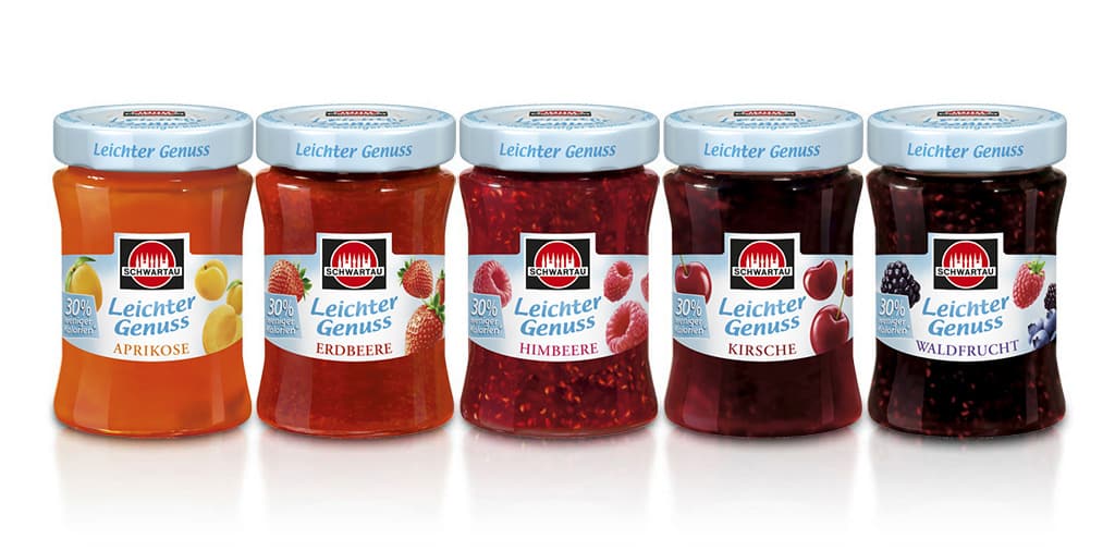
Small changes produced a big impact. The fresh and airy appearance of the range now communicates its product benefit even more clearly. Shelf visibility has also been improved through the consistent design of the label and lid, helping it hold its own against the competition while maintaining brand recognition. Crucial for a successful brand with loyal customers entering a new competitive environment.
Line Extension – Ginger with Lemon: Fruity & Spicy
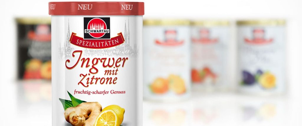
The Schwartau Specialties range stands for jams made from traditional recipes in eight varieties with unique fruit combinations. Its classic tin design with striking fruit arrangements targets so-called Best Agers – older consumers with traditional values and discerning tastes.
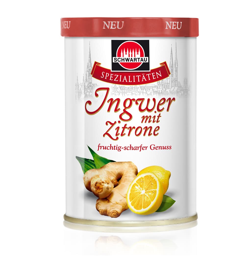
The newest addition, Ginger-Lemon, refreshes the range with a fruity-spicy note. The design of the tin and lid needed to fit seamlessly into the range while also standing out as a newcomer at the POS. The result is a harmonious composition of fruits combined with the classic design elements of the Specialties range. .
Attention is drawn through a red lid, which contrasts clearly with the range’s usual gold closures
Schwartau Packaging Relaunch – From Wellness to Frutivia
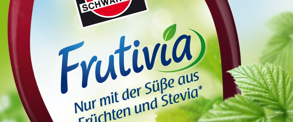
Schwartau’s Wellness line now completely forgoes refined sugar, sweetening its jams exclusively with fruit and – as an industry first – the sweetness of stevia. This move anticipates a growing trend in food production, particularly in the jam sector, shifting away from low-calorie fitness or “light” lines toward naturally sweetened products. Alongside the packaging design relaunch, the product name was changed from Wellness to Frutivia, for which we also designed the logo.
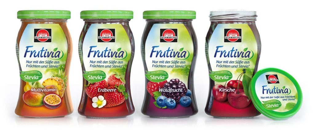
On the market, this product benefit is primarily communicated through its packaging. We designed the lid and jar label in a natural green with a more minimal background. An information panel placed between the front and back labels gives consumers a brief and clear explanation of the sweetening agent stevia.