What it’s about
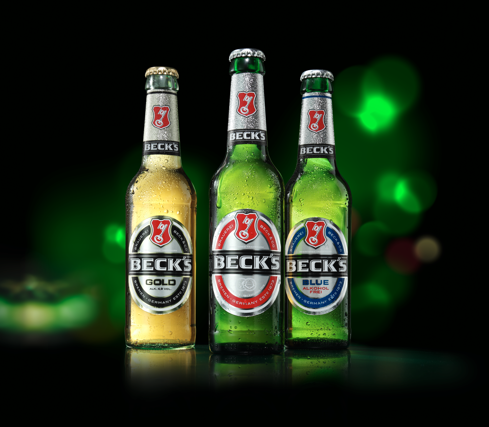
Due to varying prioritization of the Beck’s brand across three European markets, different aspects of the brand positioning have been visually emphasized in each country over recent years. This gradually led to an inconsistent brand presence. We were commissioned to develop a cohesive visual language for the brand communication that would be relevant across all three markets.
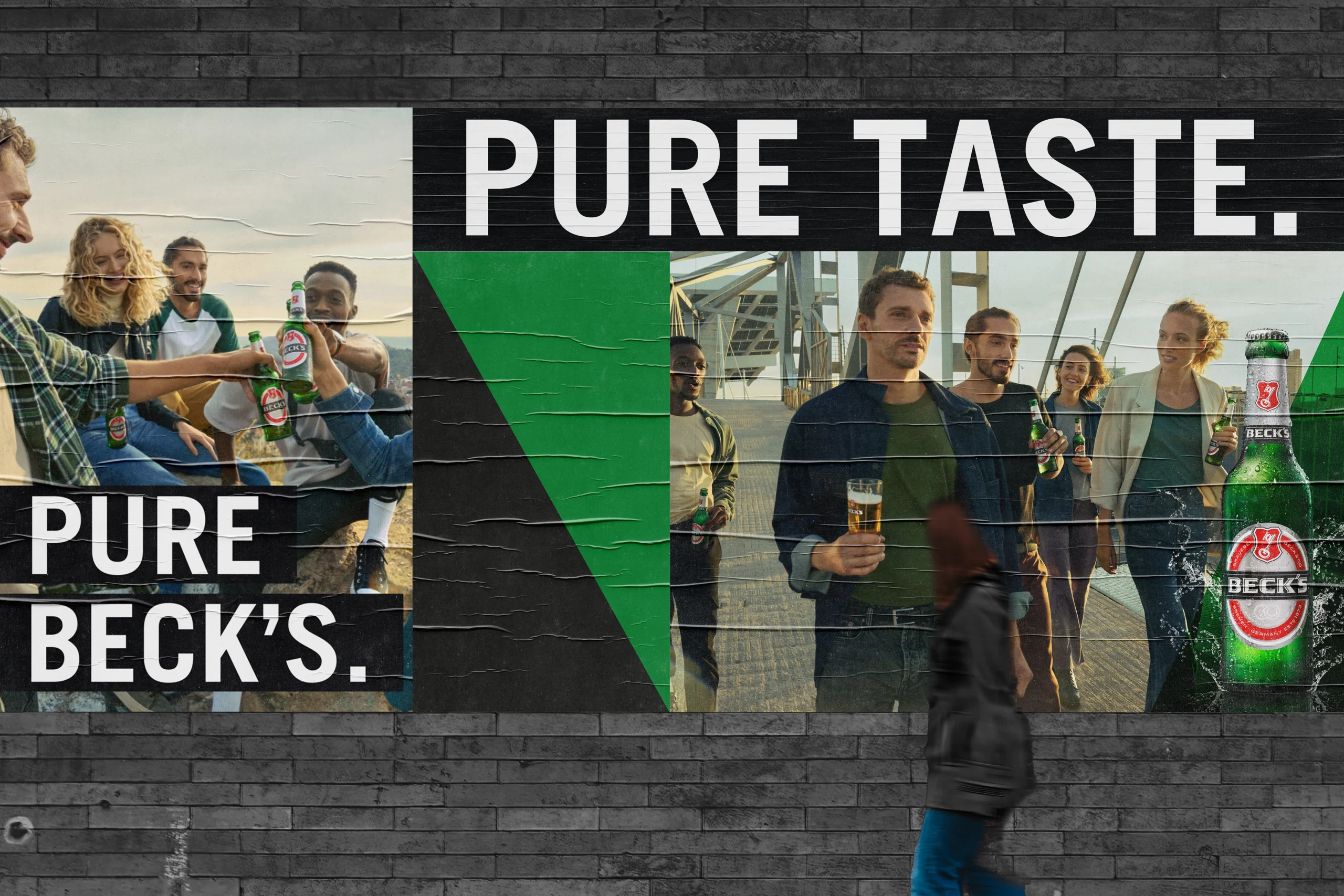
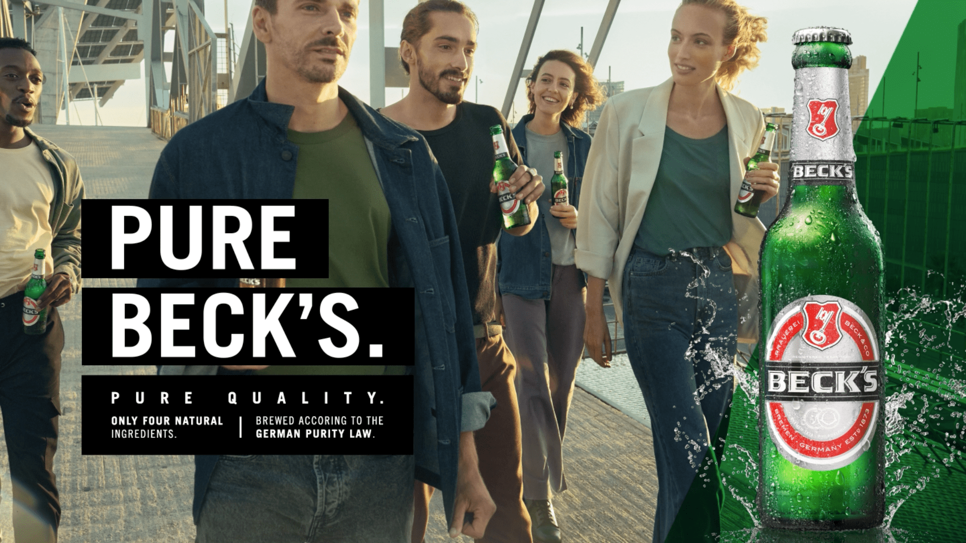
Under the concept “Broaden your horizon,” we translated Beck’s original brand values into a contemporary context. We gave the brand’s core value, freedom, an urban interpretation and enriched it with the inherent value of adventure. The result is a modern visual language that resonates with the target audience and fully supports the brand’s positioning.
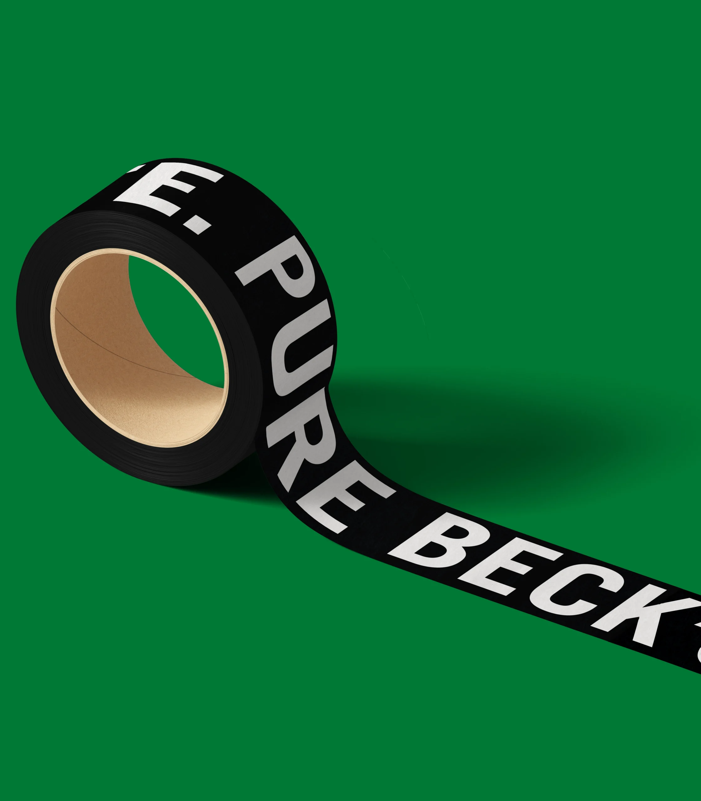
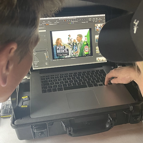
We brought this visual world to life through a dedicated photo shoot. To transform the imagery into a universally usable key visual, we enhanced it with unique yet flexible brand elements. The Quality Bar, in combination with the typography, underscores the brand’s premium claim and confidently addresses a young audience. As a nod to the brand’s heritage and its iconic testimonial – the sailing ship “Alexander von Humboldt” – we integrated a triangular image element symbolizing a sail as a stage for the packshot.
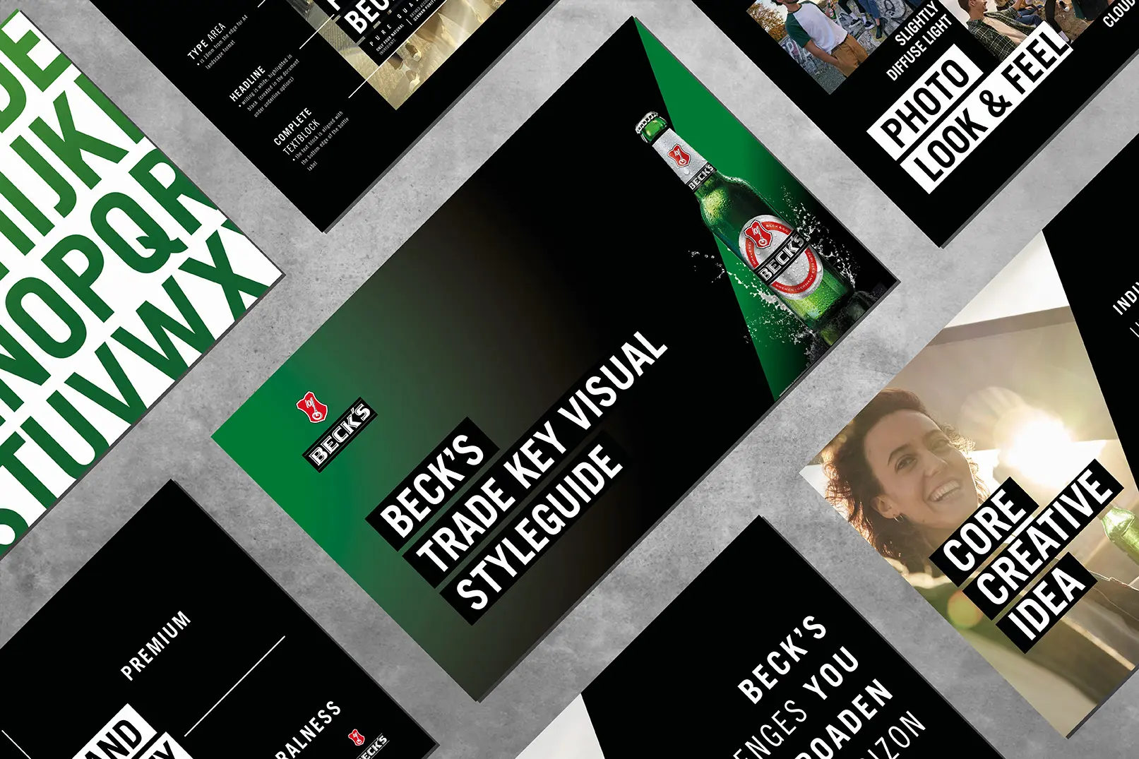
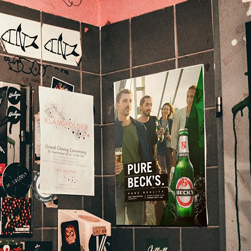
This distinctive and brand-consistent visual language was universalized by us in the form of a brand guideline, making it scalable across various future campaigns and media touchpoints. The brand architecture we developed also serves as the foundation for all brand assets, including digital platforms such as social media. In doing so, we created a cohesive, high-impact, credibly ownable, and above all, relevant visual communication platform.
5 characters, 2 motifs, 1 relevant brand platform