What it’s about
For over two decades, we have partnered with the internationally renowned brand Beck’s as their global lead agency for packaging design. Our collaboration is built on a very special connection: our founders, Sebastian Beck and Jörg Ratzlaff, created the iconic two-component crate with rubberized handles. This market-defining innovation was a revolution in the world of beer crates, which until then had been dominated by purely functional and often standardized transport boxes. For JUSTBLUE, this marked the start of a long-standing collaboration with the Bremen icon and our client AB InBev.
Today, we design and continuously evolve the brand’s entire visual identity, including the complete visual relaunch of both the Core and Mix ranges. Our goal: to elevate brand iconography, ensure clarity at the point of sale, and enhance shelf impact – worldwide.
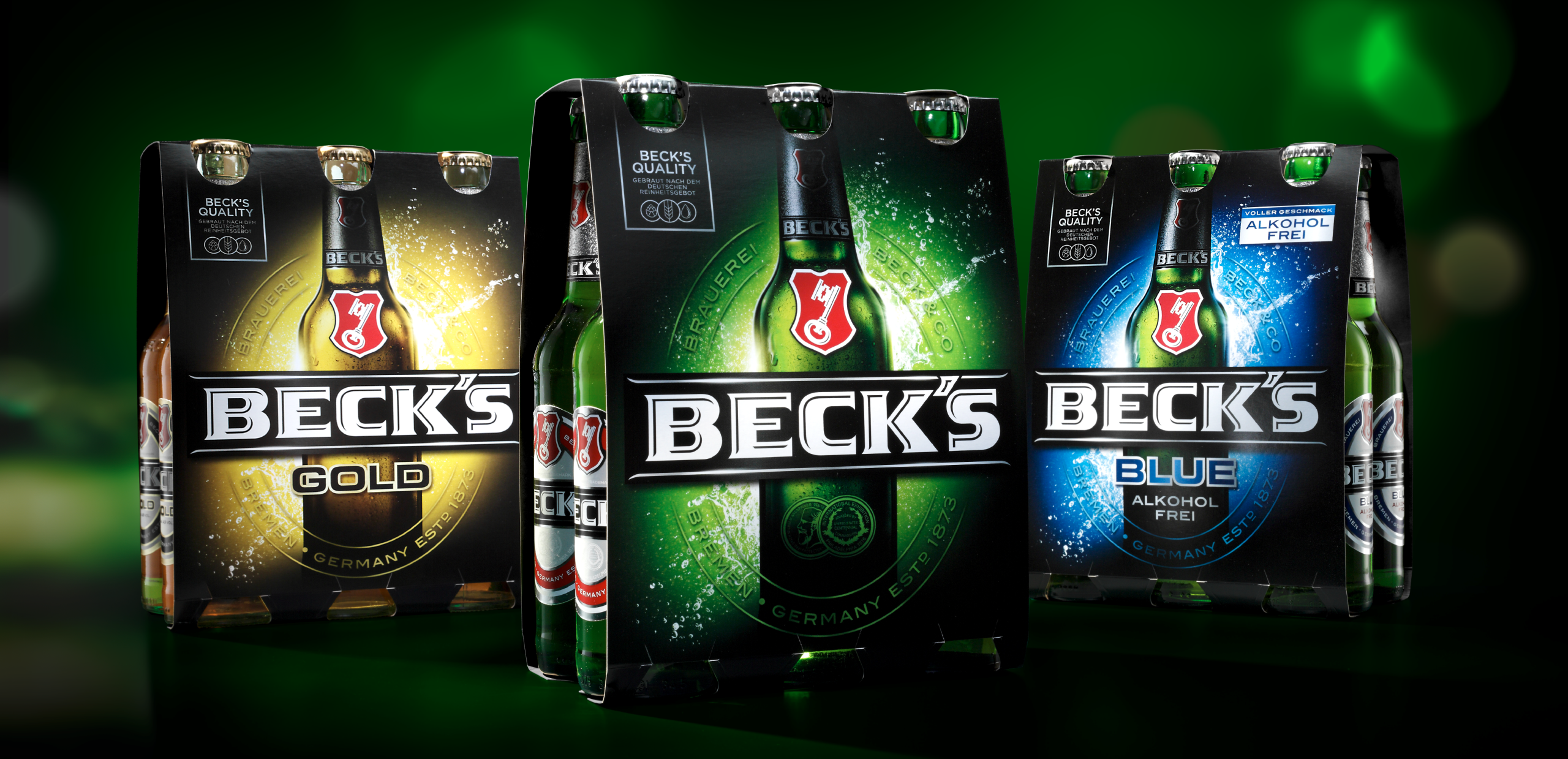
For the worldwide relaunch of the Core Range, we reinforced the brand’s iconic values and gave them a modern interpretation. The new design focuses on clarity, reduction, and strong recognition:
-
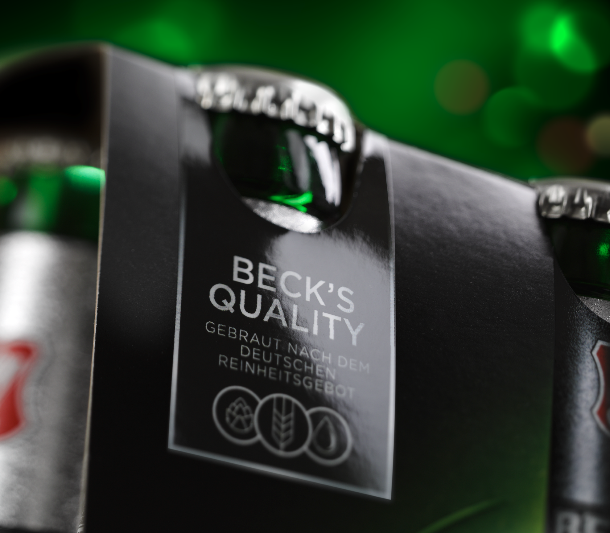
The distinctive red oval continues the evolution of the bottle design with consistency.
-
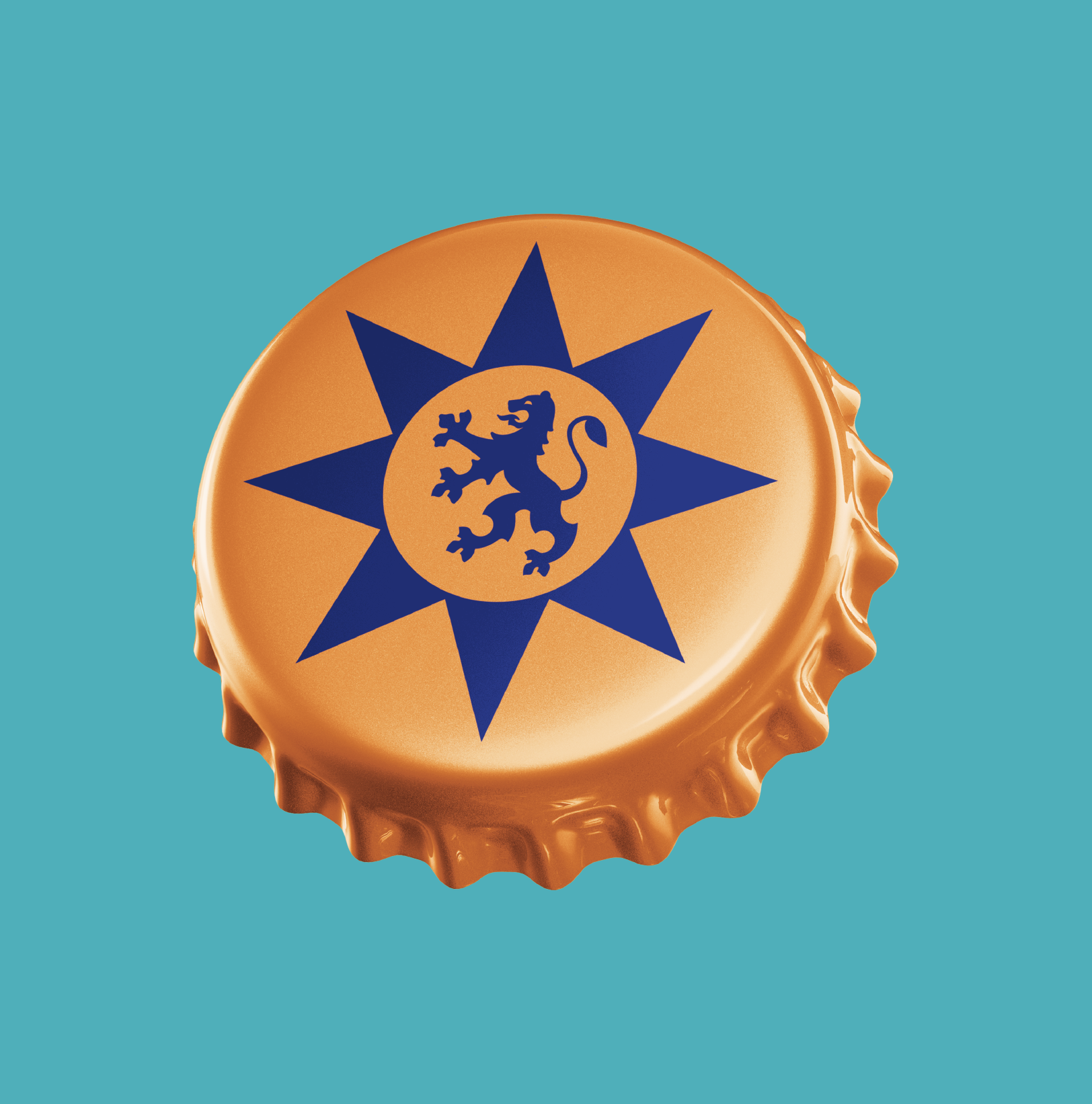
The enlarged key emblem increases visual impact and highlights the brand’s heritage.
-
The removal of decorative lines ensures a bold and minimalistic design language.
-
The integration of the founding year 1873 with the international abbreviation “ESTD” underscores the brand’s global positioning.
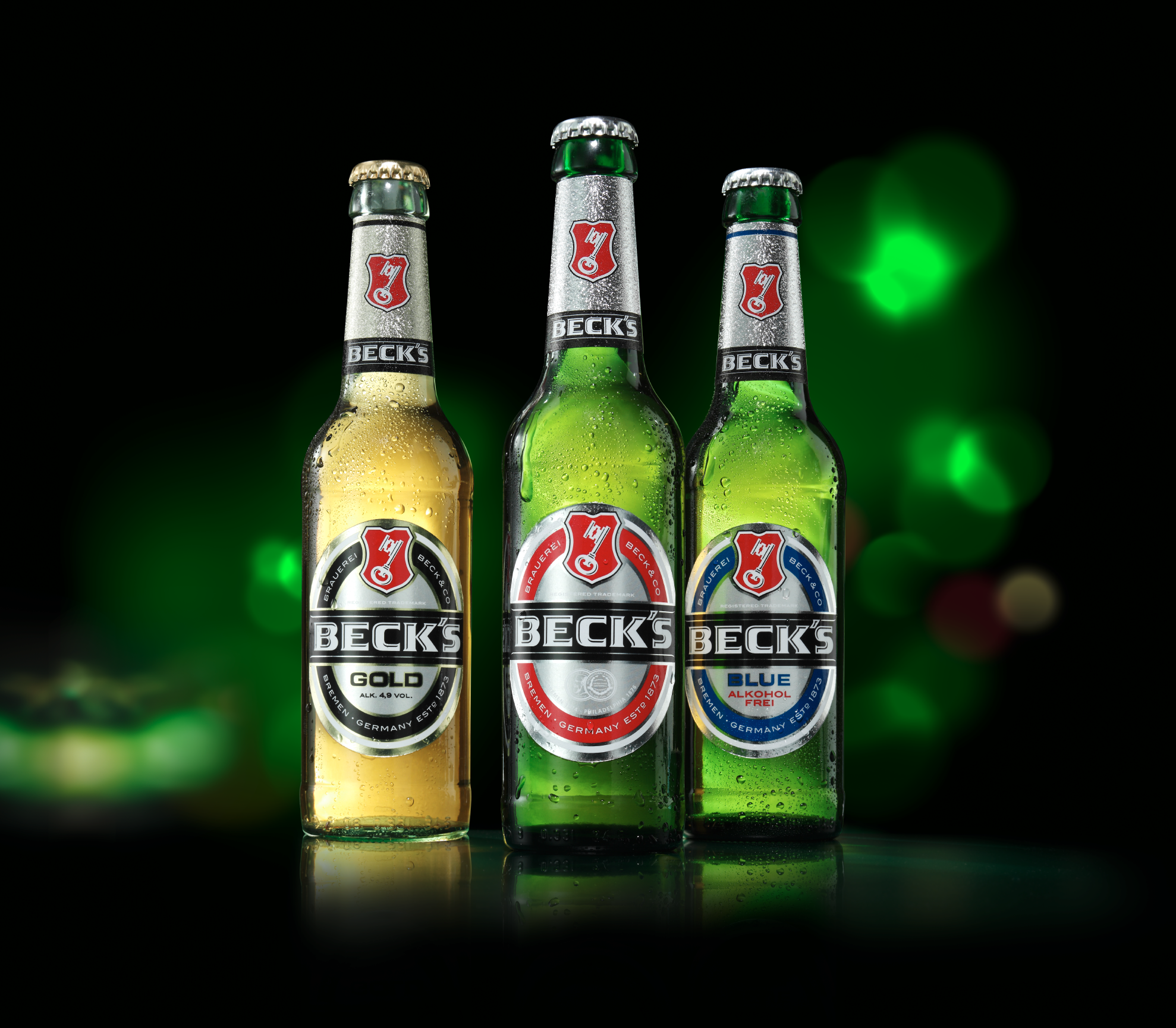
The 0.33l longneck bottle is a key element of the brand identity. We showcased its full silhouette on the secondary packaging, creating stronger shelf presence and helping consumers distinguish between different varieties with ease. This approach strengthens the brand block and enhances orientation at the point of sale.
The new water splash evokes maximum refreshment and is reminiscent of the spray at a ship’s bow – a tribute to the famous sailing ship Alexander von Humboldt, which played a prominent role in the brand’s communication for many years. The relaunch encompasses a global update of all packaging formats, as well as all POS and communication assets, ensuring a cohesive and iconic brand experience across every touchpoint.
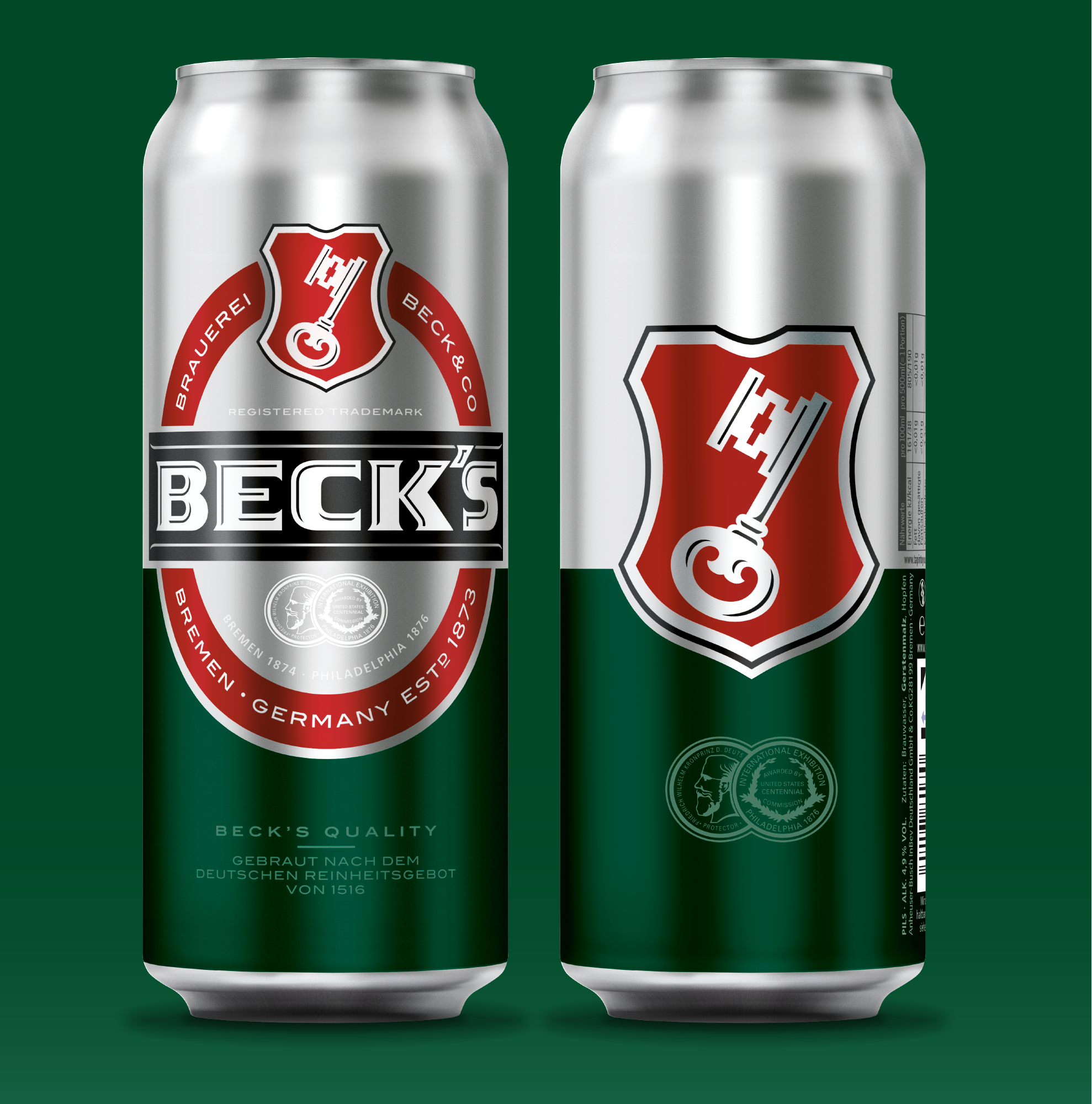
The new can design makes a bold move: it breaks with the classic, market-standard double-facing and instead offers two distinct sides, each with a striking and highly attention-grabbing look. One side creates strong shelf impact by placing the Beck’s oval against a vibrant silver-and-green contrast, while the other side showcases the coat of arms as the central brand emblem.
The design also considers that trays at the point of sale cover a large portion of the can. Despite this, brand recognition is fully ensured in every situation.

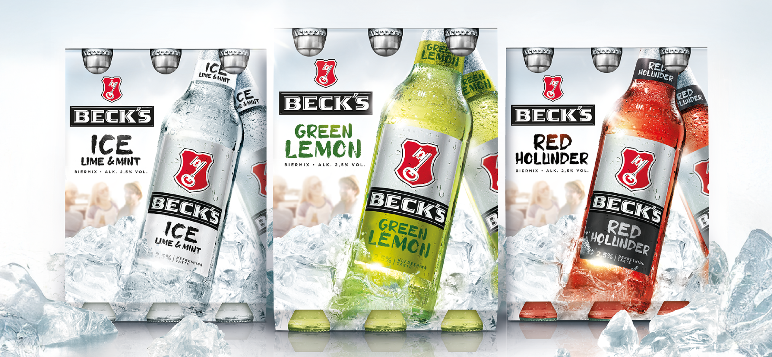
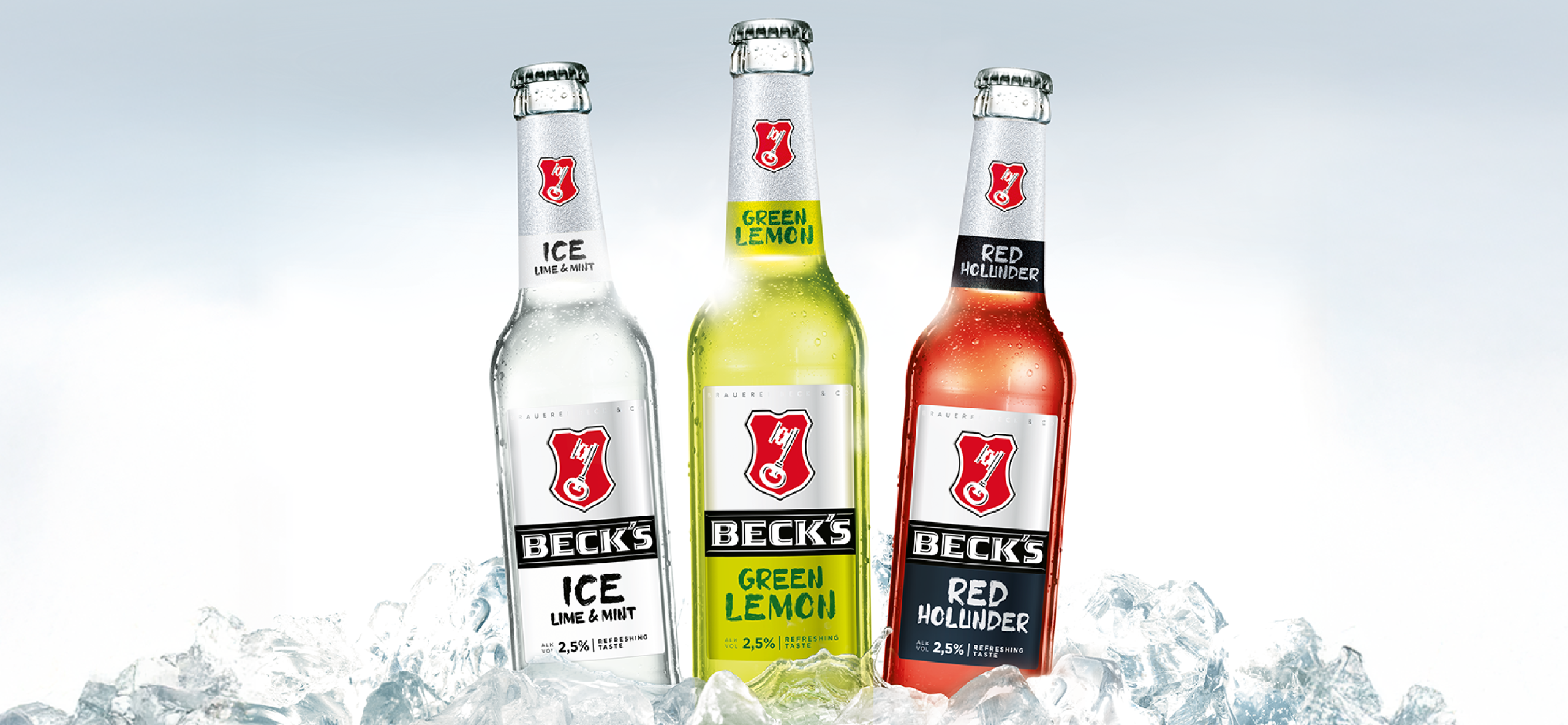
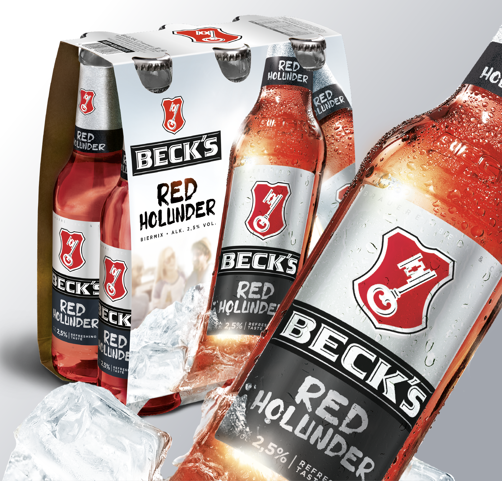
In Germany, Beck’s is considered a true pioneer in the segment of beer mix beverages. For the successful Mix Range, we developed a new design architecture that combines clear brand affiliation with maximum differentiation, perfectly meeting the demands of a highly impulse-driven category.
The six-pack design once again showcases the bottle in a prominent and refreshing way, while the high proportion of color ensures clear flavor coding and strong appetite appeal. Outdoor visuals, ice textures, and dynamic perspectives convey the lifestyle of the target audience—fresh, young, and spontaneous—while interpreting the core values of the master brand: freedom, friendship, and adventure.

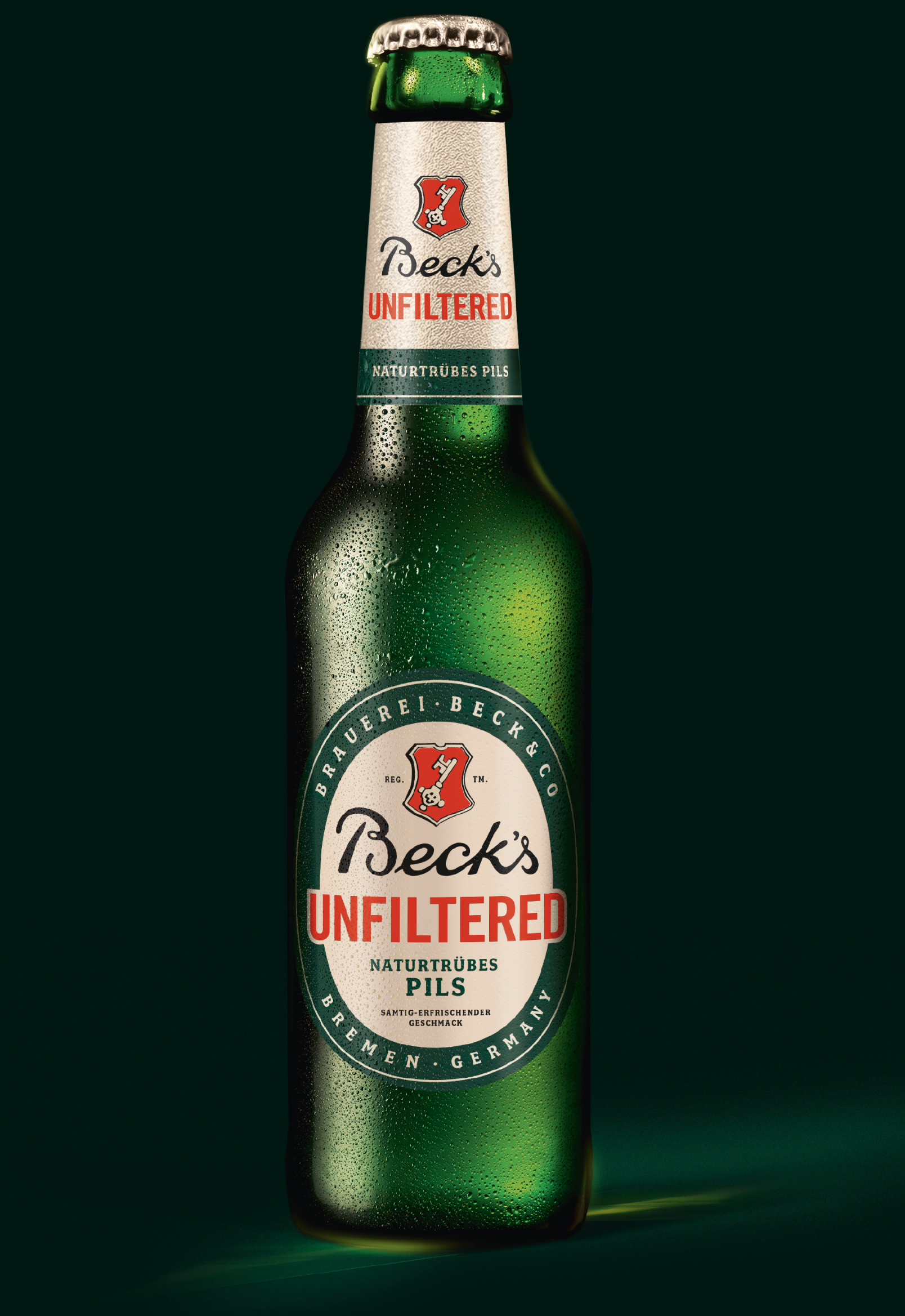
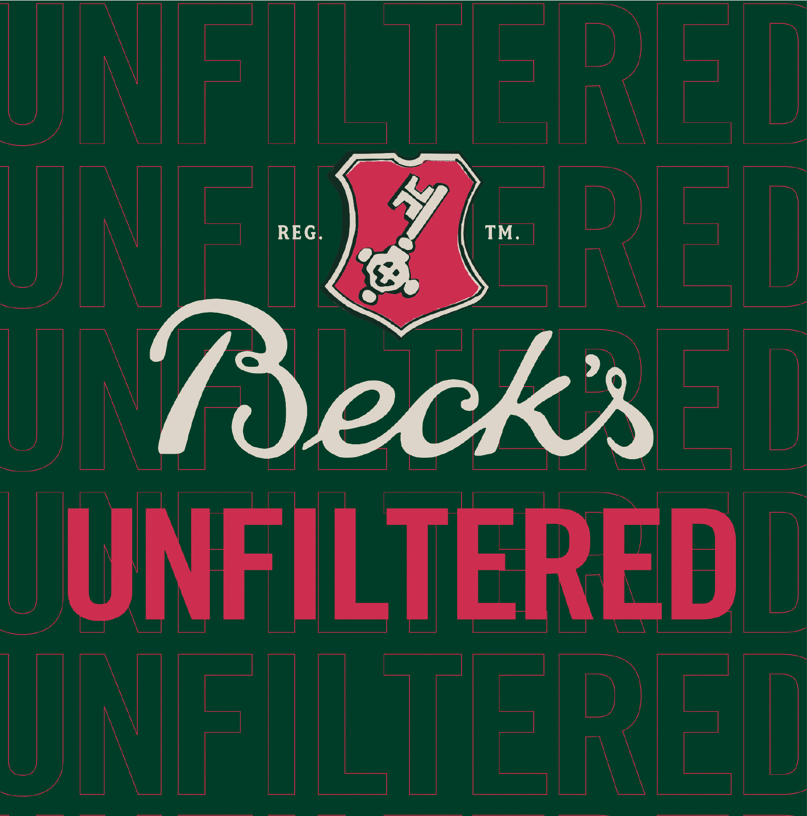
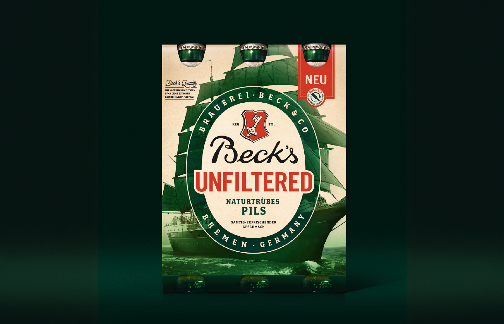
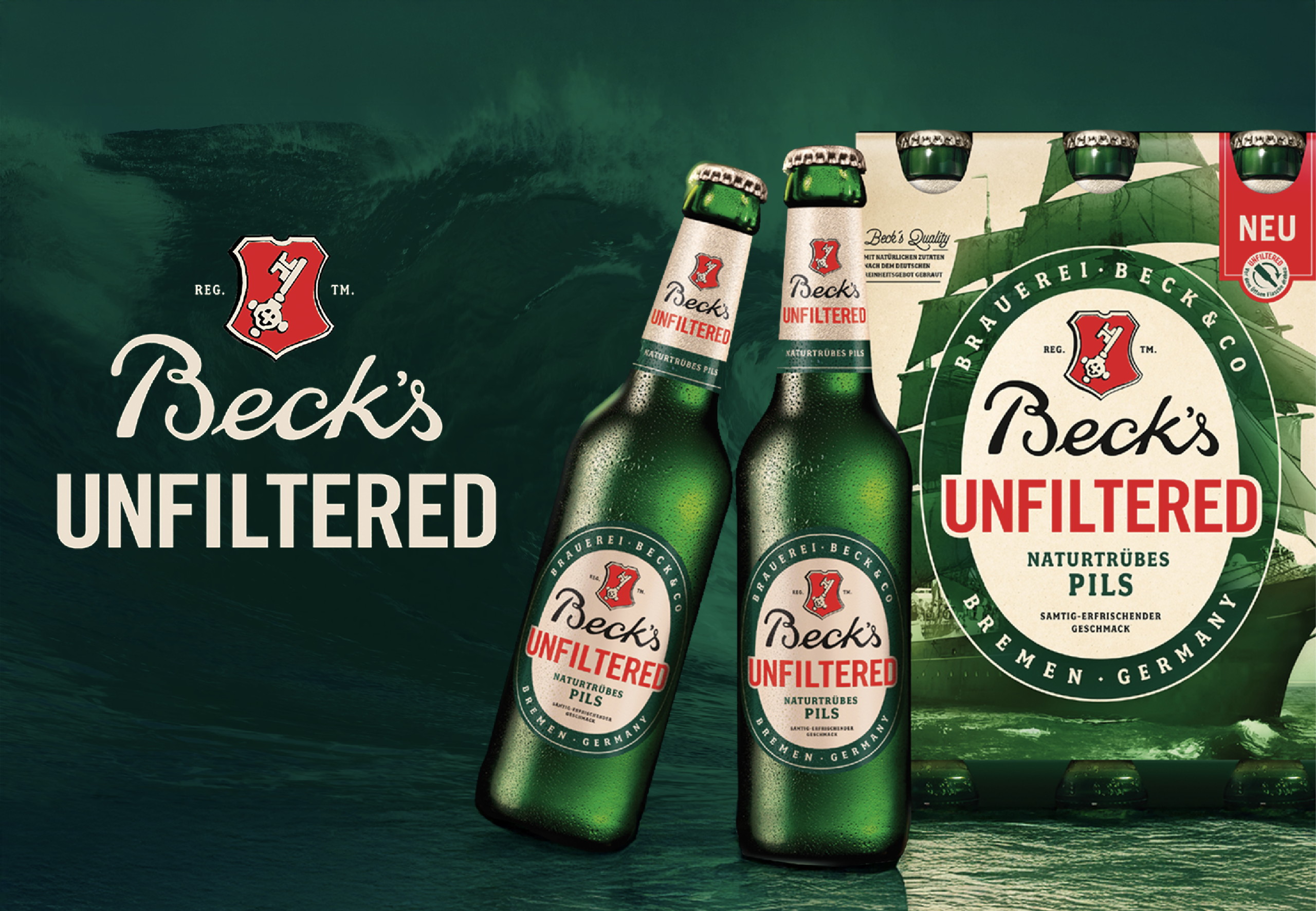
Beck’s Unfiltered presents the brand from a new perspective – unfiltered, naturally cloudy, and full of character. The design was created to seamlessly integrate into the visual Beck’s family while clearly standing out as a new product. Our modern retro interpretation builds a bridge between Beck’s heritage and a fresh product promise. It draws inspiration from the original method of unfiltered brewing, highlighting the beer’s authentic and premium character.
By integrating the iconic sailing ship Alexander von Humboldt into the six-pack design, we brought a true “grand dame” of advertising history back to the stage. On the packaging, the ship becomes a powerful visual metaphor for the brand values of discovery, authenticity, and freedom.