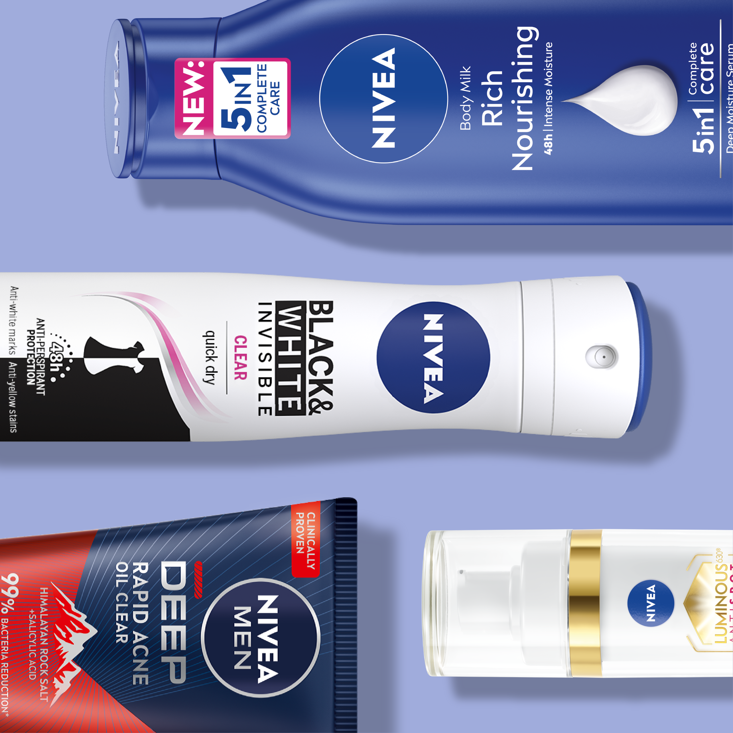
What it’s about
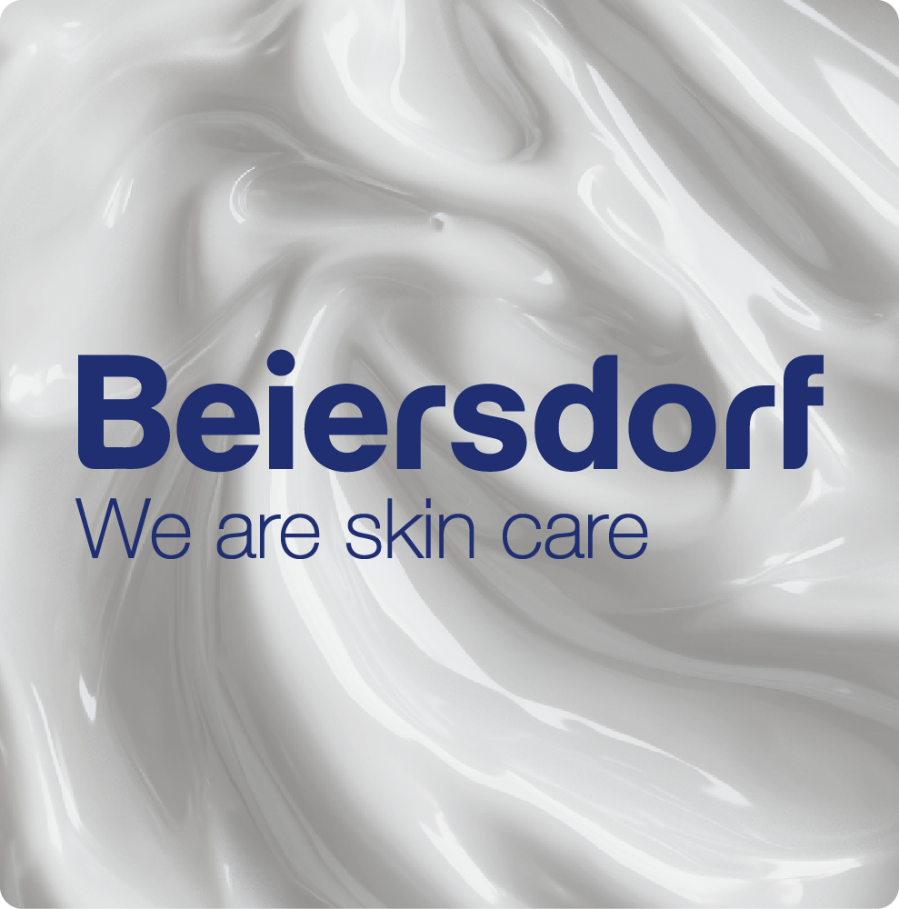
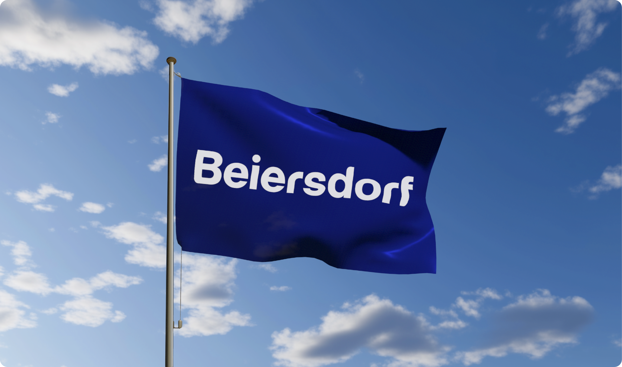
As part of its strategic development, Beiersdorf commissioned us to modernise its logo with a clear focus on its ‘Blue Agenda’. As part of the modernisation, this logo relaunch was particularly concerned with referring to a far-reaching strategic realignment of the group, in which we were able to provide support as a partner.
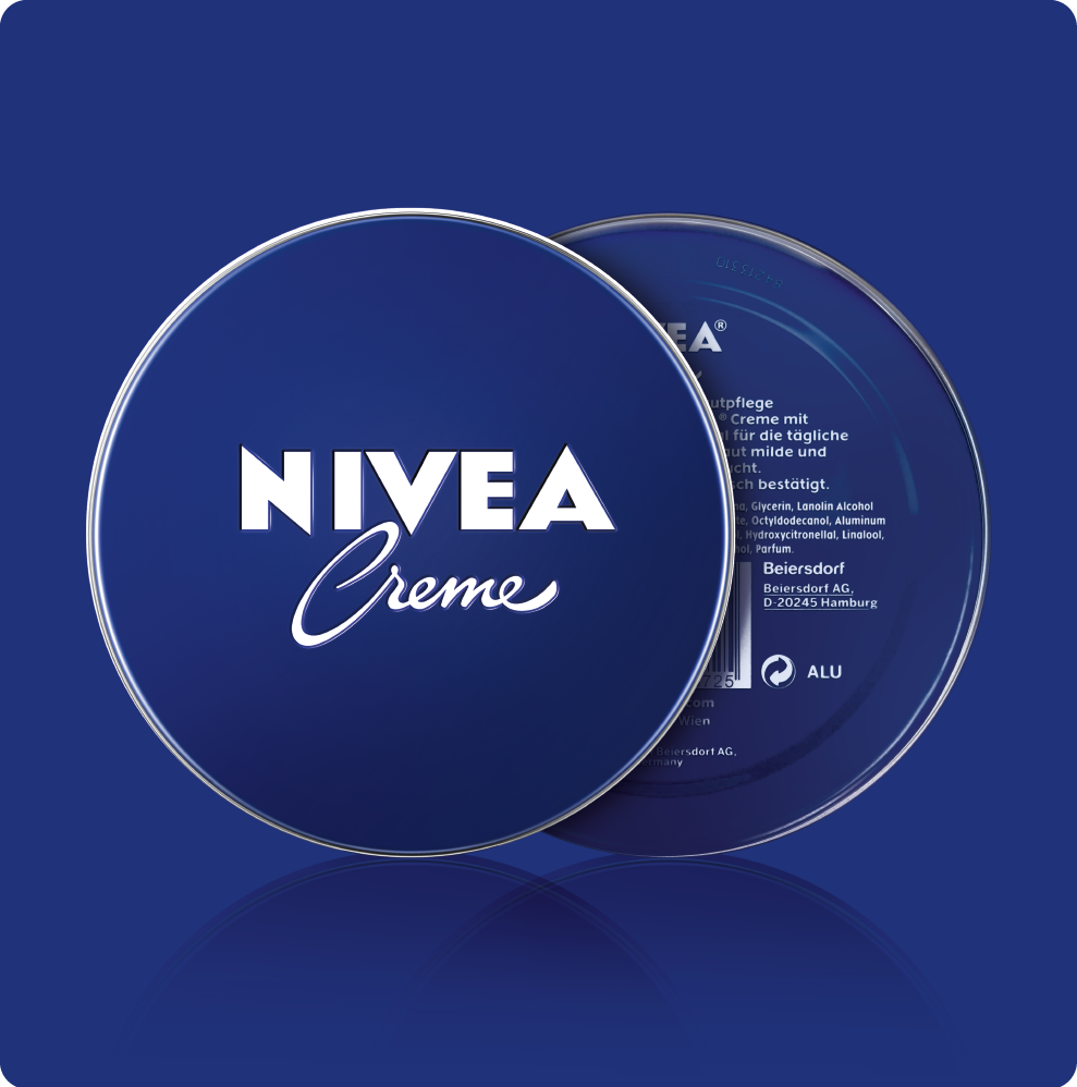
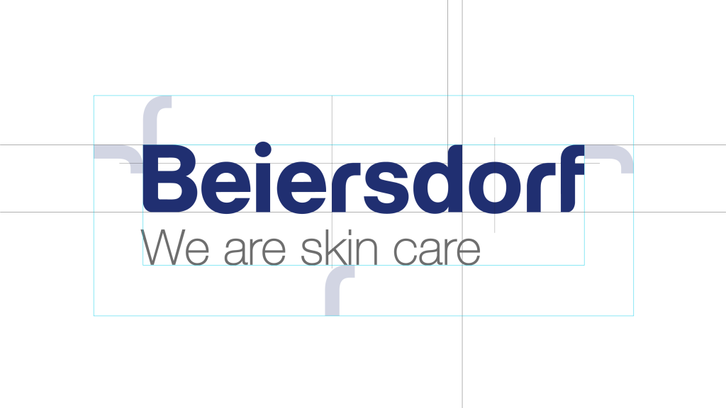
With the “Blue Agenda” as the overarching vision, the first task was to simplify the previous logo. The four dots that previously symbolised the company divisions were removed in order to emphasise the focus on Beiersdorf’s core competence of skin care.
What it’s about
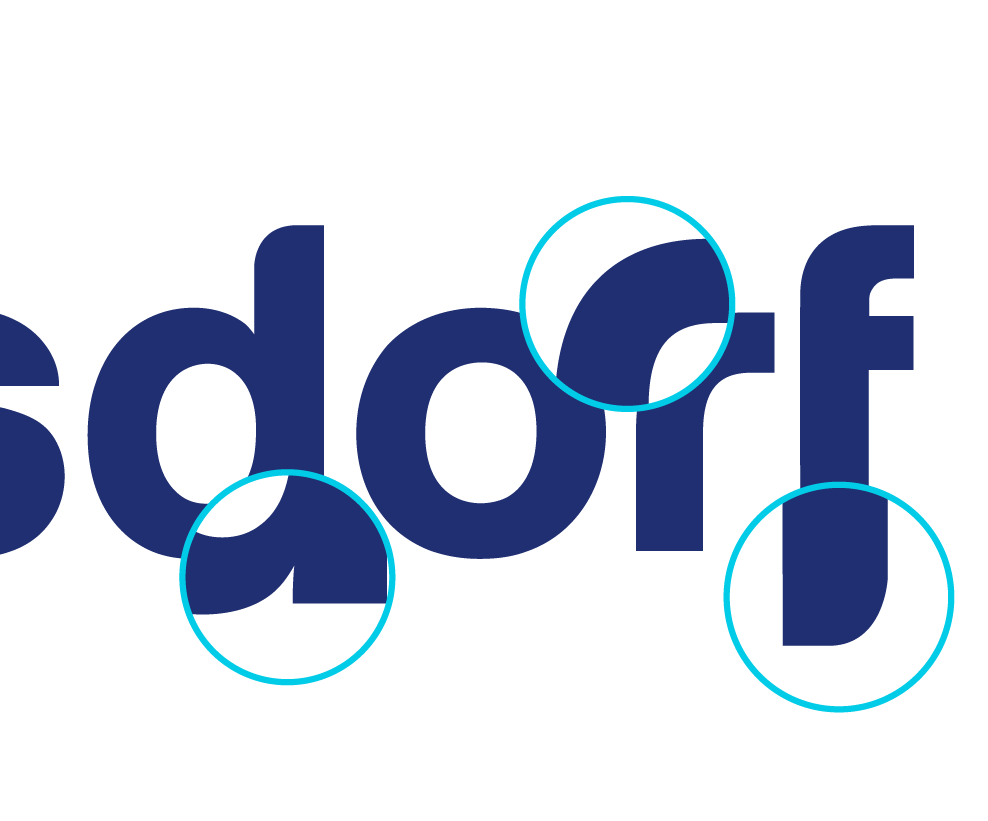
Furthermore, the new purist design deliberately dispenses with pictorial elements and instead favours typographic development. The soft curves of the letters create a clear visual link to the brand values – care, trust and innovation – and at the same time ensure modernity and uniqueness. The iconic “NIVEA Blue” as the central logo colour also strengthens the connection between the corporate brand and its best-known product brand.
By striking a balance between continuity and innovation, it has been possible to develop a logo that both respects Beiersdorf’s traditional past and embodies a modern, future-orientated look. The relaunch of the Beiersdorf logo not only modernises and simplifies the brand, but also visually communicates its strategic development to the outside world.