What it’s about
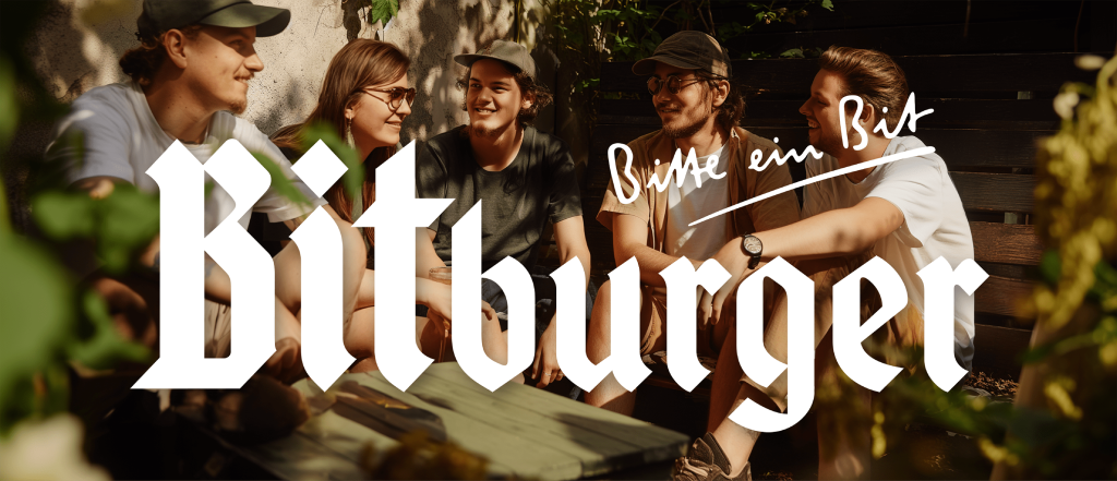
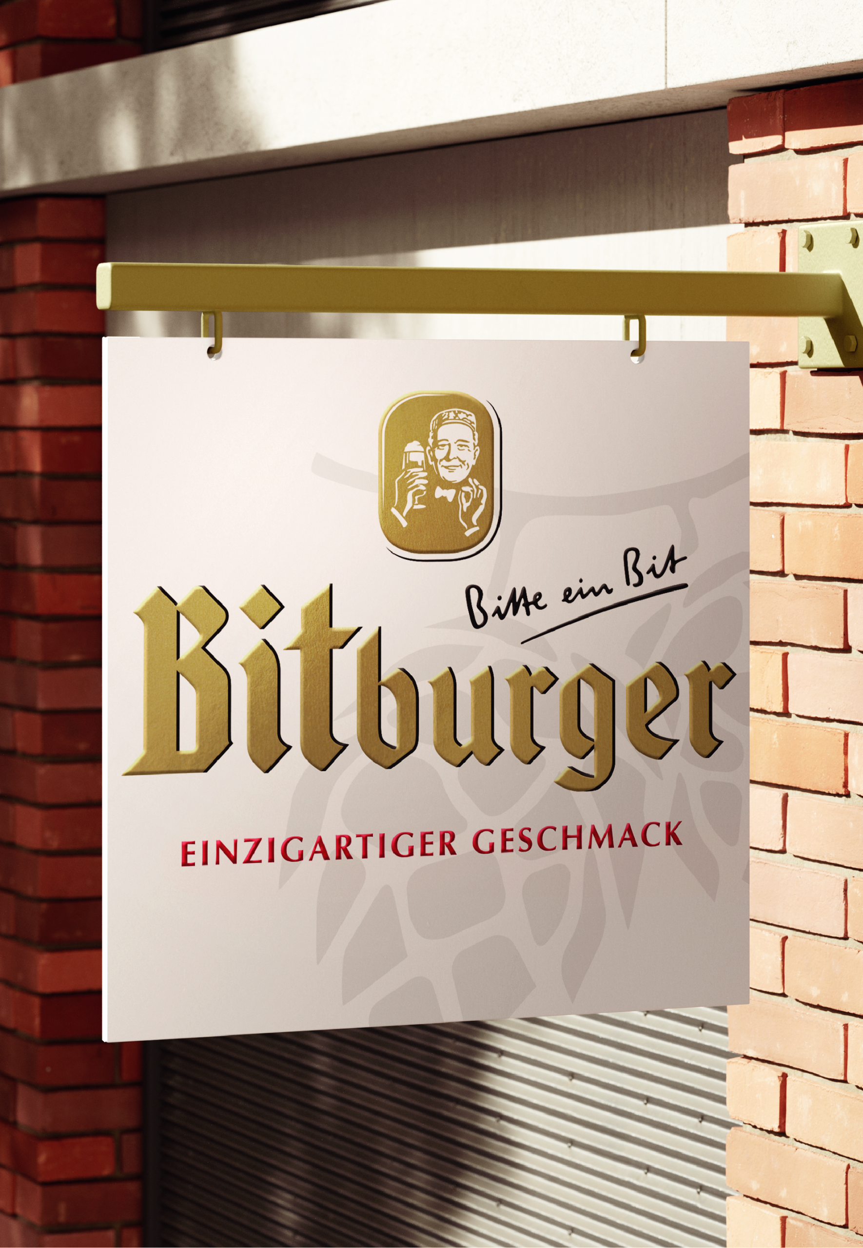
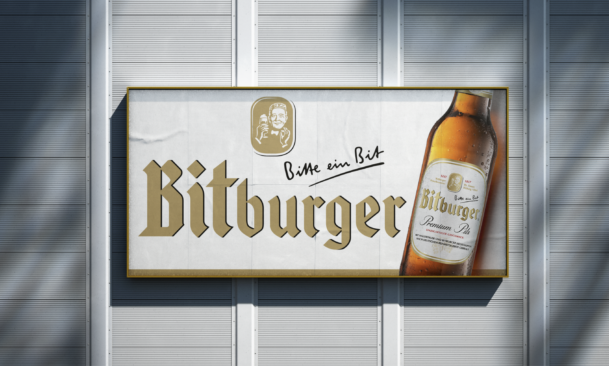
We’ve had the pleasure of partnering with Bitburger as their creative ally for many years. From strategy to visual execution, we accompany every step of the branding journey and have helped shape the brand’s visual identity over time.
Bitburger Brewery is one of Germany’s most important private breweries. When working with such an established heritage brand, our challenge is to continuously keep its visual identity in sync with the times. After all, brands operate in a dynamic environment—driven by competitor activity, shifting consumer needs, or emerging trends. The true art lies in remaining authentic while staying both visually and conceptually relevant.


Through joint workshops and regular innovation meetings, we continuously review the brand’s positioning and execution for coherence, identify growth opportunities or new target audiences, and spark new product ideas and promotional concepts. Sometimes, that even means stepping into the role of fashion designers and creating exclusive collections for the Bitburger webshop. Depending on the goal, each new project helps us build relevance for long-time users or freshly defined target groups. Communicating the brand’s core values – visually and conceptually – is always our highest priority.


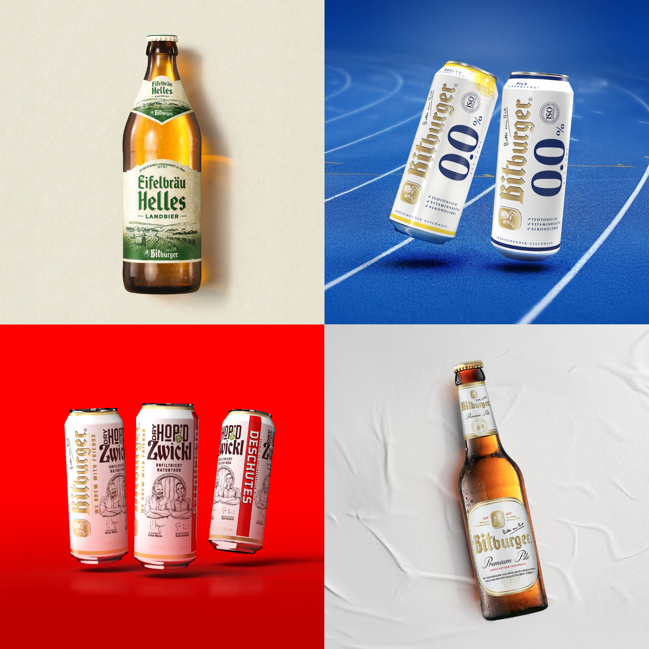
Bitburger and football have always gone hand in hand. As the official beer partner of UEFA Euro 2024 in Germany, the brand proudly presented its strong connection to the sport. For this European Championship, we developed the design of all packaging. In close coordination with UEFA, we created a visual fusion of the official UEFA corporate design and the Bitburger brand world – bringing to life diversity, openness, and athletic dynamism in a high-impact design.
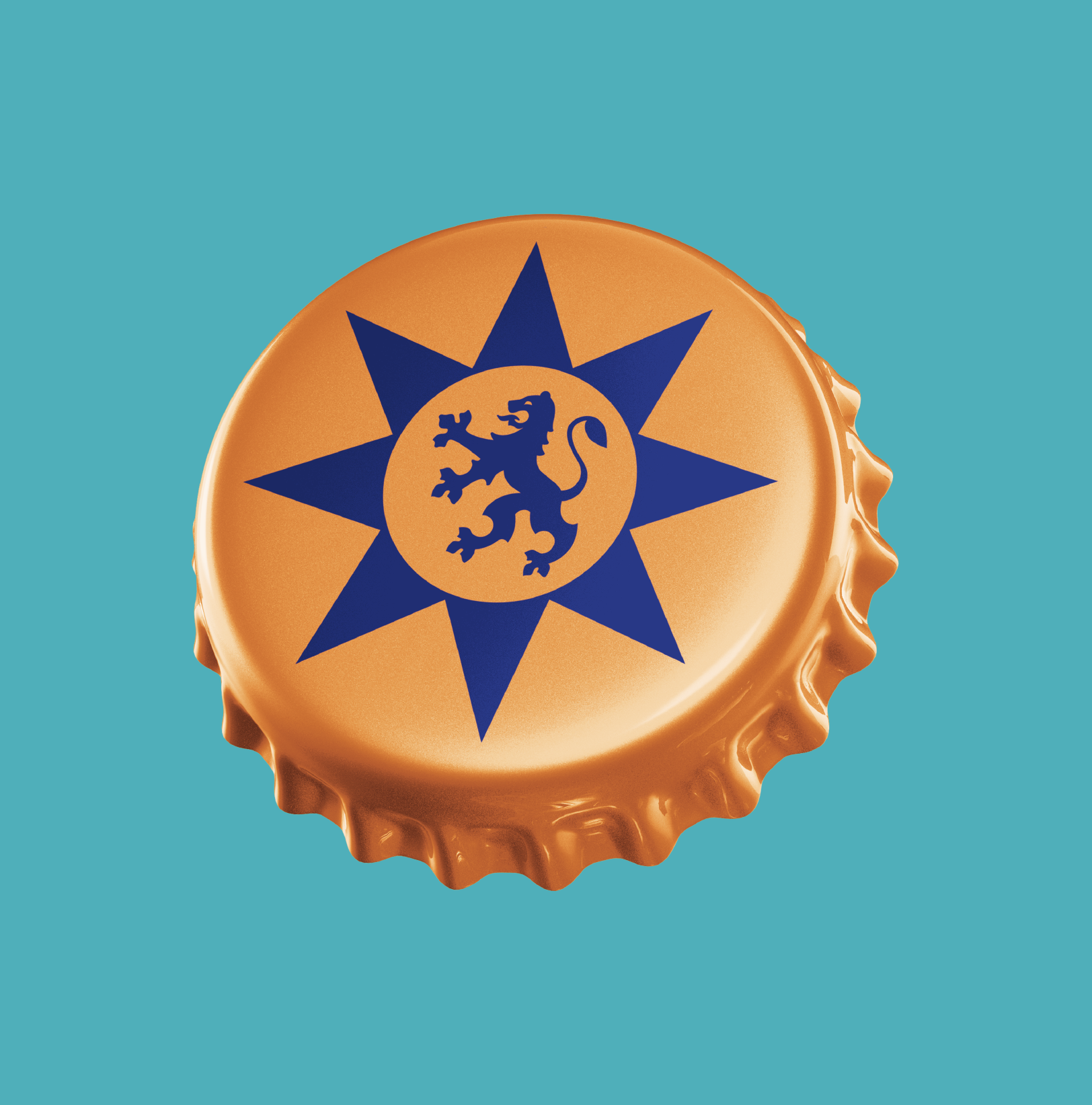
One of the project highlights was the stadium cup, which quickly became a sought-after collectible during the tournament, alongside a crown cap campaign rolled out across primary and secondary packaging formats.

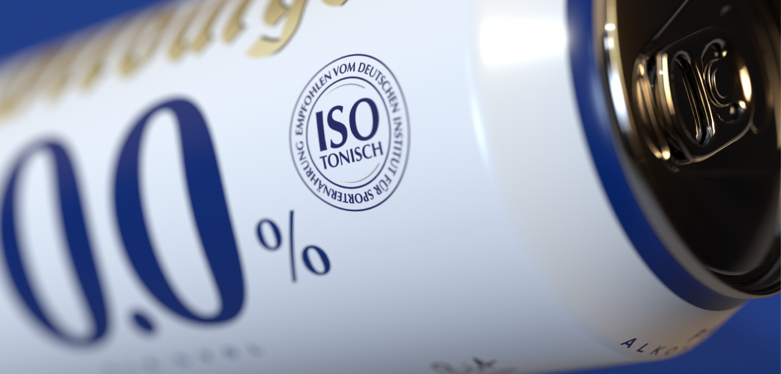

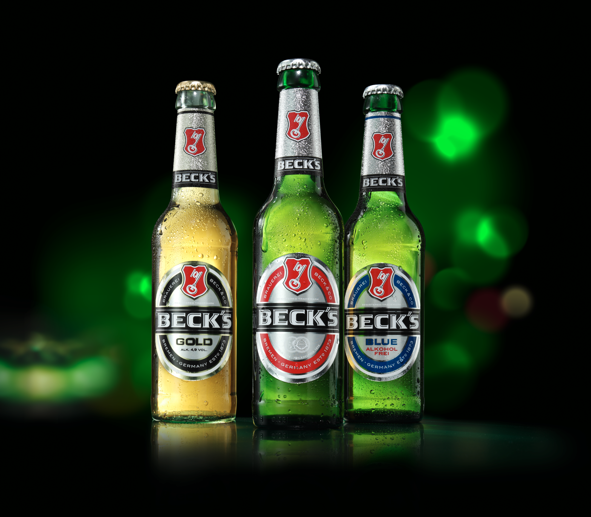
Bitburger 0.0% was a pioneer in the alcohol-free category and remains one of the most successful brands in the non-alcoholic beer segment to this day. The range has continually expanded through line extensions. From the start, our focus was on creating a bold and standout visual identity for the 0.0 sub-brand. The challenge was to find the perfect balance between Bitburger’s traditional look and feel, and the sporty, energetic world of non-alcoholic, isotonic beverages. The two dominant zeroes in a premium shade of blue achieve just that – ensuring quick recognition and visibility at the point of sale.
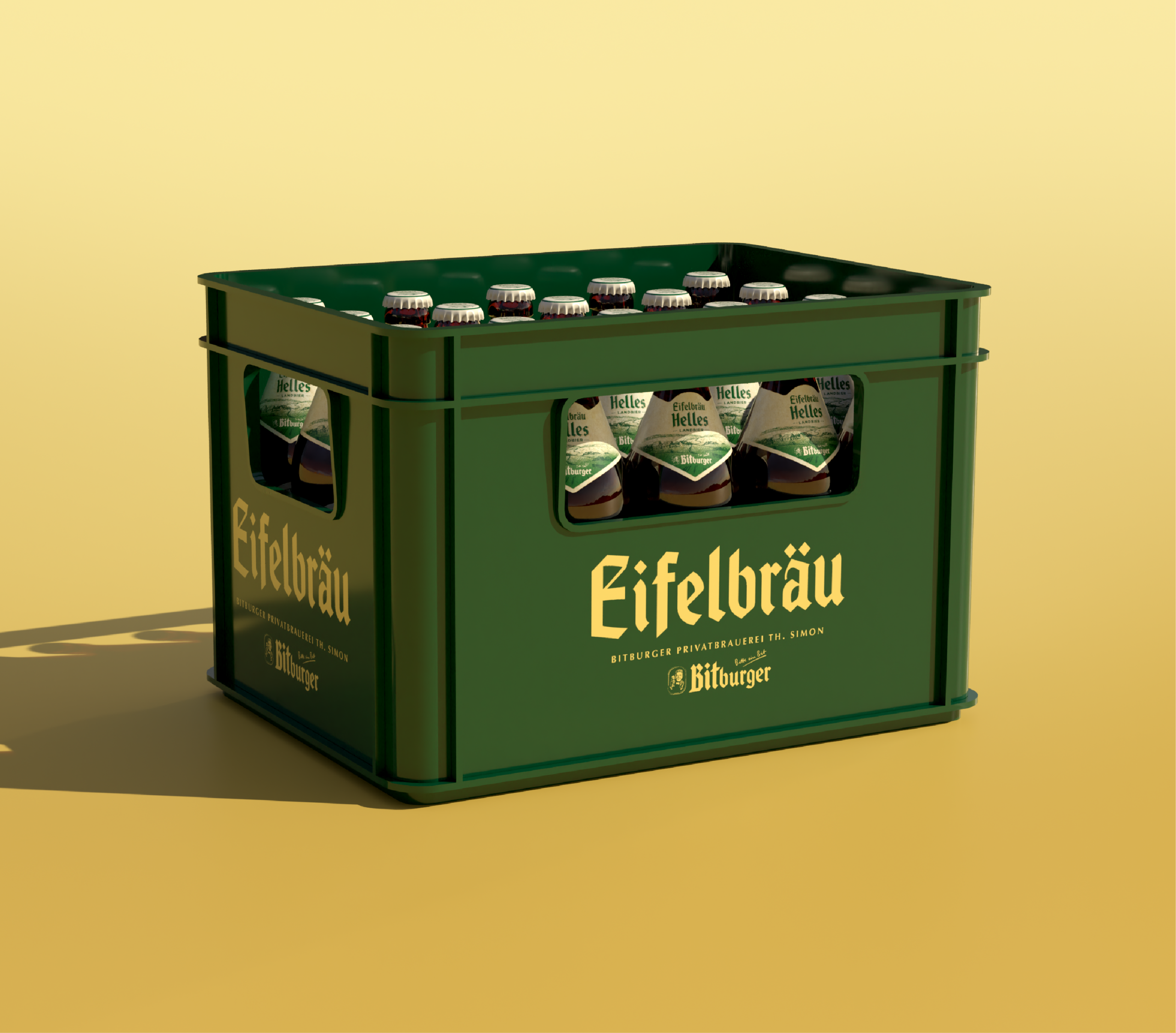

“Eifelbräu Helles” is our response to the growing demand for pale lagers. As a beer brand from the Eifel region, Bitburger introduces “Eifelbräu Helles” as a new brand, stepping into the role of an endorser for the first time. This move brings authenticity to a traditionally Bavarian product concept with a strong regional focus. The wordmark is clearly derived from the Bitburger logo, blending tradition and nostalgia inspired by visual cues from classic Bavarian Helles beers. The minimalist color palette and purist crate design emphasize the grounded, straightforward character of the new brand. A bold key visual featuring the product and its own signature glass rounds out the packaging design.
Makes you want more
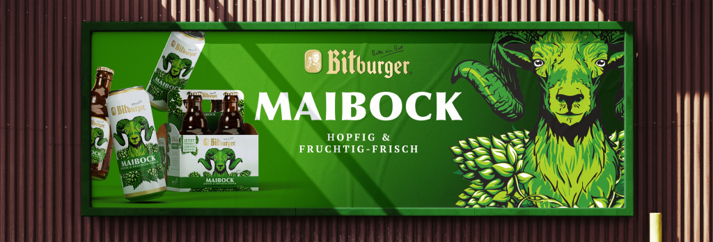
In addition to ongoing collaborations with regional U.S. craft beer brands, Bitburger’s product portfolio also includes limited seasonal editions. These intentionally break away from the familiar brand look to attract new target audiences and trigger impulse purchases at the POS.