What it’s about
Gerolsteiner is the market leader in the German mineral water segment and can look back on a long and storied company history. It is a position that must be earned again and again – through a strong brand presence, continuous innovation, and relevance for both loyal and new target audiences.
As a creative and strategic partner, we have been working with Gerolsteiner since 2017, when we were entrusted with the comprehensive relaunch of the core product range as well as all refreshing beverages.
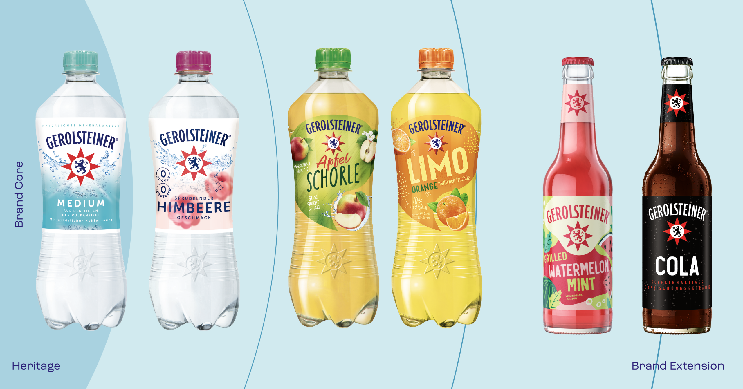
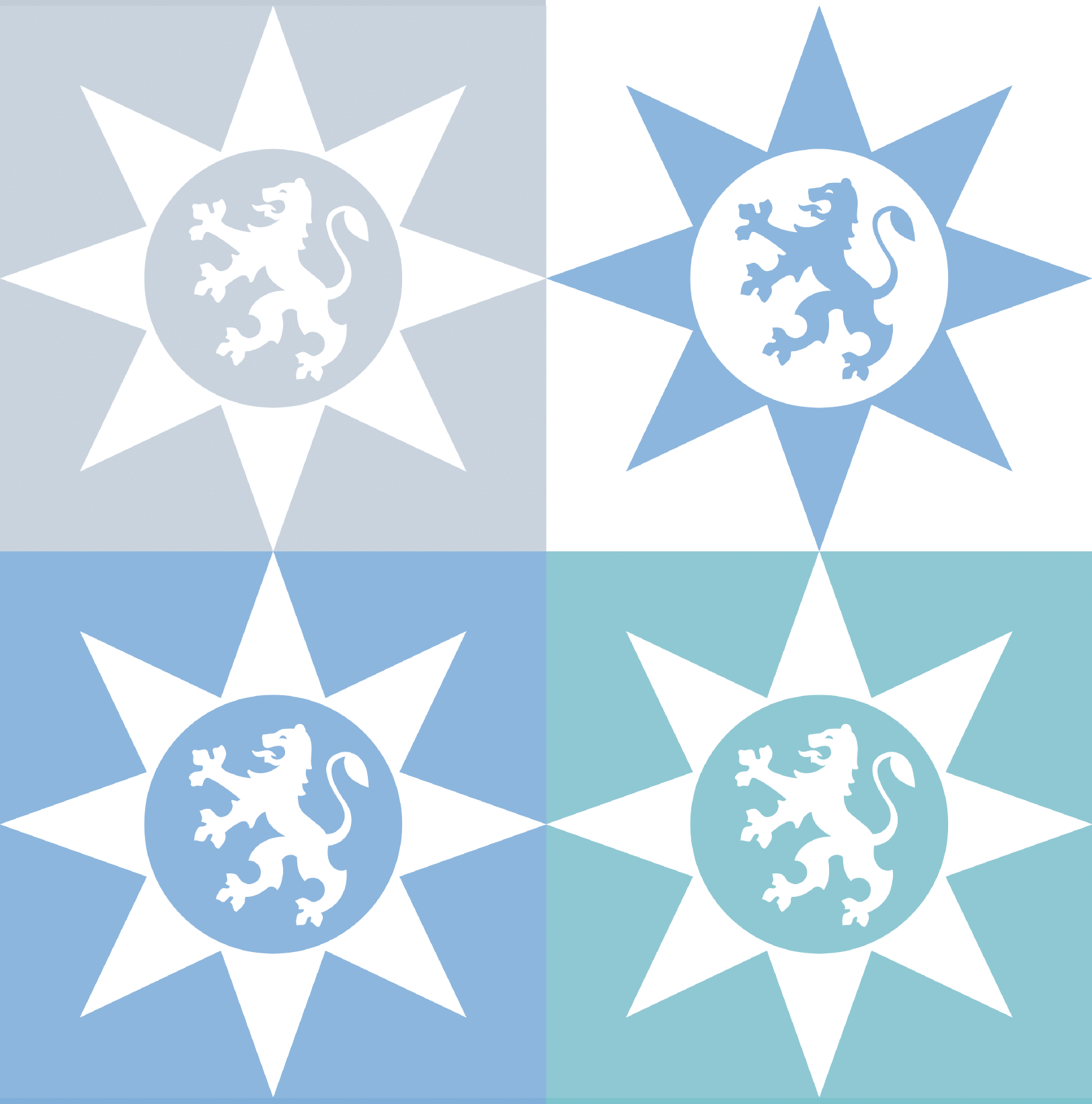
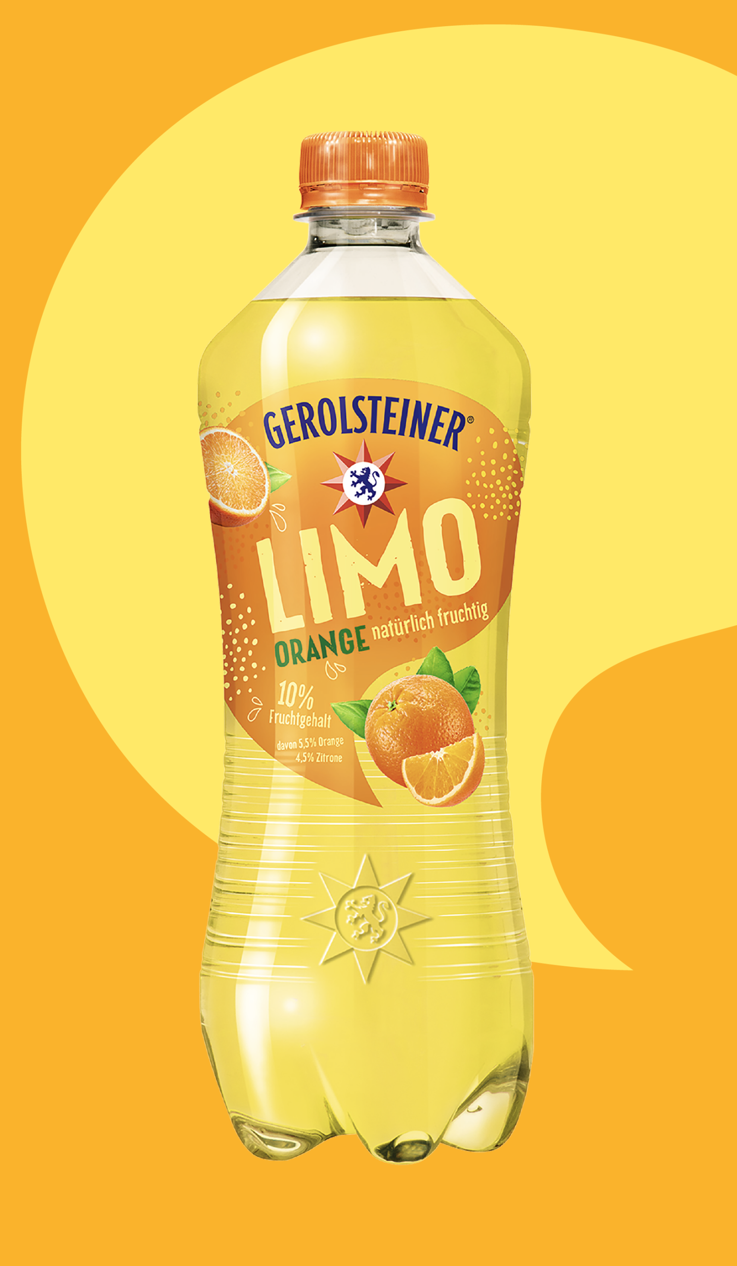
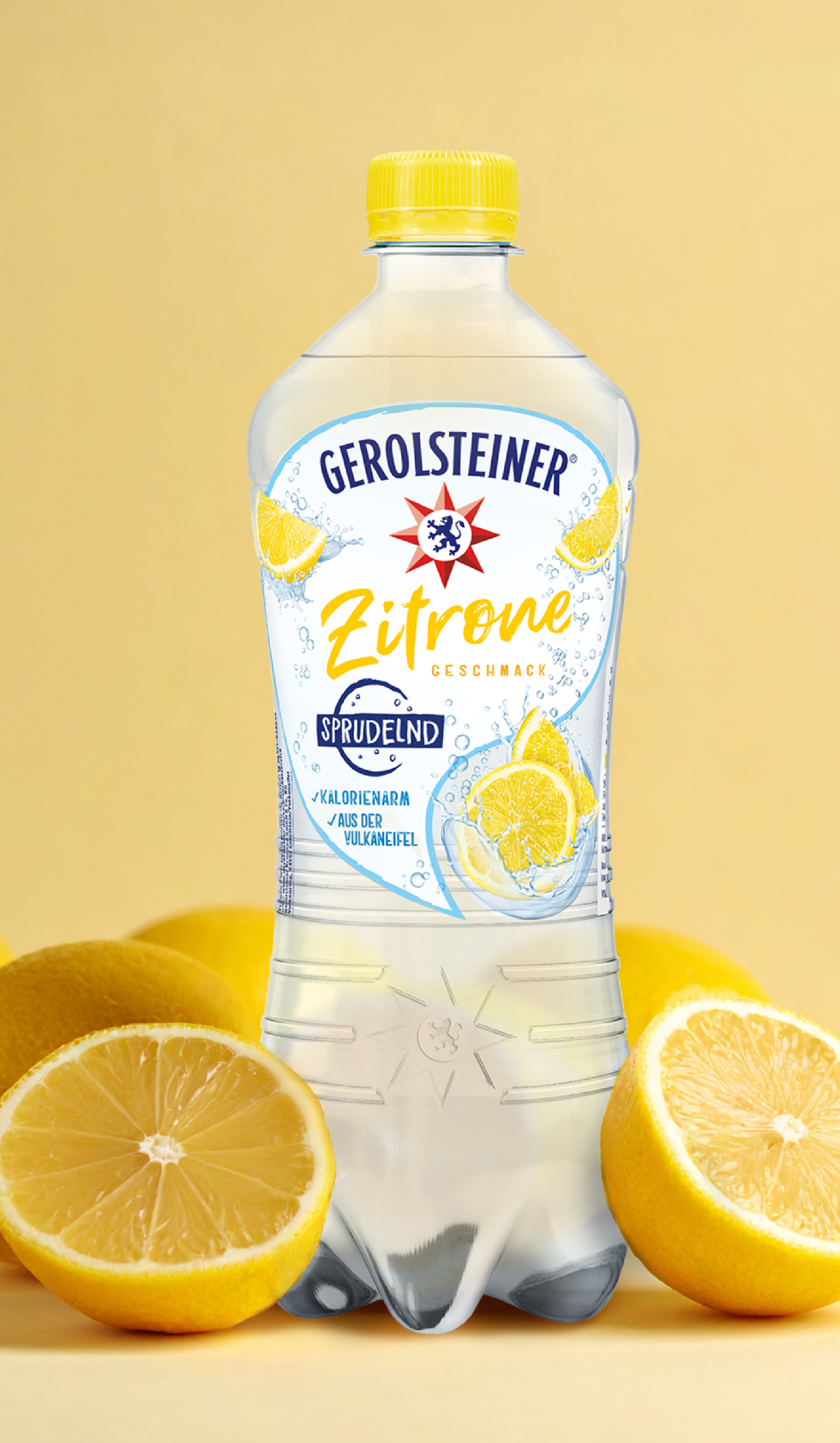
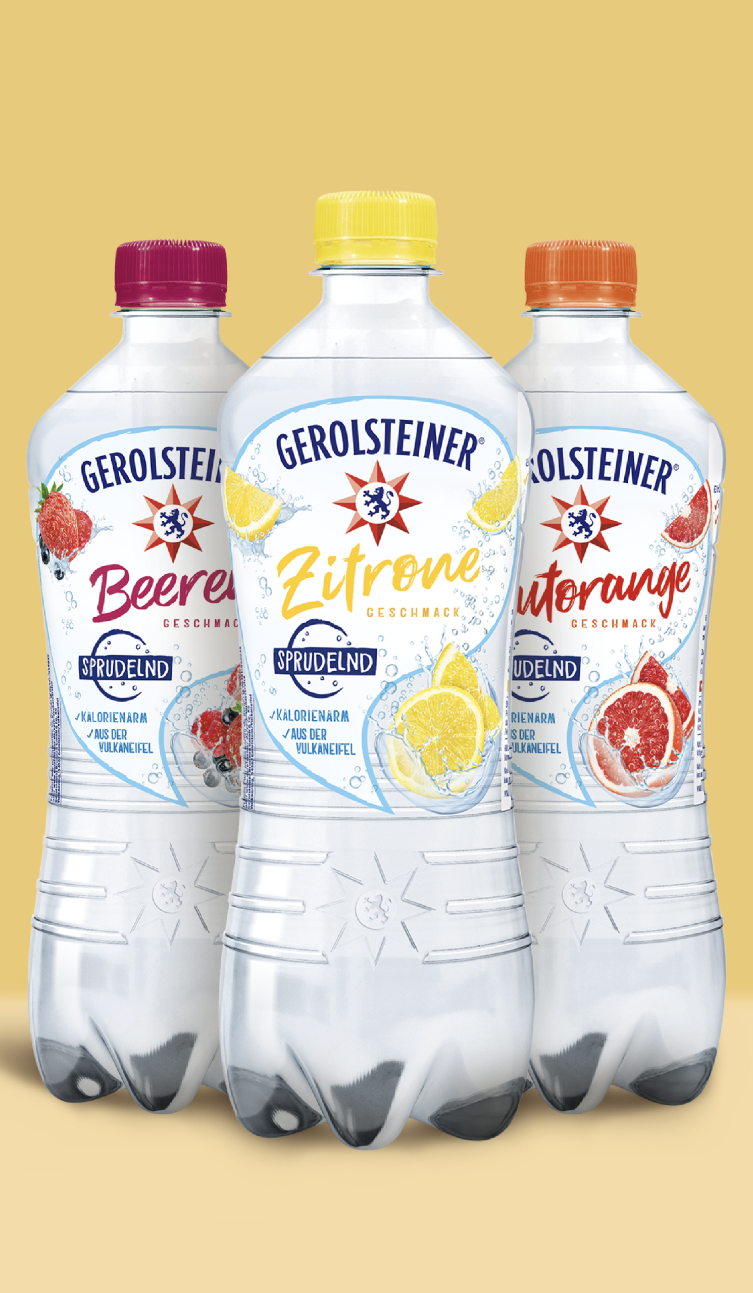
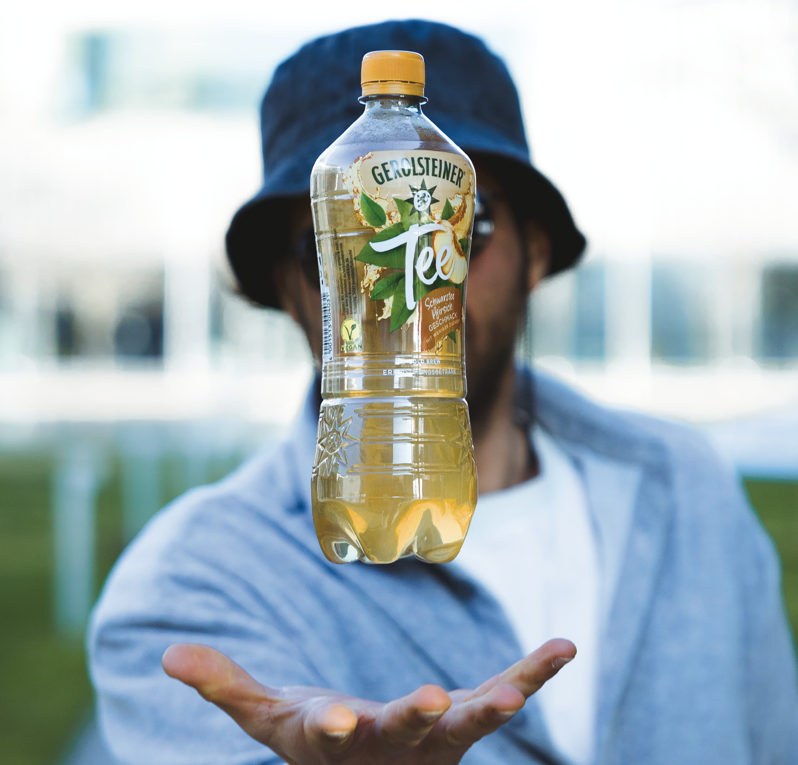
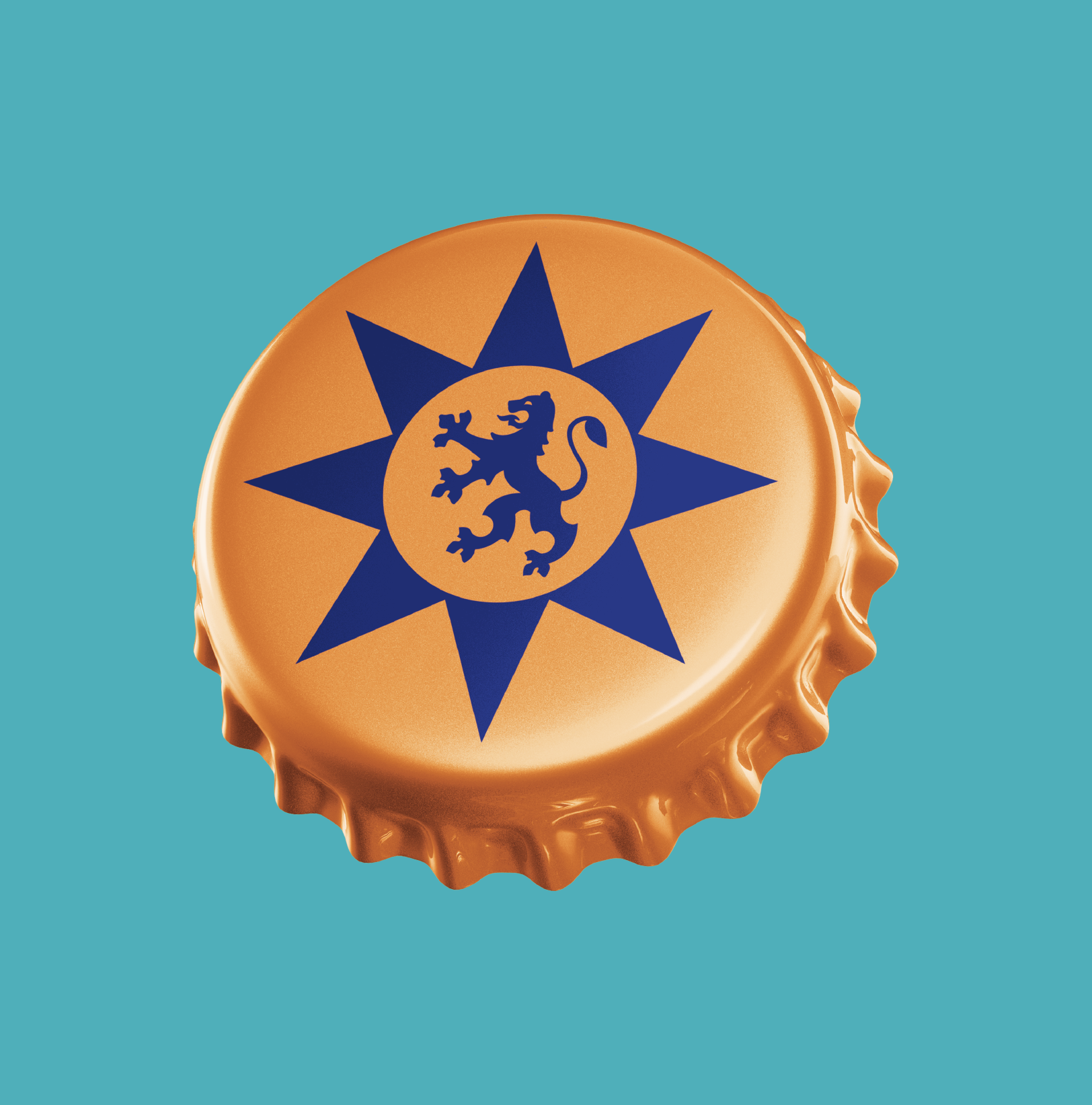
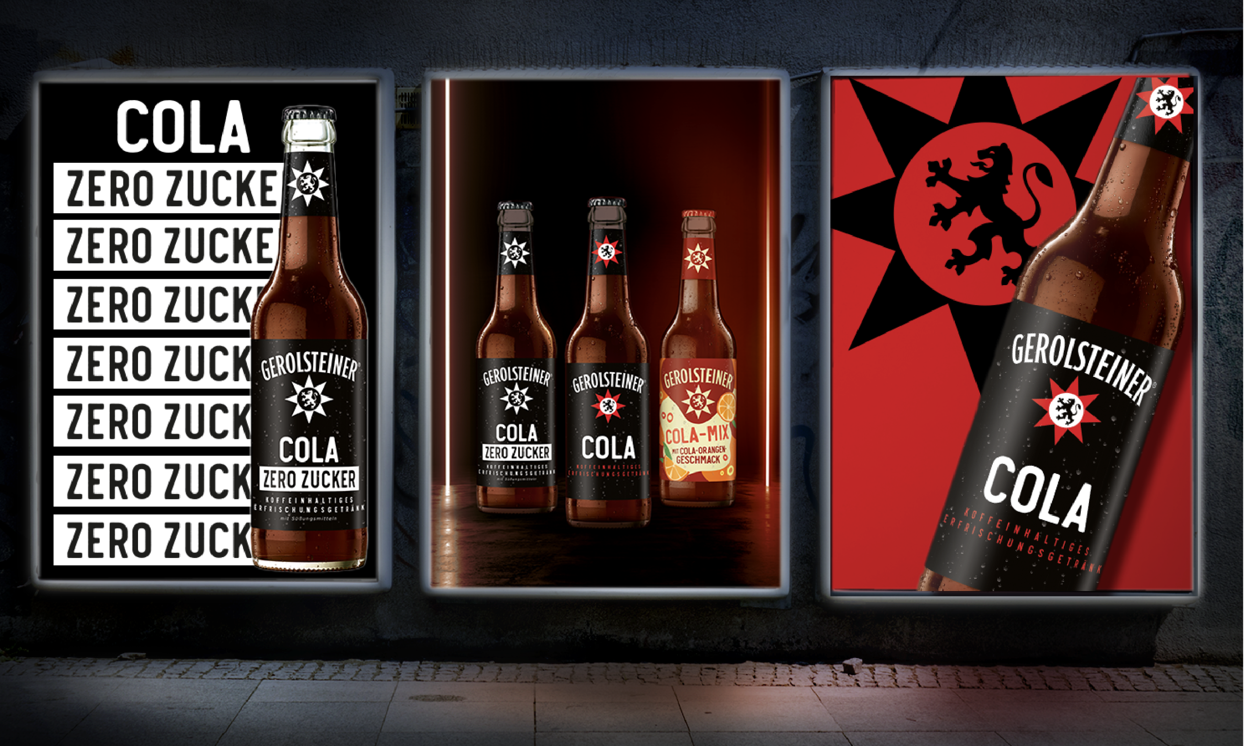
Our focus was on turning the red star into an icon – establishing it as the central visual of the brand. As a unique brand asset, it sharpens the brand’s profile while creating a powerful shelf block that delivers both strong visual impact and clear orientation for consumers at the point of sale.
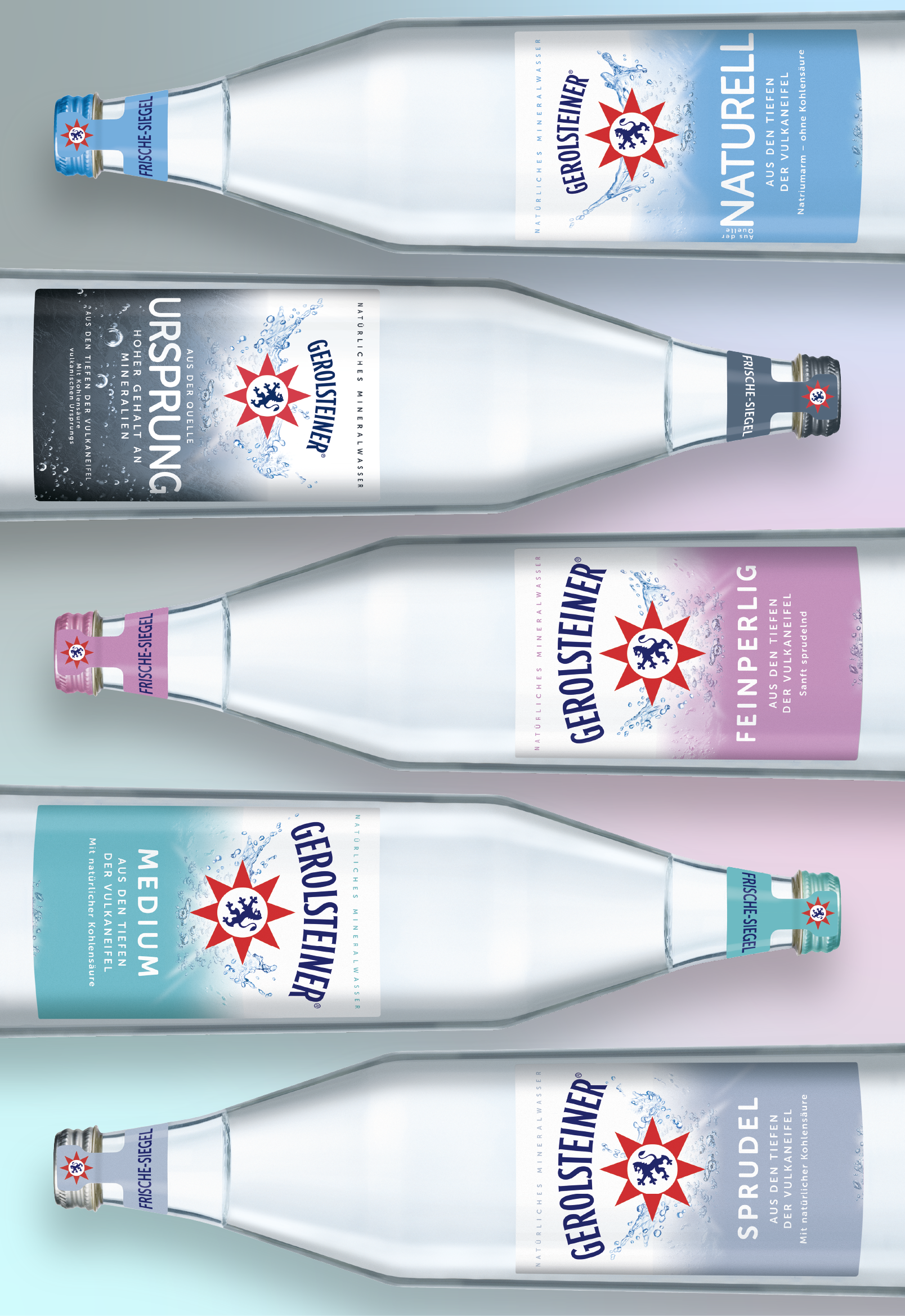

Especially in a largely standardized product category like mineral water, design plays a crucial role: it differentiates at the point of sale, conveys the brand’s values, and serves as a key driver for brand preference. That is why we always focus on sharpening the brand’s visual identity without ever compromising its recognizability.
We act as innovators, sparring partners, and consultants across all brand touchpoints – from overarching design strategy to the precise execution in packaging design.
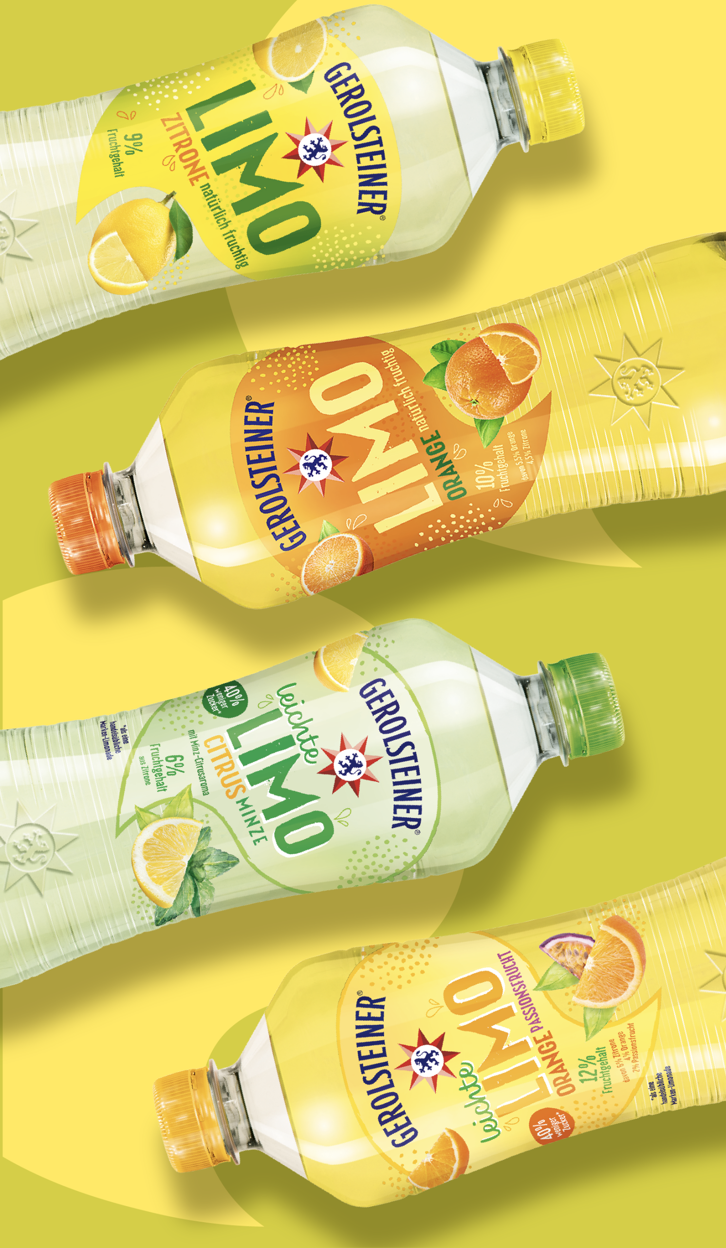
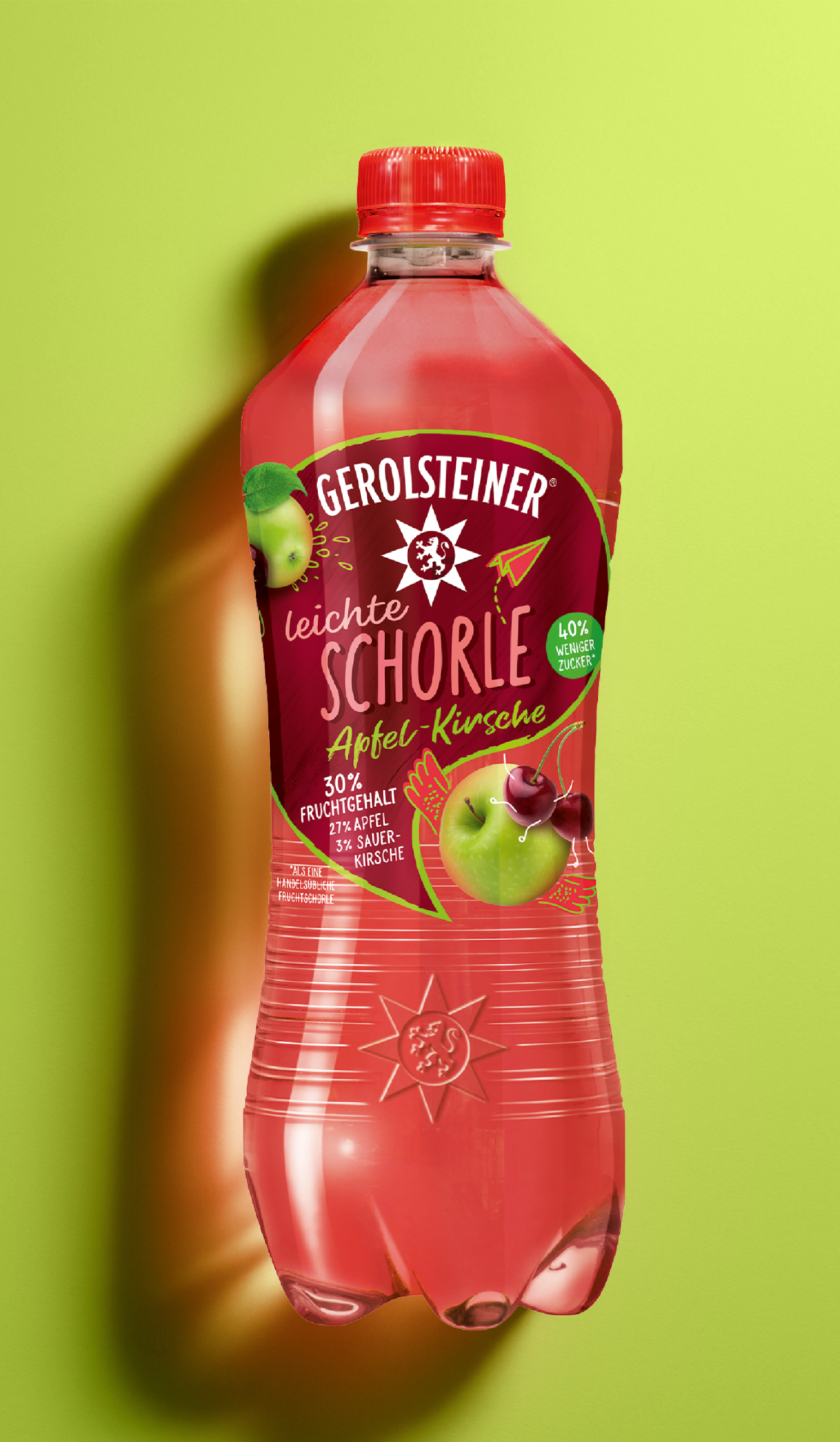
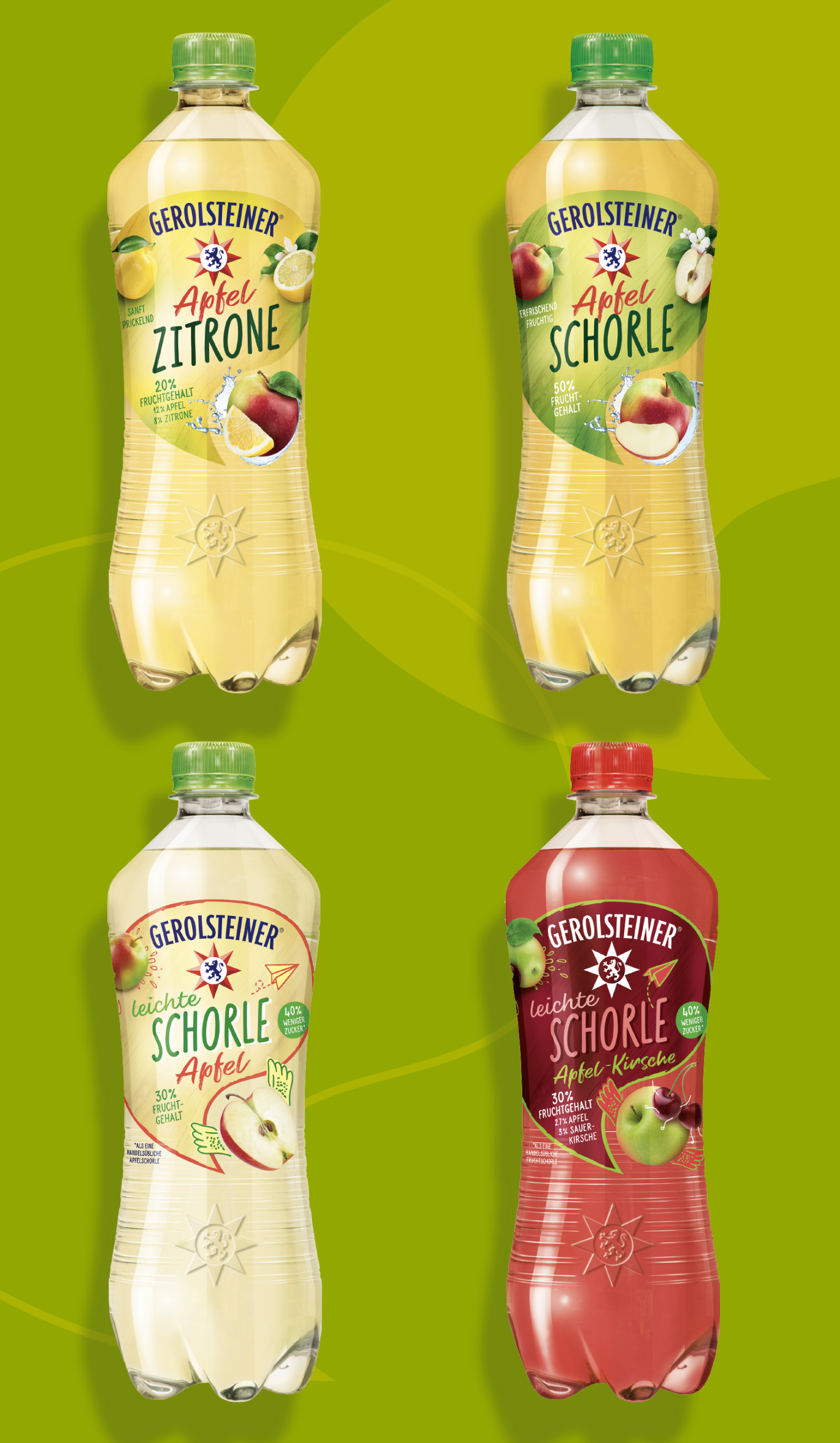

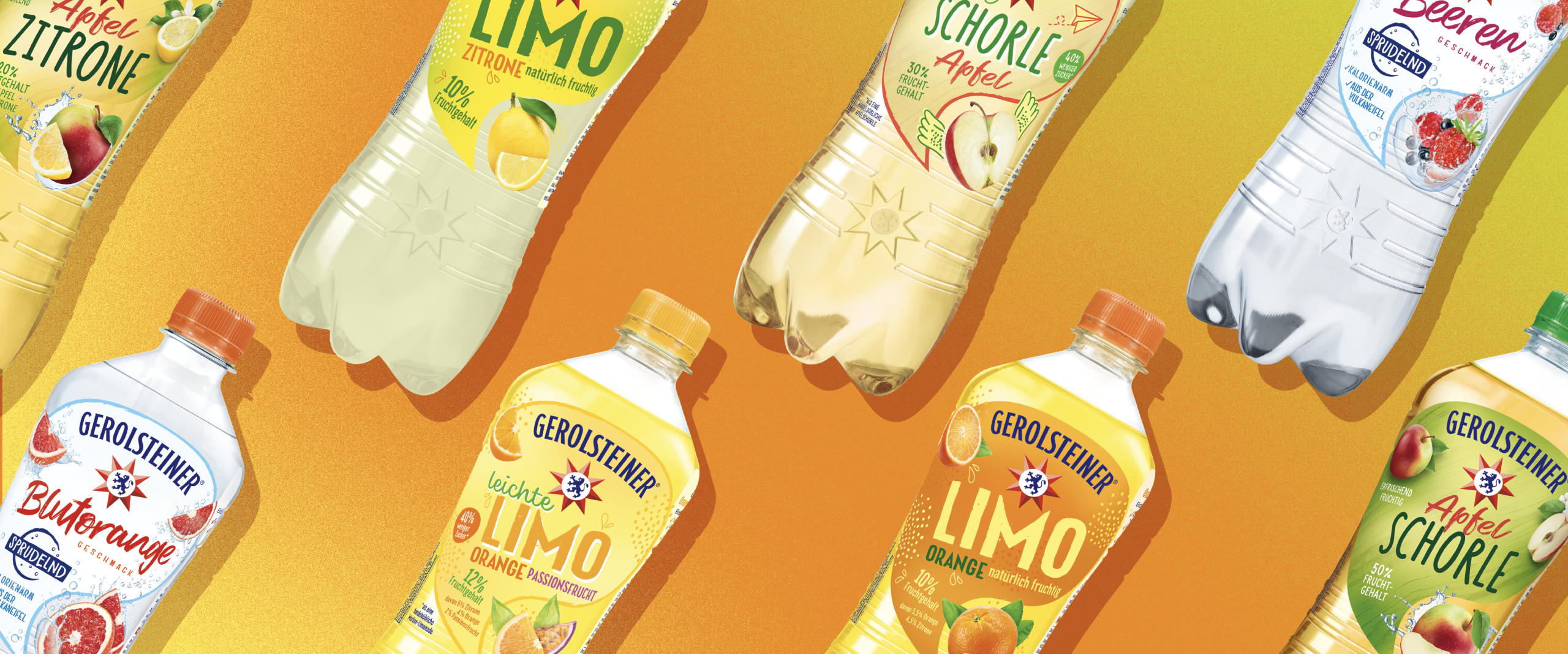
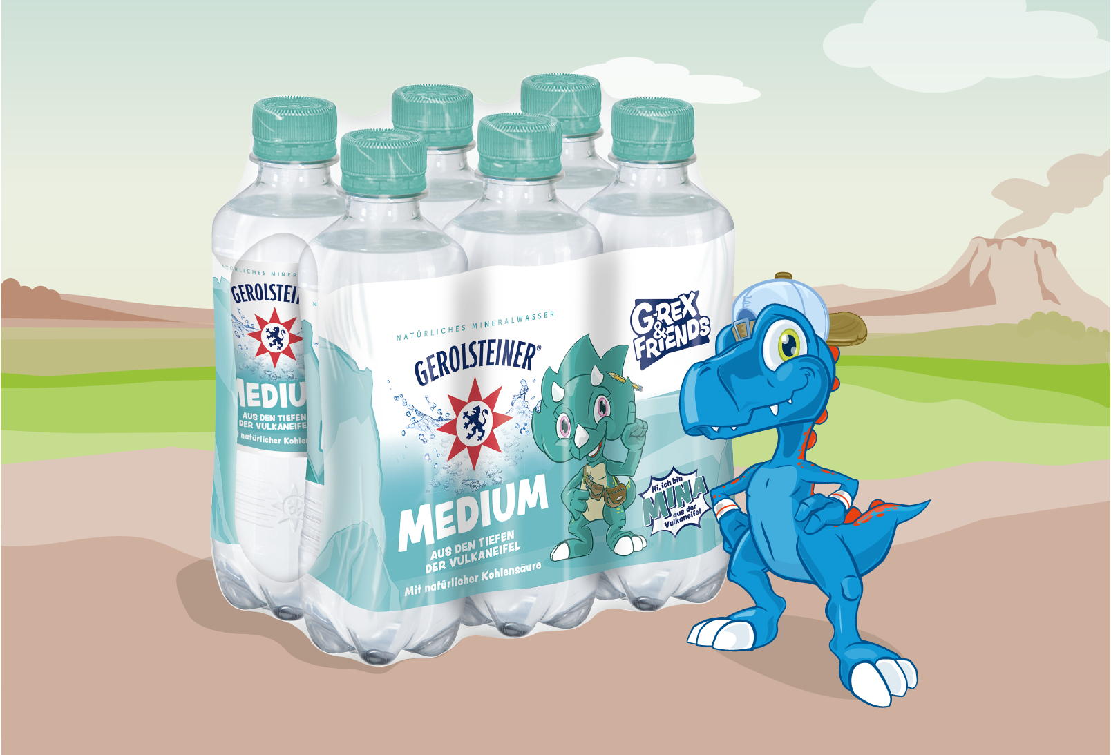
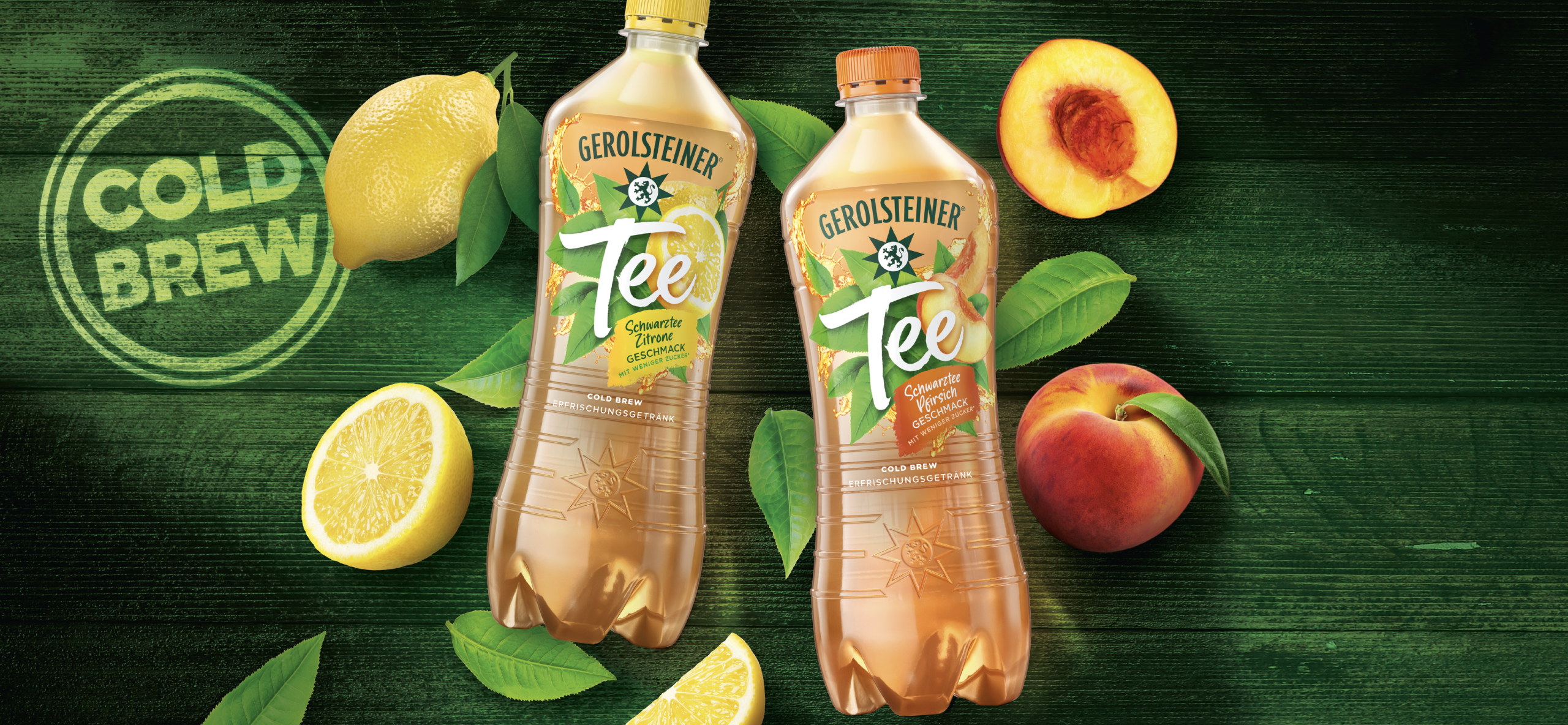
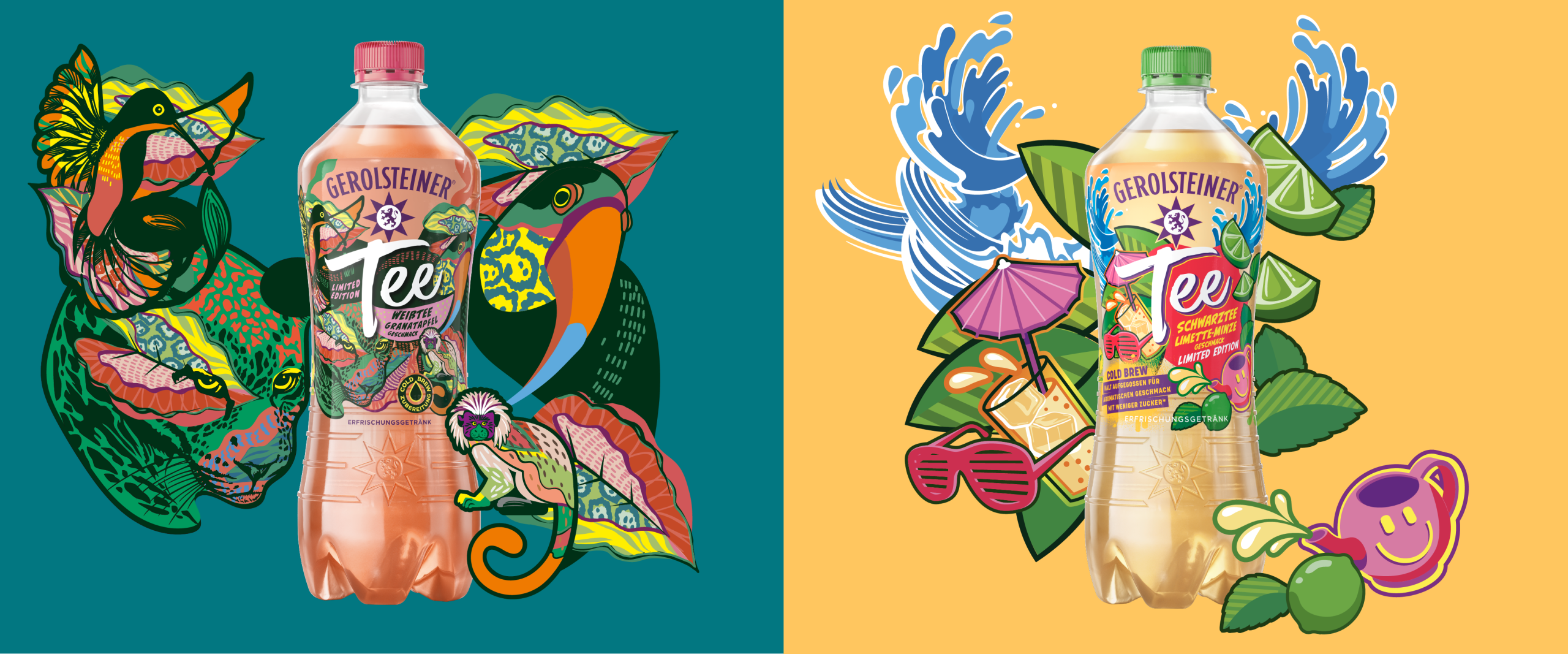
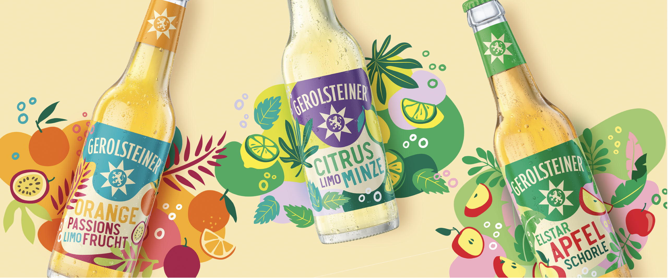
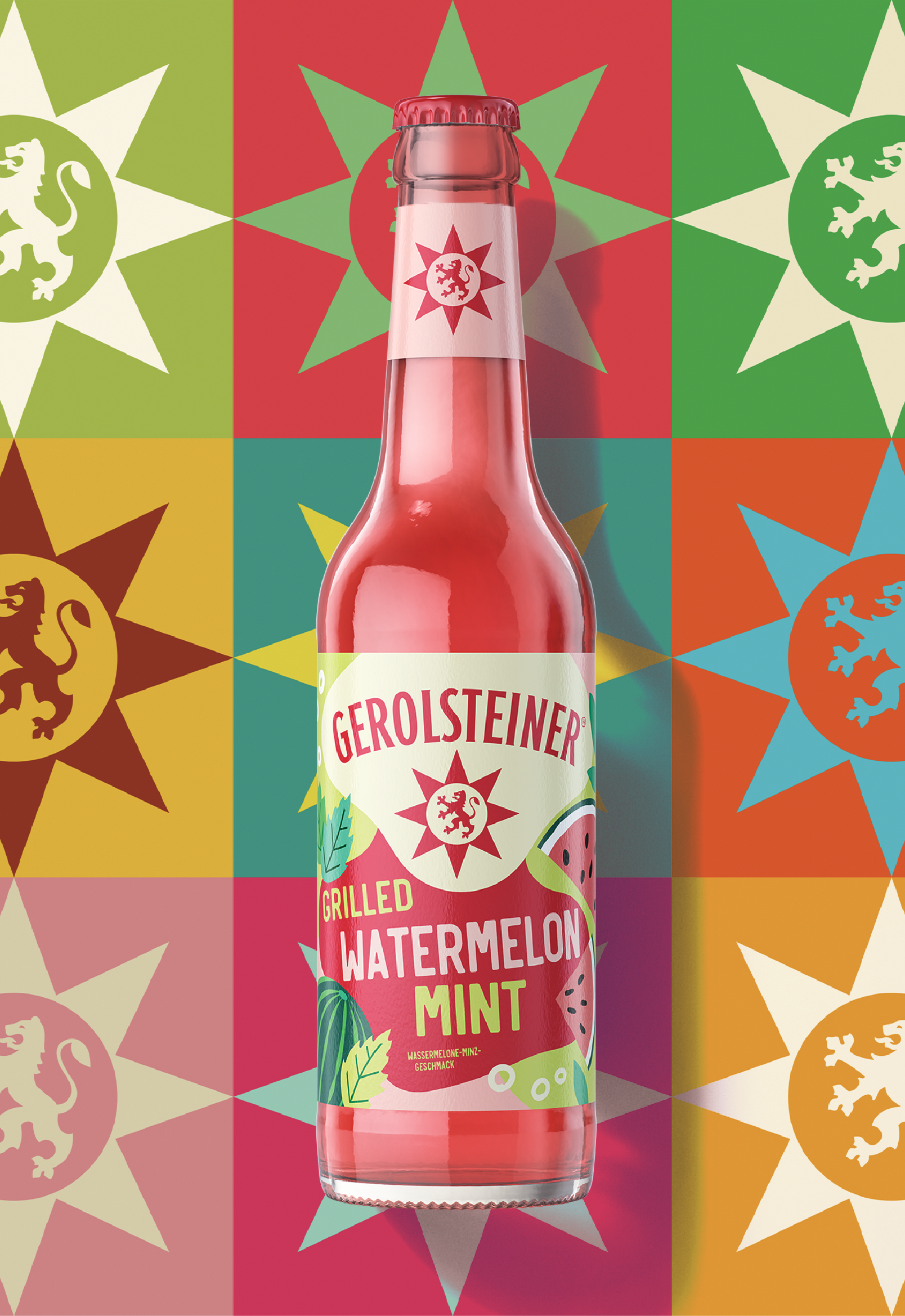
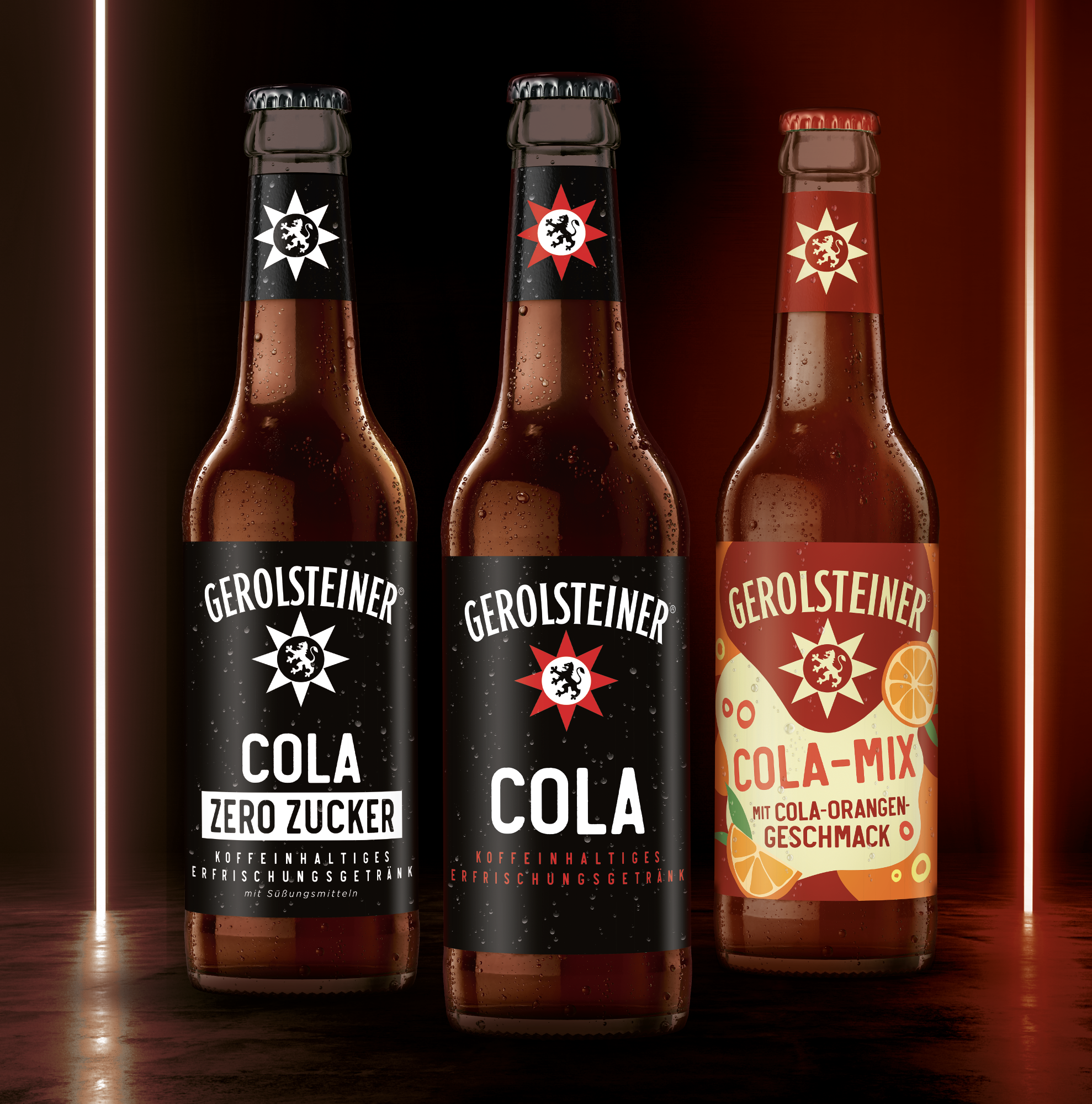
Through joint workshops and regular exchange formats, we collaborate closely with the Gerolsteiner team to develop new ideas, test formats, and take an integrated approach to design. We support the development of new products and ranges – from innovation concepts and limited editions in collaboration with artists, to the design of PET bottle formats and concepts for the OMR trade fair stand.
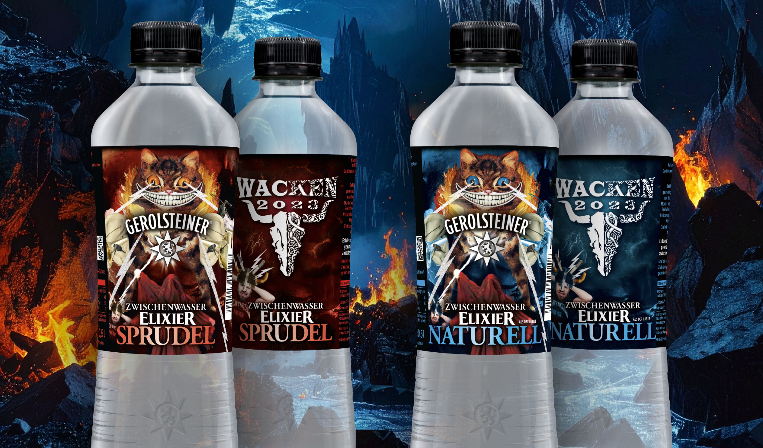
Our approach is holistic and always fresh, continuously reimagining the brand experience. In recent years, we have also created special editions for the Wacken Festival, further demonstrating the brand’s versatility and cultural relevance.
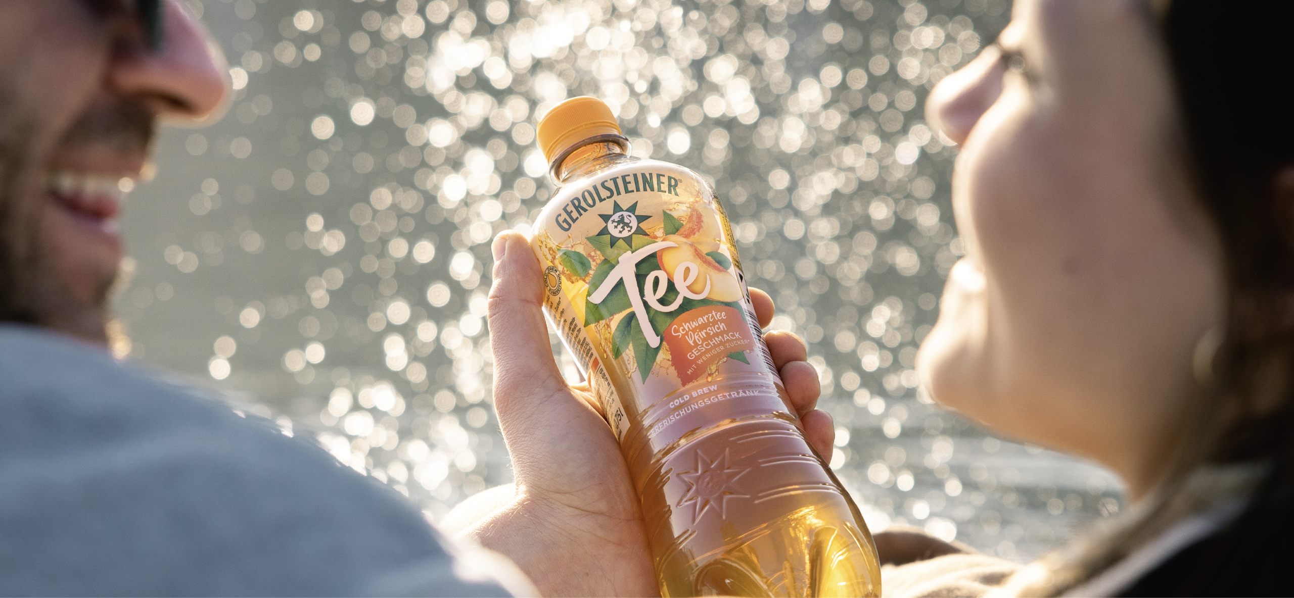
This creates a brand experience that inspires trust while still surprising consumers – delighting loyal customers and winning over new target audiences.
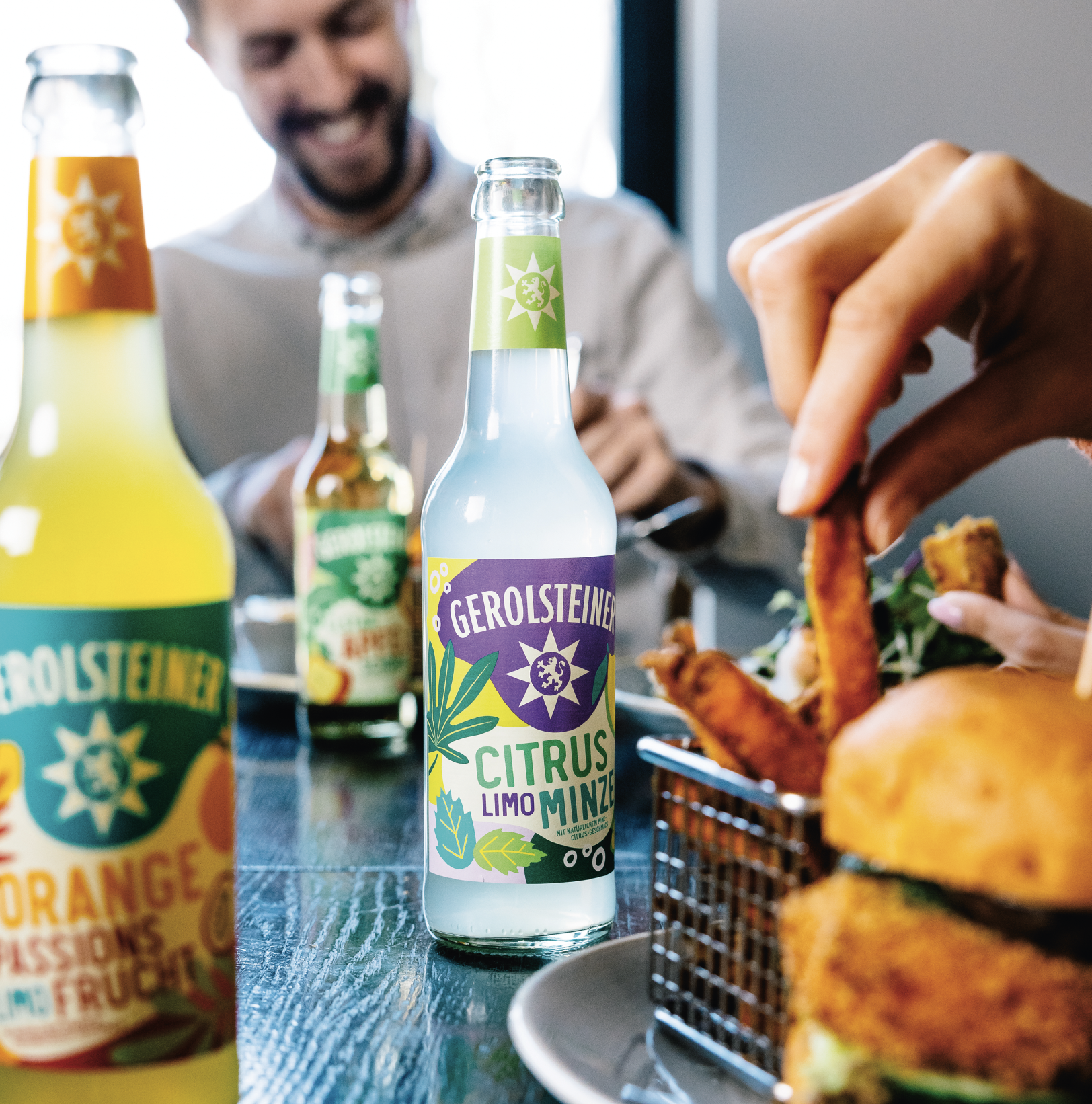
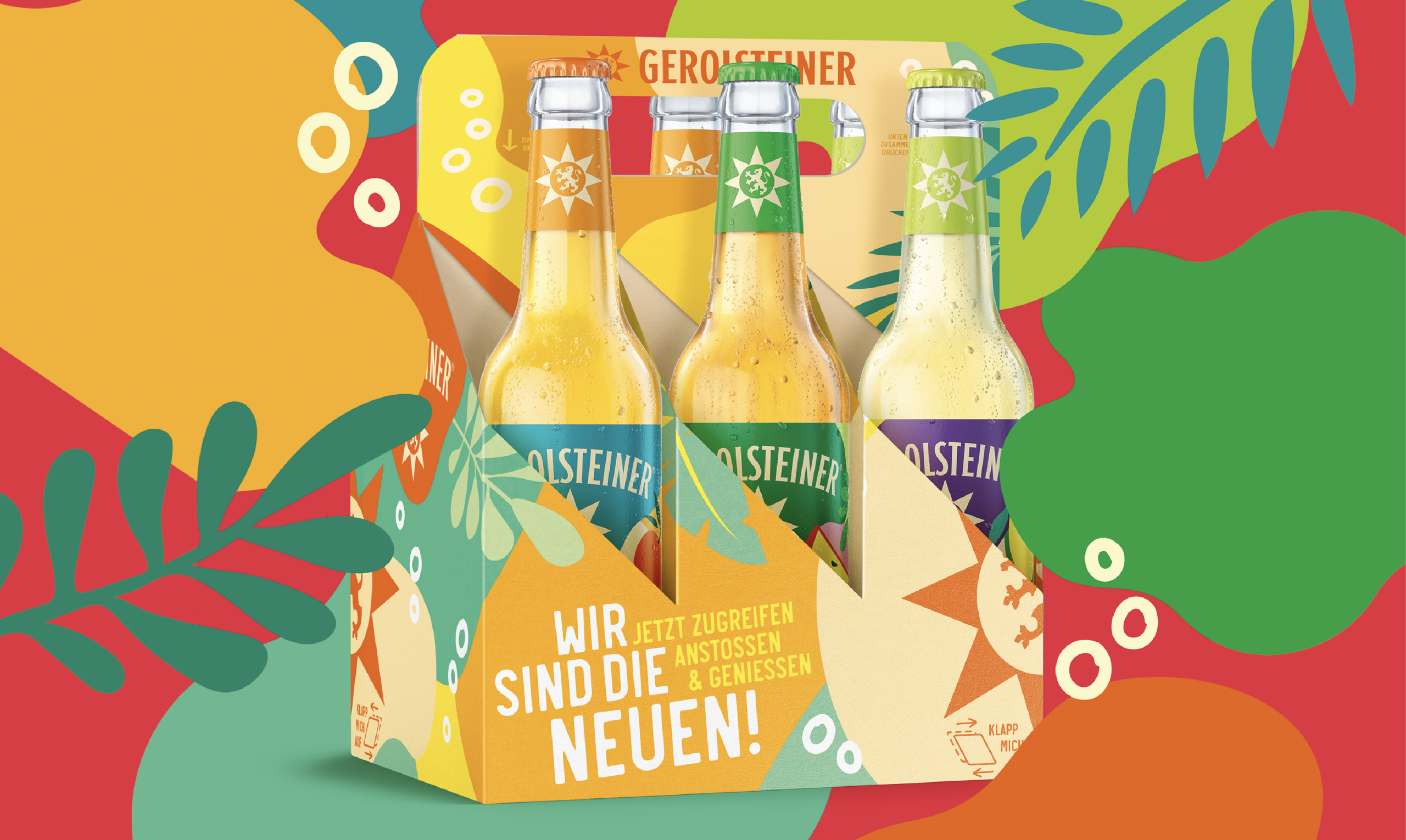
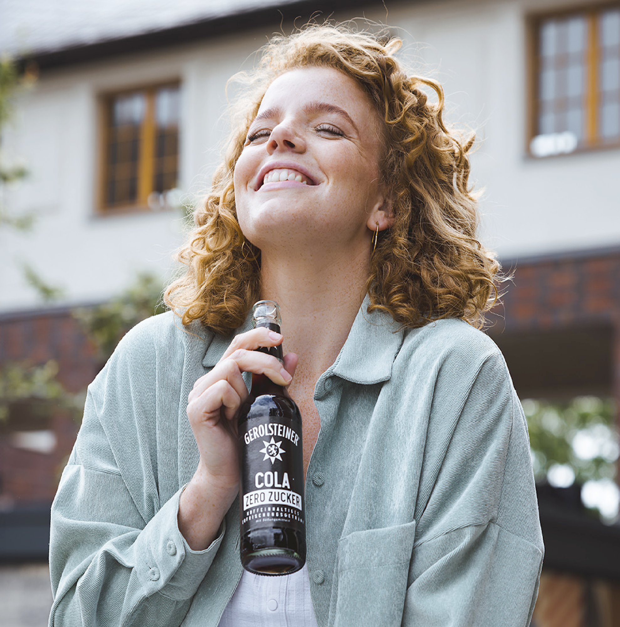
With the expansion of its packaging portfolio to include the 0.33l longneck bottle, Gerolsteiner extends its presence into trendy gastronomy and bar environments. In developing the design, the focus was on rejuvenating the brand perception. The playful yet striking design resonates with a younger, urban audience that prefers a more relaxed drinking culture. The colorful labels reflect the graphic minimalism of the category, while the organic shapes communicate naturalness as a central element of the brand’s heritage.
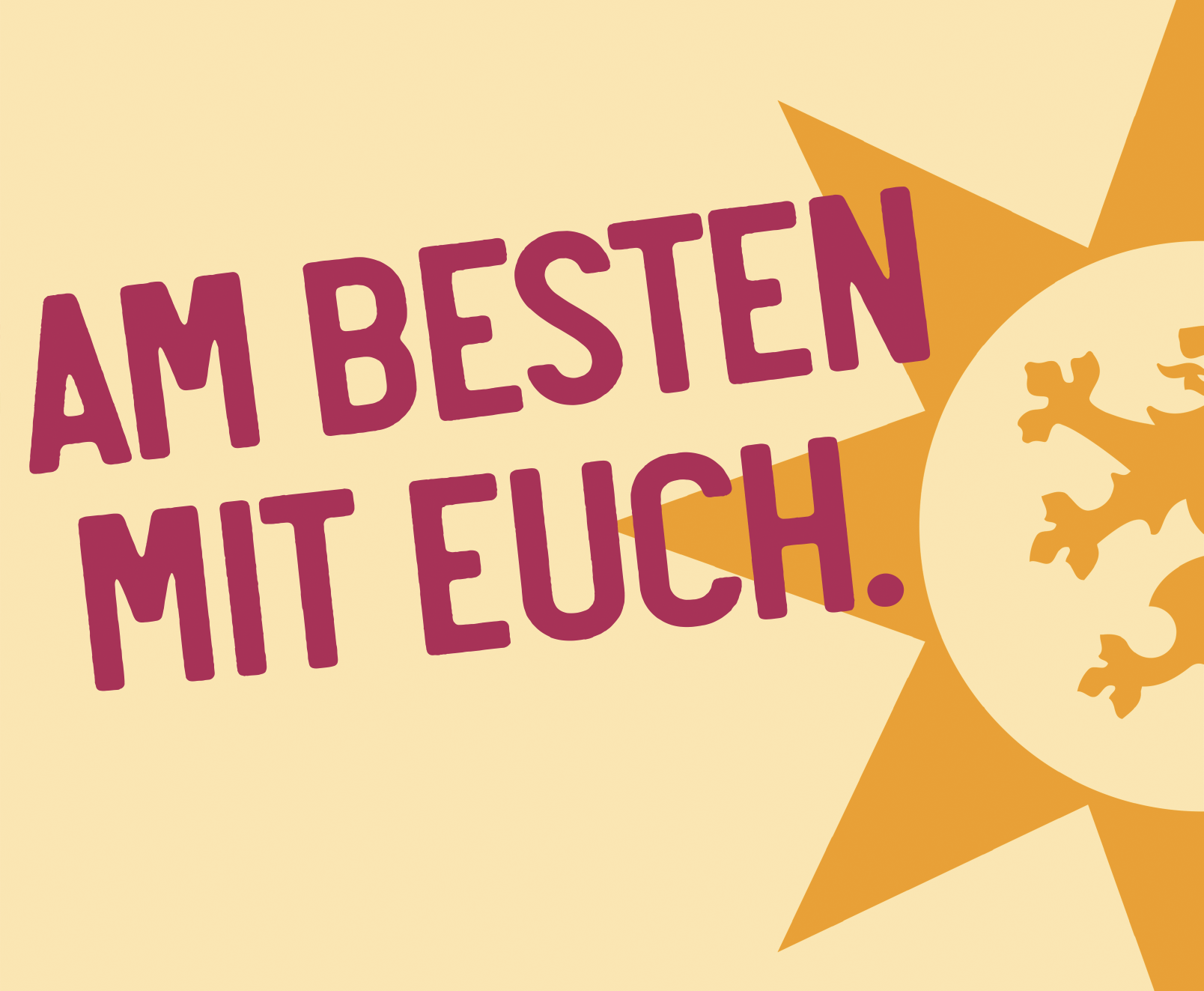
The launch claim “We Are the New Ones” confidently underlines the brand’s ambition to stand out in the highly competitive soft drinks market and establish itself alongside already well-known competitors.

This creates a brand experience that inspires trust while still delivering moments of surprise – one that excites existing customers and convinces new target audiences.
By expanding its packaging portfolio to include the 0.33l longneck bottle, Gerolsteiner extends its presence into trend-driven gastronomy and the bar segment. The development of the design focused on refreshing and rejuvenating the brand’s perception. Its playful yet bold look makes the brand relevant to a younger, urban audience that embraces a more relaxed drinking culture. The colorful labels cater to the visually reduced, graphic style preferred in this category, while the organic shapes reflect naturalness as a core element of the brand’s heritage.
The launch claim “We Are the New Ones” confidently highlights the ambition to compete in the highly contested soft drinks market and establish itself alongside long-standing competitors.