What it’s about
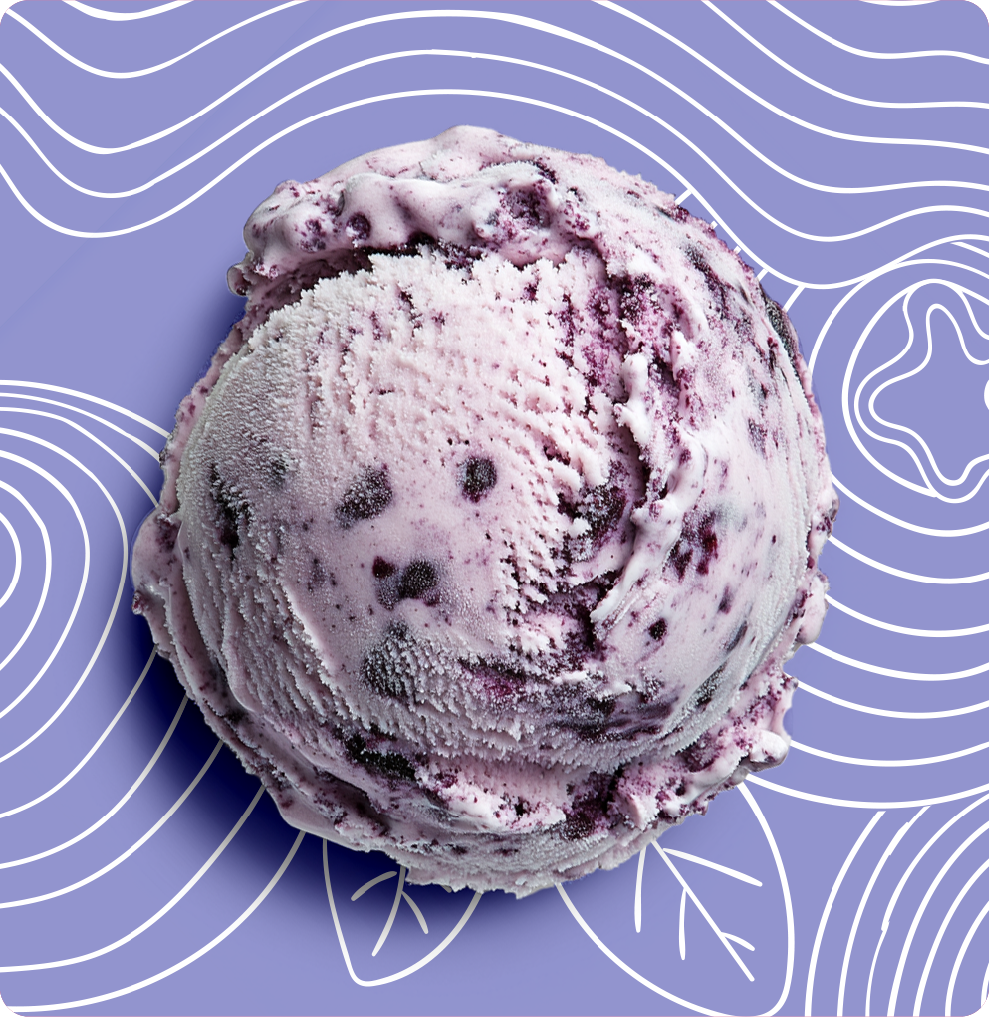
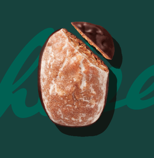
For the brand launch of Glycklich Ice Cream, we had the privilege of developing a brand positioning strategy as well as implementing it through the packaging design. Our goal was to clearly position the brand while creating an emotional connection with the target audience. The overall branding was guided by Glycklich’s USPs – natural production and a unique flavor experience.
The first challenge was to define an insight that aligned with both the brand’s values and its promise. Inspired by the natural ice cream flavors and the irresistible indulgence they offer, we chose “Ice cream makes people happy” as our core message. Since the brand has its roots on the island of Sylt, we decided on a unique, playful brand name with a wink: Glycklich (a blend of the German words for “lucky” and “happiness”). The handwritten style of the logo further emphasizes the brand’s personal and authentic character.
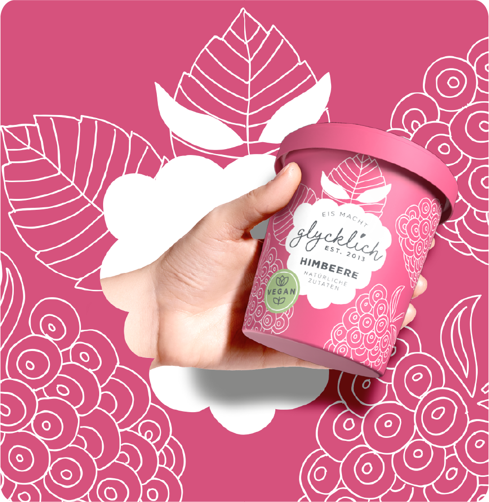
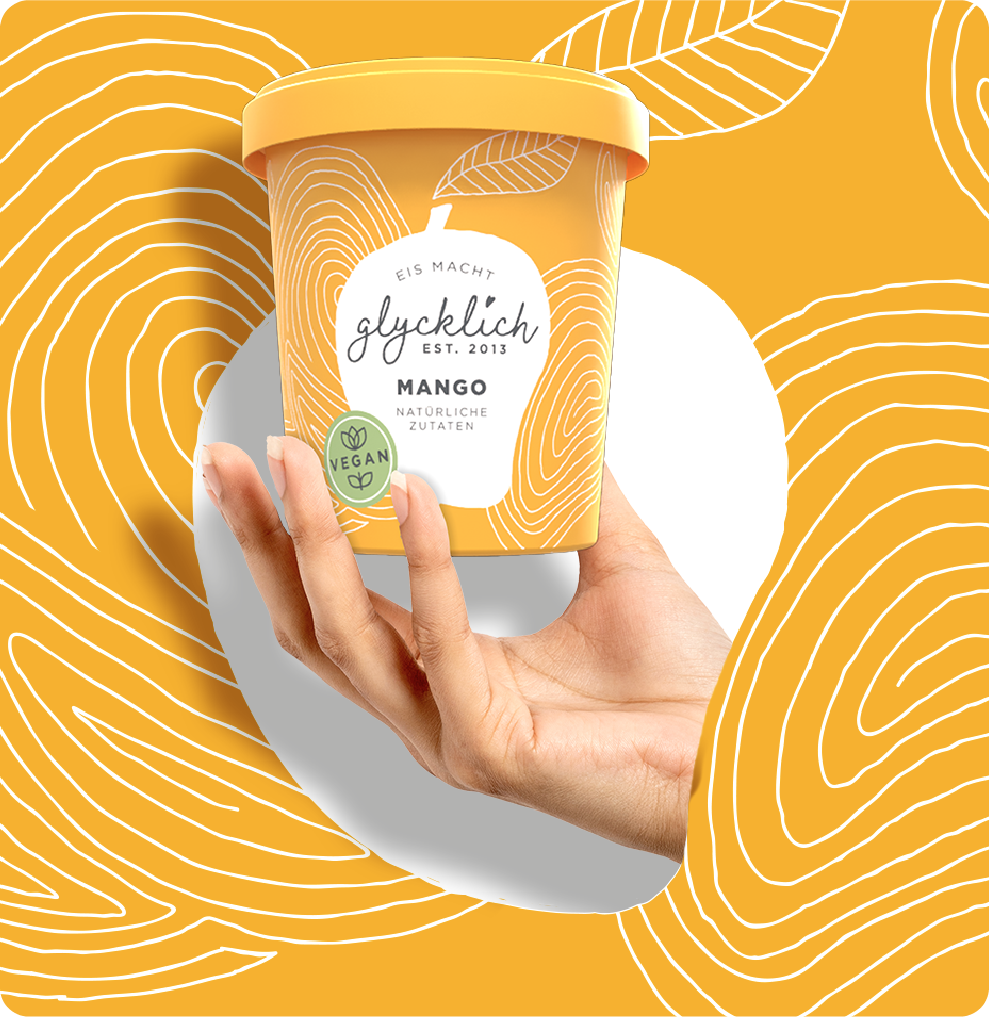
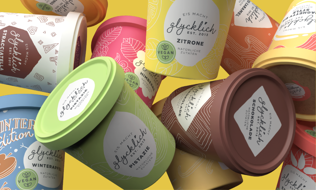
The packaging embodies the brand’s identity, creating strong visual cohesion for easy recognition and a robust brand presence. At the same time, the design concept leaves plenty of room to highlight individual flavors, emphasizing the handcrafted quality of the brand. This approach has enabled Glycklich Ice Cream to establish a sustainable presence at the point of sale, laying the foundation for many more delicious flavors to come.