What it’s about
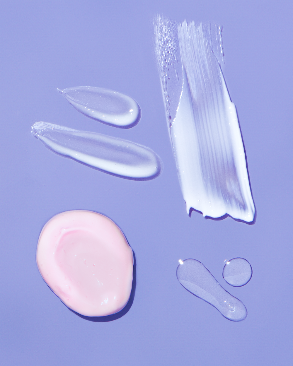
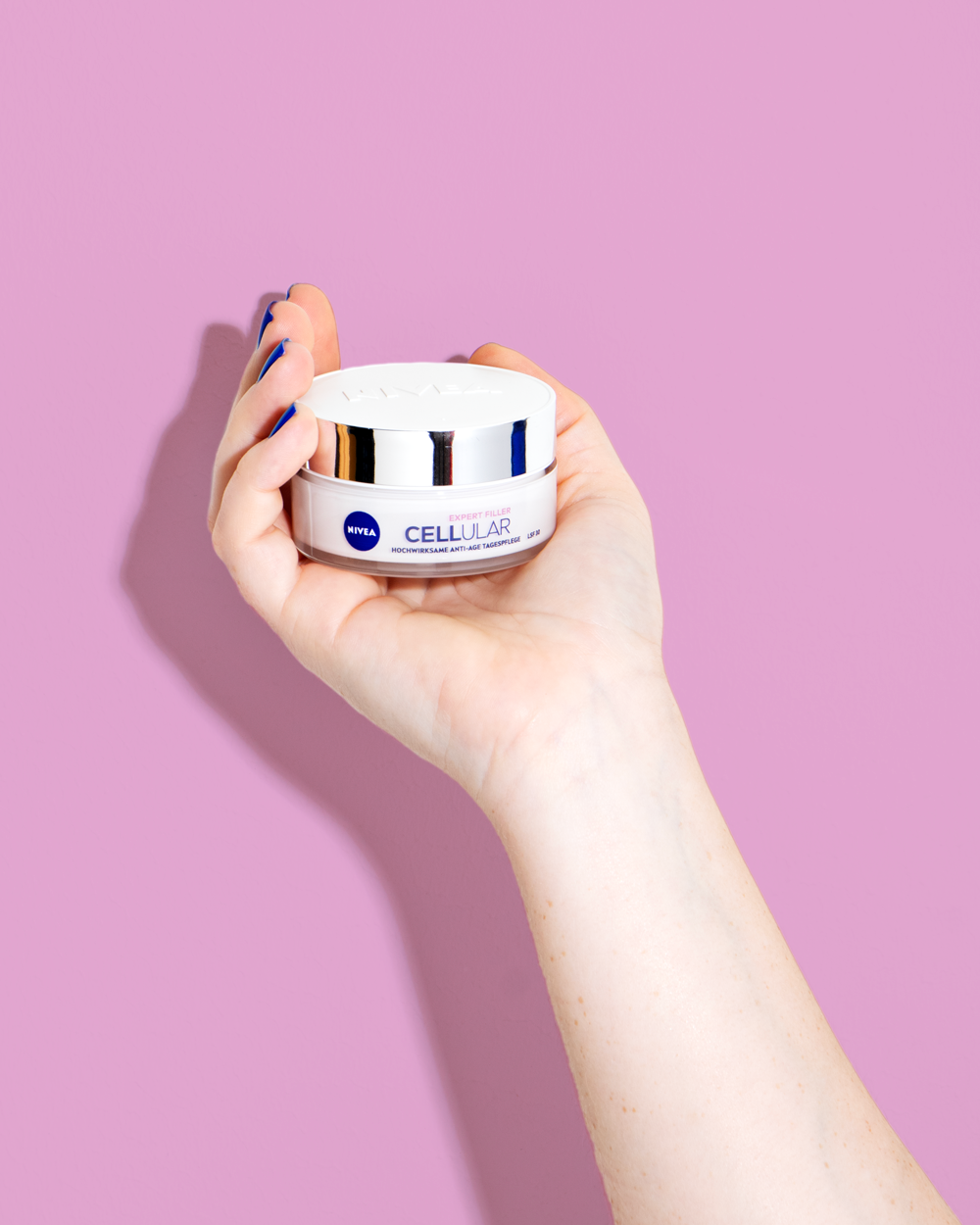
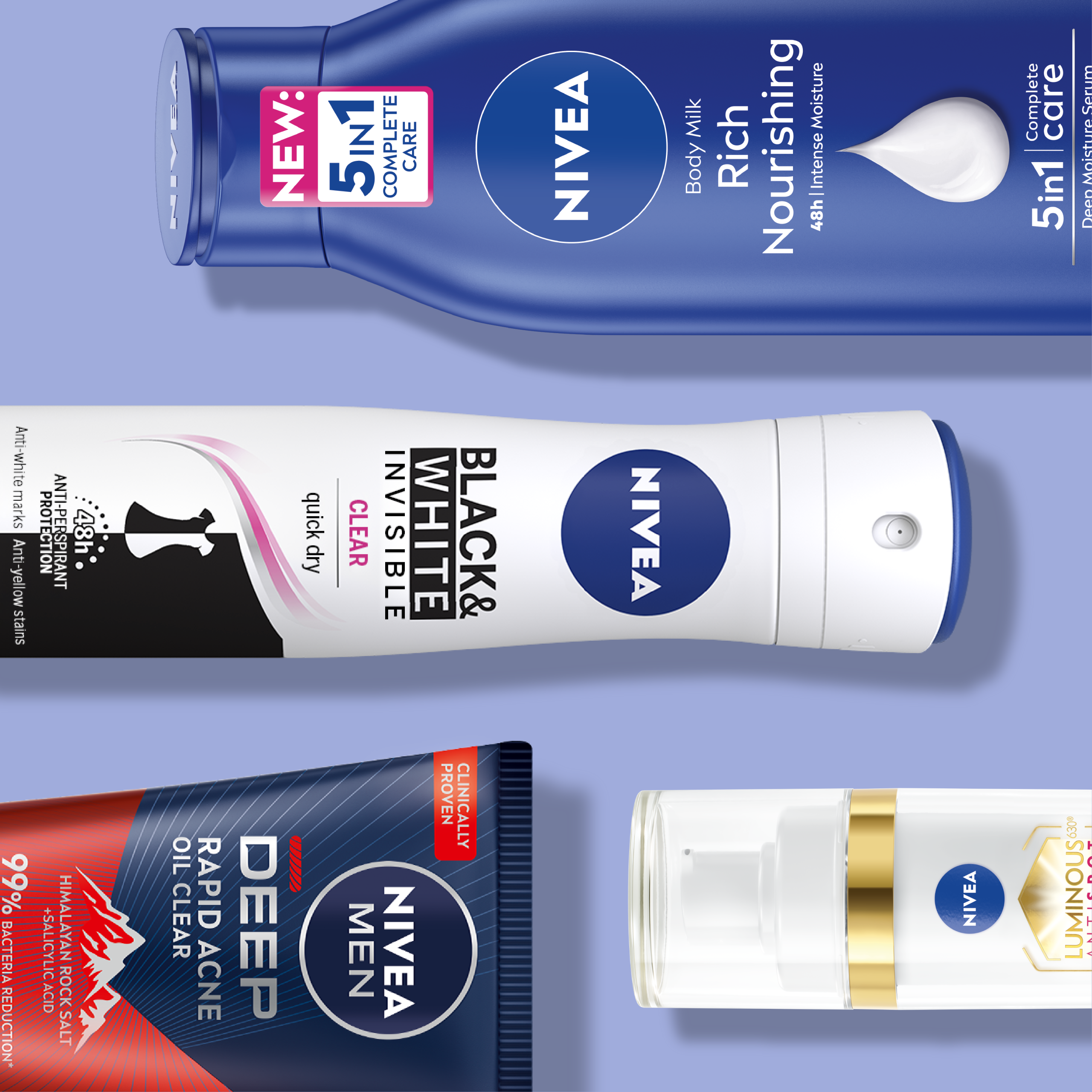
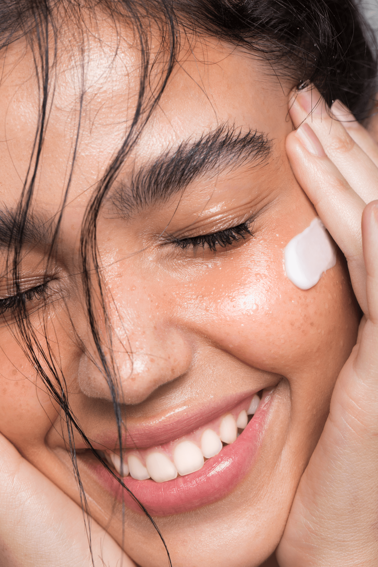
With NIVEA Cellular, we had the opportunity to shape a global brand icon. NIVEA entrusted us with redesigning the worldwide visual identity of its most powerful anti-aging product range. NIVEA Cellular features highly effective anti-aging ingredients that actively counteract the visible signs of skin aging.
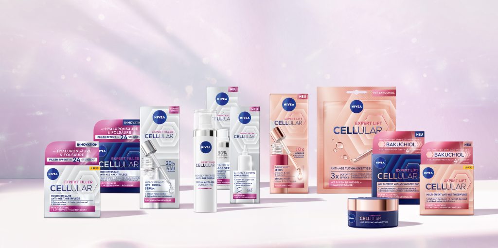
To strengthen its position in an increasingly competitive market and maintain relevance in the anti-aging skincare segment, the Cellular range was given a bold new look. The goal of the relaunch was to meet the expectations of a discerning target audience while visually communicating the outstanding product performance through the packaging design.
To achieve this, we developed a key visual as the central design element. Inspired by cellular structures, it represents the precise efficacy and multi-effect action of the NIVEA skincare range. This visual anchor enhances the product performance perception, gives the range a unique identity, and creates a cohesive brand language. Combined with an enlarged Cellular logo and an optimized information hierarchy, the new design ensures clear shelf navigation for consumers.
The result is a premium, modern, and strategically structured relaunch design that enhances shelf visibility through increased impact and luxury appeal. Its timeless aesthetic makes it a distinctive brand asset for NIVEA.