What it’s about
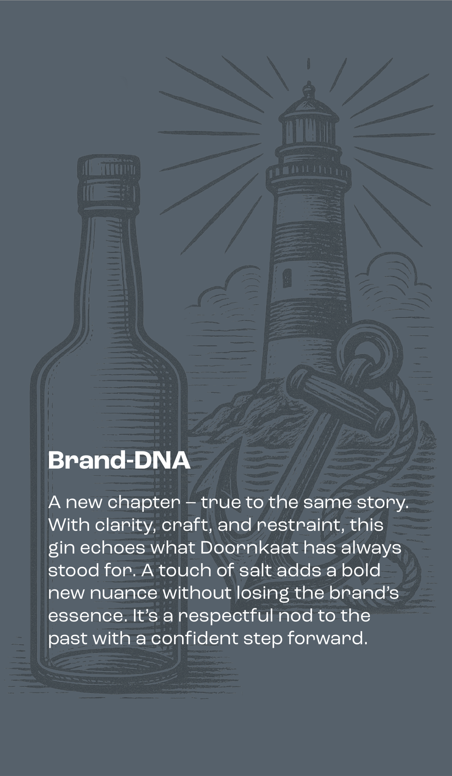
Gin has become one of the most dynamic segments in the spirits market – with a flood of new brands and flavors filling the shelves. The result? A dense and often indistinguishable category, full of lifestyle storytelling and botanical one-upmanship. In this environment, heritage brand Doornkaat was looking for something different: a gin with a clear point of view and credible positioning.
We led the strategic and creative process – starting with an in-depth workshop alongside the client and industry experts. Together, we identified key consumer shifts and uncovered white space in the category – including a rising desire for regional authenticity and grounded storytelling. From that, we developed the brand’s strategic foundation.


The core idea:
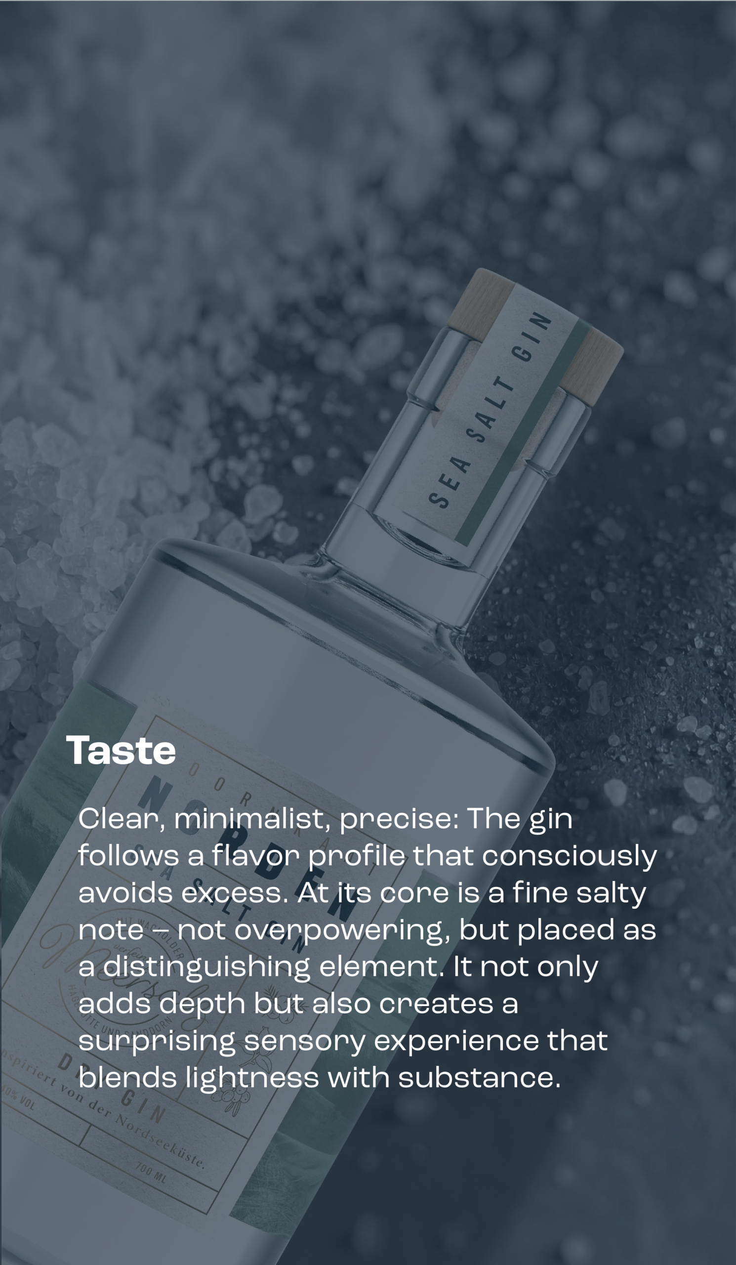
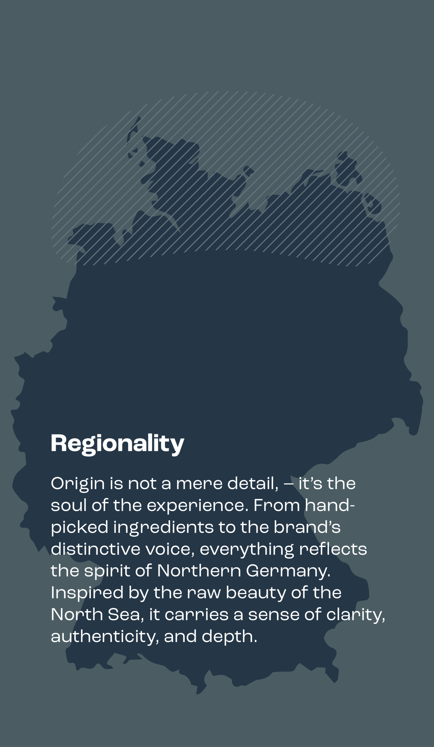
A gin rooted in Northern Germany – refined with sea salt to deliver a distinctive, subtle salinity. This wasn’t just a flavor cue, but a positioning anchor. It gave the product a clear sense of place and a sensory profile that stands out in a crowded field.
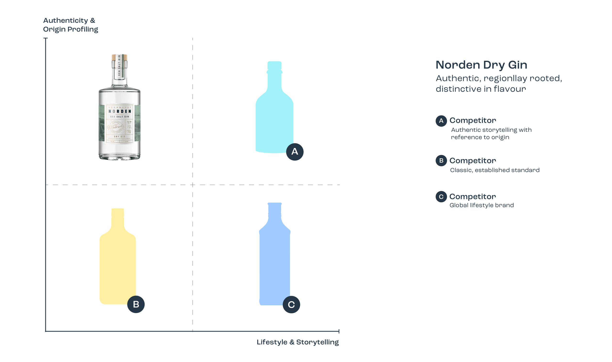
The design was a natural extension of the strategy. Clear. Confident. Minimal. The visual language combined regional character with a refined aesthetic and understated elegance. The result is a gin that feels truly differentiated – not by shouting louder, but by being unmistakably grounded.
Because in the noisy German gin market, you need more than just another twist on botanicals. You need relevance. You need real stories. And you need design that doesn’t decorate, but delivers.
Norden Dry Gin is exactly that:
A high-quality, credible product.
A gin that doesn’t speak in hype – but in clarity.
A brand that stands out through focus, not volume.