What its about
For Orangina, the natural premium lemonade with real fruit pulp, we were tasked with translating the campaign idea “Shake It Up” onto the beverage can. The goal was not just to highlight the need to turn the bottle upside down to mix the fruit pulp, but to encapsulate the brand’s core attitude. Orangina embodies a sunny, positive vibe and a playful zest for life, and the can needed to match the iconic Orangina bottle in its design impact.
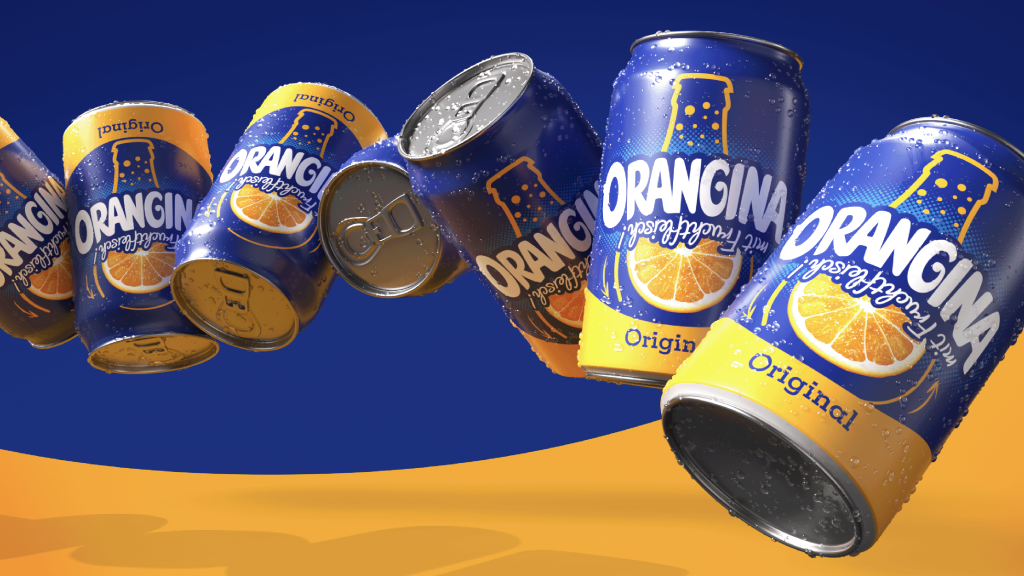
The overarching campaign concept revolved around Orangina’s unique feature: its high fruit pulp content, which calls for a quick shake before opening. Under the motto “Flip It”, this action was elevated into a brand philosophy, encouraging people to change perspectives and find the silver lining in everyday challenges.
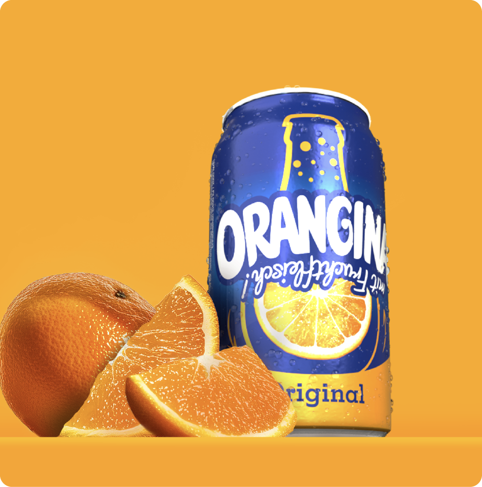
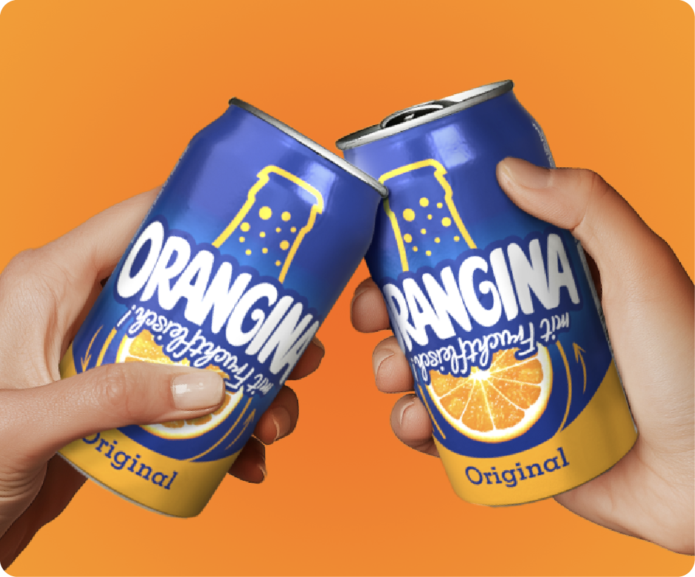
For the can design, we focused on the iconic bottle shape and the shaking motion as a striking visual cue. One side of the can features the Orangina bottle upside down, while the other shows it upright. This created a unique, high-visibility design with strong shelf impact, reinforcing the brand’s playful positioning.
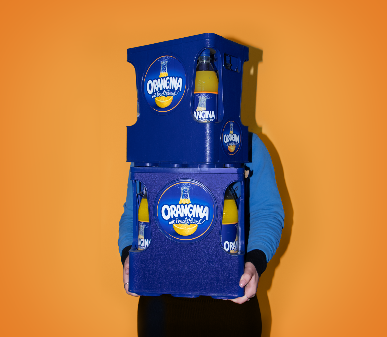
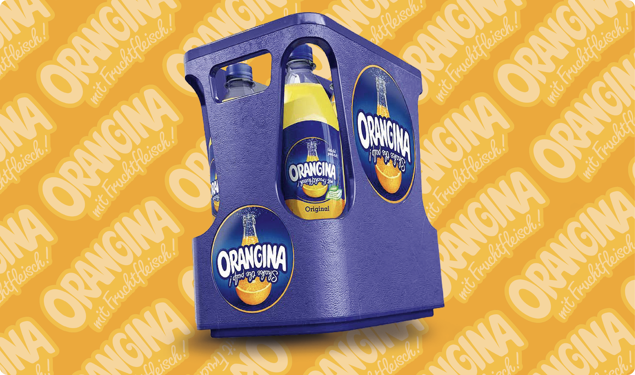
We also designed the new 6×1-liter beverage crate, a project that posed several challenges. The crate design needed to reflect Orangina’s brand values, meet communication objectives, and remain functional, all while maintaining a timeless aesthetic capable of lasting 15 to 20 years. The result is a modern crate with a distinctive, brand-centric look that clearly communicates Orangina’s message. The signature Orangina blue and prominent logo placement enhance shelf visibility, while the highlight feature – the orange peel texture – underscores Orangina’s premium image. A side opening adds practicality by making it easy for consumers to differentiate between flavors at a quick glance.