What it’s about
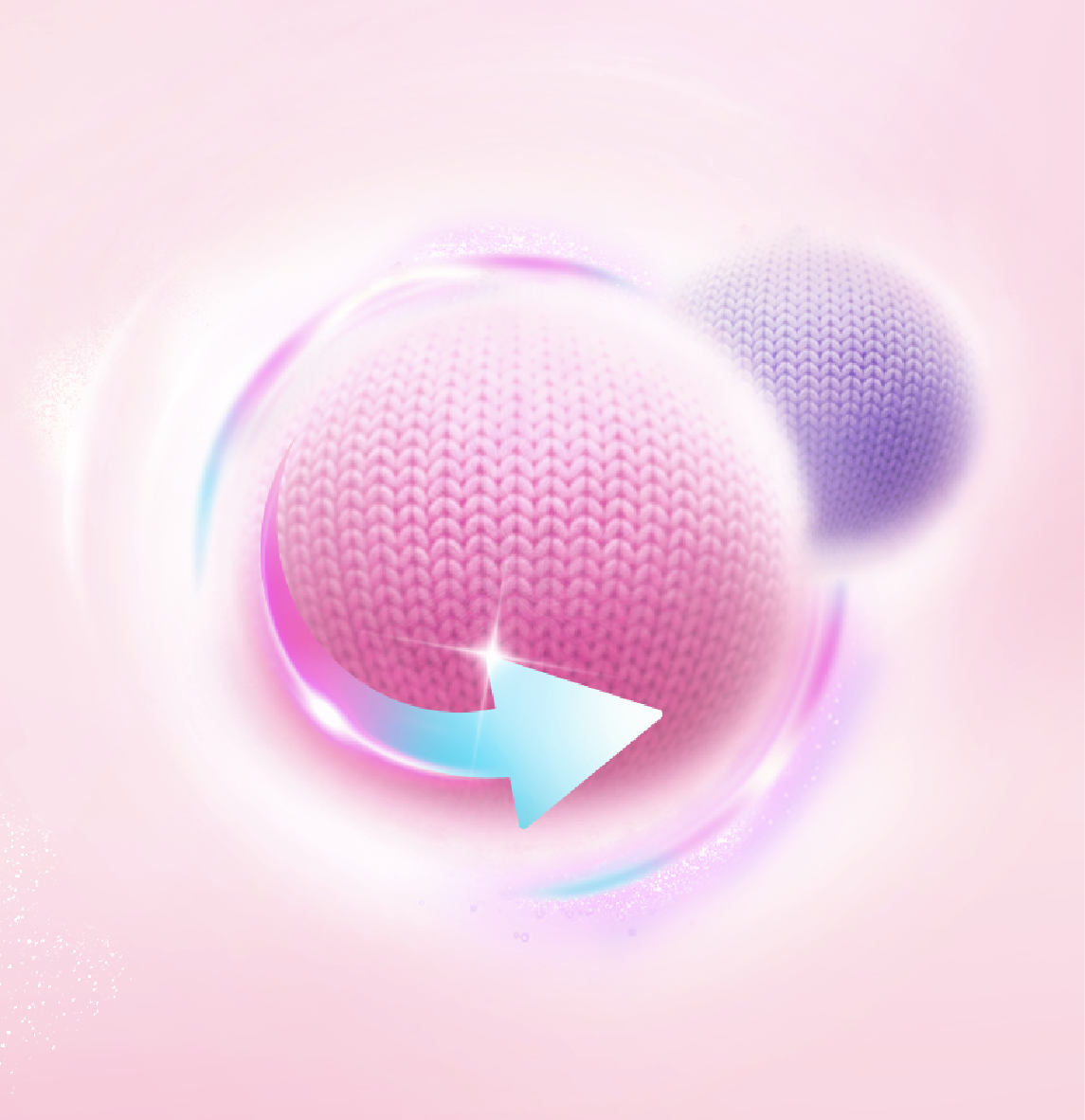
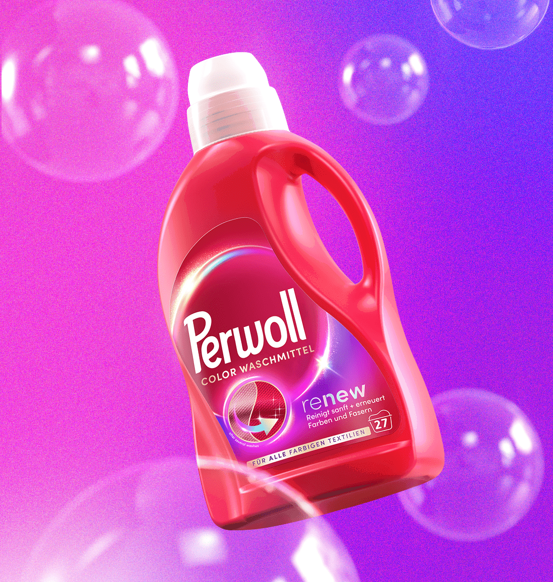
We were tasked with modernizing the Perwoll brand and bringing its new positioning to life. For many years, Perwoll has stood for much more than just wool – it stands for magic! Clothes stay beautiful for longer, looking as good as new after every wash.
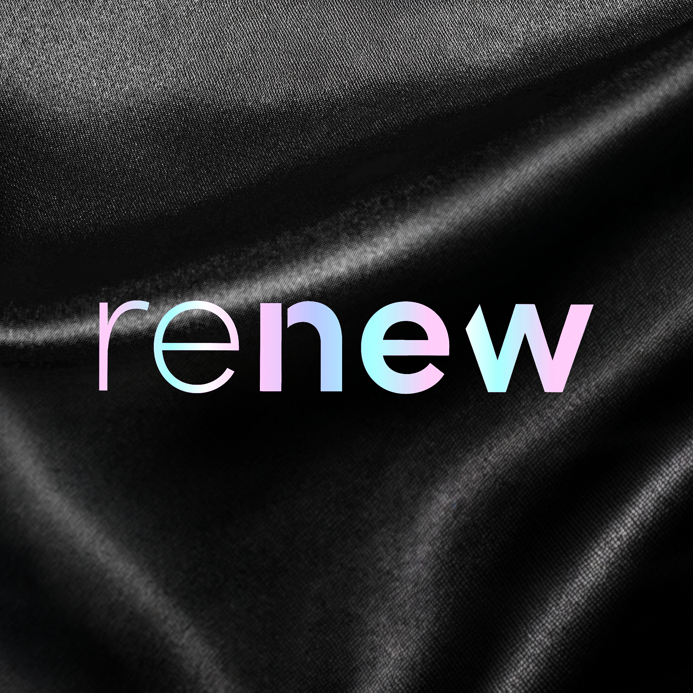
Our goal was to showcase the magic of Perwoll’s unique “Triple Renew Technology” while creating a premium brand presence.
At the heart of the new design, the refreshed brand logo radiates confidence while preserving the signature typography. A streamlined information layout and improved readability ensure a clean, sophisticated look, allowing consumers to instantly grasp the product’s benefits.
This premium aesthetic makes Perwoll stand out on the shelf while enhancing navigation across the product range. The new, magical brand identity seamlessly blends Perwoll’s USP with established category codes. To further emphasize its exceptional quality, premium finishing touches – such as holographic foil details – elevate the overall design.