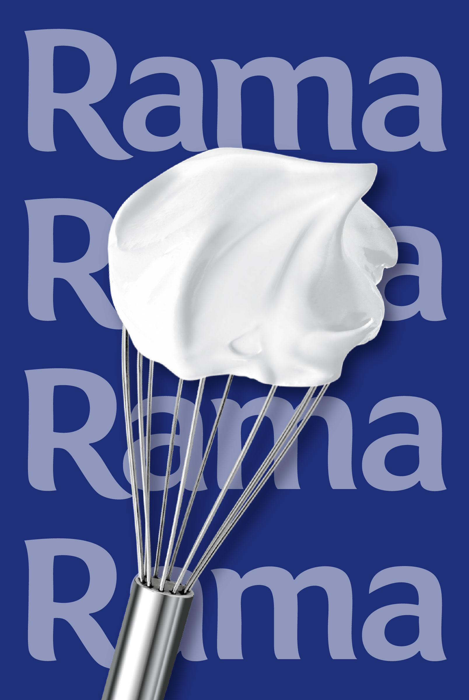
What it’s about
After years without visual evolution, it became clear: Rama Cremefine needed an update – contemporary, brand-strengthening, and built for long-term consistency. Together with the client, we refined the product range, supported line extensions, and established Cremefine as a distinctive and enduring sub-range within the Rama brand.
The previous design felt solid but somewhat lacking in impact with little flavour differentiation, limited appetite appeal, and no clear visual focus. At the same time, Cremefine had already become a trusted companion in many kitchens. Our task was therefore clear: to sharpen Cremefine’s individual brand character, maintain recognisability, and enhance appetite appeal with a look that inspires cooking while staying natural and authentic.
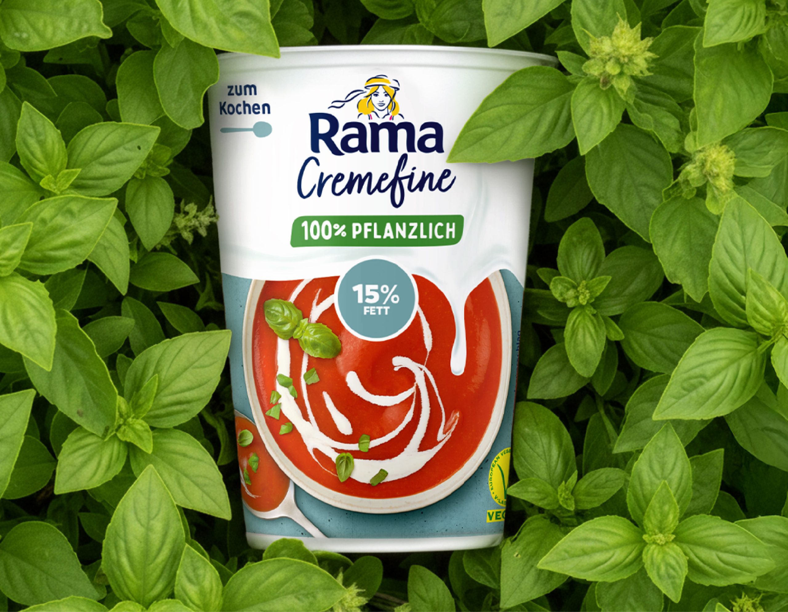
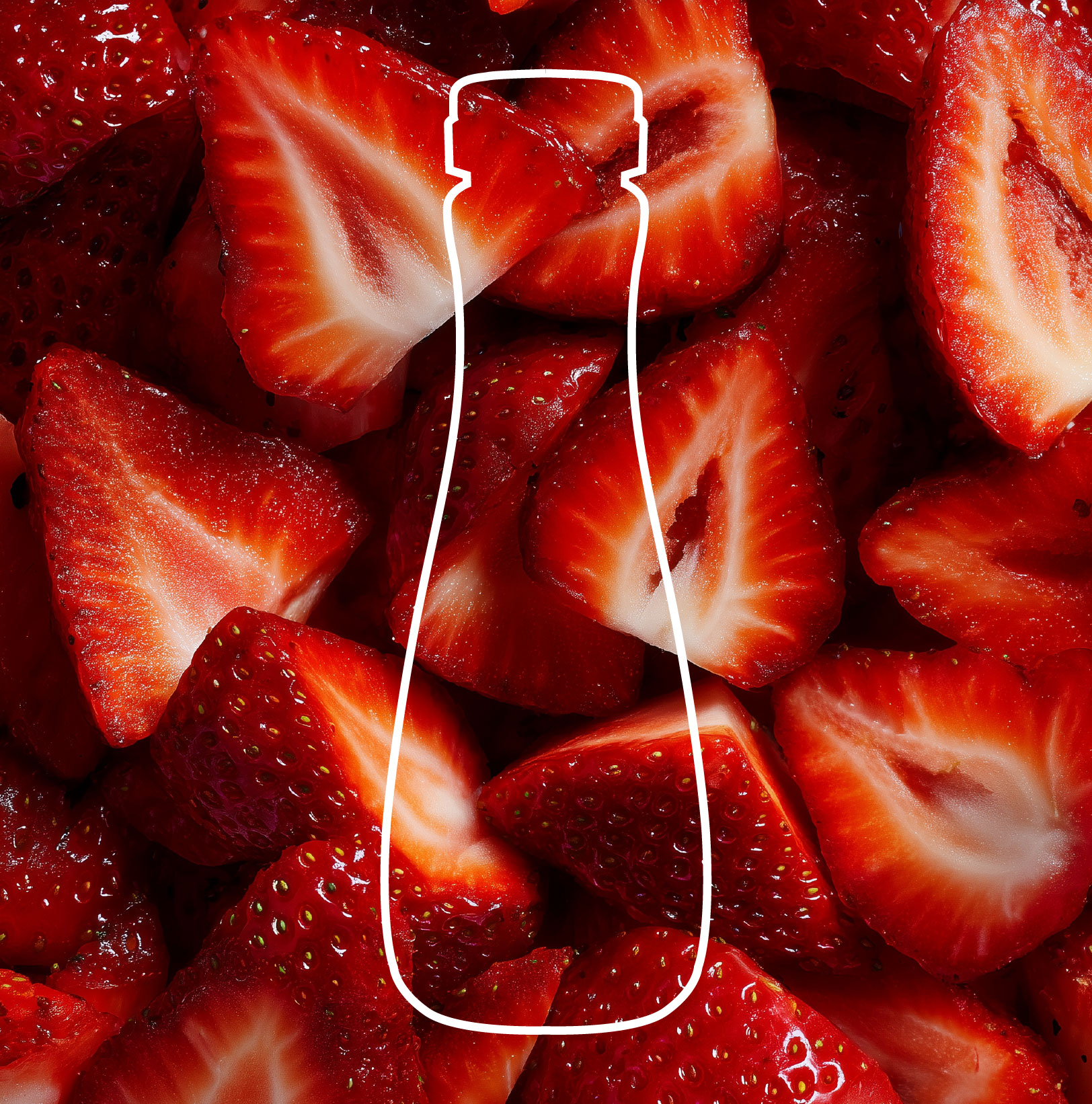
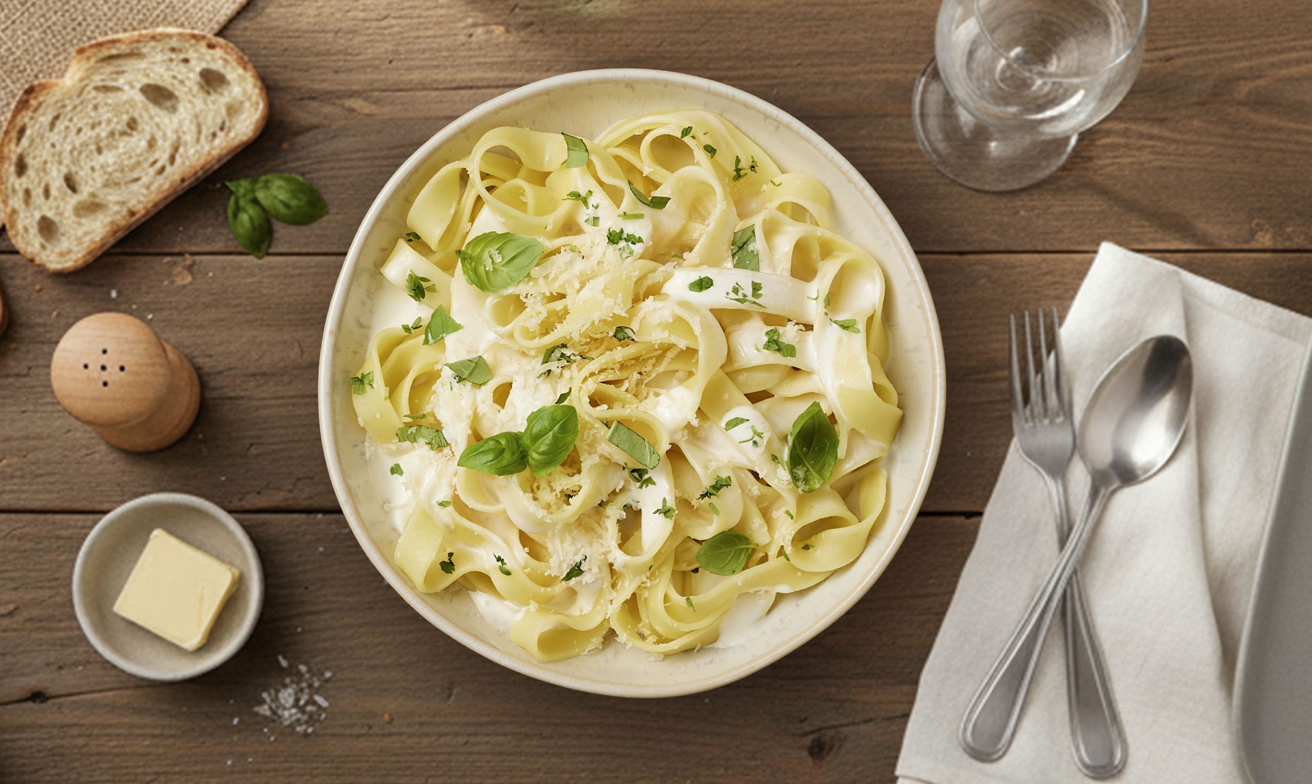
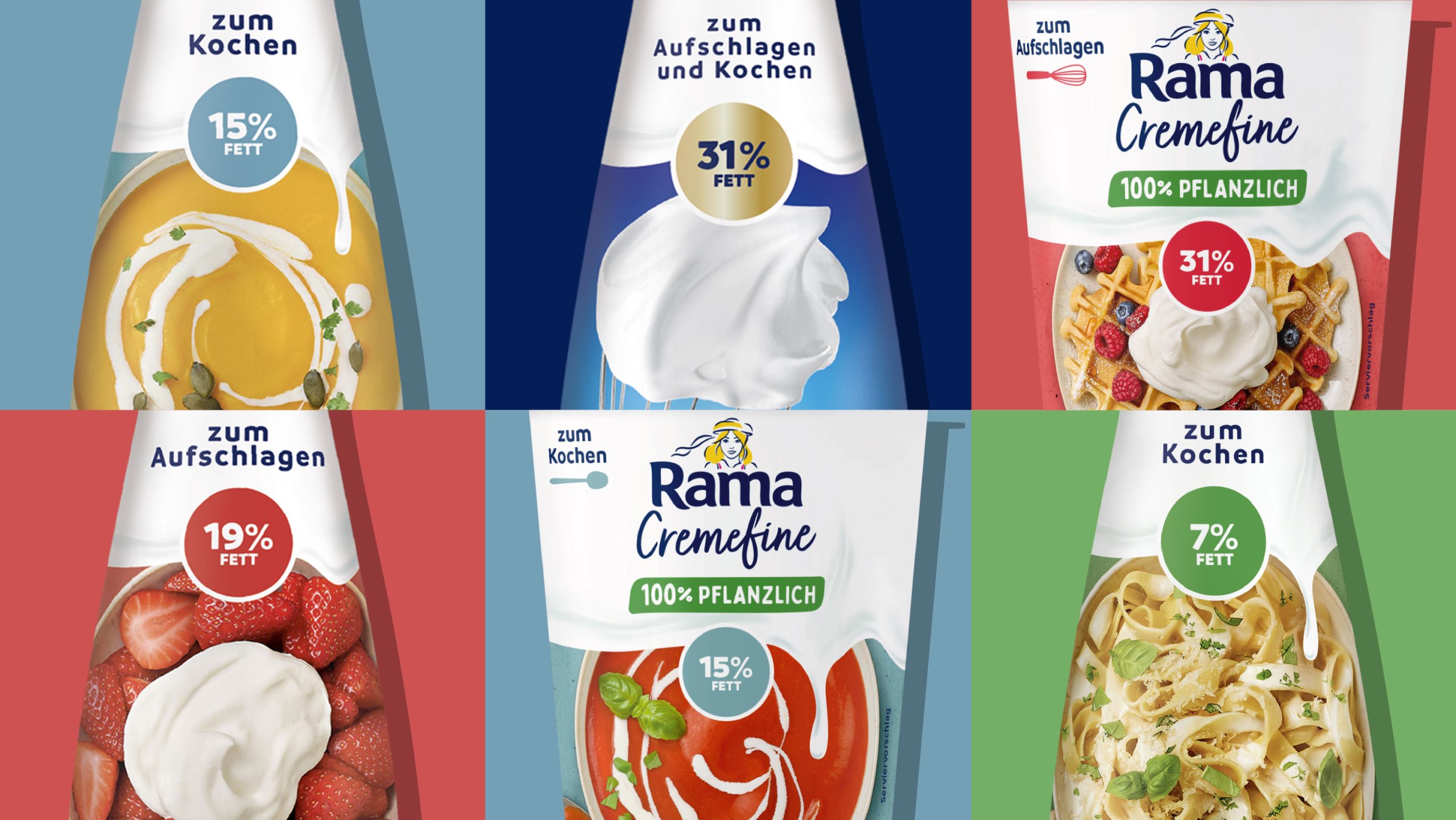
A central element of the redesign was the new food shot concept. All visuals were newly produced with a focus on the different usage occasions of each variety, making in-store navigation easier for consumers. The imagery emphasises appetite appeal, naturalness, and freshness. The dishes look delicious yet approachable – avoiding overly staged, high-gloss aesthetics.
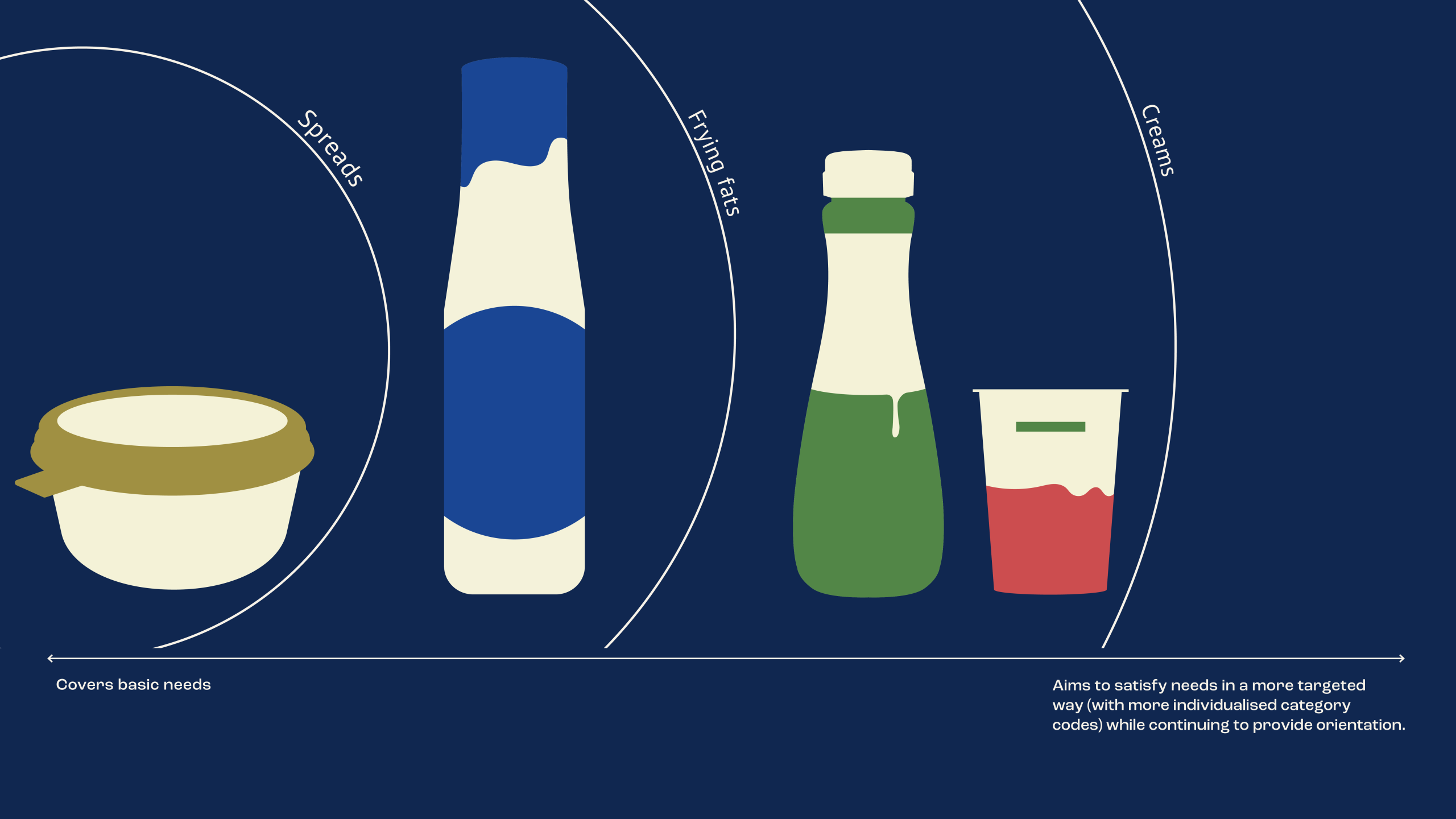
Because Cremefine has long since established its independence within the Rama universe. A look at the brand orbit illustrates this architecture clearly: Rama serves as the umbrella brand, representing the full spectrum of cooking and baking expertise from spreads and frying fats to creams. Within this, Cremefine forms the emotional, pleasure-driven counterpart, for those who love to cook lightly and creatively. This clear positioning served as the foundation for the new design.
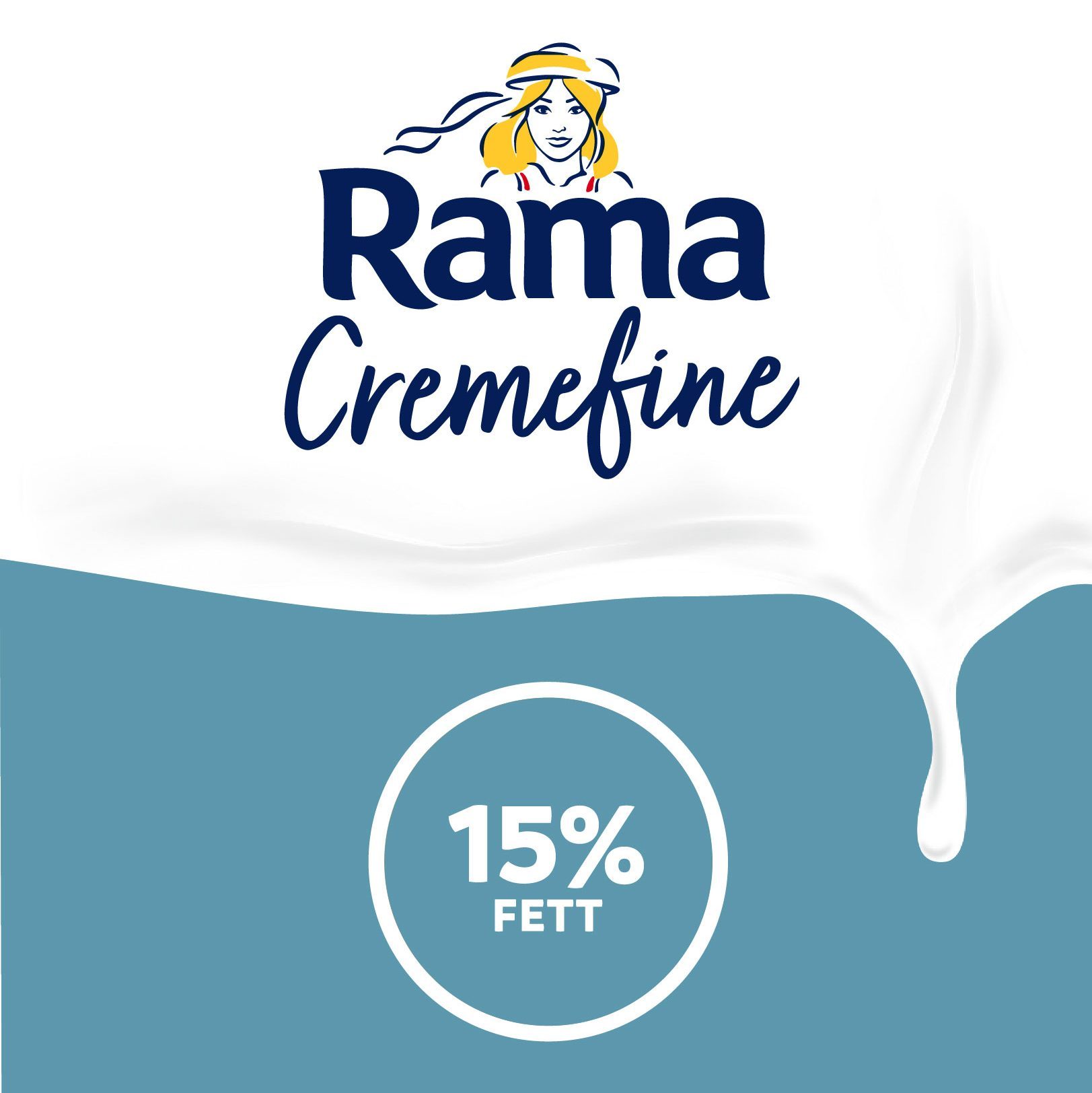
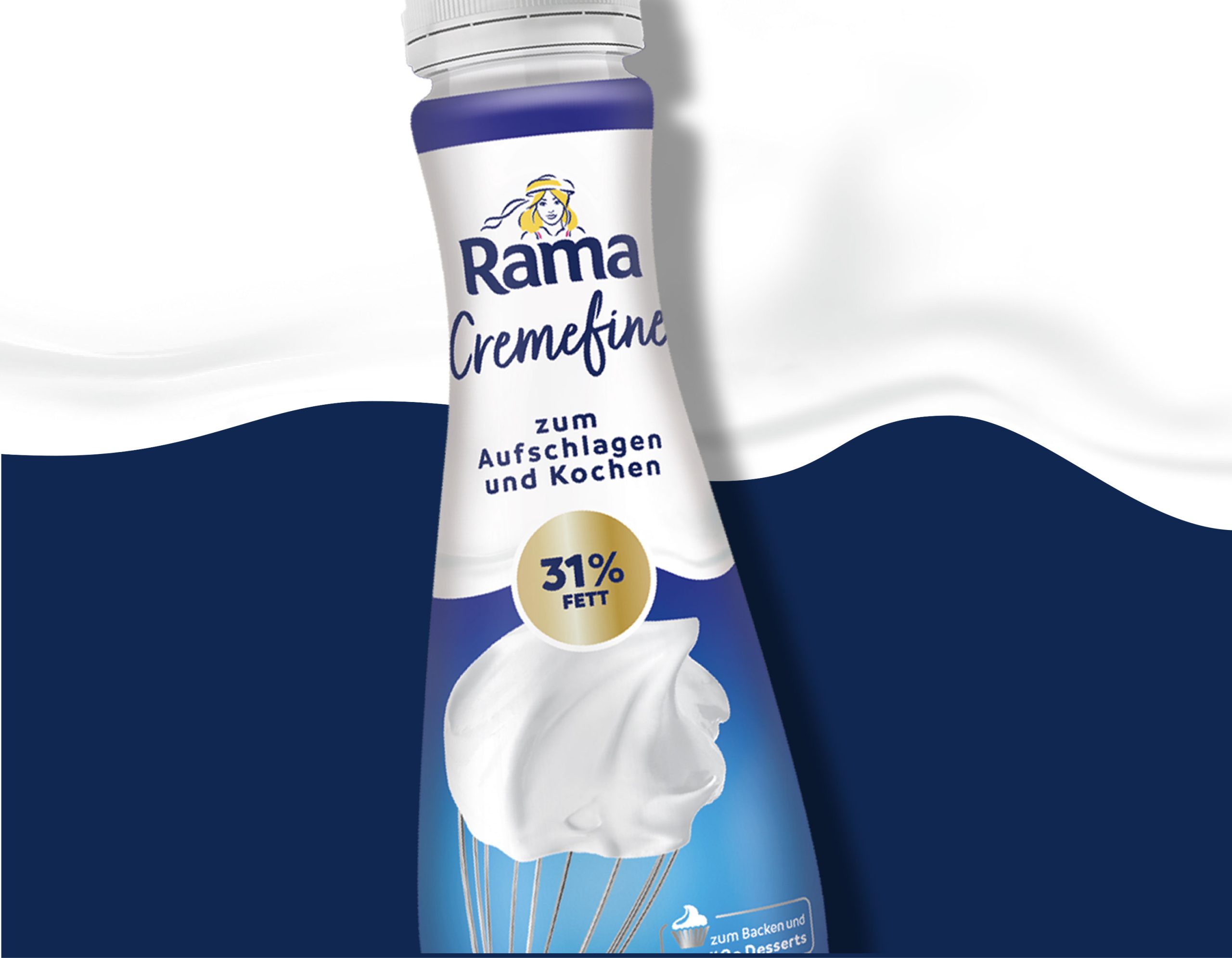
With the brand facelift, we carefully brought the range into the present, without becoming loud or chasing trends. The design was created to endure: visually stable, timeless, and true to the brand’s character. We refined the wordmark and rebalanced the typography, achieving greater clarity and confidence while preserving the familiar look and feel. The white “cream top” remains a recognisable brand cue, only now appearing clearer, fresher, and more distinctive for Cremefine: connected to Rama, yet confidently standing on its own.
The flavour coding was also refined: soft, milky tones highlight the creamy character of the product while creating a calm, appetising impression on shelf. Each product variant is instantly recognisable, clearly differentiated, yet part of a harmonious overall look.
Today, Rama Cremefine demonstrates the power of a brand in everyday life – familiar, distinctive, and visually well-defined. A packaging design built to last, for years to come.