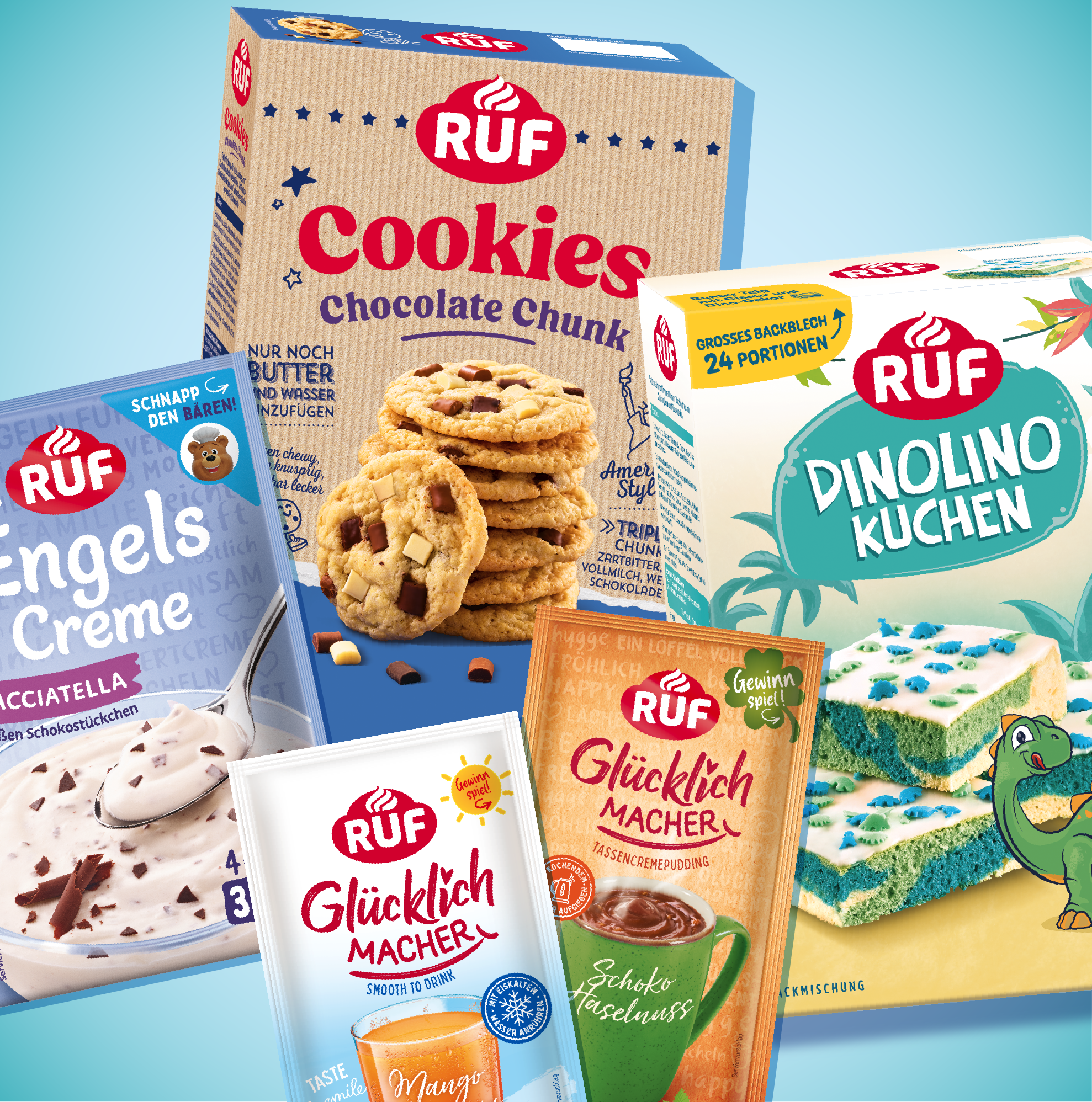
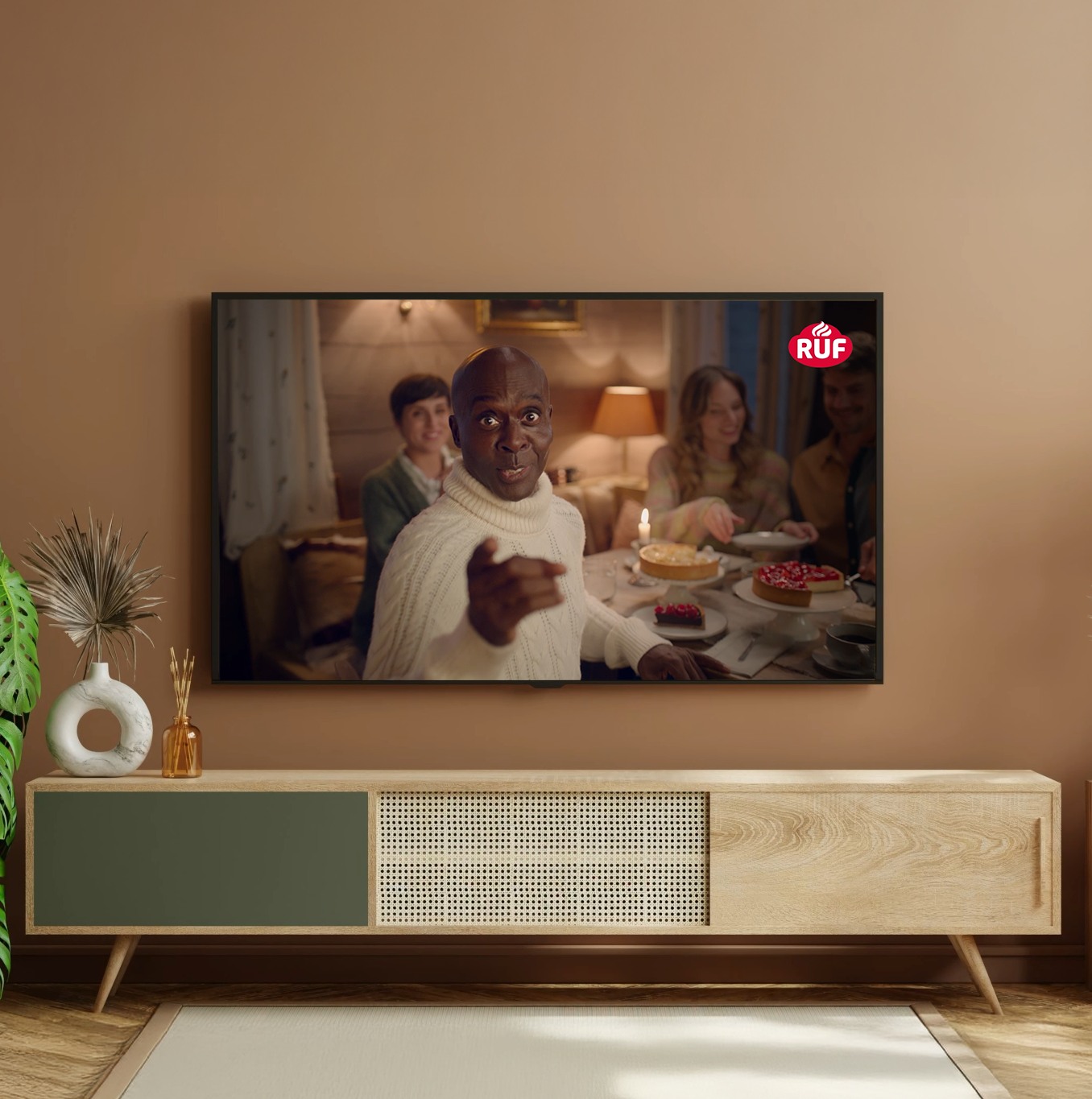
With over 100 years of baking heritage, RUF is a name that generations have trusted – familiar, dependable, a staple in many kitchens. But that legacy came with a challenge: the brand’s look and feel no longer reflected the world we live in today. In a market driven by emotion, simplicity, and trust, it was clear: RUF needed a refresh – one that modernizes without losing what makes it special.
Unlike private labels, RUF offers true brand quality, variety, and great value – all while continuing to innovate with new, exciting products, from baking staples to frozen cakes and creative dessert ideas.
We worked closely with the RUF team to sharpen the brand’s positioning: friendly, accessible, functional – and full of joyful moments. RUF is for everyone who finds happiness, confidence, and delight in baking – no matter their age or experience.
The logo was carefully evolved, not reinvented. Brand recognition remained essential, but the design needed to feel warmer, clearer, and more emotionally engaging. So we kept the core elements – the iconic red, the whipped cream shape, the original form – and refined where it mattered most:
• Fewer edges, more curves – to create a softer, friendlier impression that feels warm, welcoming, and full of baking joy.
• New typography that feels open, light, and human – a visual mirror of the brand’s spirit.
• Simplified composition for better legibility and a more iconic, self-confident presence. One glance says: this works – and it’s going to be delicious.
The result? A logo that now functions as a seal of quality – representing products that taste great, turn out perfectly, and feel accessible to everyone. Design that promises exactly what the brand delivers.
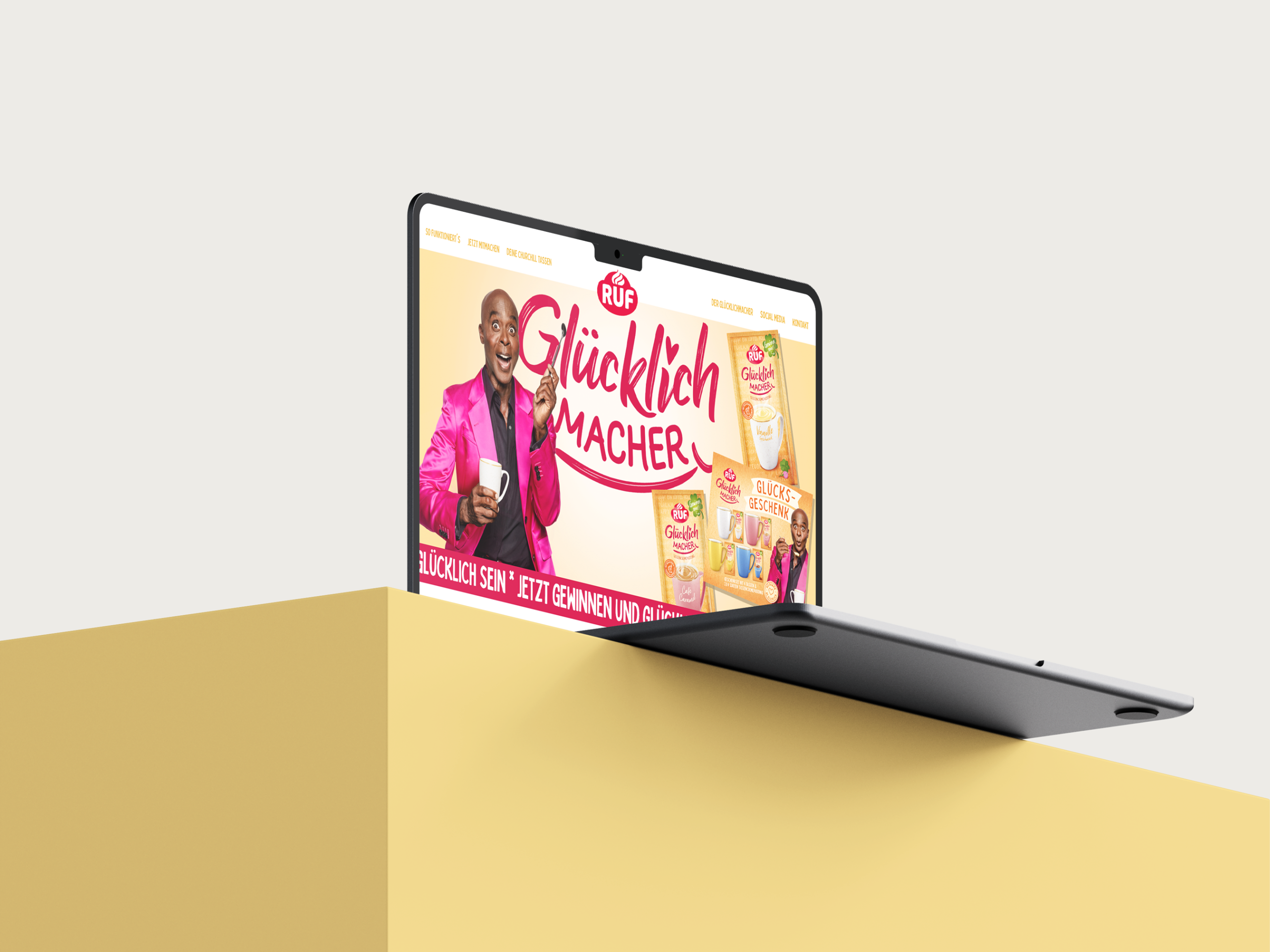
The logo evolution was the visual expression of a broader strategic foundation – one we developed together with RUF. And from Happy Cake to Glücklichmacher to colorful kids’ baking mixes, the new look is now consistently rolling out across the product portfolio. Step by step, a unified and modern brand world is taking shape – across all touchpoints.
The new identity captures what RUF stands for today: the joy of baking for all.
A visual language that bridges heritage with modern relevance – and brings to life everything the products promise: quality, indulgence, accessibility – and a feel-good moment in every pack.