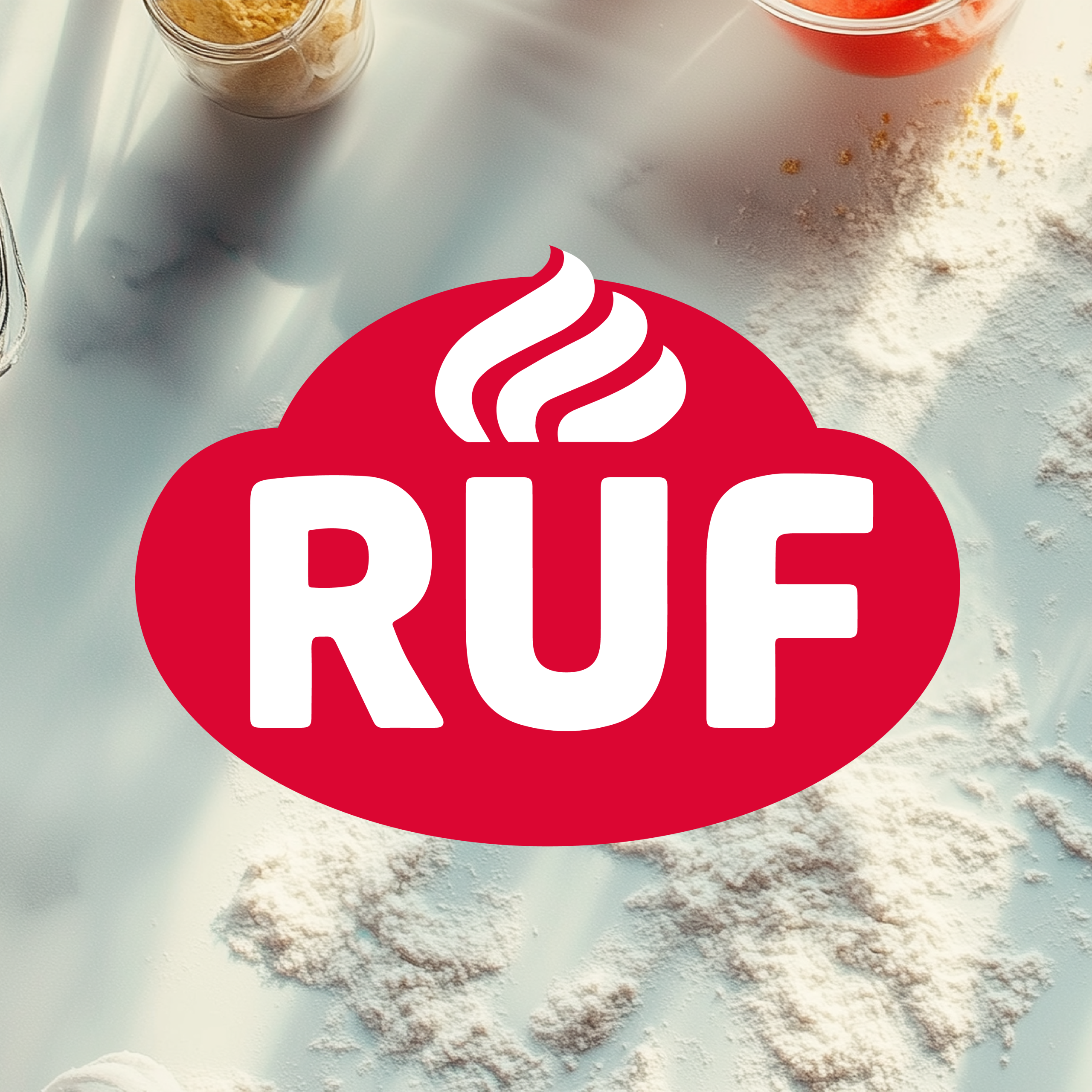
What it’s about
RUF’s new visual identity captures what the brand stands for today: the joy of baking for everyone. A design that blends tradition with modern spirit – and delivers on what the products promise: quality, indulgence, accessibility – and a warm, feel-good moment.
With over a century of baking heritage, RUF is a trusted name on the shelf. But even the most familiar brand worlds need fresh energy. In a market shaped by price pressure, private labels, and aggressive competition, we knew one thing for sure: RUF had to feel younger, bolder, and more visible.
So instead of designing individual packs, we built holistic brand worlds across product ranges. Each design tells its own story – yet all speak the same tone: warm, indulgent, and full of inspiration.
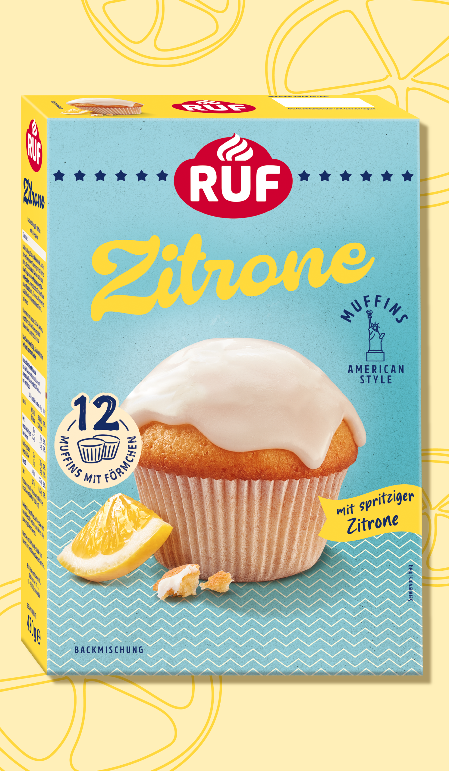
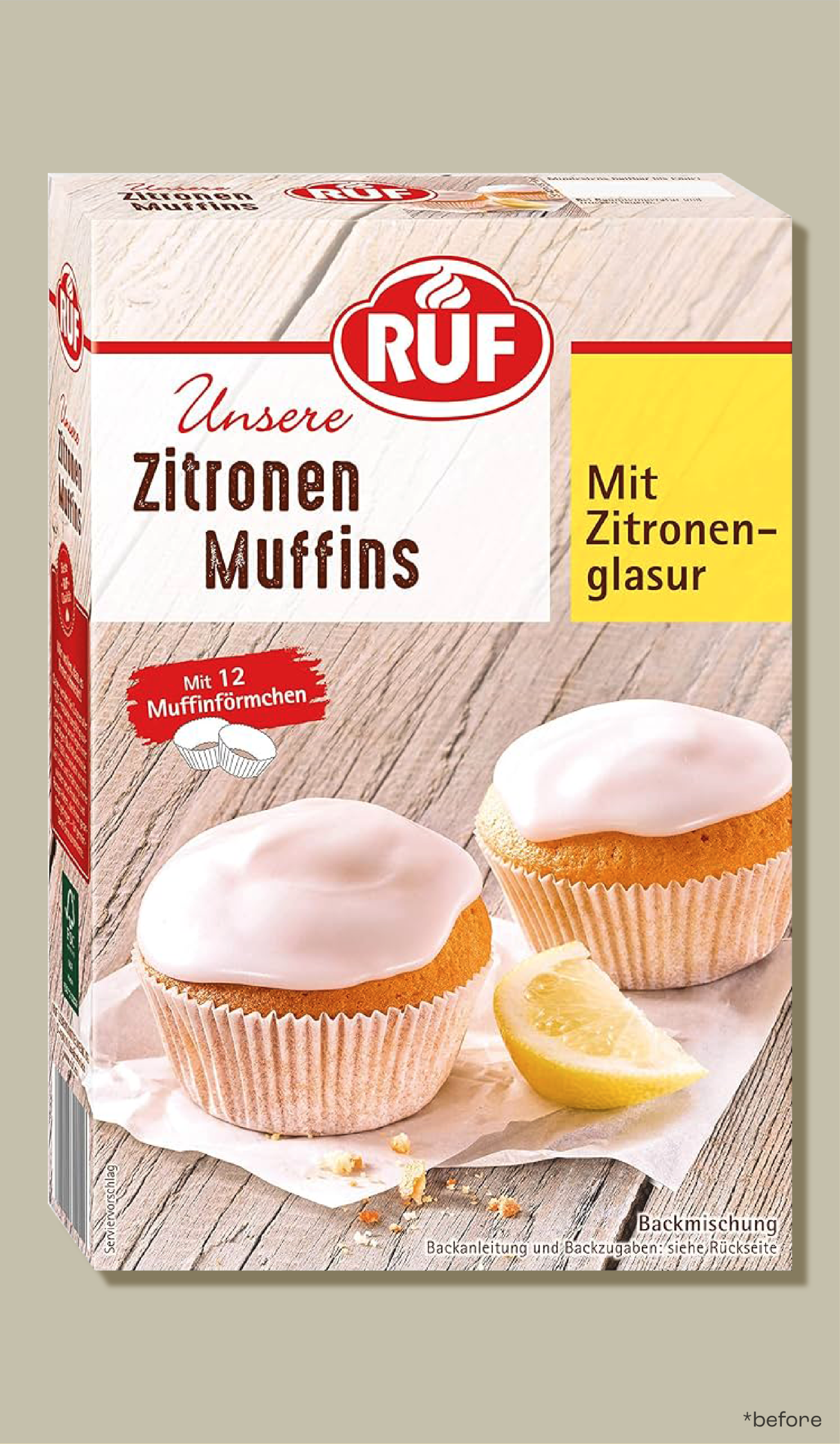
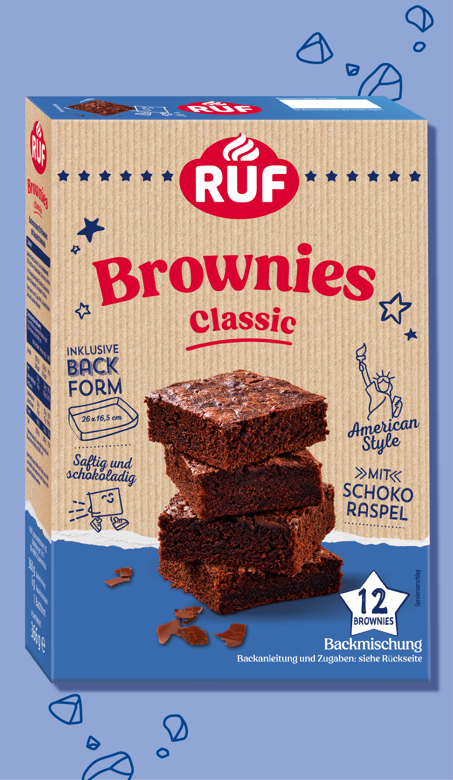
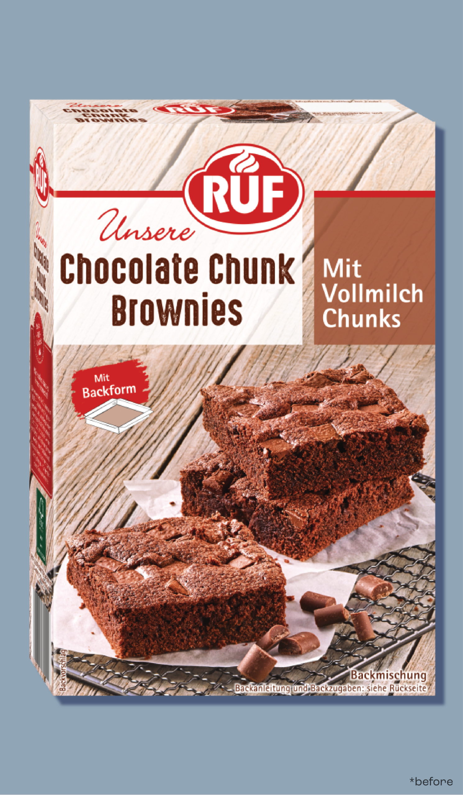
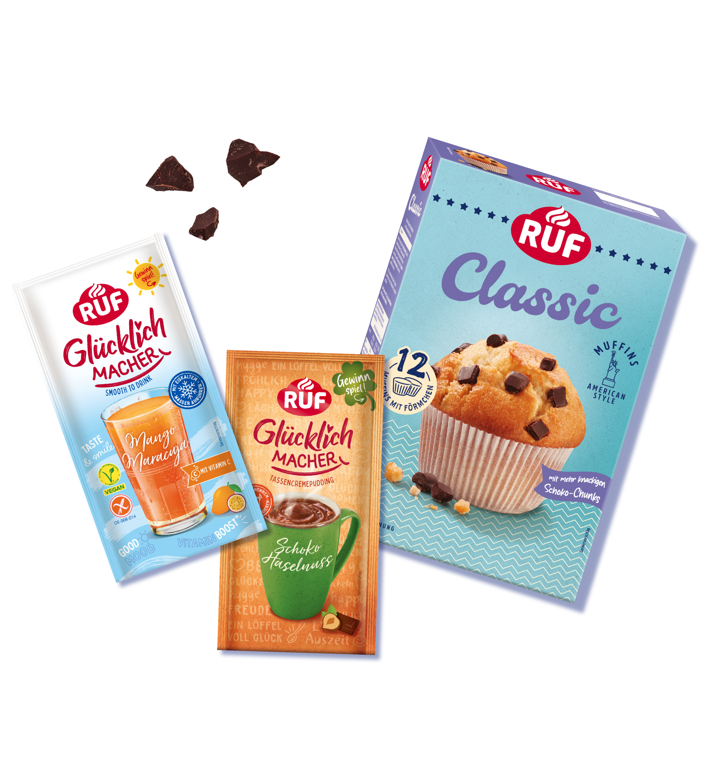
– Muffins –
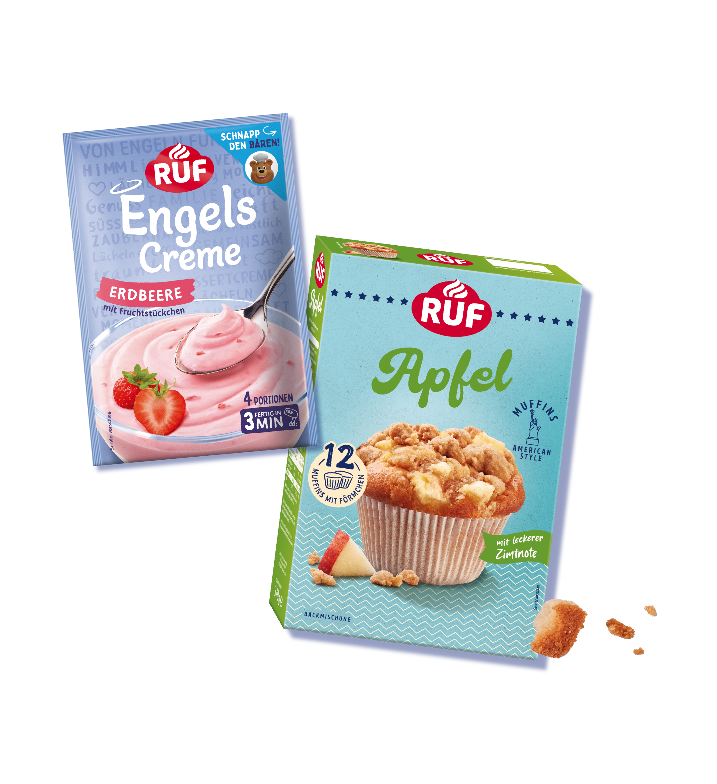
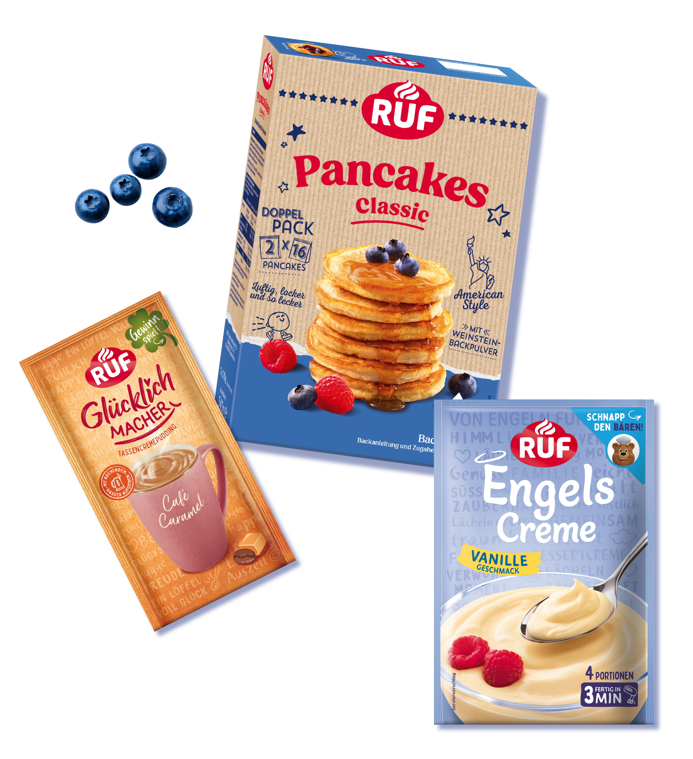
For the muffin range, we created the “American Dream” concept – heroizing the product with bold appetite appeal and iconic U.S. design cues. All in on yum.
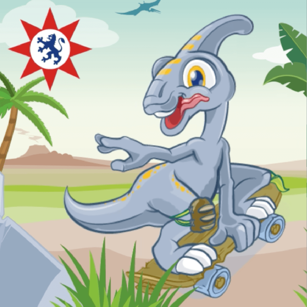
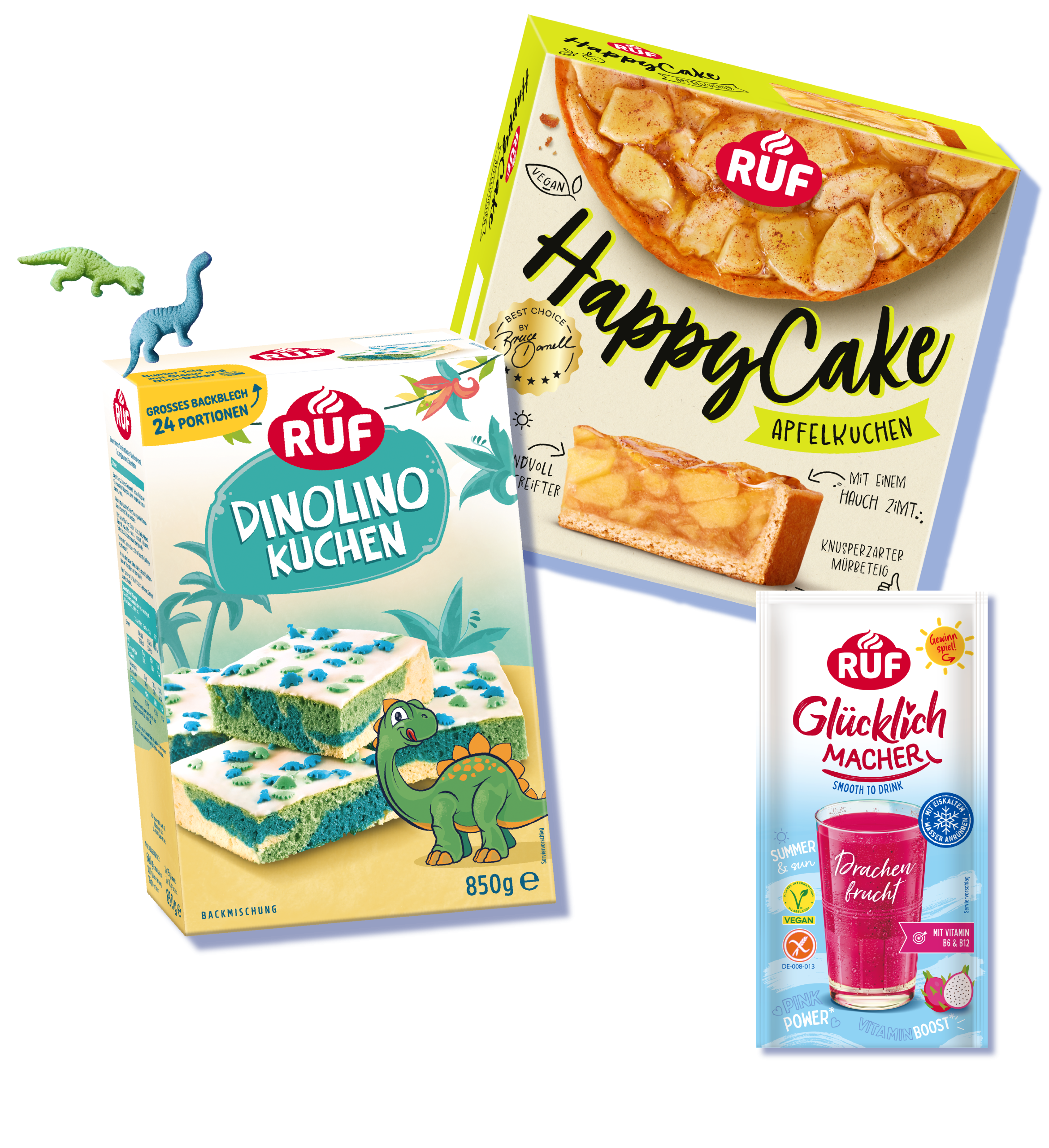
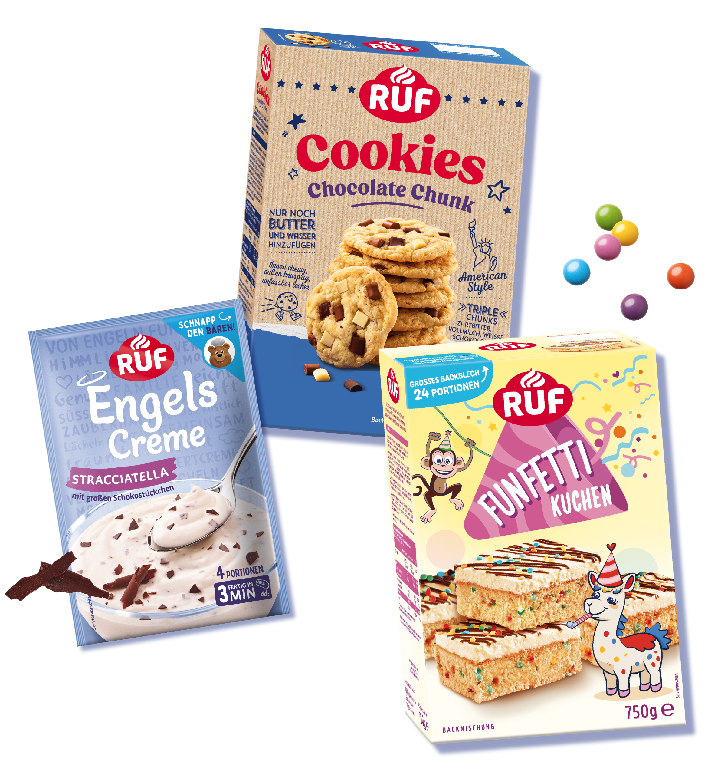
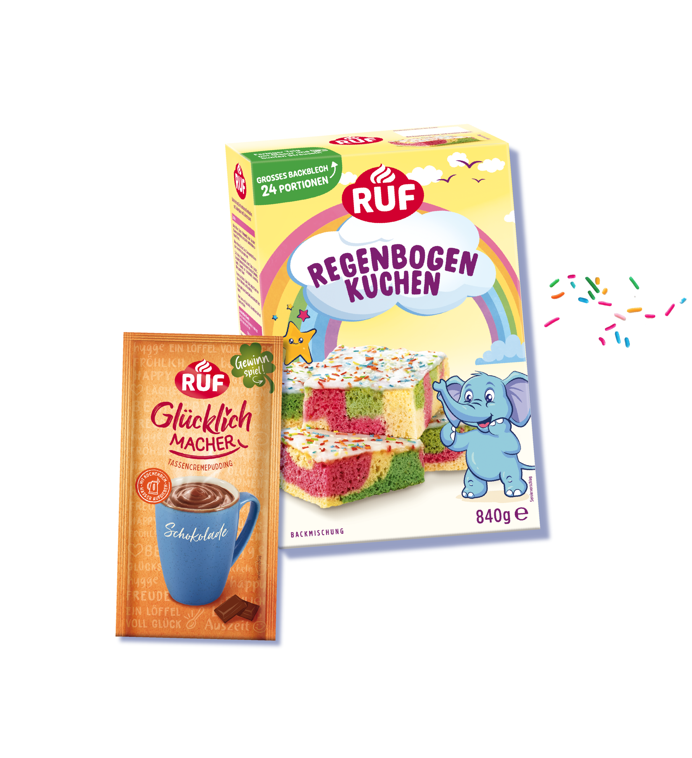
– Kids –
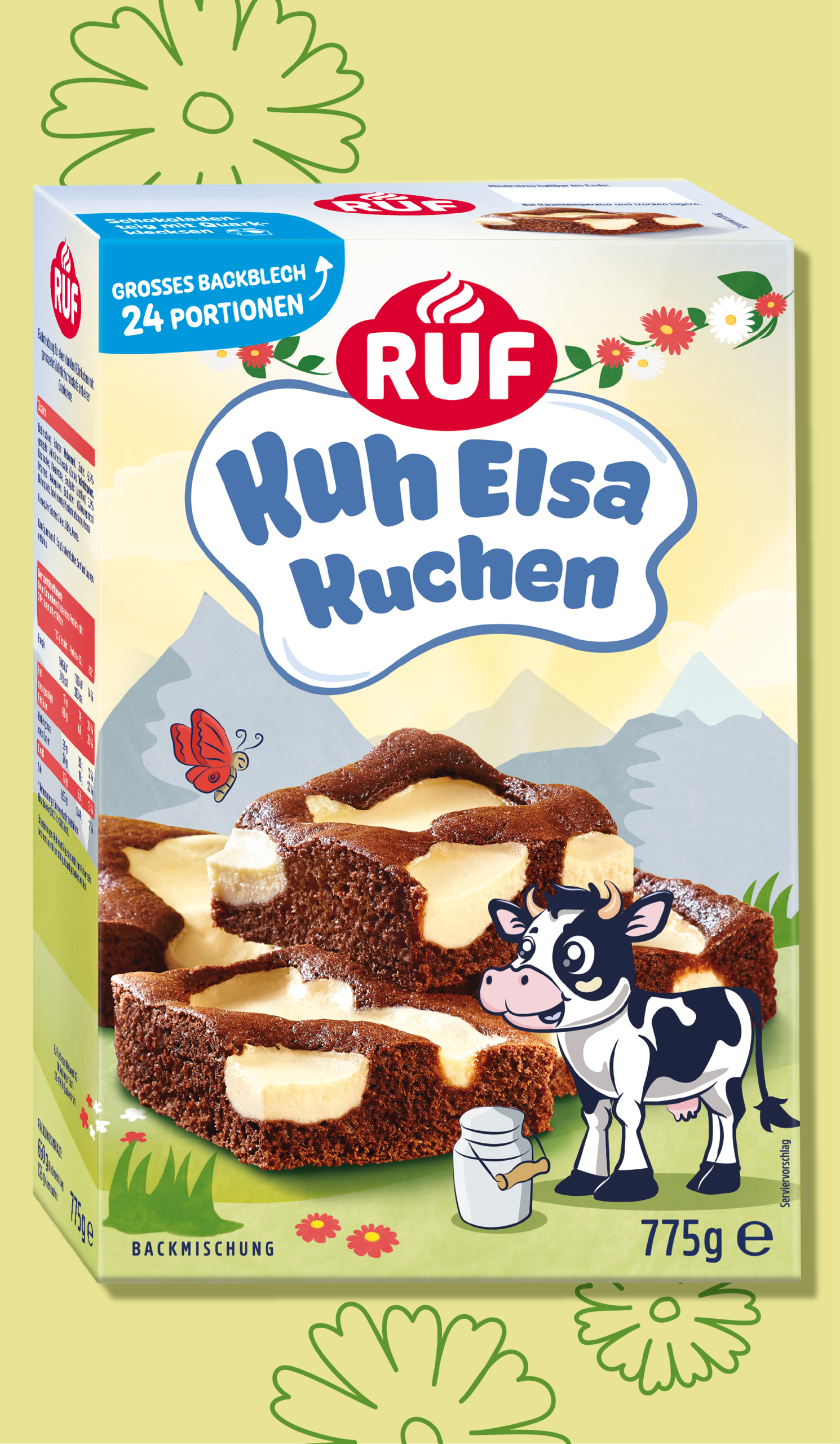
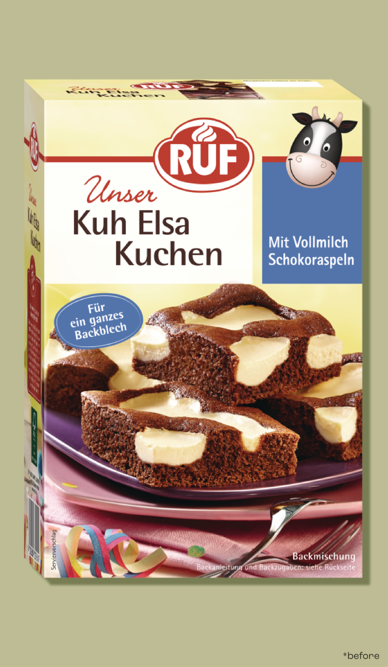
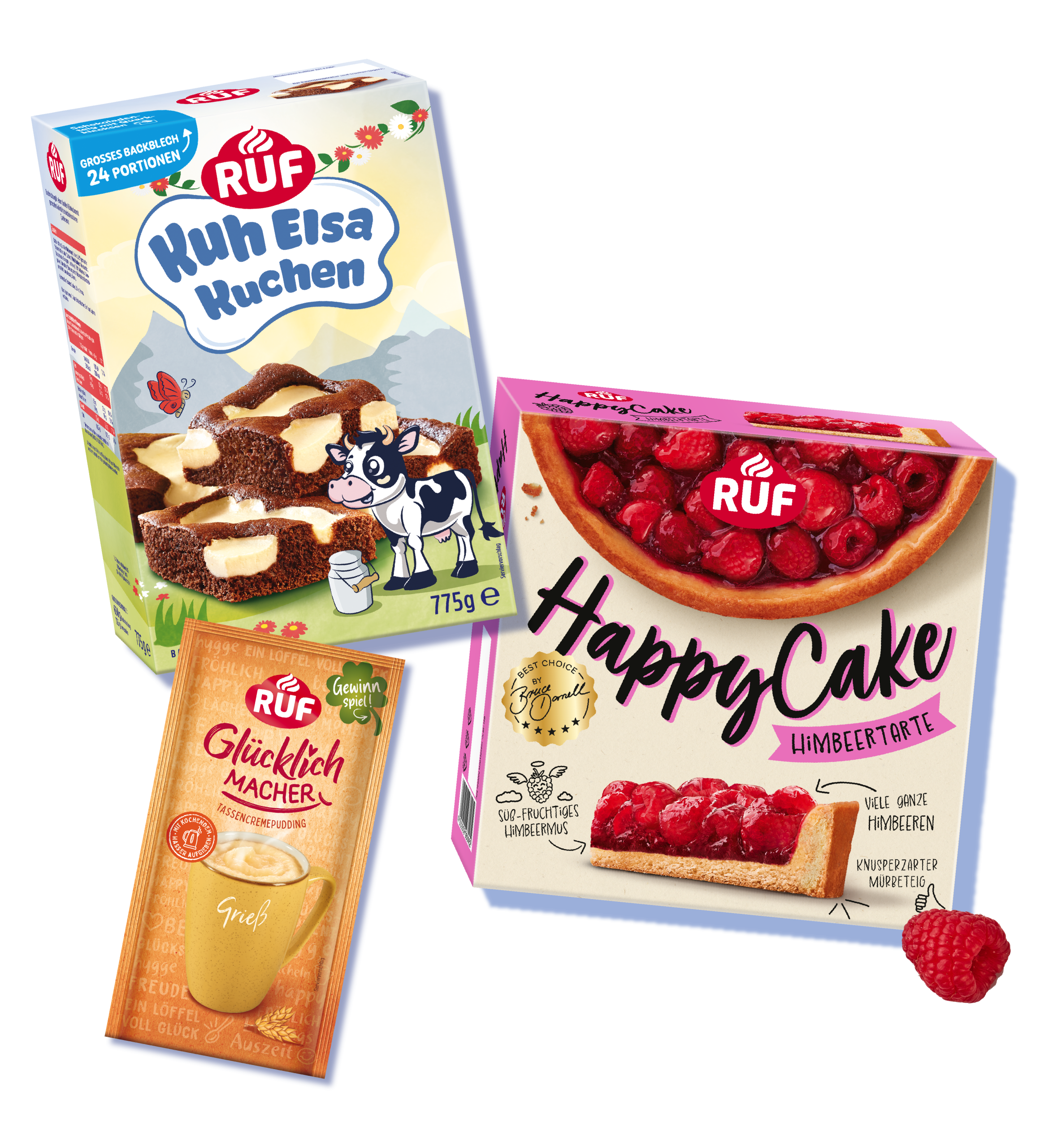
Each baking mix in the RUF Kids line lives in its own imaginative universe – bursting with color, fun characters, and stories that turn baking into an adventure for children and parents alike.
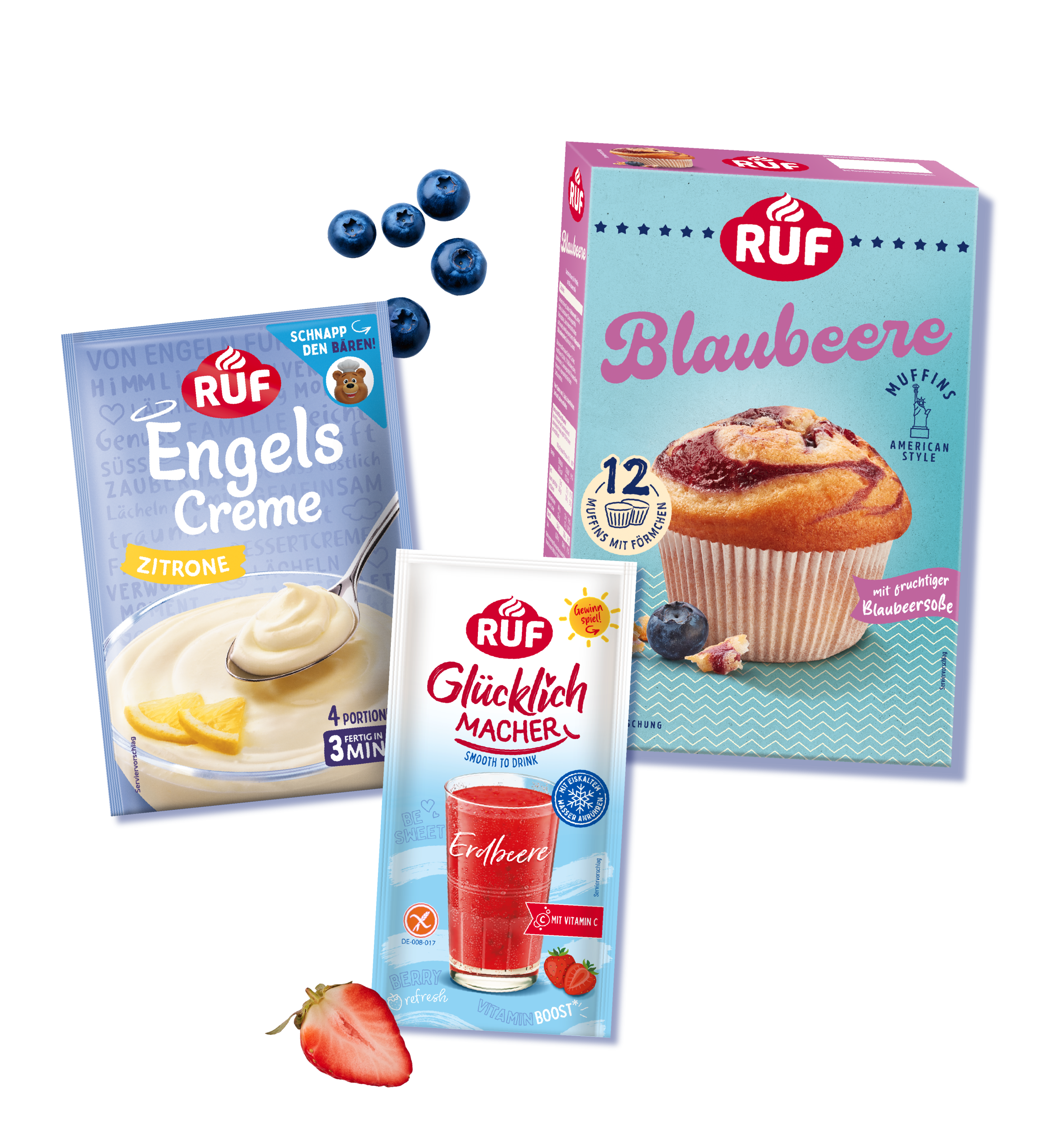
– Cream Pudding –
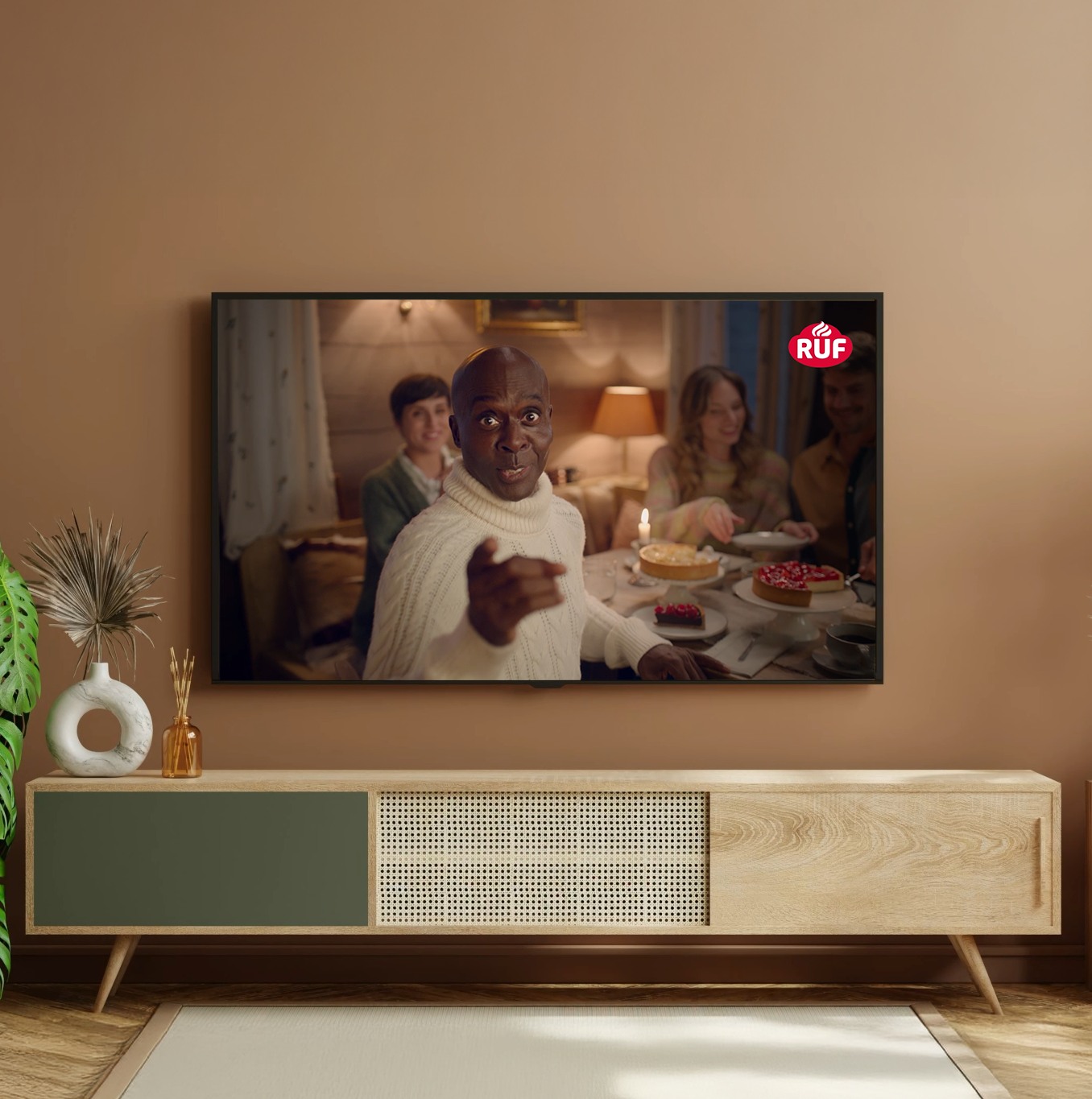
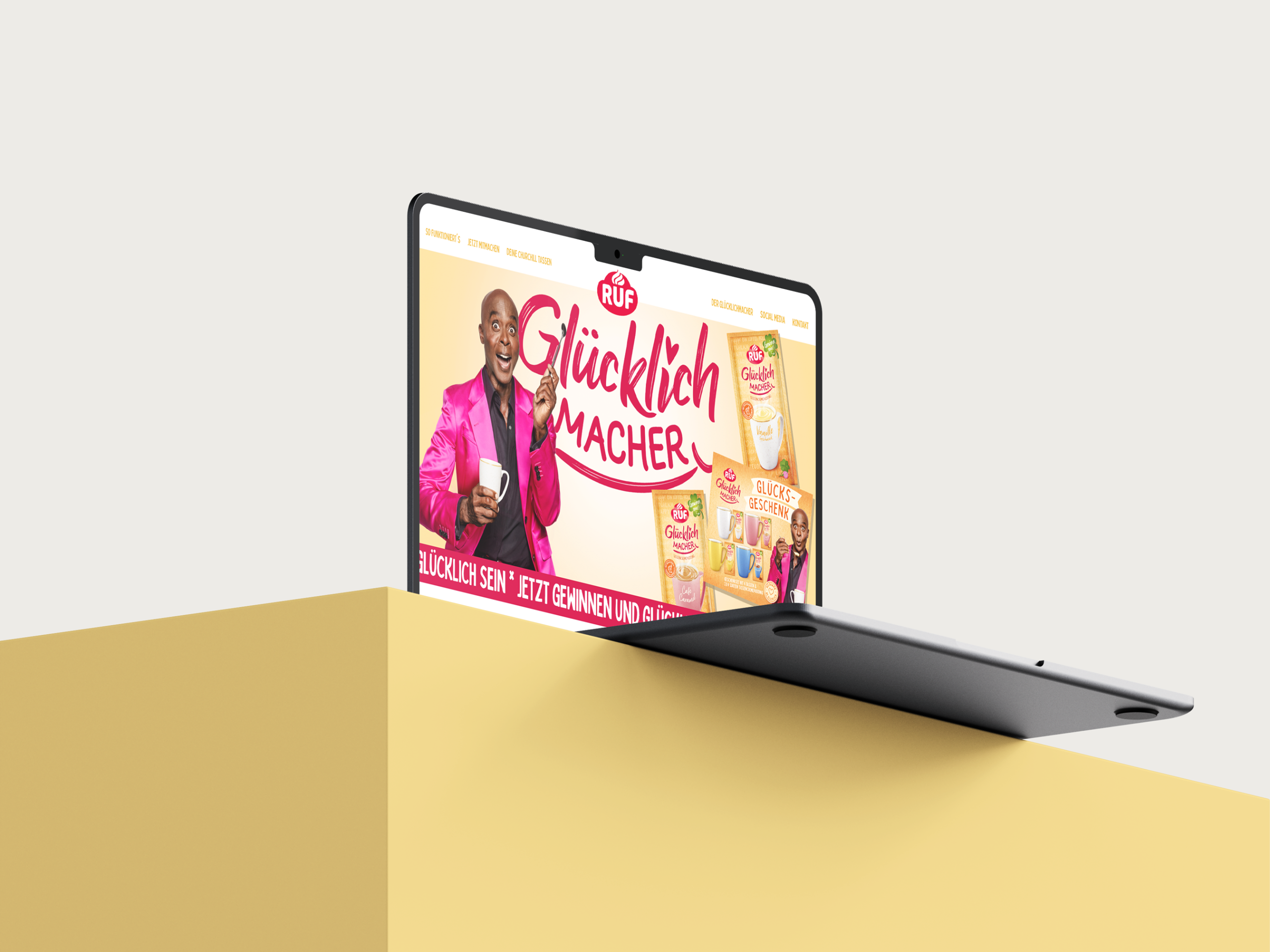
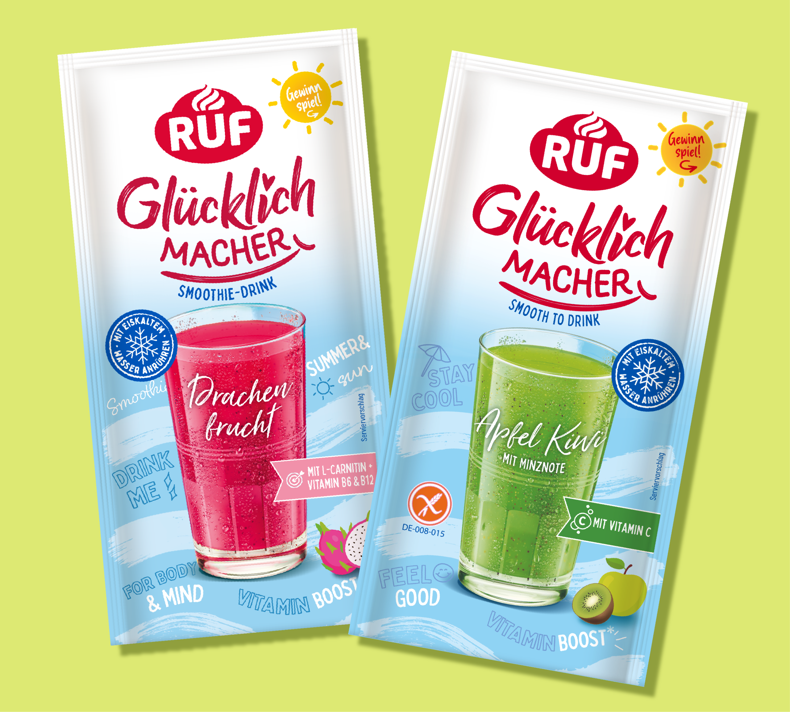
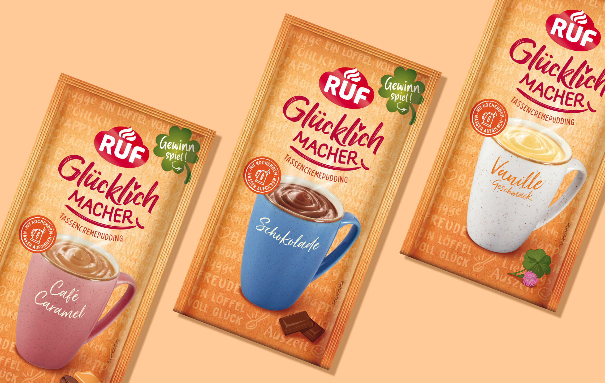
The classic dessert cups got a full makeover under the new name Glücklichmacher (“little joy bringers”) – with vibrant illustrations, playful doodles, and charming symbols of happiness. The design is supported by Bruce Darnell, whose distinctive charm and warmth make him more than just a face – he’s a connector to the emotional essence of the product: joy, ease, and that certain something.
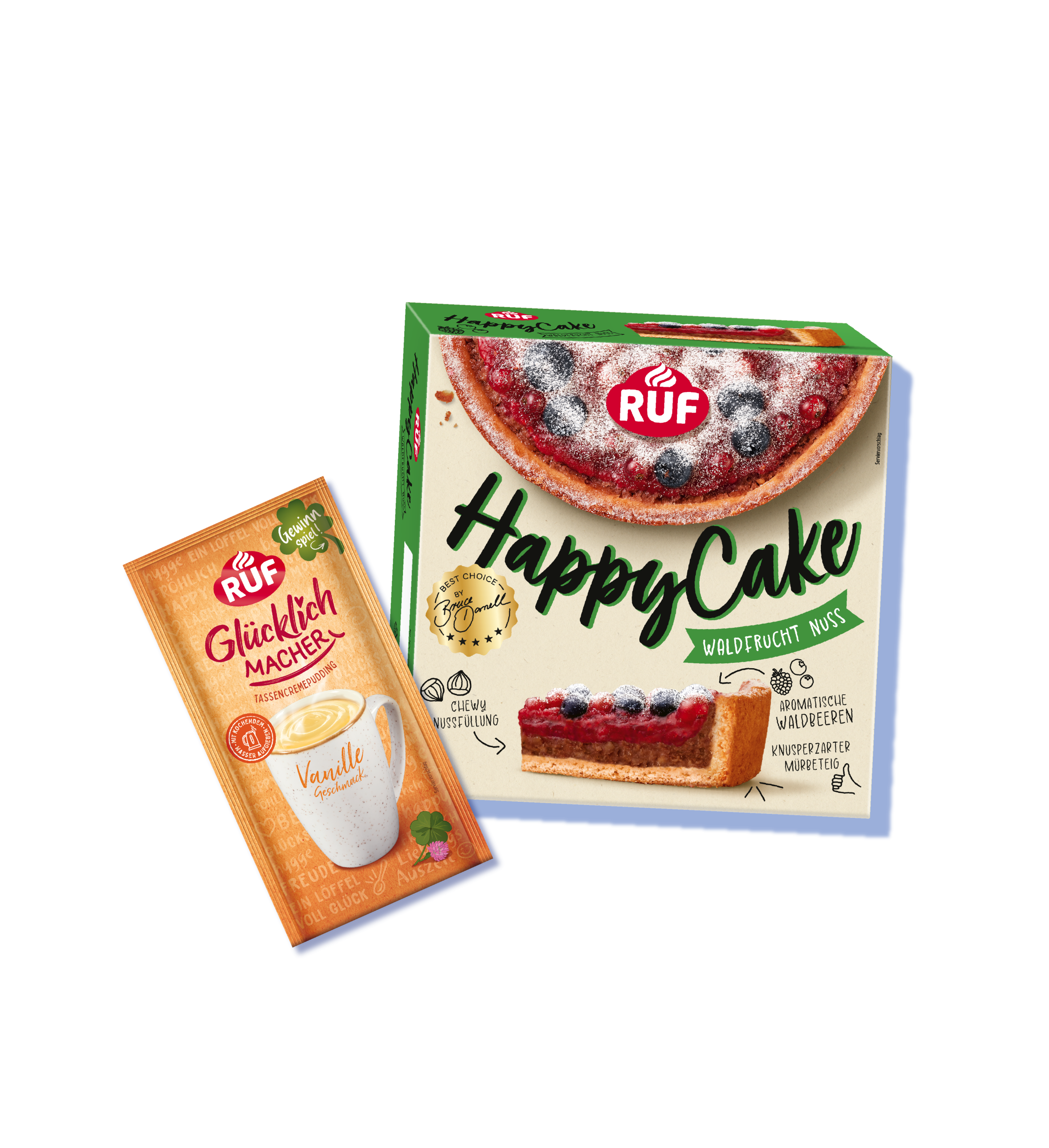
– HappyCakes –
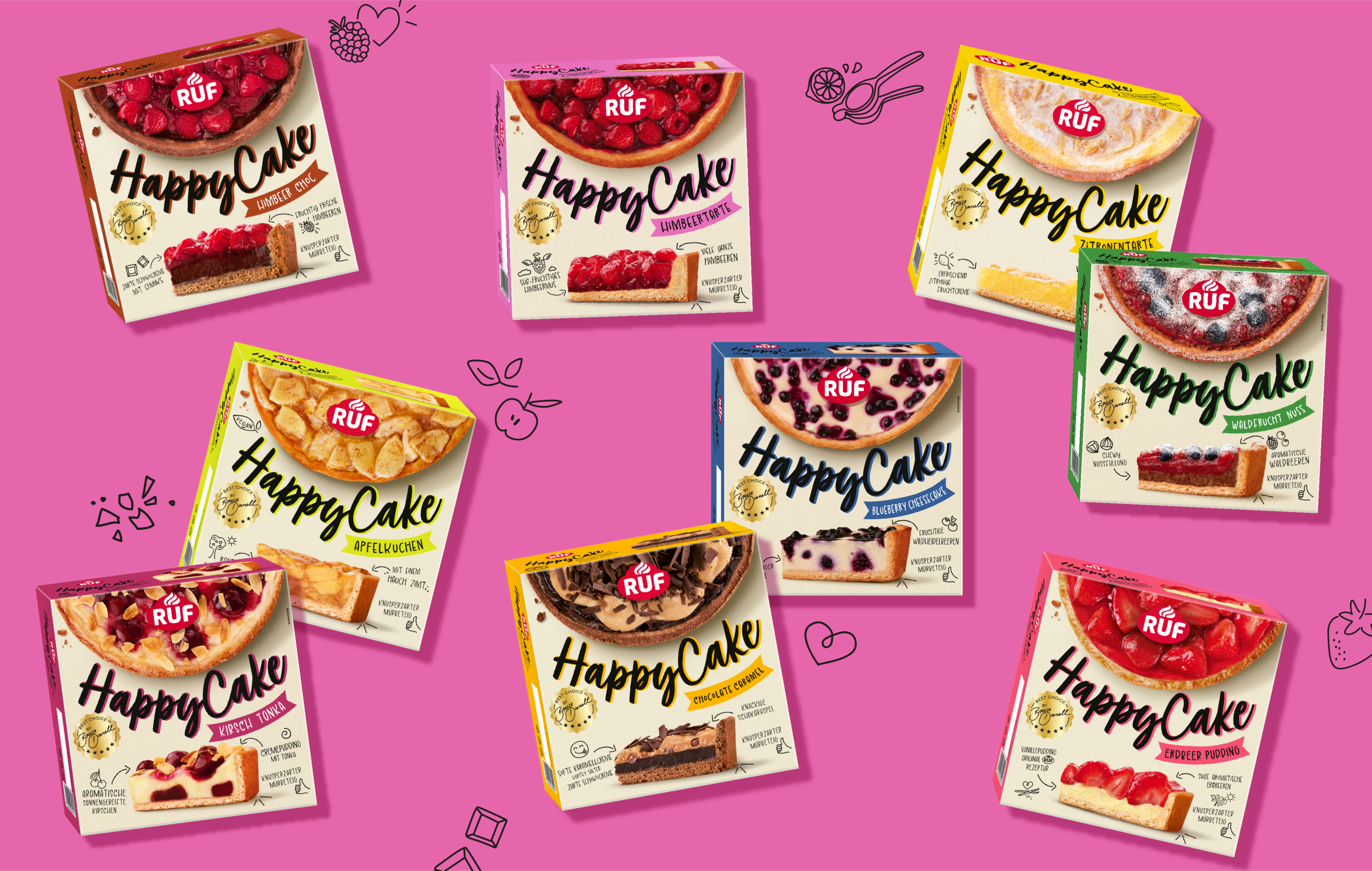
We supported the freezer-aisle launch of HappyCakes with a bold design that breaks the usual patisserie codes – confident, contemporary, and intentionally disruptive, yet deeply emotional in how it promises indulgence, quality, and handmade appeal.
All designs share one clear goal: to create stopping power on shelf, build recognition, and spark desire. Not just to stand out – but to invite people in.

Each product range was built on its own visual concept – from naming to storytelling to execution within the larger brand universe. Across every detail, we ensured strong brand consistency, intuitive recognition, and emotional continuity. No pack design stands alone – everything is part of a bigger picture.
The new look creates targeted shelf impact: it cuts through the noise, brings orientation, and builds brand presence in a crowded category.
From packaging to TV to social feeds – RUF is stepping forward: bold, modern, and relatable.
This isn’t about slapping on a new label. It’s about staging a brand that’s authentic to its core – with heart, flavor, and joy baked into every detail.