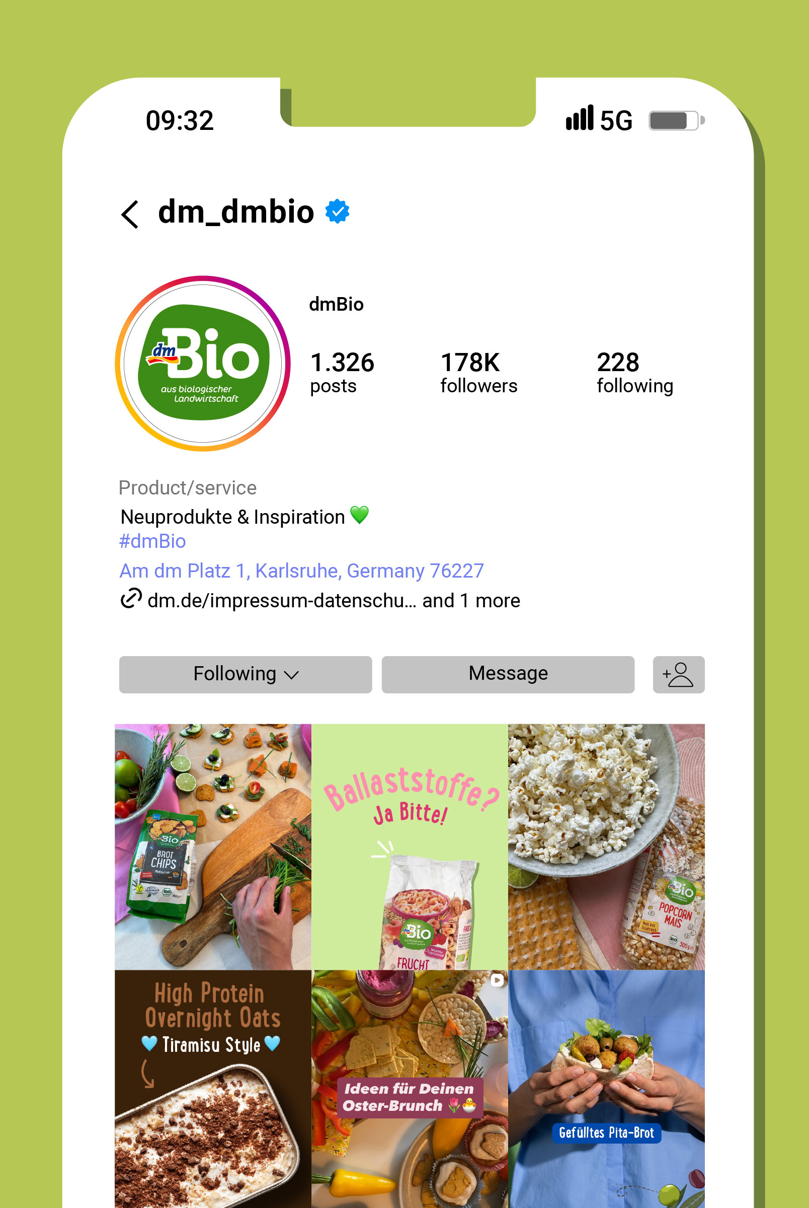
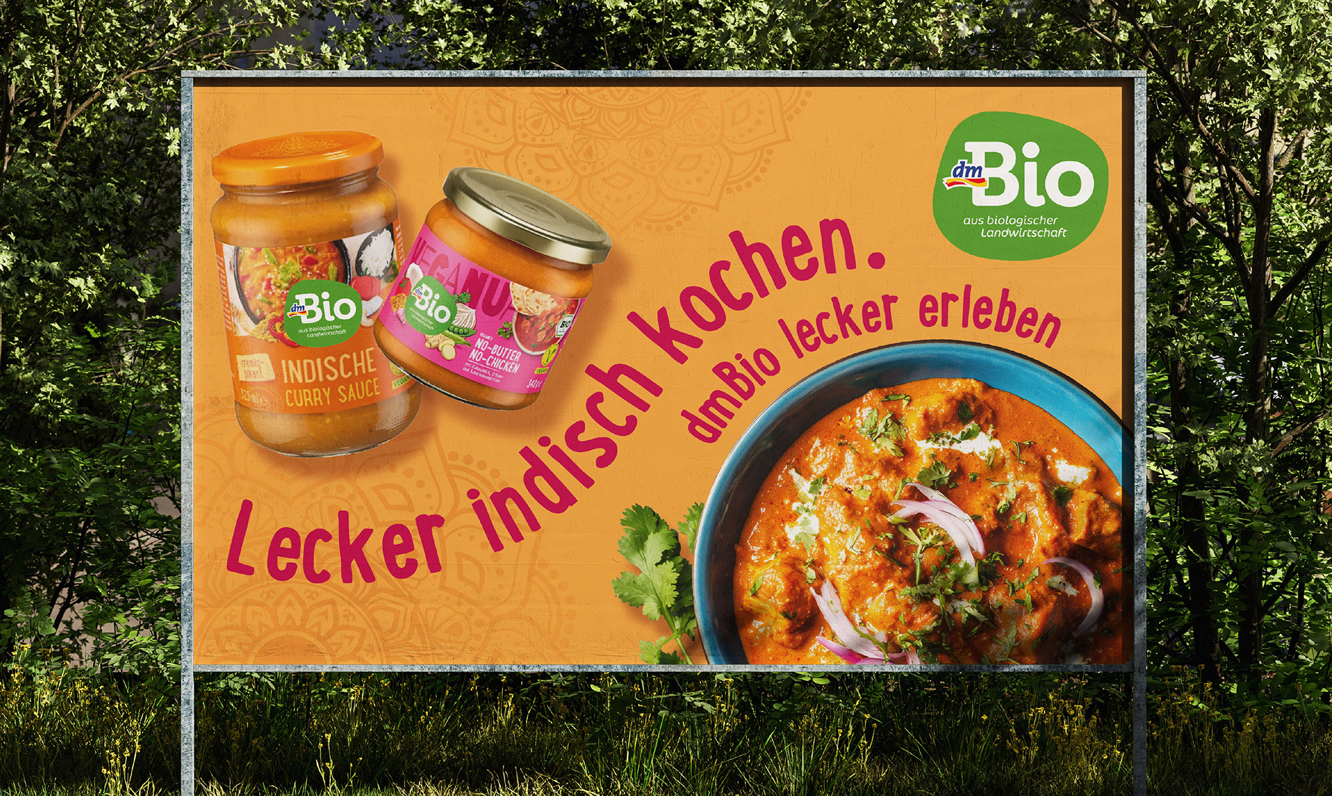
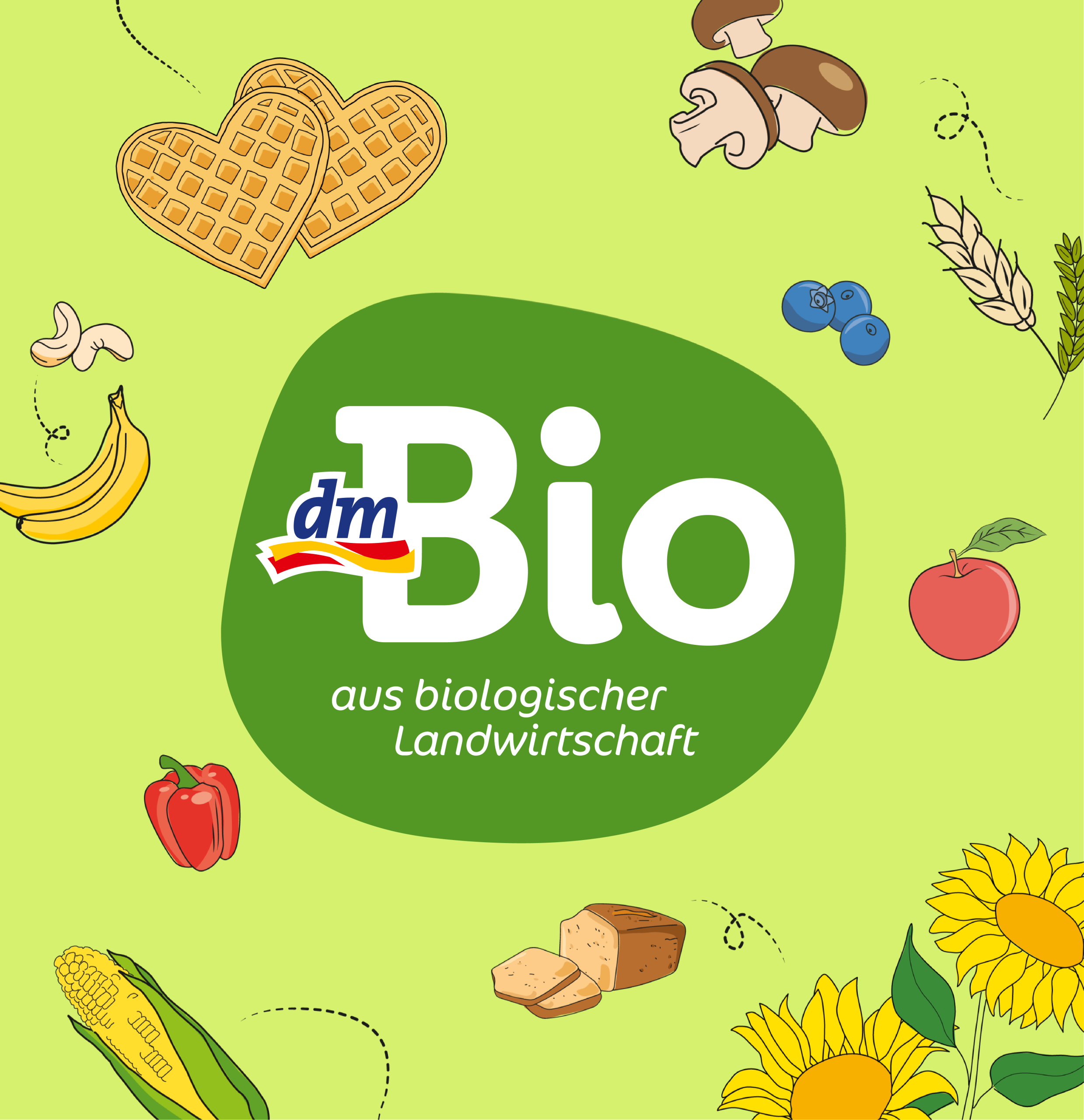
dmBio has been an integral part of many consumers’ everyday lives for years, standing for authenticity, trust, and a clear set of values. However, the framework conditions have evolved: digital applications, new touchpoints, and increasing visual density in the organic segment now demand greater clarity and legibility. Against this backdrop, we refined the dmBio logo to meet these new challenges — while respecting the brand and its established character.
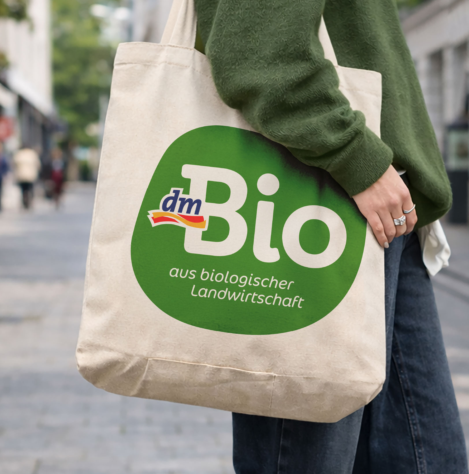
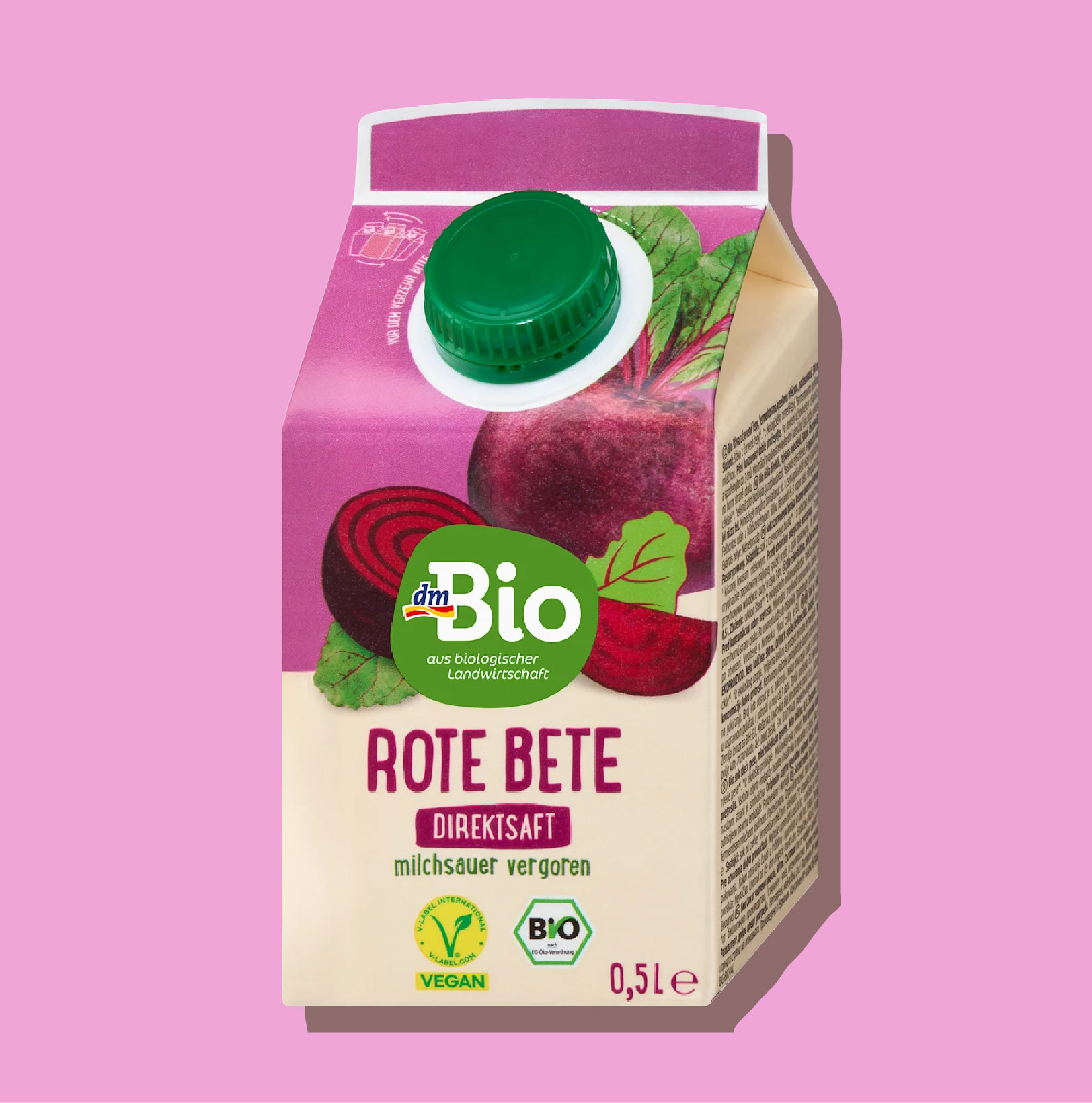
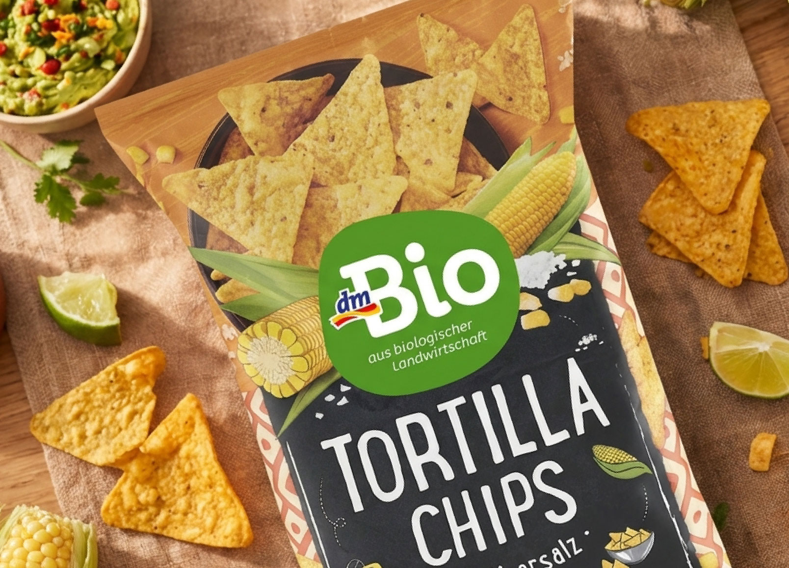
Our strategic guiding principle was: preserve what works, and sharpen what strengthens. The organic design language, a core element of the brand’s identity, was intentionally retained. At the same time, we rebalanced the logo to create a calmer, clearer overall impression, ensuring the brand remains consistent and distinctive across all channels. We simplified the brand to its essentials, giving the logo greater focus and improved functionality in application.


In the design execution, the logo was carefully fine-tuned and refined. The typography was opened up and made more scalable, without losing its familiar feel. A defined shade of green enhances recognizability and adds presence to the brand — authentic, premium, and confident. In addition, the visual language was further developed and consolidated into updated guidelines to ensure a consistent brand design across all touchpoints.
The result is a logo facelift that prepares dmBio for the demands of today’s brand environments. We adapted the dmBio logo to contemporary requirements, because in the digital age, brands need clarity, reduction, and strong recognizability – on small screens as well as on the shelf.