As one of the most recognized FMCG brands, Persil has stood for uncompromising cleanliness for decades — while operating in a category that is often visually driven by functional cues. For Henkel, the key strategic question was: how can an iconic brand be strengthened, made more emotional, and further differentiated without losing its recognizability?
In collaboration with JUSTBLUE, Persil was evolved through a holistic relaunch design—bringing brand, strategy, and visual performance into closer alignment.

The challenge lay in handling an icon with care. At Persil, every detail matters, and every step must reinforce consumer trust rather than call it into question. This led us to a clear strategic principle: evolution, not revolution.
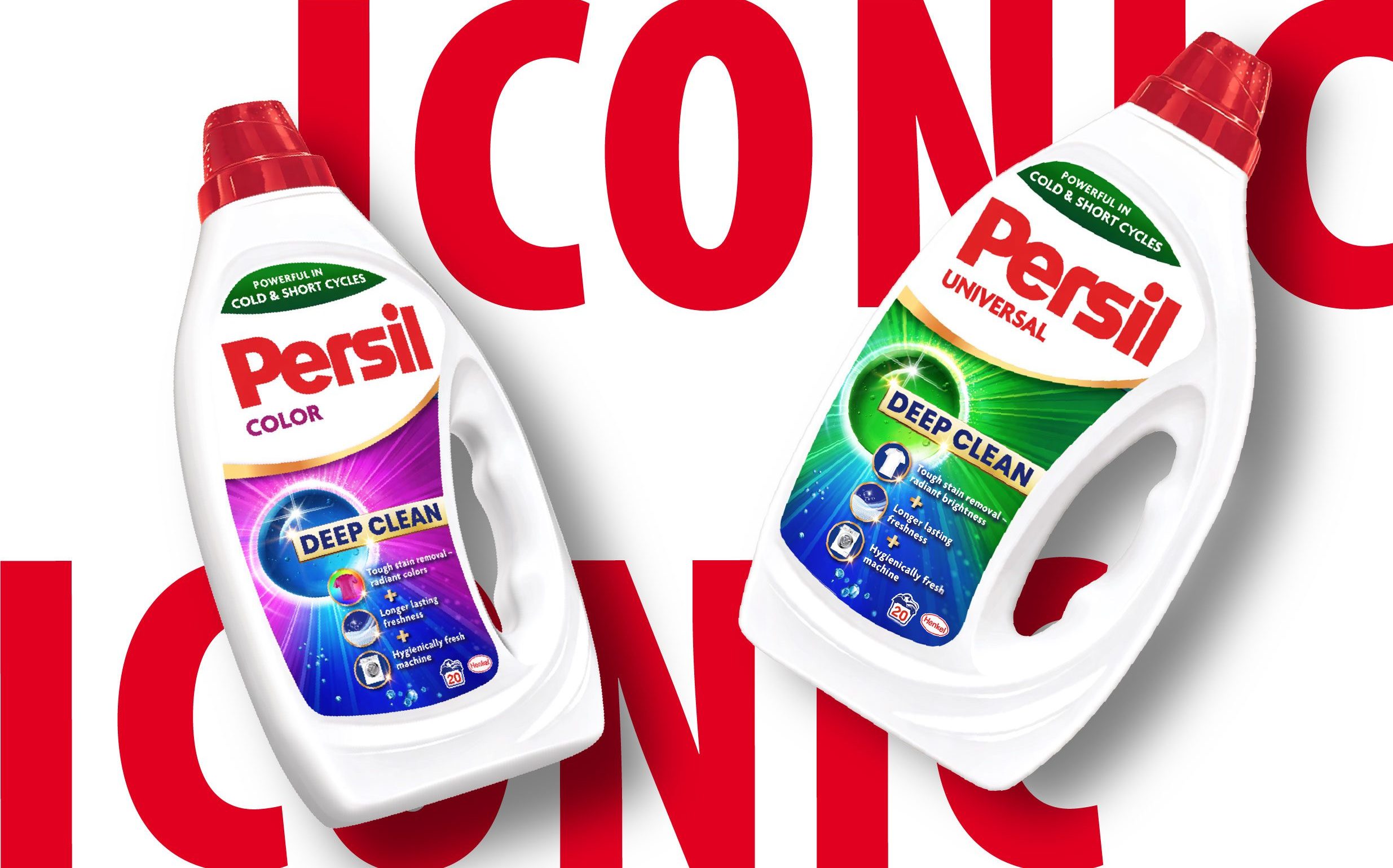
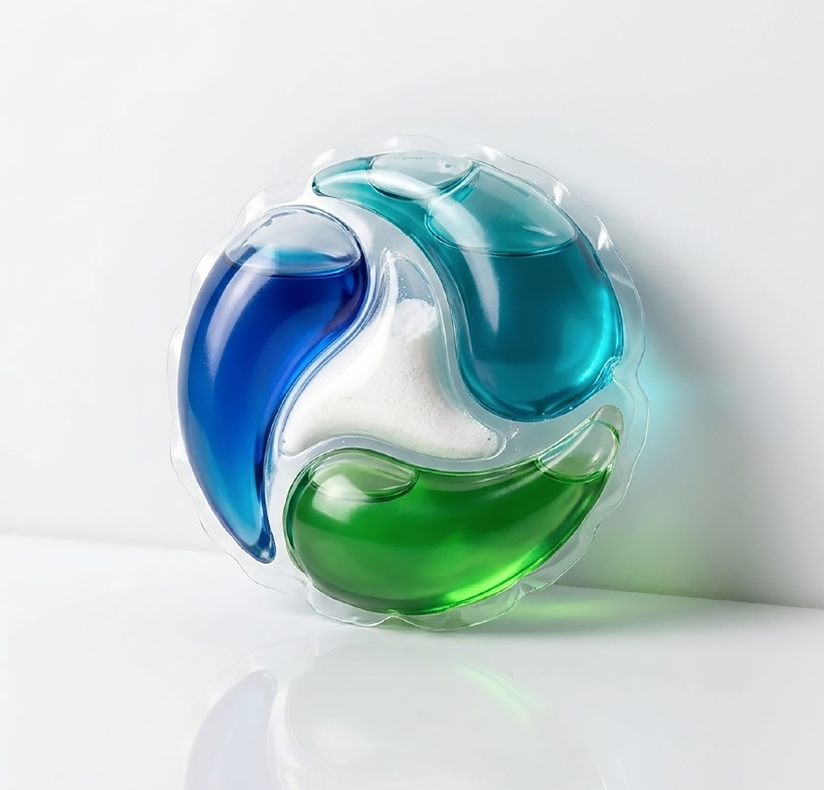
At the core was a sharpened articulation of the central promise, “Deep Clean.” This was not only refined conceptually, but consistently translated into a visual guiding system.
The Persil Power Ball becomes the central symbol, representing the source of performance and the visible starting point of deep-cleaning efficacy. From the brand itself, the cleaning power unfolds, making the promise tangible and immediate.
The result is a clearly refined, high-impact brand presence at the point of sale. Across the entire range, the products gain in clarity, differentiation, and recognizability. At the same time, the brand is emotionally elevated – powerful, precise, and approachable.
The outcome is a brand experience that not only communicates Persil’s strength, but makes it visually tangible, taking this icon a decisive step into the future.